Customize Blazor Component Themes with Theme Studio
8 Jul 202624 minutes to read
Theme Studio for Blazor can be used to customize a new theme from an existing theme. It does not support data visualization components such as Blazor Charts, Blazor Diagram, Blazor Circular Gauge, Blazor Linear Gauge, Blazor Maps, and Blazor Range Navigator.
Customize theme colors from Theme Studio
The Blazor themes are developed under the SCSS environment. Each theme has a unique common variable list. When you change the common variable color code value, it will reflect in all the Blazor components. All Blazor component styles are derived from these theme-based common variables. This common variable list is handled inside the Theme Studio application for customizing theme-based colors.
- Open Blazor Theme Studio application.
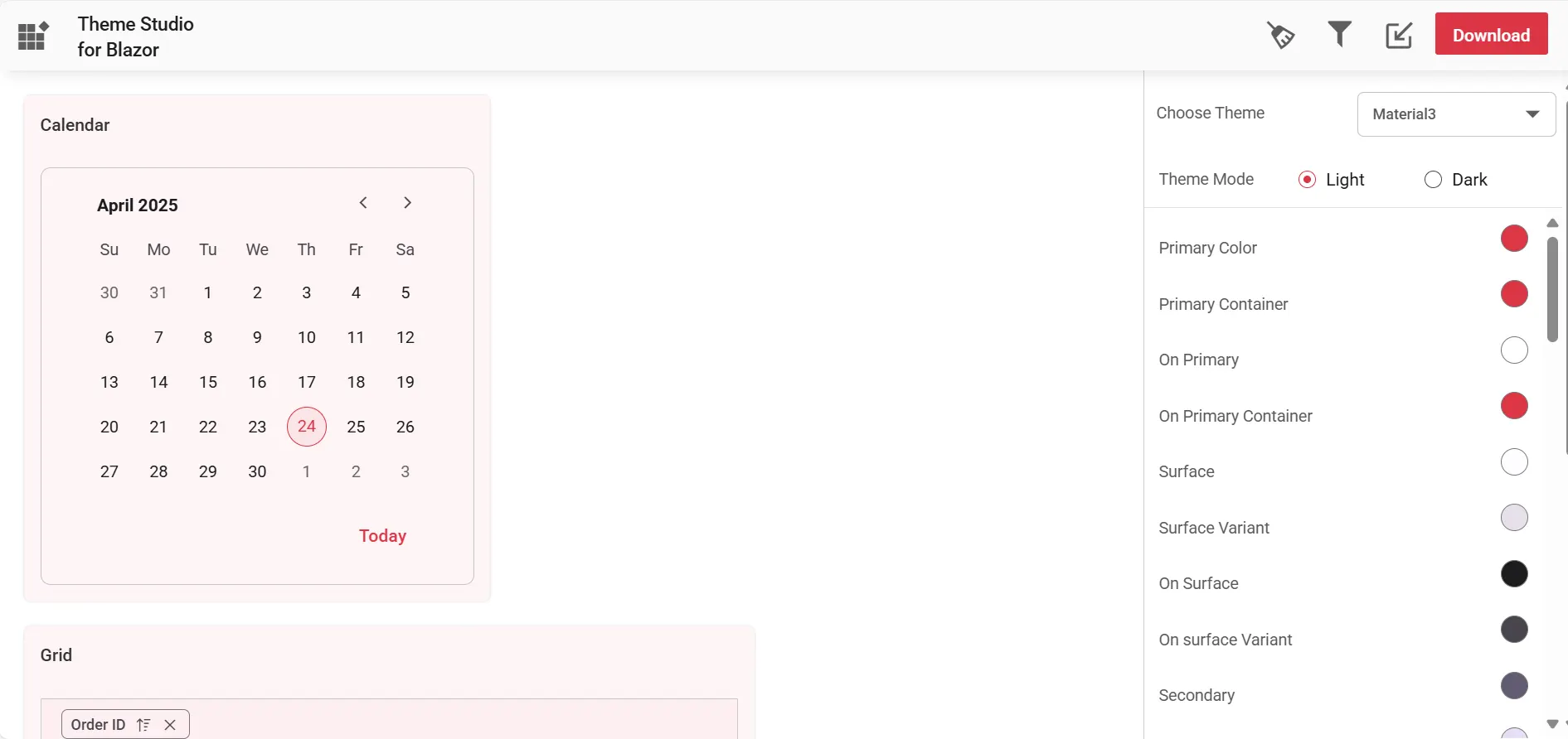
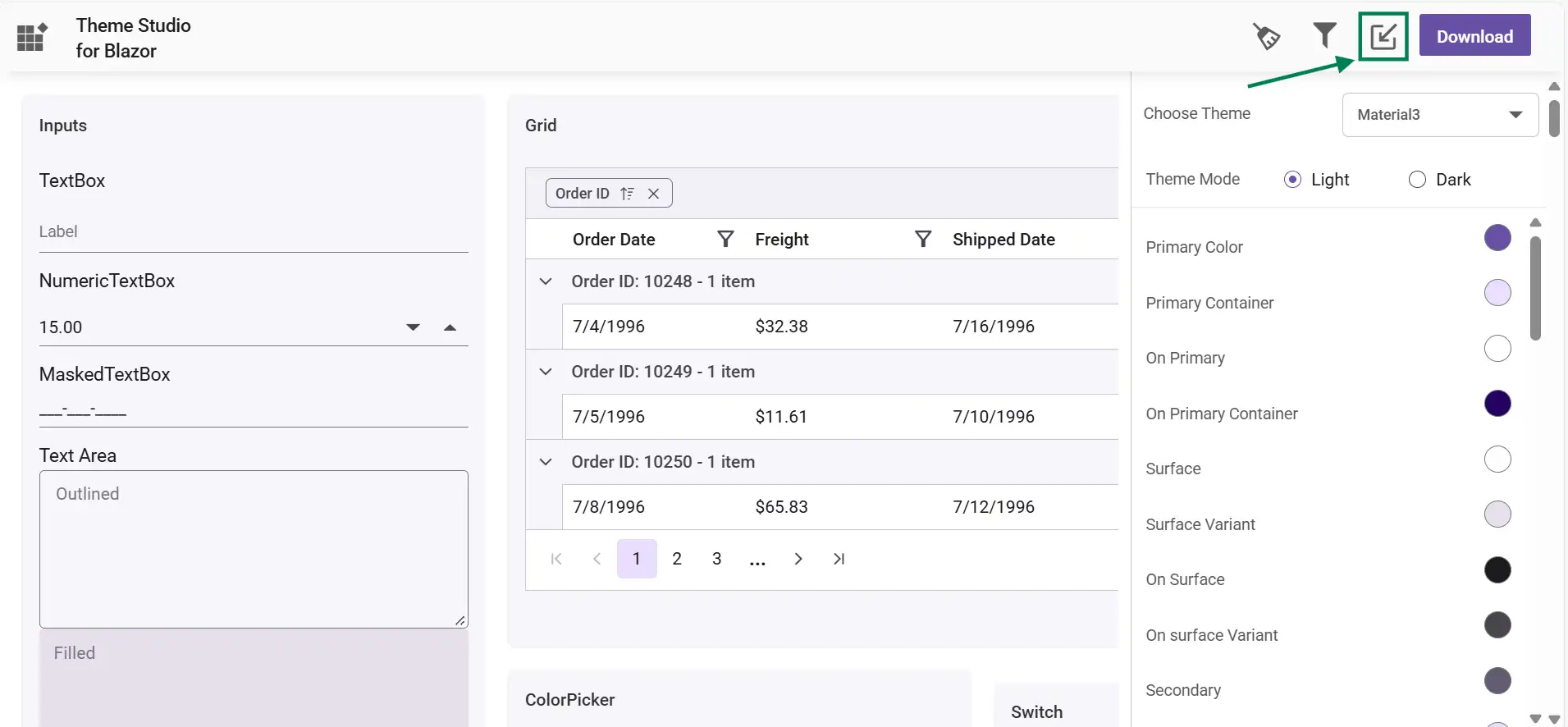
- The Theme Studio application page can be divided into two sections: the components preview section on the left, and the theme customization section on the right.
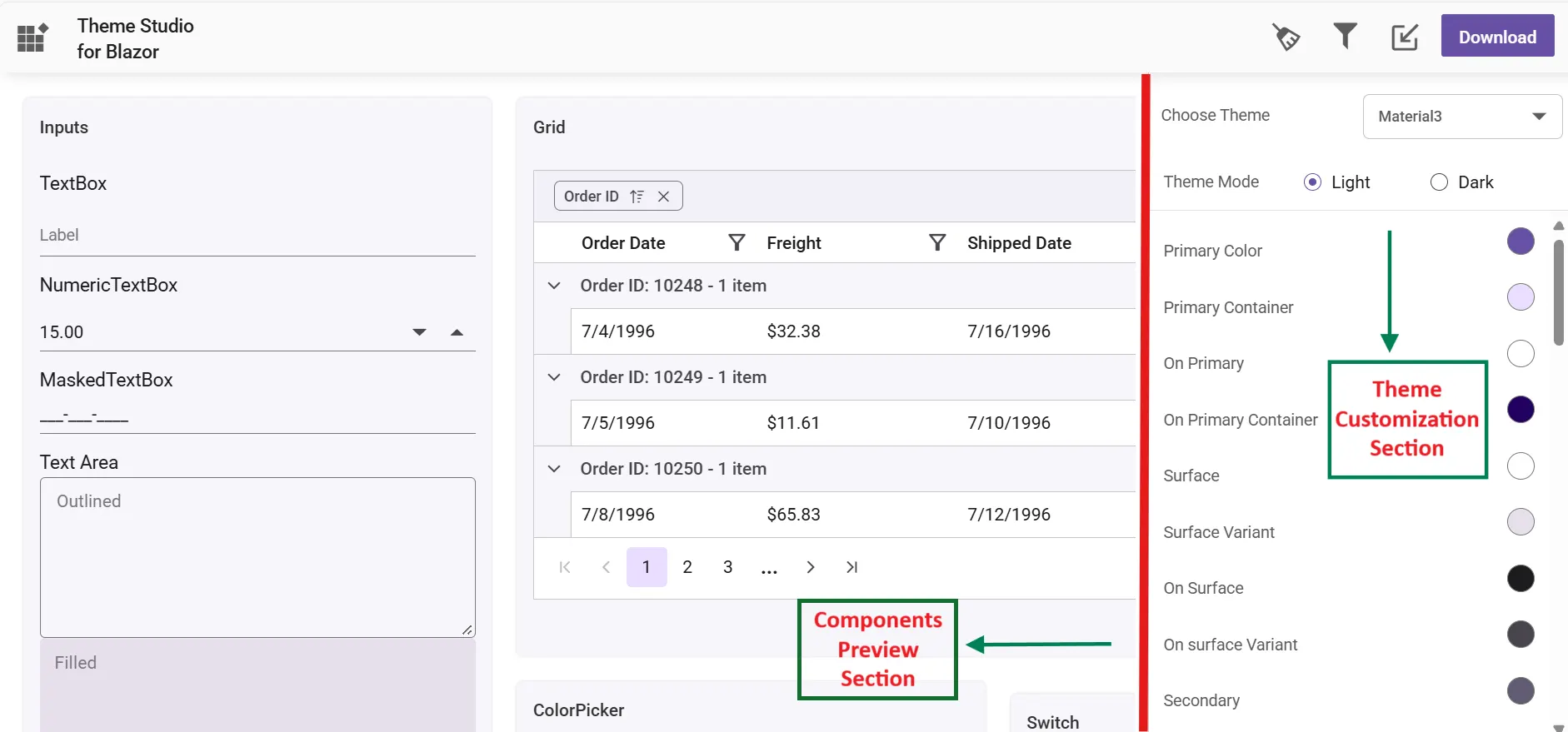
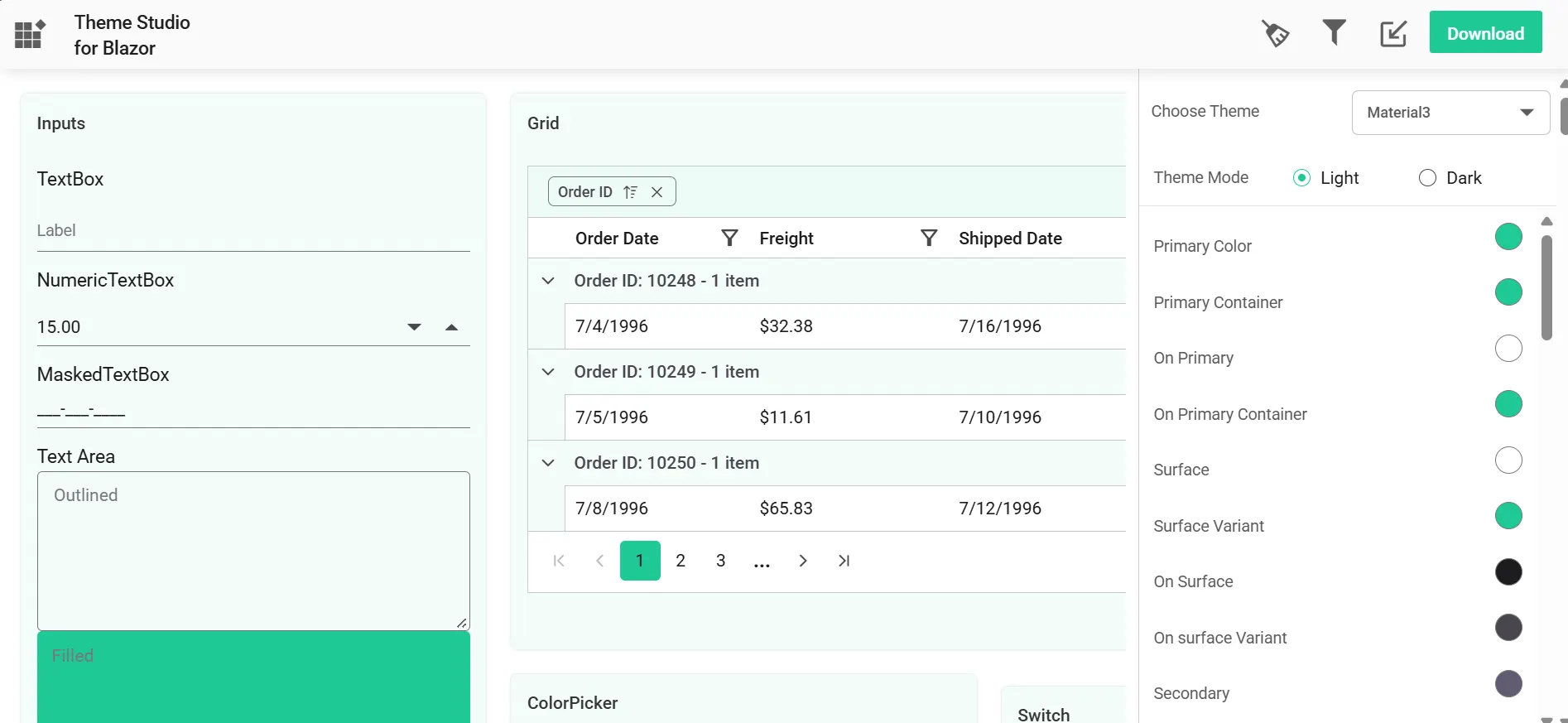
- Click the color pickers in the theme customization section to select your desired colors.
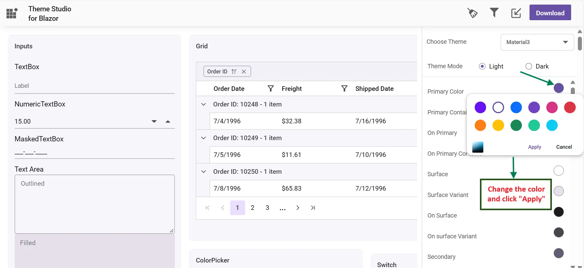
- The Blazor components are rendered with the newly selected colors in the preview section after selecting a custom color from the color picker.
Filter a specific list of components
Using the theme studio, you can apply custom themes to a list of specific components. This option is used when you integrate a selective list of Blazor components in your application. The theme studio will filter the selected components and customize the final output for the components’ styles alone by reducing the final output file size.
- Click the Filter icon at the top-right corner, and select the components whose theme you want to customize.
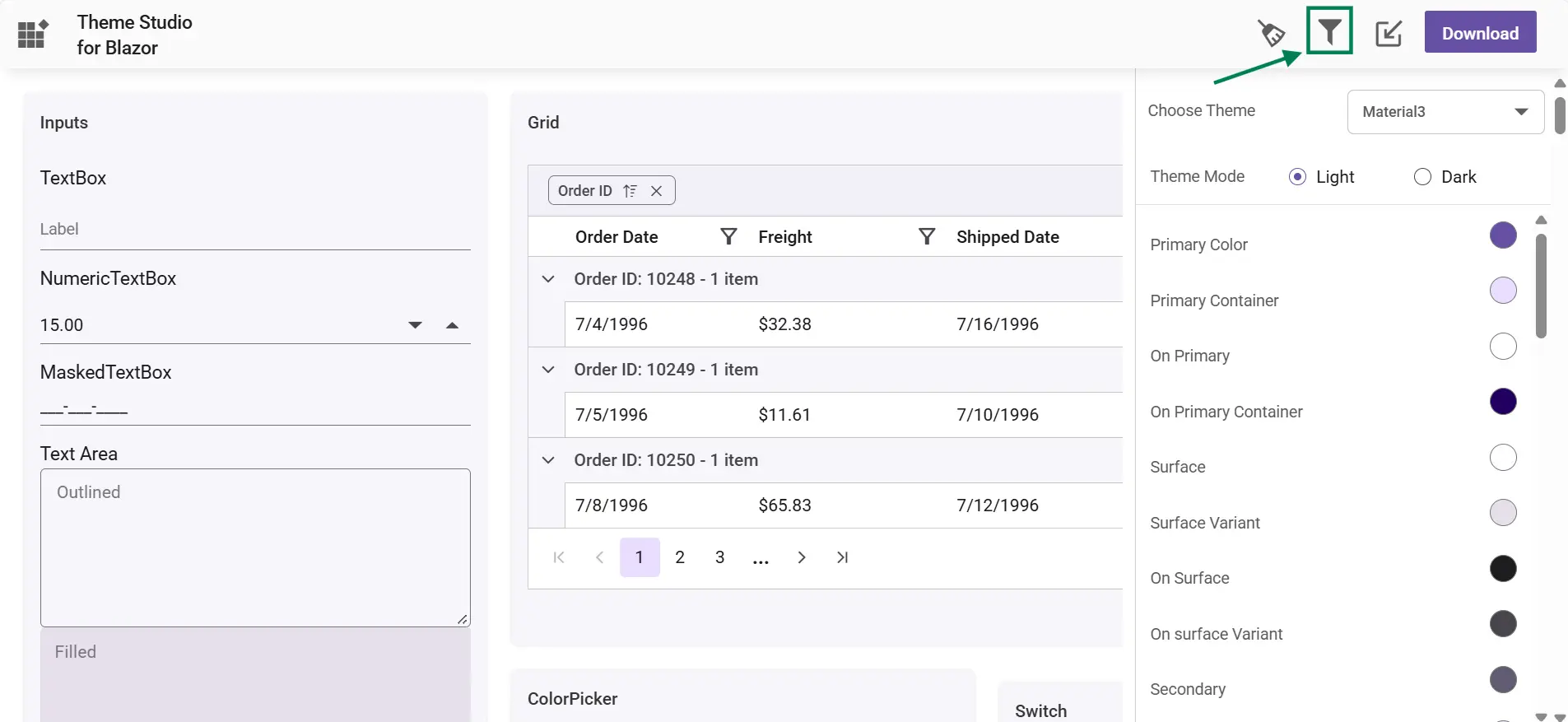
- Click the Apply button in the Filter dialog. Now, only the selected components will be rendered in the components preview section.
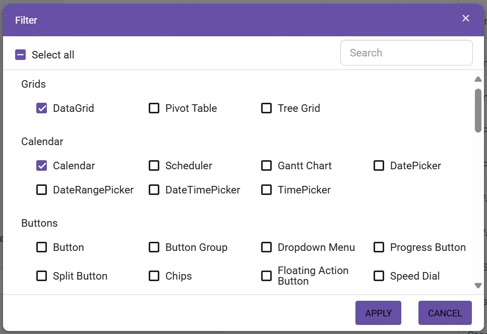
- Now, you can customize the colors in the theme customization section for the components selected.
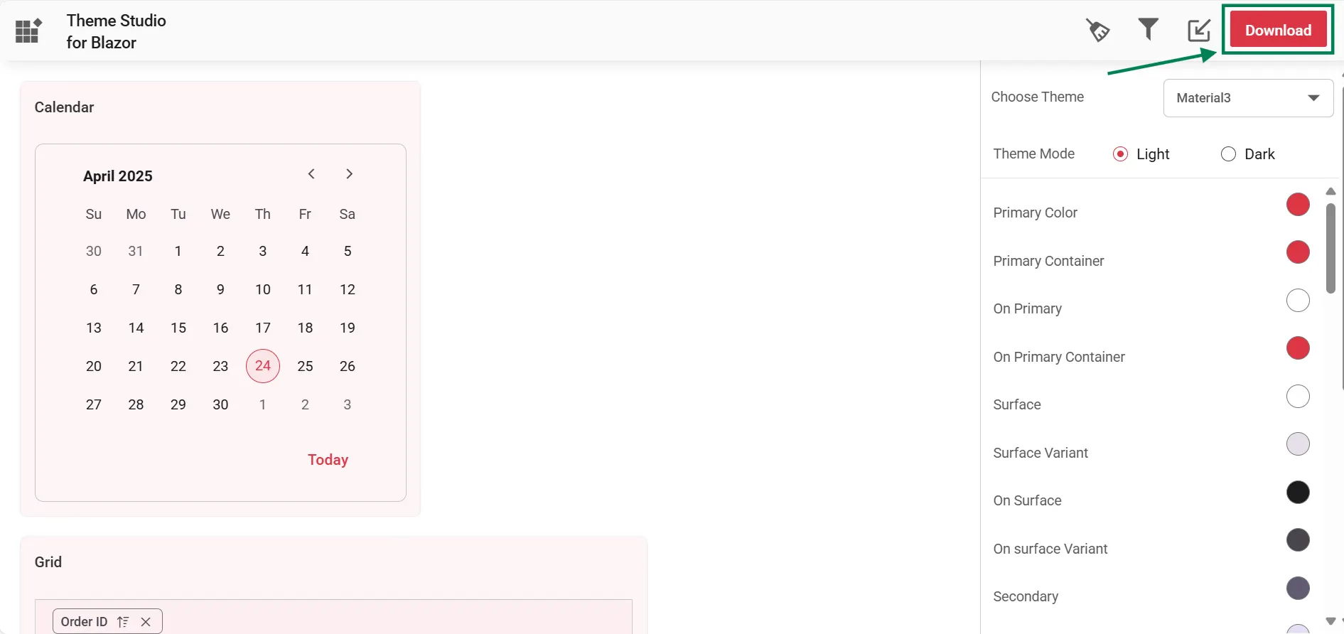
Download the customized theme
You can download the custom styles after customizing the theme colors.
- Click the Download button at the top-right corner, and the Download dialog will appear.
- Assign a theme name in the File Name field, and click the Download button.
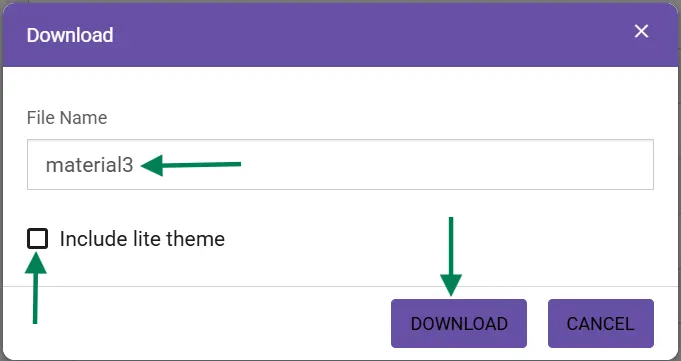
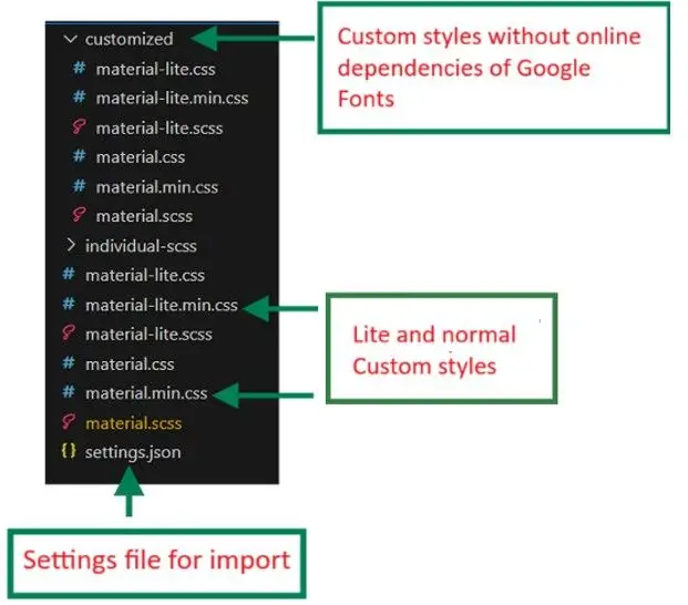
- The download styles will come as a zip file that contains
SCSSandCSSfiles for the selected Blazor components. The current settings are stored in thesettings.jsonfile.
NOTE
The Material and Tailwind themes use the online Roboto font. For offline or restricted networks, the downloaded package includes CSS files without Google Fonts dependencies. Lightweight theme files, such as
fluent2-lite.css, improve performance by excluding larger styles. When using a customized CSS file, remove any other Blazor base theme references (CDN or local) to avoid duplicate or conflicting styles.
Use a customized theme in a web application
Before applying a custom theme, ensure you have created a Blazor project. For guidance, see Getting Started with Blazor. You can use the customized CSS file directly in the web application.
- Copy the customized CSS file from the download folder to the app’s
wwwrootfolder. You can place it directly underwwwrootor in a subfolder such aswwwroot/styles/. - Reference the customized CSS file in the appropriate host page:
- For Blazor Web App, add the reference in the
<head>section of~/Components/App.razor. - For standalone Blazor WebAssembly App, add the reference in the
<head>section of~/wwwroot/index.html.
<head> <link href="/styles/{file-name}.css" rel="stylesheet" /> </head> - For Blazor Web App, add the reference in the
Import previous settings into Theme Studio
If you need to change your application theme and UI design in the future, do not customize the Blazor components from scratch in the theme studio. Just import the old settings.json file to review and update your stored settings in the Theme Studio application.
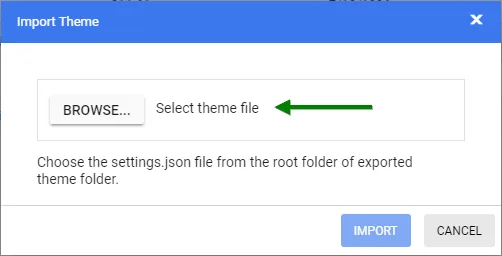
- Click the Import icon at the top-right corner.
- The Import Theme dialog will open. Click the Browse button and select the
settings.jsonfile you exported previously.
- Click the Import button.
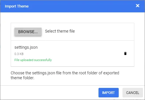
- The stored data will be reflected in the Theme Studio application. Now, you can change the theme colors based on your latest design and export the theme again.
- The exported file contains your latest changes. You can just replace the older custom style with a new style to refresh your application.
Common variables
The following list of common variables is used in the Blazor library themes for all UI components. You can change these variables to customize the corresponding theme.
Material 3 theme
| Name | Value (Default Theme) | Value (Dark Theme) |
|---|---|---|
| --color-sf-black | rgb(0,0,0) | rgb(0,0,0) |
| --color-sf-white | rgb(255,255,255) | rgb(255,255,255) |
| --color-sf-primary | rgb(103, 80, 164) | rgb(208, 188, 255) |
| --color-sf-primary-container | rgb(234, 221, 255) | rgb(79, 55, 139) |
| --color-sf-on-primary | rgb(255, 255, 255) | rgb(55, 30, 115) |
| --color-sf-on-primary-container | rgb(33, 0, 94) | rgb(234, 221, 255) |
| --color-sf-surface | rgb(255, 255, 255) | rgb(28, 27, 31) |
| --color-sf-surface-variant | rgb(231, 224, 236) | rgb(73, 69, 79) |
| --color-sf-on-surface | rgb(28, 27, 31) | rgb(230, 225, 229) |
| --color-sf-on-surface-variant | rgb(73, 69, 78) | rgb(202, 196, 208) |
| --color-sf-secondary | rgb(98, 91, 113) | rgb(204, 194, 220) |
| --color-sf-secondary-container | rgb(232, 222, 248) | rgb(74, 68, 88) |
| --color-sf-on-secondary | rgb(255, 255, 255) | rgb(51, 45, 65) |
| --color-sf-on-secondary-container | rgb(30, 25, 43) | rgb(232, 222, 248) |
| --color-sf-tertiary | rgb(125, 82, 96) | rgb(239, 184, 200) |
| --color-sf-tertiary-container | rgb(255, 216, 228) | rgb(99, 59, 72) |
| --color-sf-on-tertiary | rgb(255, 255, 255) | rgb(73, 37, 50) |
| --color-sf-on-tertiary-container | rgb(55, 11, 30) | rgb(255, 216, 228) |
| --color-sf-background | rgb(255, 255, 255) | rgb(28, 27, 31) |
| --color-sf-on-background | rgb(28, 27, 31) | rgb(230, 225, 229) |
| --color-sf-outline | rgb(121, 116, 126) | rgb(147, 143, 153) |
| --color-sf-outline-variant | rgb(196, 199, 197) | rgb(68, 71, 70) |
| --color-sf-shadow | rgb(0, 0, 0) | rgb(0, 0, 0) |
| --color-sf-surface-tint-color | rgb(103, 80, 164) | rgb(208, 188, 255) |
| --color-sf-inverse-surface | rgb(49, 48, 51) | rgb(230, 225, 229) |
| --color-sf-inverse-on-surface | rgb(244, 239, 244) | rgb(49, 48, 51) |
| --color-sf-inverse-primary | rgb(208, 188, 255) | rgb(103, 80, 164) |
| --color-sf-scrim | rgb(0, 0, 0) | rgb(0, 0, 0) |
| --color-sf-error | rgb(179, 38, 30) | rgb(242, 184, 181) |
| --color-sf-error-container | rgb(249, 222, 220) | rgb(140, 29, 24) |
| --color-sf-on-error | rgb(255, 250, 250) | rgb(96, 20, 16) |
| --color-sf-on-error-container | rgb(65, 14, 11) | rgb(249, 222, 220) |
| --color-sf-success | rgb(32, 81, 7) | rgb(83, 202, 23) |
| --color-sf-success-container | rgb(209, 255, 186) | rgb(22, 62, 2) |
| --color-sf-on-success | rgb(244, 255, 239) | rgb(13, 39, 0) |
| --color-sf-on-success-container | rgb(13, 39, 0) | rgb(183, 250, 150) |
| --color-sf-info | rgb(1, 87, 155) | rgb(71, 172, 251) |
| --color-sf-info-container | rgb(233, 245, 255) | rgb(0, 67, 120) |
| --color-sf-on-info | rgb(250, 253, 255) | rgb(0, 51, 91) |
| --color-sf-on-info-container | rgb(0, 51, 91) | rgb(173, 219, 255) |
| --color-sf-warning | rgb(145, 76, 0) | rgb(245, 180, 130) |
| --color-sf-warning-container | rgb(254, 236, 222) | rgb(123, 65, 0) |
| --color-sf-on-warning | rgb(255, 255, 255) | rgb(99, 52, 0) |
| --color-sf-on-warning-container | rgb(47, 21, 0) | rgb(255, 220, 193) |
Bootstrap 5 theme
| Name | Value (Default Theme) | Value (Dark Theme) |
|---|---|---|
| $black | #000 | #000 |
| $white | #fff | #fff |
| $gray-100 | #f8f9fa | #f8f9fa |
| $gray-200 | #e9ecef | #e9ecef |
| $gray-300 | #dee2e6 | #dee2e6 |
| $gray-400 | #ced4da | #ced4da |
| $gray-500 | #adb5bd | #adb5bd |
| $gray-600 | #6c757d | #6c757d |
| $gray-700 | #495057 | #495057 |
| $gray-800 | #343a40 | #343a40 |
| $gray-900 | #212529 | #212529 |
| $blue | #0d6efd | #0d6efd |
| $indigo | #6610f2 | #6610f2 |
| $purple | #6f42c1 | #6f42c1 |
| $pink | #d63384 | #d63384 |
| $red | #dc3545 | #dc3545 |
| $orange | #fd7e14 | #fd7e14 |
| $yellow | #ffc107 | #ffc107 |
| $green | #198754 | #198754 |
| $teal | #20c997 | #20c997 |
| $cyan | #0dcaf0 | #0dcaf0 |
Fluent theme
| Name | Value (Default Theme) | Value (Dark Theme) |
|---|---|---|
| $black | #000 | #000 |
| $white | #fff | #fff |
| $gray220 | #11100f | #11100f |
| $gray210 | #161514 | #161514 |
| $gray200 | #1b1a19 | #1b1a19 |
| $gray190 | #201f1e | #201f1e |
| $gray180 | #252423 | #252423 |
| $gray170 | #292827 | #292827 |
| $gray160 | #323130 | #323130 |
| $gray150 | #3b3a39 | #3b3a39 |
| $gray140 | #484644 | #484644 |
| $gray130 | #605e5c | #605e5c |
| $gray120 | #797775 | #797775 |
| $gray110 | #8a8886 | #8a8886 |
| $gray100 | #979593 | #979593 |
| $gray90 | #a19f9d | #a19f9d |
| $gray80 | #b3b0ad | #b3b0ad |
| $gray70 | #bebbb8 | #bebbb8 |
| $gray60 | #c8c6c4 | #c8c6c4 |
| $gray50 | #d2d0ce | #d2d0ce |
| $gray40 | #e1dfdd | #e1dfdd |
| $gray30 | #edebe9 | #edebe9 |
| $gray20 | #f3f2f1 | #f3f2f1 |
| $gray10 | #faf9f8 | #faf9f8 |
| $cyanblue10 | #0078d4 | #0078d4 |
| $red10 | #d13438 | #d13438 |
| $orange20 | #ca5010 | #ca5010 |
| $green20 | #0b6a0b | #0b6a0b |
| $cyan20 | #038387 | #038387 |
Bootstrap 4 theme
| Name | Value |
|---|---|
| $white | #fff |
| $gray-100 | #f8f9fa |
| $gray-200 | #e9ecef |
| $gray-300 | #dee2e6 |
| $gray-400 | #ced4da |
| $gray-500 | #adb5bd |
| $gray-600 | #6c757d |
| $gray-700 | #495057 |
| $gray-800 | #343a40 |
| $gray-900 | #212529 |
| $black | #000 |
| $blue | #007bff |
| $indigo | #6610f2 |
| $purple | #6f42c1 |
| $pink | #e83e8c |
| $red | #dc3545 |
| $orange | #fd7e14 |
| $yellow | #ffc107 |
| $green | #28a745 |
| $teal | #20c997 |
| $cyan | #17a2b8 |
Bootstrap Theme
Design based on Bootstrap 3 theme.
| Name | Value (Default Theme) | Value (Dark Theme) |
|---|---|---|
| $brand-primary | #317ab9 | #0070f0 |
| $brand-primary-darken-10 | #3071a9 | darken($brand-primary, 10%) |
| $brand-primary-darken-15 | #2a6496 | darken($brand-primary, 20%) |
| $brand-primary-darken-25 | #1f496e | darken($brand-primary, 30%) |
| $brand-primary-darken-35 | #142f46 | darken($brand-primary, 40%) |
| $brand-primary-font | #fff | #fff |
| $gray-base | #000 | #1a1a1a |
| $gray-darker | #222 | #131313 |
| $gray-dark | #333 | #2a2a2a |
| $gray | #555 | #313131 |
| $gray-light | #777 | #393939 |
| $grey-44 | #444 | #414141 |
| $grey-88 | #888 | #484848 |
| $grey-99 | #999 | #505050 |
| $grey-8c | #8c8c8c | #585858 |
| $grey-ad | #adadad | #676767 |
| $grey-dark-font | #fff | #f0f0f0 |
| $grey-white | #fff | #6e6e6e |
| $grey-lighter | #eee | #767676 |
| $grey-f9 | #f9f9f9 | #7e7e7e |
| $grey-f8 | #f8f8f8 | #858585 |
| $grey-f5 | #f5f5f5 | #8d8d8d |
| $grey-e6 | #e6e6e6 | #959595 |
| $grey-dd | #ddd | #9c9c9c |
| $grey-d4 | #d4d4d4 | #a4a4a4 |
| $grey-cc | #ccc | #acacac |
| $grey-light-font | #333 | #fff |
| $brand-success | #5cb85c | #48b14c |
| $brand-success-dark | #3c763d | #358238 |
| $brand-info | #5bc0de | #2aaac0 |
| $brand-info-dark | #31708f | #208090 |
| $brand-warning | #f0ad4e | #fac168 |
| $brand-warning-dark | #8a6d3b | #f9ad37 |
| $brand-danger | #d9534f | #d44f4f |
| $brand-danger-dark | #a94442 | #c12f2f |
| $brand-success-light | #dff0d8 | #dff0d8 |
| $brand-info-light | #d9edf7 | #d9edf7 |
| $brand-warning-light | #fcf8e3 | #fcf8e3 |
| $brand-danger-light | #f2dede | #f2dede |
| $input-border-focus | #66afe9 | #104888 |
| $brand-success-font | #3c763d | #2f7432 |
| $brand-info-font | #31708f | #1a6c7a |
| $brand-warning-font | #8a6d3b | #9d6106 |
| $brand-danger-font | #a94442 | #ac2a2a |
| $base-font | #000 | #000 |
| $brand-primary-lighten-10 | lighten($brand-primary, 10%) | |
| $brand-primary-lighten-15 | lighten($brand-primary, 15%) | |
| $brand-primary-lighten-20 | lighten($brand-primary, 20%) | |
| $brand-primary-lighten-30 | lighten($brand-primary, 30%) | |
| $brand-primary-lighten-40 | lighten($brand-primary, 40%) |
Material theme
| Name | Value (Default Theme) | Value (Dark Theme) |
|---|---|---|
| $accent | #e3165b | #ff80ab |
| $accent-font | #fff | #000 |
| $primary | #3f51b5 | #3f51b5 |
| $primary-50 | #e8eaf6 | #e8eaf6 |
| $primary-100 | #c5cae9 | #c5cae9 |
| $primary-200 | #9fa8da | #9fa8da |
| $primary-300 | #7986cb | #7986cb |
| $primary-font | #fff | #fff |
| $primary-50-font | #000 | #000 |
| $primary-100-font | #000 | #000 |
| $primary-200-font | #000 | #000 |
| $primary-300-font | #fff | #fff |
| $grey-white | #fff | #fff |
| $grey-black | #000 | #000 |
| $grey-50 | #fafafa | #fafafa |
| $grey-100 | #f5f5f5 | #f5f5f5 |
| $grey-200 | #eee | #eee |
| $grey-300 | #e0e0e0 | #e0e0e0 |
| $grey-400 | #bdbdbd | #bdbdbd |
| $grey-500 | #9e9e9e | #9e9e9e |
| $grey-600 | #757575 | #757575 |
| $grey-700 | #616161 | #616161 |
| $grey-800 | #424242 | #424242 |
| $grey-900 | #212121 | #212121 |
| $grey-dark | #303030 | #303030 |
| $grey-light-font | #000 | #000 |
| $grey-dark-font | #fff | #fff |
| $base-font | #000 | #000 |
| $error-font | #f44336 | #ff6652 |
| $success-bg | #4caf50 | |
| $error-bg | #ff6652 | |
| $warning-bg | #ff9800 | |
| $info-bg | #03a9f4 | |
| $message-font | #fff | |
| $success-font | #4caf50 | |
| $warning-font | #ff9800 | |
| $info-font | #03a9f4 |
Tailwind CSS theme
| Name | Value (Default Theme) | Value (Dark Theme) |
|---|---|---|
| $black | #000 | #000 |
| $white | #fff | #fff |
| $transparent | transparent | transparent |
| $cool-gray-50 | #f9fafb | #f9fafb |
| $cool-gray-100 | #f3f4f6 | #f3f4f6 |
| $cool-gray-200 | #e5e7eb | #e5e7eb |
| $cool-gray-300 | #d1d5db | #d1d5db |
| $cool-gray-400 | #9ca3af | #9ca3af |
| $cool-gray-500 | #6b7280 | #6b7280 |
| $cool-gray-600 | #4b5563 | #4b5563 |
| $cool-gray-700 | #374151 | #374151 |
| $cool-gray-800 | #1f2937 | #1f2937 |
| $cool-gray-900 | #111827 | #111827 |
| $red-100 | #fee2e2 | #fee2e2 |
| $red-400 | #f87171 | #f87171 |
| $red-500 | #ef4444 | #ef4444 |
| $red-600 | #dc2626 | #dc2626 |
| $red-800 | #991b1b | #991b1b |
| $green-100 | #dcfce7 | #dcfce7 |
| $green-500 | #22c55e | #22c55e |
| $green-600 | #16a34a | #16a34a |
| $green-700 | #15803d | #15803d |
| $orange-100 | #ffedd5 | #ffedd5 |
| $orange-500 | #f97316 | #f97316 |
| $orange-600 | #ea580c | #ea580c |
| $orange-700 | #c2410c | #c2410c |
| $orange-800 | #9a3412 | #9a3412 |
| $cyan-300 | #67e8f9 | #67e8f9 |
| $cyan-400 | #22d3ee | #22d3ee |
| $cyan-500 | #06b6d4 | #06b6d4 |
| $cyan-600 | #0891b2 | #0891b2 |
| $cyan-800 | #155e75 | #155e75 |
| $indigo-50 | #eef2ff | |
| $indigo-100 | #e0e7ff | |
| $indigo-200 | #c7d2fe | |
| $indigo-300 | #a5b4fc | |
| $indigo-400 | #818cf8 | |
| $indigo-500 | #6366f1 | |
| $indigo-600 | #4f46e5 | |
| $indigo-700 | #4338ca | |
| $indigo-800 | #3730a3 | |
| $indigo-900 | #312e81 | |
| $green-400 | #4ade80 | |
| $light-blue-50 | #f0f9ff | |
| $light-blue-100 | #e0f2fe | |
| $light-blue-400 | #38bdf8 | |
| $light-blue-500 | #0ea5e9 | |
| $light-blue-600 | #0284c7 | |
| $light-blue-700 | #0369a1 | |
| $light-blue-800 | #075985 |
Microsoft Office Fabric theme
| Name | Value (Default Theme) | Value (Dark Theme) |
|---|---|---|
| $theme-primary | #0078d6 | #0074cc |
| $theme-dark-alt | darken($theme-primary, 3%) | darken($theme-primary, 3%) |
| $theme-dark | darken($theme-primary, 10%) | darken($theme-primary, 6%) |
| $theme-darker | darken($theme-primary, 18%) | darken($theme-primary, 10%) |
| $theme-secondary | lighten($theme-primary, 3%) | lighten($theme-primary, 3%) |
| $theme-tertiary | lighten($theme-primary, 21%) | lighten($theme-primary, 21%) |
| $theme-light | lighten($theme-primary, 44%) | lighten($theme-primary, 44%) |
| $theme-lighter | lighten($theme-primary, 49%) | lighten($theme-primary, 49%) |
| $theme-lighter-alt | lighten($theme-primary, 55%) | lighten($theme-primary, 55%) |
| $neutral-white | #fff | #201f1f |
| $neutral-lighter-alt | #f8f8f8 | #282727 |
| $neutral-lighter | #f4f4f4 | #333232 |
| $neutral-light | #eaeaea | #414040 |
| $neutral-quintenaryalt | #dadada | #4a4848 |
| $neutral-quintenary | #d0d0d0 | #514f4f |
| $neutral-tertiary-alt | #c8c8c8 | #6f6c6c |
| $neutral-tertiary | #a6a6a6 | #9a9a9a |
| $neutral-secondary-alt | #767676 | #c8c8c8 |
| $neutral-secondary | #666 | #dadada |
| $neutral-primary | #333 | #fff |
| $neutral-dark | #212121 | #f4f4f4 |
| $neutral-black | #000 | #f8f8f8 |
| $alert-bg | #deecf9 | #bf7500 |
| $error-bg | #fde7e9 | #cd2a19 |
| $success-bg | #dff6dd | #37844d |
| $theme-dark-font | #fff | #fff |
| $theme-primary-font | #fff | #fff |
| $theme-light-font | #333 | #000 |
| $neutral-light-font | #333 | #dadada |
| $neutral-light-fontalt | #000 | #fff |
| $grey-dark-font | #fff | #000 |
| $base-font | #333 | #dadada |
| $message-font | #333 | #fff |
| $alert-font | #d83b01 | #ff9d48 |
| $error-font | #a80000 | #ff5f5f |
| $success-font | #107c10 | #8eff8d |
| $info-bg | #1e79cb | |
| $info-font | #62cfff |
High Contrast Theme
| Name | Value |
|---|---|
| $selection-bg | #ffd939 |
| $selection-font | #000 |
| $selection-border | #ffd939 |
| $hover-bg | #685708 |
| $hover-font | #fff |
| $hover-border | #fff |
| $border-default | #969696 |
| $border-alt | #757575 |
| $border-fg | #fff |
| $border-fg-alt | #ffd939 |
| $bg-base-0 | #000 |
| $bg-base-5 | #0d0d0d |
| $bg-base-10 | #1a1a1a |
| $bg-base-15 | #262626 |
| $bg-base-20 | #333 |
| $bg-base-75 | #bfbfbf |
| $bg-base-100 | #fff |
| $header-font | #ffd939 |
| $header-font-alt | #fff |
| $content-font | #fff |
| $content-font-alt | #969696 |
| $link | #8a8aff |
| $invert-font | #000 |
| $success-bg | #166600 |
| $error-bg | #b30900 |
| $message-font | #fff |
| $alert-bg | #944000 |
| $info-bg | #0056b3 |
| $success-alt | #2bc700 |
| $error-alt | #ff6161 |
| $alert-alt | #ff7d1a |
| $info-alt | #66b0ff |
| $disable | #757575 |
Overriding Blazor Theme Studio variables using Sass @use and with()
When working with Blazor Theme Studio, you may want to override predefined theme variables without editing the generated theme files directly.
The recommended Sass approach is to use the module system with @use and with().
Define the value as a CSS custom property
Create or update your Custom.scss file, or any other global stylesheet:
:root {
  --color-test-primary: 124, 86, 118;
}
Override the Theme Studio variable
Import the generated Theme Studio stylesheet, such as material3.scss, and configure the variable with with():
@use 'material3.scss' with (
  $primary: var(--color-test-primary)
);
Why this pattern works
-
@useis the modern Sass module system and is the recommended replacement for@import. -
with()lets you configure Sass variables before the stylesheet is compiled. -
var(--color-test-primary)allows the compiled CSS to read the value from a CSS custom property.