Highlight Search Blazor AutoComplete Component
11 Jun 20264 minutes to read
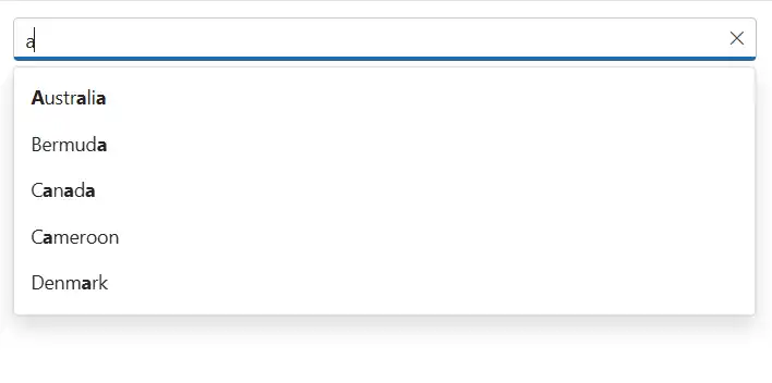
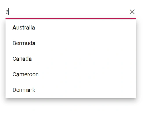
Highlight the search text in the suggested list items of the AutoComplete component by using the Highlight property. The default value is false. When set to true, the component highlights the characters that match the current search query in the suggestion list. The rendered markup uses the e-highlight CSS class for the matched segments.
@using Syncfusion.Blazor.DropDowns;

<SfAutoComplete TValue="string" TItem="Country" Placeholder="e.g. Australia" DataSource="@LocalData" Highlight="@Highlight">
    <AutoCompleteFieldSettings Value="Name" />
</SfAutoComplete>

@code {

    public class Country
    {
        public string Name { get; set; }
        public string Code { get; set; }
    }

    List<Country> LocalData = new List<Country> {
        new Country() { Name = "Australia", Code = "AU" },
        new Country() { Name = "Bermuda", Code = "BM" },
        new Country() { Name = "Canada", Code = "CA" },
        new Country() { Name = "Cameroon", Code = "CM" },
        new Country() { Name = "Denmark", Code = "DK" }
    };

    public bool Highlight { get; set; } = true;
}
Highlight with template
Use the HighLightSearch method within an item template to highlight matched text in custom-rendered list items. It accepts the following arguments and highlights characters that match the search query based on the specified options.
-
textValue- The display text from the current list item to evaluate and render with highlights. -
ignoreCase- Whentrue, performs case-insensitive matching. -
filterType- Specifies how matches are determined (for example, starts with, contains, or ends with). -
highlightText- Optional. The text to highlight. If not provided, the method uses the current filter value.
@using Syncfusion.Blazor.DropDowns;

<SfAutoComplete @ref="@AutoCompleteObj" TValue="string" TItem="Country" Placeholder="e.g. Australia" DataSource="@LocalData">
    <AutoCompleteFieldSettings Value="Name" />
       <AutoCompleteTemplates TItem="Country">

        <ItemTemplate Context="icontext">

            <div class="samplename"> @((MarkupString)AutoCompleteObj.HighLightSearch(icontext.Name, true, Syncfusion.Blazor.DropDowns.FilterType.Contains))</div>

        </ItemTemplate>

    </AutoCompleteTemplates>
</SfAutoComplete>

@code {
    SfAutoComplete<string, Country> AutoCompleteObj;

    public class Country
    {
        public string Name { get; set; }
        public string Code { get; set; }
    }

    List<Country> LocalData = new List<Country> {
        new Country() { Name = "Australia", Code = "AU" },
        new Country() { Name = "Bermuda", Code = "BM" },
        new Country() { Name = "Canada", Code = "CA" },
        new Country() { Name = "Cameroon", Code = "CM" },
        new Country() { Name = "Denmark", Code = "DK" }
    };

}
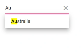
Change the highlight style
Customize the appearance of the highlighted text using the .e-highlight class. In the following example, the background color for matched text is styled to improve visibility.
@using Syncfusion.Blazor.DropDowns;

<SfAutoComplete TValue="string" TItem="Country" Placeholder="e.g. Australia" DataSource="@LocalData" Highlight="@Highlight">
    <AutoCompleteFieldSettings Value="Name" />
</SfAutoComplete>

@code {

    public class Country
    {
        public string Name { get; set; }
        public string Code { get; set; }
    }

    List<Country> LocalData = new List<Country> {
        new Country() { Name = "Australia", Code = "AU" },
        new Country() { Name = "Bermuda", Code = "BM" },
        new Country() { Name = "Canada", Code = "CA" },
        new Country() { Name = "Cameroon", Code = "CM" },
        new Country() { Name = "Denmark", Code = "DK" }
    };

    public bool Highlight { get; set; } = true;
}

<style>
    .e-highlight {
        background-color: yellow;
    }
</style>