How can I help you?
Placeholder and Float Label in AutoComplete
4 Nov 20253 minutes to read
This section describes how to configure the placeholder and float label behavior in the Blazor AutoComplete component and how to customize their styles.
Placeholder
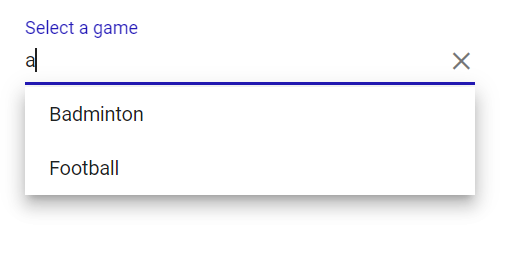
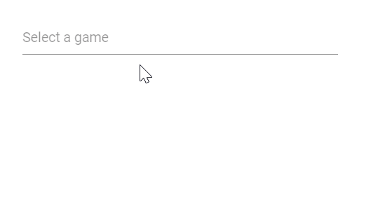
Use the Placeholder property to display guidance text for the expected input value. In the following example, setting Select a game as the Placeholder value applies it to the input element’s placeholder attribute.
@using Syncfusion.Blazor.DropDowns;

<SfAutoComplete TValue="string" TItem="string" Placeholder="Select a game" DataSource="@data" Width="300px"></SfAutoComplete>

@code{
    List<string> data = new List<string>() { "Cricket", "Badminton","Football" };
}
Color of the placeholder text
Change the placeholder text color by targeting the input.e-input::placeholder selector and setting the desired CSS color value.
@using Syncfusion.Blazor.DropDowns

<SfAutoComplete TValue="string" TItem="string" Placeholder="Select a game" DataSource="@data" Width="300px"></SfAutoComplete>

@code {
    List<string> data = new List<string>() { "Cricket", "Badminton", "Football" };
}
<style>
    .e-ddl.e-input-group input.e-input::placeholder {
        color: red;
    }
</style>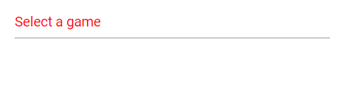
Add mandatory indicator using placeholder
Apply a mandatory indicator (*) to the floating label by targeting the .e-float-text::after selector and setting the content style. Note that this customizes the floating label element rather than the native placeholder text.
@using Syncfusion.Blazor.DropDowns
@using Syncfusion.Blazor.Inputs

<SfAutoComplete TValue="string" TItem="string" Placeholder="Select a game" FloatLabelType="FloatLabelType.Auto" DataSource="@data" Width="300px"></SfAutoComplete>

@code {
    List<string> data = new List<string>() { "Cricket", "Badminton", "Football" };
}
<style>
    .e-input-group.e-control-wrapper.e-control-container.e-float-input .e-float-text::after {
        content: "*";
        color: red;
    }
</style>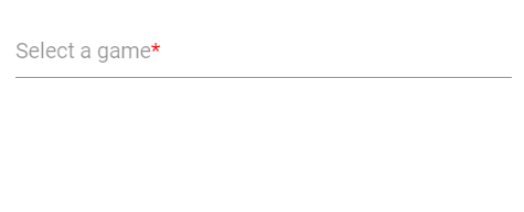
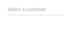
FloatLabel
Use the FloatLabelType property to control how the Placeholder text floats above the AutoComplete. FloatLabelType applies only when Placeholder is set. The default value is Never.
The floating label supports the following modes:
| Type | Description |
|---|---|
| Auto | The label floats above the input on focus or when a value is entered. |
| Always | The label always floats above the input. |
| Never | The label never floats above the input when a placeholder is available. |
The FloatLabelType set to Auto is demonstrated in the following example.
@using Syncfusion.Blazor.DropDowns
@using Syncfusion.Blazor.Inputs

<SfAutoComplete TValue="string" TItem="string" Placeholder="Select a game" FloatLabelType="FloatLabelType.Auto" DataSource="@data" Width="300px"></SfAutoComplete>

@code {
    List<string> data = new List<string>() { "Cricket", "Badminton", "Football" };
}
Customizing the float label element’s focusing color
Change the floating label text color when focused by targeting the .e-input-focus .e-float-text.e-label-top selector and applying the desired color.
@using Syncfusion.Blazor.DropDowns
@using Syncfusion.Blazor.Inputs

<SfAutoComplete TValue="string" TItem="string" Placeholder="Select a game" FloatLabelType="FloatLabelType.Auto" DataSource="@data" Width="300px"></SfAutoComplete>

@code {
    List<string> data = new List<string>() { "Cricket", "Badminton", "Football" };
}

<style>
    .e-float-input.e-input-group:not(.e-float-icon-left) .e-float-line::before, .e-float-input.e-control-wrapper.e-input-group:not(.e-float-icon-left) .e-float-line::before, .e-float-input.e-input-group:not(.e-float-icon-left) .e-float-line::after, .e-float-input.e-control-wrapper.e-input-group:not(.e-float-icon-left) .e-float-line::after {
        background-color: #2319b8;
    }

    .e-ddl.e-lib.e-input-group.e-control-wrapper.e-control-container.e-float-input.e-input-focus .e-float-text.e-label-top {
        color: #2319b8;
    }
</style>