Style and Appearance in Blazor AutoComplete Component
18 Jun 202624 minutes to read
The following content explains the CSS structure and options that can be used to modify the component’s appearance based on user preferences and theming requirements.
Read-only mode
Specify a boolean value for the Readonly property to control whether the AutoComplete allows the user to change the value.
@using Syncfusion.Blazor.DropDowns;

<SfAutoComplete TValue="string" TItem="Games" Placeholder="Select a game" Width="300px" Readonly=true @bind-Value="GameValue" DataSource="@LocalData">
    <AutoCompleteFieldSettings Value="Text"></AutoCompleteFieldSettings>
</SfAutoComplete>


@code {

    public string GameValue { get; set; } = "Basketball";

    public class Games
    {
        public string ID { get; set; }
        public string Text { get; set; }
    }

    List<Games> LocalData = new List<Games> {
    new Games() { ID= "Game1", Text= "American Football" },
    new Games() { ID= "Game2", Text= "Badminton" },
    new Games() { ID= "Game3", Text= "Basketball" },
    new Games() { ID= "Game4", Text= "Cricket" },
    new Games() { ID= "Game5", Text= "Football" },
    new Games() { ID= "Game6", Text= "Golf" },
    new Games() { ID= "Game7", Text= "Hockey" },
    new Games() { ID= "Game8", Text= "Rugby"},
    new Games() { ID= "Game9", Text= "Snooker" },
    new Games() { ID= "Game10", Text= "Tennis"},
    };

}
Disabled state
Specify a boolean value for the Enabled property to indicate whether the component is enabled.
@using Syncfusion.Blazor.DropDowns;

<SfAutoComplete TValue="string" TItem="Games" Placeholder="Select a game" Width="300px" Enabled=false DataSource="@LocalData">
    <AutoCompleteFieldSettings Value="Text"></AutoCompleteFieldSettings>
</SfAutoComplete>


@code {

    public class Games
    {
        public string ID { get; set; }
        public string Text { get; set; }
    }

    List<Games> LocalData = new List<Games> {
    new Games() { ID= "Game1", Text= "American Football" },
    new Games() { ID= "Game2", Text= "Badminton" },
    new Games() { ID= "Game3", Text= "Basketball" },
    new Games() { ID= "Game4", Text= "Cricket" },
    new Games() { ID= "Game5", Text= "Football" },
    new Games() { ID= "Game6", Text= "Golf" },
    new Games() { ID= "Game7", Text= "Hockey" },
    new Games() { ID= "Game8", Text= "Rugby"},
    new Games() { ID= "Game9", Text= "Snooker" },
    new Games() { ID= "Game10", Text= "Tennis"},
    };

}
Customizing the disabled component’s text color
Customize the text color of a disabled component by targeting the .e-input[disabled] selector (the input element in a disabled state) and setting the desired color using the -webkit-text-fill-color property. For broader browser coverage, consider also setting the color property.
@using Syncfusion.Blazor.DropDowns;

<SfAutoComplete TValue="string" TItem="Country" Placeholder="e.g. Australia" DataSource="@LocalData" Width="300px" Enabled="false">
    <AutoCompleteFieldSettings Value="Name" />
</SfAutoComplete>

@code {

    public class Country
    {
        public string Name { get; set; }
        public string Code { get; set; }
    }

    List<Country> LocalData = new List<Country> {
        new Country() { Name = "Australia", Code = "AU" },
        new Country() { Name = "Bermuda", Code = "BM" },
        new Country() { Name = "Canada", Code = "CA" },
        new Country() { Name = "Cameroon", Code = "CM" },
        new Country() { Name = "Denmark", Code = "DK" }
    };
}

<style>
.e-input-group.e-control-wrapper .e-input[disabled] {
    -webkit-text-fill-color: #0d9133;
}
</style>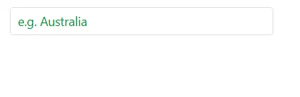
Show the custom icon in dropdown icon
Customize the dropdown icon by targeting the .e-ddl-icon::before selector (the icon element in the AutoComplete) and setting the desired glyph via the content property.
@using Syncfusion.Blazor.DropDowns;

<SfAutoComplete TValue="string" TItem="Games" Placeholder="Select a game" Width="300px" ShowPopupButton=true DataSource="@LocalData">
    <AutoCompleteFieldSettings Value="Text"></AutoCompleteFieldSettings>
</SfAutoComplete>


@code {

    public class Games
    {
        public string ID { get; set; }
        public string Text { get; set; }
    }

    List<Games> LocalData = new List<Games> {
    new Games() { ID= "Game1", Text= "American Football" },
    new Games() { ID= "Game2", Text= "Badminton" },
    new Games() { ID= "Game3", Text= "Basketball" },
    new Games() { ID= "Game4", Text= "Cricket" },
    new Games() { ID= "Game5", Text= "Football" },
    new Games() { ID= "Game6", Text= "Golf" },
    new Games() { ID= "Game7", Text= "Hockey" },
    new Games() { ID= "Game8", Text= "Rugby"},
    new Games() { ID= "Game9", Text= "Snooker" },
    new Games() { ID= "Game10", Text= "Tennis"},
    };
}

<style>
    .e-ddl.e-input-group.e-control-wrapper .e-ddl-icon::before {
        content: '\e304';
    }
</style>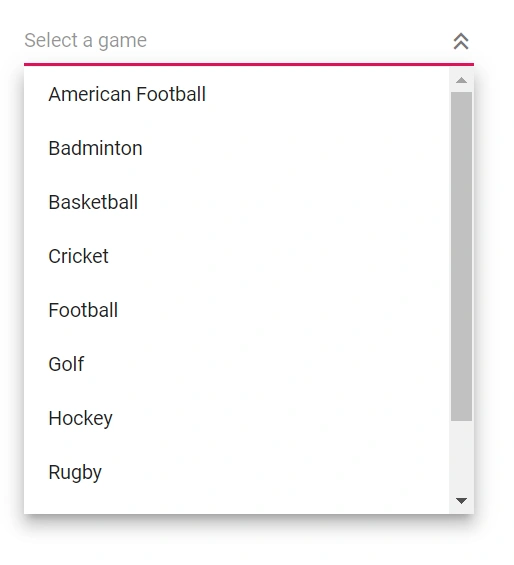
Customize the dropdown icon for a specific component instance using the CssClass property and apply styles to that custom class.
@using Syncfusion.Blazor.DropDowns;

<SfAutoComplete TValue="string" TItem="Games" Placeholder="Select a game" Width="300px" CssClass="e-custom" ShowPopupButton=true DataSource="@LocalData">
    <AutoCompleteFieldSettings Value="Text"></AutoCompleteFieldSettings>
</SfAutoComplete>


@code {

    public class Games
    {
        public string ID { get; set; }
        public string Text { get; set; }
    }

    List<Games> LocalData = new List<Games> {
    new Games() { ID= "Game1", Text= "American Football" },
    new Games() { ID= "Game2", Text= "Badminton" },
    new Games() { ID= "Game3", Text= "Basketball" },
    new Games() { ID= "Game4", Text= "Cricket" },
    new Games() { ID= "Game5", Text= "Football" },
    new Games() { ID= "Game6", Text= "Golf" },
    new Games() { ID= "Game7", Text= "Hockey" },
    new Games() { ID= "Game8", Text= "Rugby"},
    new Games() { ID= "Game9", Text= "Snooker" },
    new Games() { ID= "Game10", Text= "Tennis"},
    };
}

<style>
    .e-custom.e-ddl.e-input-group.e-control-wrapper .e-ddl-icon::before {
        content: '\e304';
    }
</style>
Customizing the appearance of container element
Customize the container element within the AutoComplete by targeting the .e-input selector (the parent element of the input), and apply the desired styles to change the component’s appearance.
@using Syncfusion.Blazor.DropDowns;

<SfAutoComplete TValue="string" TItem="Country" Placeholder="e.g. Australia" DataSource="@LocalData" Width="300px">
    <AutoCompleteFieldSettings Value="Name" />
</SfAutoComplete>

@code {

    public class Country
    {
        public string Name { get; set; }
        public string Code { get; set; }
    }

    List<Country> LocalData = new List<Country> {
        new Country() { Name = "Australia", Code = "AU" },
        new Country() { Name = "Bermuda", Code = "BM" },
        new Country() { Name = "Canada", Code = "CA" },
        new Country() { Name = "Cameroon", Code = "CM" },
        new Country() { Name = "Denmark", Code = "DK" }
    };
}

<style>
    .e-ddl.e-input-group.e-control-wrapper .e-input {
    font-size: 20px;
    font-family: emoji;
    color: #ab3243;
    background: #32a5ab;
}
</style>
Customizing the dropdown icon’s color
Customize the dropdown icon color by targeting the .e-ddl-icon.e-icons selector and setting the desired value for the color property.
@using Syncfusion.Blazor.DropDowns;

<SfAutoComplete TValue="string" TItem="Country" Placeholder="e.g. Australia" DataSource="@LocalData" Width="300px" ShowPopupButton="true">
    <AutoCompleteFieldSettings Value="Name" />
</SfAutoComplete>

@code {

    public class Country
    {
        public string Name { get; set; }
        public string Code { get; set; }
    }

    List<Country> LocalData = new List<Country> {
        new Country() { Name = "Australia", Code = "AU" },
        new Country() { Name = "Bermuda", Code = "BM" },
        new Country() { Name = "Canada", Code = "CA" },
        new Country() { Name = "Cameroon", Code = "CM" },
        new Country() { Name = "Denmark", Code = "DK" }
    };
}

<style>
.e-ddl .e-input-group-icon.e-ddl-icon.e-icons, .e-ddl .e-input-group-icon.e-ddl-icon.e-icons:hover {
    color: #bb233d;
    font-size: 13px;
}
</style>
Customizing the focus color
Customize the component’s color when focused by targeting the .e-input-focus::after selector (the input element when focused) and setting the desired background value.
@using Syncfusion.Blazor.DropDowns;

<SfAutoComplete TValue="string" TItem="Country" Placeholder="e.g. Australia" DataSource="@LocalData" Width="300px">
    <AutoCompleteFieldSettings Value="Name" />
</SfAutoComplete>

@code {

    public class Country
    {
        public string Name { get; set; }
        public string Code { get; set; }
    }

    List<Country> LocalData = new List<Country> {
        new Country() { Name = "Australia", Code = "AU" },
        new Country() { Name = "Bermuda", Code = "BM" },
        new Country() { Name = "Canada", Code = "CA" },
        new Country() { Name = "Cameroon", Code = "CM" },
        new Country() { Name = "Denmark", Code = "DK" }
    };
}

<style>
.e-ddl.e-input-group.e-control-wrapper.e-input-focus::before, .e-ddl.e-input-group.e-control-wrapper.e-input-focus::after {
    background: #c000ff;
}
</style>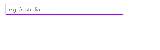
Customizing the outline theme’s focus color
Customize the focus appearance when using an outline theme by targeting the e-outline variant selectors for the input. Adjust the relevant focus styles (such as border or outline color) to achieve the desired effect.
@using Syncfusion.Blazor.DropDowns;

<SfAutoComplete TValue="string" TItem="Country" Placeholder="e.g. Australia" DataSource="@LocalData" Width="300px" CssClass="e-outline">
    <AutoCompleteFieldSettings Value="Name" />
</SfAutoComplete>

@code {

    public class Country
    {
        public string Name { get; set; }
        public string Code { get; set; }
    }

    List<Country> LocalData = new List<Country> {
        new Country() { Name = "Australia", Code = "AU" },
        new Country() { Name = "Bermuda", Code = "BM" },
        new Country() { Name = "Canada", Code = "CA" },
        new Country() { Name = "Cameroon", Code = "CM" },
        new Country() { Name = "Denmark", Code = "DK" }
    };
}

<style>
.e-outline.e-input-group.e-input-focus:hover:not(.e-success):not(.e-warning):not(.e-error):not(.e-disabled):not(.e-float-icon-left),.e-outline.e-input-group.e-input-focus.e-control-wrapper:hover:not(.e-success):not(.e-warning):not(.e-error):not(.e-disabled):not(.e-float-icon-left),.e-outline.e-input-group.e-input-focus:not(.e-success):not(.e-warning):not(.e-error):not(.e-disabled),.e-outline.e-input-group.e-control-wrapper.e-input-focus:not(.e-success):not(.e-warning):not(.e-error):not(.e-disabled) {
    border-color: #b1bd15;
    box-shadow: inset 1px 1px #b1bd15, inset -1px 0 #b1bd15, inset 0 -1px #b1bd15;
}
</style>
Customizing the background color of focus, hover, and active items
Customize the background and text colors of list items when focused, active, or hovered by targeting .e-list-item.e-item-focus, .e-list-item.e-active, and .e-list-item.e-hover, and set the background-color and color properties as needed.
@using Syncfusion.Blazor.DropDowns;
@using Syncfusion.Blazor.Inputs;

<SfAutoComplete TValue="string" TItem="Country"  Placeholder="Select a game" DataSource="@LocalData" Width="300px">
    <AutoCompleteFieldSettings Value="Name" />
</SfAutoComplete>

@code {

    public class Country
    {
        public string Name { get; set; }
        public string Code { get; set; }
    }

    List<Country> LocalData = new List<Country> {
        new Country() { Name = "Australia", Code = "AU" },
        new Country() { Name = "Bermuda", Code = "BM" },
        new Country() { Name = "Canada", Code = "CA" },
        new Country() { Name = "Cameroon", Code = "CM" },
        new Country() { Name = "Denmark", Code = "DK" }
    };
}

<style>
.e-dropdownbase .e-list-item.e-item-focus, .e-dropdownbase .e-list-item.e-active, .e-dropdownbase .e-list-item.e-active.e-hover, .e-dropdownbase .e-list-item.e-hover {
    background-color: #1f9c99;
    color: #2319b8;
}
</style>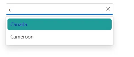
Customizing the appearance of popup element
Customize the popup element within the AutoComplete by targeting the .e-list-item.e-item-focus selector (the list item when focused) and applying the desired styles to adjust the popup’s appearance.
@using Syncfusion.Blazor.DropDowns;

<SfAutoComplete TValue="string" TItem="Country"  Placeholder="Select a game" DataSource="@LocalData" Width="300px">
    <AutoCompleteFieldSettings Value="Name" />
</SfAutoComplete>

@code {

    public class Country
    {
        public string Name { get; set; }
        public string Code { get; set; }
    }

    List<Country> LocalData = new List<Country> {
        new Country() { Name = "Australia", Code = "AU" },
        new Country() { Name = "Bermuda", Code = "BM" },
        new Country() { Name = "Canada", Code = "CA" },
        new Country() { Name = "Cameroon", Code = "CM" },
        new Country() { Name = "Denmark", Code = "DK" }
    };
}

<style>
.e-dropdownbase .e-list-item, .e-dropdownbase .e-list-item.e-item-focus {
    background-color: #29c2b8;
    color: #207cd9;
    font-family: emoji;
    min-height: 29px;
}
</style>
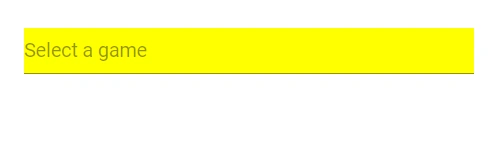
Change the HTML attributes
Add additional HTML attributes, such as styles and classes, to the root element using the HTMLAttributes property, which accepts any number of attributes in key–value pair format.
@using Syncfusion.Blazor.DropDowns;


<SfAutoComplete TValue="string" TItem="Games" Placeholder="Select a game" Width="300px" DataSource="@LocalData" HtmlAttributes="@htmlAttribute">
    <AutoCompleteFieldSettings Value="Text"></AutoCompleteFieldSettings>
</SfAutoComplete>


@code {
    public class Games
    {
        public string ID { get; set; }
        public string Text { get; set; }
    }

    List<Games> LocalData = new List<Games> {
    new Games() { ID= "Game1", Text= "American Football" },
    new Games() { ID= "Game2", Text= "Badminton" },
    new Games() { ID= "Game3", Text= "Basketball" },
    new Games() { ID= "Game4", Text= "Cricket" },
    new Games() { ID= "Game5", Text= "Football" },
    new Games() { ID= "Game6", Text= "Golf" },
    new Games() { ID= "Game7", Text= "Hockey" },
    new Games() { ID= "Game8", Text= "Rugby"},
    new Games() { ID= "Game9", Text= "Snooker" },
    new Games() { ID= "Game10", Text= "Tennis"},
    };

    Dictionary<string, object> htmlAttribute = new Dictionary<string, object>()
    {
        {"class", "e-games" },
        {"name", "games" },
        {"style", "background-color: yellow; text-align: right" },
        {"title", "Syncfusion DropDownList" }
    };

}
Set the various font family for autocomplete elements
Change the font family by overriding the relevant selectors. To scope the override to a specific component instance, add a class via the CssClass property and target that class.
In the following sample, the font family of the AutoComplete input, list item text, and filter input text is changed.
@using Syncfusion.Blazor.DropDowns;

<SfAutoComplete @ref="dropdown" TValue="string" TItem="Games" ShowPopupButton=true Placeholder="Select a game" Width="300px" DataSource="@LocalData" CssClass="e-custom" AllowFiltering=true FilterBarPlaceholder="Search here">
    <AutoCompleteFieldSettings Value="Text"></AutoCompleteFieldSettings>
</SfAutoComplete>


@code {
    SfAutoComplete<string, Games> dropdown;
    public string GameValue { get; set; } = "Badminton";

    public class Games
    {
        public string ID { get; set; }
        public string Text { get; set; }
    }

    List<Games> LocalData = new List<Games> {
    new Games() { ID= "Game1", Text= "American Football" },
    new Games() { ID= "Game2", Text= "Badminton" },
    new Games() { ID= "Game3", Text= "Basketball" },
    new Games() { ID= "Game4", Text= "Cricket" },
    new Games() { ID= "Game5", Text= "Football" },
    new Games() { ID= "Game6", Text= "Golf" },
    new Games() { ID= "Game7", Text= "Hockey" },
    new Games() { ID= "Game8", Text= "Rugby"},
    new Games() { ID= "Game9", Text= "Snooker" },
    new Games() { ID= "Game10", Text= "Tennis"},
    };

}

<style>
    /*Text in DropDownList*/
    .e-custom.e-input-group input.e-dropdownlist {
        font-family: cursive;
    }
    /*Item Text in DropDownList*/
    .e-custom.e-popup-open {
        font-family: cursive;
    }
    /*Dropdownlist filterInput font-family*/
    .e-custom span.e-input-group.e-control-container.e-control-wrapper {
        font-family: cursive;
    }
</style>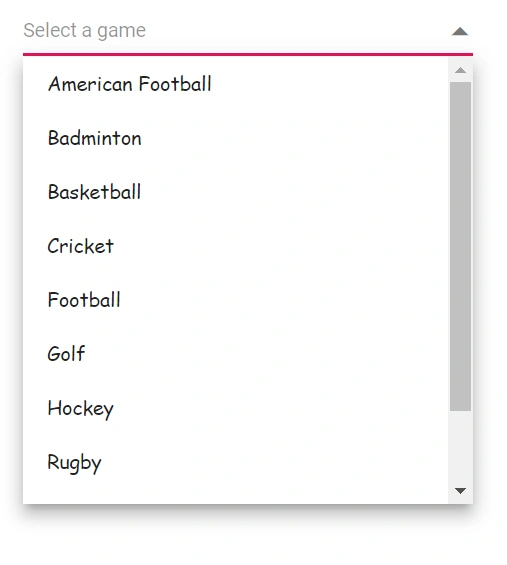
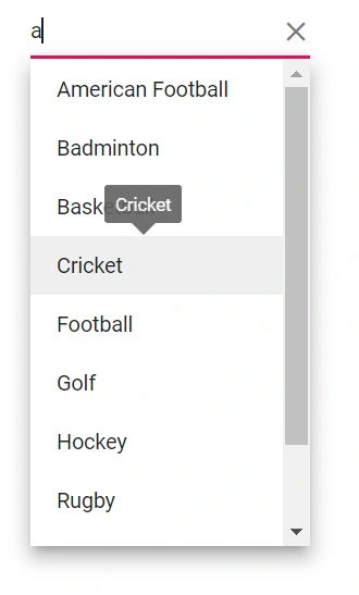
Show tooltip on list item
This behavior can be achieved by integrating the Tooltip component so that when the mouse hovers over an AutoComplete option, a tooltip displays information about the hovered list item. For details, see the Tooltip component documentation.
The following code demonstrates how to display a tooltip when hovering over an AutoComplete option.
@using Syncfusion.Blazor.Popups;
@using Syncfusion.Blazor.DropDowns;

<SfTooltip @ref="TooltipObj" ID="Tooltip" Target=".e-list-item .name[title]">
</SfTooltip>

<SfAutoComplete TItem="GameFields" TValue="string" Placeholder="Select a game" DataSource="@Games">
    <AutoCompleteFieldSettings Text="Text" Value="ID"></AutoCompleteFieldSettings>
    <AutoCompleteTemplates TItem="GameFields">
        <ItemTemplate>
            <div class="name" title="@((context as GameFields).Text)"> @((context as GameFields).Text) </div>
        </ItemTemplate>
    </AutoCompleteTemplates>
    <AutoCompleteEvents TValue="string" TItem="GameFields" Opened="OnOpen" OnClose="OnClose"></AutoCompleteEvents>
</SfAutoComplete>

@code {

    SfTooltip TooltipObj;
    public Boolean isOpen { get; set; } = false;

    public class GameFields
    {
        public string ID { get; set; }
        public string Text { get; set; }
    }

    private List<GameFields> Games = new List<GameFields>() {
        new GameFields(){ ID= "Game1", Text= "American Football" },
        new GameFields(){ ID= "Game2", Text= "Badminton" },
        new GameFields(){ ID= "Game3", Text= "Basketball" },
        new GameFields(){ ID= "Game4", Text= "Cricket" },
        new GameFields(){ ID= "Game5", Text= "Football" },
        new GameFields(){ ID= "Game6", Text= "Golf" },
        new GameFields(){ ID= "Game7", Text= "Hockey" },
        new GameFields(){ ID= "Game8", Text= "Rugby"},
        new GameFields(){ ID= "Game9", Text= "Snooker" },
        new GameFields(){ ID= "Game10", Text= "Tennis"},
    };

    public void OnOpen(PopupEventArgs args)
    {
        isOpen = true;
    }

    public void OnClose(PopupEventArgs args)
    {
        TooltipObj.CloseAsync();
    }

    protected override async Task OnAfterRenderAsync(bool firstRender)
    {
        if (isOpen)
        {
            await TooltipObj.RefreshAsync();
        }
    }
}
Customize selected item opacity
In the following code, CSS targets the .e-list-item elements within .e-dropdownbase when in an active or active-and-hovered state, setting the opacity property to adjust visual prominence. This changes the appearance of AutoComplete list items in those states.
@using Syncfusion.Blazor.DropDowns;

<SfAutoComplete @ref="autocomplete" TValue="string" TItem="Games" Placeholder="Select a game" Width="300px" DataSource="@LocalData" CssClass="e-custom" AllowFiltering=true FilterBarPlaceholder="Search here">
    <AutoCompleteFieldSettings Value="Text"></AutoCompleteFieldSettings>
</SfAutoComplete>


@code {
    SfAutoComplete<string, Games> autocomplete;
    public string GameValue { get; set; } = "Game5";

    public class Games
    {
        public string ID { get; set; }
        public string Text { get; set; }
    }

    List<Games> LocalData = new List<Games> {
    new Games() { ID= "Game1", Text= "American Football" },
    new Games() { ID= "Game2", Text= "Badminton" },
    new Games() { ID= "Game3", Text= "Basketball" },
    new Games() { ID= "Game4", Text= "Cricket" },
    new Games() { ID= "Game5", Text= "Football" },
    new Games() { ID= "Game6", Text= "Golf" },
    new Games() { ID= "Game7", Text= "Hockey" },
    new Games() { ID= "Game8", Text= "Rugby"},
    new Games() { ID= "Game9", Text= "Snooker" },
    new Games() { ID= "Game10", Text= "Tennis"},
    };

}

<style>

    .e-dropdownbase .e-list-item.e-active,
    .e-dropdownbase .e-list-item.e-active.e-hover {
        opacity: 0.1;
    }

</style>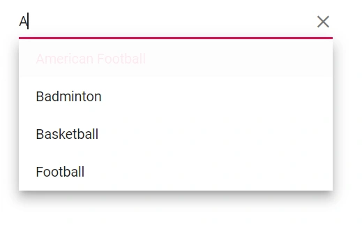
Customizing the height
Height of AutoComplete
Use the PopupHeight property to change the height of the popup.
@using Syncfusion.Blazor.DropDowns;

<SfAutoComplete TValue="string" TItem="Games" ShowPopupButton=true Placeholder="Select a game" Width="300px" DataSource="@LocalData" PopupHeight="500px" CssClass="e-custom">
    <AutoCompleteFieldSettings Value="Text" Text="Text"></AutoCompleteFieldSettings>
</SfAutoComplete>

@code {
    public class Games
    {
        public string ID { get; set; }
        public string Text { get; set; }
    }

    List<Games> LocalData = new List<Games> {
    new Games() { ID= "Game1", Text= "American Football" },
    new Games() { ID= "Game2", Text= "Badminton" },
    new Games() { ID= "Game3", Text= "Basketball" },
    new Games() { ID= "Game4", Text= "Cricket" },
    new Games() { ID= "Game5", Text= "Football" },
    new Games() { ID= "Game6", Text= "Golf" },
    new Games() { ID= "Game7", Text= "Hockey" },
    new Games() { ID= "Game8", Text= "Rugby"},
    new Games() { ID= "Game9", Text= "Snooker" },
    new Games() { ID= "Game10", Text= "Tennis"},
    };

}

<style>
    .e-custom.e-input-group, .e-custom.e-input-group.e-control-wrapper {
        height: 50px;
    }

</style>
Width of AutoComplete
To customize the width of the popup alone, use the PopupWidth property. By default, the popup width is set based on the component’s width. Use the Width property to change the width of the component.
@using Syncfusion.Blazor.DropDowns;

<SfAutoComplete TValue="string" TItem="Games" ShowPopupButton=true Placeholder="Select a game" DataSource="@LocalData" Width="500px" PopupWidth="300px">
    <AutoCompleteFieldSettings Value="Text"></AutoCompleteFieldSettings>
</SfAutoComplete>

@code {
    public class Games
    {
        public string ID { get; set; }
        public string Text { get; set; }
    }

    List<Games> LocalData = new List<Games> {
    new Games() { ID= "Game1", Text= "American Football" },
    new Games() { ID= "Game2", Text= "Badminton" },
    new Games() { ID= "Game3", Text= "Basketball" },
    new Games() { ID= "Game4", Text= "Cricket" },
    new Games() { ID= "Game5", Text= "Football" },
    new Games() { ID= "Game6", Text= "Golf" },
    new Games() { ID= "Game7", Text= "Hockey" },
    new Games() { ID= "Game8", Text= "Rugby"},
    new Games() { ID= "Game9", Text= "Snooker" },
    new Games() { ID= "Game10", Text= "Tennis"},
    };

}
Disable specific items in AutoComplete
Prevent some items in the popup list from being selected by disabling specific items for a particular component instance. This can be achieved by adding a custom class to the popup element using the CssClass property and applying styles for that class.
In the following code, a single list item is disabled using JavaScript interop.
@inject IJSRuntime JSRuntime;
@using Syncfusion.Blazor.DropDowns

<SfAutoComplete ID="autocomplete" TValue="string" TItem="Countries" Width="300px" Placeholder="e.g. Australia" DataSource="@Country" CssClass="e-custom-class">
    <AutoCompleteFieldSettings Value="Name"></AutoCompleteFieldSettings>
    <AutoCompleteEvents TItem="Countries" TValue="string" Opened="OnOpen"></AutoCompleteEvents>
</SfAutoComplete>

@code {

    public async Task OnOpen()
    {
        await this.JSRuntime.InvokeVoidAsync("disable", "autocomplete");
    }
    public class Countries
    {
        public string Name { get; set; }

        public string Code { get; set; }
    }

    List<Countries> Country = new List<Countries>
    {
        new Countries() { Name = "Australia", Code = "AU" },
        new Countries() { Name = "Bermuda", Code = "BM" },
        new Countries() { Name = "Canada", Code = "CA" },
        new Countries() { Name = "Cameroon", Code = "CM" },
        new Countries() { Name = "Denmark", Code = "DK" },
        new Countries() { Name = "France", Code = "FR" },
        new Countries() { Name = "Finland", Code = "FI" },
        new Countries() { Name = "Germany", Code = "DE" },
        new Countries() { Name = "Greenland", Code = "GL" },
        new Countries() { Name = "Hong Kong", Code = "HK" },
        new Countries() { Name = "India", Code = "IN" },
        new Countries() { Name = "Italy", Code = "IT" },
        new Countries() { Name = "Japan", Code = "JP" },
        new Countries() { Name = "Mexico", Code = "MX" },
        new Countries() { Name = "Norway", Code = "NO" },
        new Countries() { Name = "Poland", Code = "PL" },
        new Countries() { Name = "Switzerland", Code = "CH" },
        new Countries() { Name = "United Kingdom", Code = "GB" },
        new Countries() { Name = "United States", Code = "US" },
    };
}
<script>
window.disable = function (id) {
setTimeout(function (e) {
var liCollections = document.querySelectorAll('.e-popup.e-custom-class .e-list-item')
if (liCollections && liCollections.length > 0)
liCollections[1].classList.add('e-disabled');
liCollections[1].classList.add('e-overlay');
}, 30);
}
</script>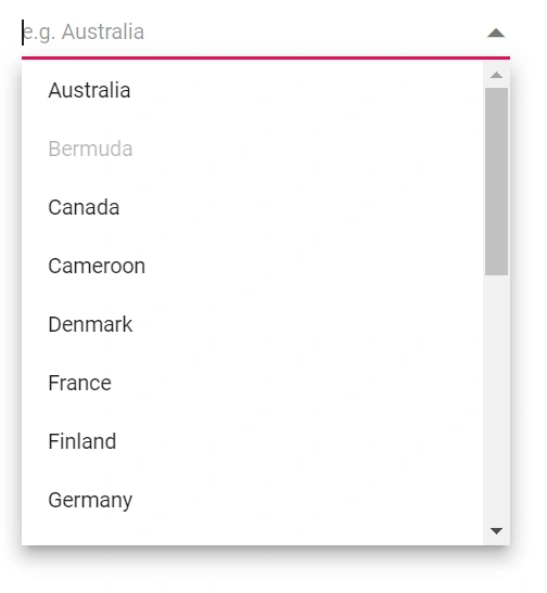
Adding search icon in the Blazor AutoComplete component.
Add a search icon to the AutoComplete by overriding the content of the existing icon. The following code demonstrates how to add a search icon.
@using Syncfusion.Blazor.DropDowns

<SfAutoComplete TValue="string" TItem="GameFields" Width="300px" ShowPopupButton="true" Placeholder="e.g. Basketball" DataSource="@Games">
    <AutoCompleteFieldSettings Value="Text"></AutoCompleteFieldSettings>
</SfAutoComplete>

<style>
    .e-ddl.e-input-group.e-control-wrapper .e-ddl-icon::before {
        content: '\e754';
        font-family: 'e-icons';
        font-size: 16px;
        opacity: 0.4;
    }
</style>

@code{
    public class GameFields
    {
        public string ID { get; set; }
        public string Text { get; set; }
    }
    public List<GameFields> Games = new List<GameFields>()
    {
        new GameFields(){ ID= "Game1", Text= "American Football" },
        new GameFields(){ ID= "Game2", Text= "Badminton" },
        new GameFields(){ ID= "Game3", Text= "Basketball" },
        new GameFields(){ ID= "Game4", Text= "Cricket" },
        new GameFields(){ ID= "Game5", Text= "Football" },
    };
}
Customizing the float label element’s focusing color
Change the text color of the floating label on focus by targeting .e-input-focus and .e-float-text.e-label-top (the focused floating label text) and setting the desired color.
@using Syncfusion.Blazor.DropDowns;
@using Syncfusion.Blazor.Inputs;

<SfAutoComplete TValue="string" TItem="Country" Placeholder="e.g. Australia" DataSource="@LocalData" Width="300px" FloatLabelType="FloatLabelType.Auto">
    <AutoCompleteFieldSettings Value="Name" />
</SfAutoComplete>

@code {

    public class Country
    {
        public string Name { get; set; }
        public string Code { get; set; }
    }

    List<Country> LocalData = new List<Country> {
        new Country() { Name = "Australia", Code = "AU" },
        new Country() { Name = "Bermuda", Code = "BM" },
        new Country() { Name = "Canada", Code = "CA" },
        new Country() { Name = "Cameroon", Code = "CM" },
        new Country() { Name = "Denmark", Code = "DK" }
    };
}

<style>
.e-float-input.e-input-group:not(.e-float-icon-left) .e-float-line::before,.e-float-input.e-control-wrapper.e-input-group:not(.e-float-icon-left) .e-float-line::before,.e-float-input.e-input-group:not(.e-float-icon-left) .e-float-line::after,.e-float-input.e-control-wrapper.e-input-group:not(.e-float-icon-left) .e-float-line::after {
    background-color: #2319b8;
}

.e-ddl.e-lib.e-input-group.e-control-wrapper.e-control-container.e-float-input.e-input-focus .e-float-text.e-label-top {
    color: #2319b8;
}
</style>
Customizing the color of the placeholder text
Change the color of the placeholder by targeting input.e-input::placeholder (the placeholder text) and setting the desired color.
@using Syncfusion.Blazor.DropDowns

<SfAutoComplete TValue="string" TItem="Country"  Placeholder="Select a game" DataSource="@LocalData" Width="300px" >
    <AutoCompleteFieldSettings Value="Name" />
</SfAutoComplete>

@code {

    public class Country
    {
        public string Name { get; set; }
        public string Code { get; set; }
    }

    List<Country> LocalData = new List<Country> {
        new Country() { Name = "Australia", Code = "AU" },
        new Country() { Name = "Bermuda", Code = "BM" },
        new Country() { Name = "Canada", Code = "CA" },
        new Country() { Name = "Cameroon", Code = "CM" },
        new Country() { Name = "Denmark", Code = "DK" }
    };
}

<style>
.e-ddl.e-input-group input.e-input::placeholder {
    color: red;
}
</style>
Customizing the placeholder to add mandatory indicator(*)
Apply a mandatory indicator * to the placeholder by targeting .e-float-text::after and using the content style.
@using Syncfusion.Blazor.DropDowns;
@using Syncfusion.Blazor.Inputs;

<SfAutoComplete TValue="string" TItem="Country"  Placeholder="Select a game" DataSource="@LocalData" Width="300px" FloatLabelType="FloatLabelType.Auto">
    <AutoCompleteFieldSettings Value="Name" />
</SfAutoComplete>

@code {

    public class Country
    {
        public string Name { get; set; }
        public string Code { get; set; }
    }

    List<Country> LocalData = new List<Country> {
        new Country() { Name = "Australia", Code = "AU" },
        new Country() { Name = "Bermuda", Code = "BM" },
        new Country() { Name = "Canada", Code = "CA" },
        new Country() { Name = "Cameroon", Code = "CM" },
        new Country() { Name = "Denmark", Code = "DK" }
    };
}

<style>
.e-input-group.e-control-wrapper.e-control-container.e-float-input .e-float-text::after {
    content: "*";
    color: red;
}
</style>
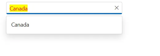
Customizing the text selection color
Customize the text selection appearance within the AutoComplete input by targeting input.e-input::selection and setting the desired background-color and color. This customization applies when text is selected manually.
@using Syncfusion.Blazor.DropDowns;

<SfAutoComplete TValue="string" TItem="Country"  Placeholder="Select a Country" DataSource="@LocalData" Width="300px">
    <AutoCompleteFieldSettings Value="Name" />
</SfAutoComplete>

@code {

    public class Country
    {
        public string Name { get; set; }
        public string Code { get; set; }
    }

    List<Country> LocalData = new List<Country> {
        new Country() { Name = "Australia", Code = "AU" },
        new Country() { Name = "Bermuda", Code = "BM" },
        new Country() { Name = "Canada", Code = "CA" },
        new Country() { Name = "Cameroon", Code = "CM" },
        new Country() { Name = "Denmark", Code = "DK" }
    };
}

<style>
.e-ddl.e-input-group input.e-input::selection {
    color: red;
    background: yellow;
}
</style>