Blocks in Blazor Block Editor Component
17 Jun 20268 minutes to read
The Block Editor uses Blocks as the fundamental units for creating and managing content. The entire editor content is structured as a collection of these blocks, which are configured and managed through the Blocks property.
Blocks
Blocks are the core building elements of the editor, where each block represents a distinct content unit, such as a Paragraph, Heading, List, or specialized content like a Callout or Image. This block-based architecture makes it easy for users to rearrange, format, and manage discrete pieces of content independently.
You can configure blocks with various properties such as ID, BlockType, Content to create a rich, structured editor.
Block types
The Block Editor supports multiple block types, each offering different formatting options and functionality:
| Built-in Block Types | Description |
|---|---|
| Paragraph | Default block type for regular text content. |
| Heading1 to Heading4 | Different levels of headings for document structure. |
| Table | Block for displaying data in a tabular format with rows and columns. |
| Checklist | Interactive to-do lists with checkable items. |
| BulletList | Unordered lists with bullet points. |
| NumberedList | Ordered lists with sequential numbering. |
| Code | Formatted code blocks with syntax highlighting. |
| Quote | Styled block for quotations. |
| Callout | Highlighted block for important information. |
| Divider | Horizontal separator line. |
| CollapsibleParagraph and CollapsibleHeading1-4 | Content blocks that can be expanded or collapsed to show or hide their children. |
| Image | Block for displaying images. |
For blocks such as
Code,Callout,Table,Image, andCollapsible, the first Backspace/Delete action applies an overlay selection to the block, and the second action removes the block content. This ensures consistent and predictable handling of block deletion across these types.
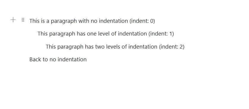
Configure indent
You can specify the indentation level of a block using the Indent property. This property accepts a numeric value that determines how deeply a block is nested from the left margin.
By default, the Indent property is set to 0.
@using Syncfusion.Blazor.BlockEditor

<div id="container">
    <SfBlockEditor Blocks="BlockData"></SfBlockEditor>
</div>
@code {
    private List<BlockModel> BlockData = new()
    {
        new BlockModel
        {
            BlockType = BlockType.Paragraph,
            Content = new() {new ContentModel{ContentType = ContentType.Text, Content = "This is a paragraph with no indentation (indent: 0)"}},
            Indent = 0
        },
        new BlockModel
        {
            BlockType = BlockType.Paragraph,
            Content = new() {new ContentModel{ContentType = ContentType.Text, Content = "This paragraph has one level of indentation (indent: 1)"}},
            Indent = 1
        },
        new BlockModel
        {
            BlockType = BlockType.Paragraph,
            Content = new() {new ContentModel{ContentType = ContentType.Text, Content = "This paragraph has two levels of indentation (indent: 2)"}},
            Indent = 2
        },
        new BlockModel
        {
            BlockType = BlockType.Paragraph,
            Content = new() {new ContentModel{ContentType = ContentType.Text, Content = "Back to no indentation"}},
            Indent = 0
        }
    };
}
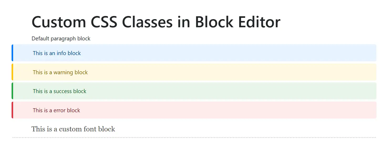
Configure CSS class
You can apply custom styling to individual blocks using the CssClass property. This property accepts a string containing one or more CSS class names.
Custom CSS classes allow you to define specialized styling for specific blocks in your editor.
@using Syncfusion.Blazor.BlockEditor

<div id="container">
    <SfBlockEditor Blocks="BlockData"></SfBlockEditor>
</div>

@code {
    private List<BlockModel> BlockData = new()
    {
        new BlockModel
        {
            BlockType = BlockType.Heading,
            Properties = new HeadingBlockSettings { Level = 1 },
            Content = new() {new ContentModel{ContentType = ContentType.Text, Content = "Custom CSS Classes in Block Editor"}}
        },
        new BlockModel
        {
            BlockType = BlockType.Paragraph,
            Content = new() {new ContentModel{ContentType = ContentType.Text, Content = "Default paragraph block"}}
        },
        new BlockModel
        {
            BlockType = BlockType.Paragraph,
            Content = new() {new ContentModel{ContentType = ContentType.Text, Content = "This is an info block"}},
            CssClass = "info-block"
        },
        new BlockModel
        {
            BlockType = BlockType.Paragraph,
            Content = new() {new ContentModel{ContentType = ContentType.Text, Content = "This is a warning block"}},
            CssClass = "warning-block"
        },
        new BlockModel
        {
            BlockType = BlockType.Paragraph,
            Content = new() {new ContentModel{ContentType = ContentType.Text, Content = "This is a success block"}},
            CssClass = "success-block"
        },
        new BlockModel
        {
            BlockType = BlockType.Paragraph,
            Content = new() {new ContentModel{ContentType = ContentType.Text, Content = "This is an error block"}},
            CssClass = "error-block"
        },
        new BlockModel
        {
            BlockType = BlockType.Paragraph,
            Content = new() {new ContentModel{ContentType = ContentType.Text, Content = "This is a custom font block"}},
            CssClass = "custom-font"
        }
    };
}

<style>
/* Custom CSS for blocks  */
.e-block.info-block, .e-block.warning-block, .e-block.success-block, .e-block.error-block {
    padding-top: 10px;
    padding-bottom: 10px;
    border-radius: 4px;
    margin-bottom: 5px;
    border-left: 4px solid;
}

.e-block.info-block {
    background-color: #e6f3ff;
    border-left-color: #007bff;
    color: #004085;
}

.e-block.warning-block {
    background-color: #fff8e1;
    border-left-color: #ffc107;
    color: #856404;
}

.e-block.success-block {
    background-color: #e8f5e9;
    border-left-color: #28a745;
    color: #155724;
}

.e-block.error-block {
    background-color: #fdecea;
    border-left-color: #dc3545;
    color: #721c24;
}

.e-block.custom-font {
    font-family: 'Georgia', serif;
    font-size: 18px;
    color: #4a4a4a;
    border-bottom: 2px dotted #ccc;
    padding-top: 10px;
    padding-bottom: 10px;
}
</style>