How can I help you?
Lists in Blazor Block Editor Component
31 Mar 20266 minutes to read
The Syncfusion Blazor Block Editor component uses list blocks to organize content into structured lists. To render a specific list type, set the BlockType property of the BlockModel to BulletList, NumberedList, or Checklist. Bullet lists are ideal for unordered items, numbered lists for ordered items, and checklists for interactive to-do lists.
Configure bullet list
You can render a Bullet List block by setting the BlockType property to BulletList. This block type is used to display unordered lists.
BlockType
// Adding bulletlist block
    new BlockModel
    {
        BlockType = BlockType.BulletList,
        Content = {new ContentModel{ContentType = ContentType.Text, Content = "your content"}}
    }
Configure placeholder
The Placeholder property sets the text that appears when the block is empty. The default placeholder for a bullet list is Add item.
// Adding placeholder value
    new BlockModel
    {
        BlockType = BlockType.BulletList,
        Properties = new BulletListBlockSettings {Placeholder = "bullet"},
        Content = {new ContentModel{ContentType = ContentType.Text, Content = "your content"}}
    }
Configure numbered list
You can render a Numbered List block by setting the BlockType property to NumberedList. This block type is used to display ordered lists.
// Adding numberedlist block
    new BlockModel
    {
        BlockType = BlockType.NumberedList,
        Content = {new ContentModel{ContentType = ContentType.Text, Content = "your content"}}
    }
Configure placeholder
The Placeholder property sets the text that appears when the block is empty. The default placeholder for a numbered list is Add item.
// Adding placeholder value
    new BlockModel
    {
        BlockType = BlockType.BulletList,
        Properties = new NumberedListBlockSettings {Placeholder = "number"},
        Content = {new ContentModel{ContentType = ContentType.Text, Content = "your content"}}
    }
Configure checklist
You can render a Checklist block by setting the BlockType property to Checklist. This block type is used for creating interactive to-do lists.
// Adding checklist block
    new BlockModel
    {
        BlockType = BlockType.Checklist,
        Content = {new ContentModel{ContentType = ContentType.Text, Content = "your content"}}
    }
Configure checked state
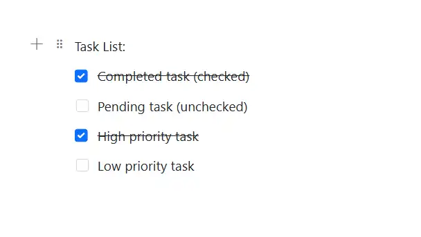
For blocks that support selection states, such as a Checklist, you can configure the checked state using the Properties property with IsChecked.
By default, the IsChecked property is set to false.
@using Syncfusion.Blazor.BlockEditor

<div id="container">
    <SfBlockEditor Blocks="BlockData"></SfBlockEditor>
</div>

@code {
    private List<BlockModel> BlockData = new()
    {
        new BlockModel
        {
            BlockType = BlockType.Paragraph,
            Content = new() {new ContentModel{ContentType = ContentType.Text, Content = "Task List:"}}
        },
        new BlockModel
        {
            BlockType = BlockType.Checklist,
            Content = new() {new ContentModel{ContentType = ContentType.Text, Content = "Completed task (checked)"}},
            Properties = new ChecklistBlockSettings {IsChecked = true}
        },
        new BlockModel
        {
            BlockType = BlockType.Checklist,
            Content = new() {new ContentModel{ContentType = ContentType.Text, Content = "Pending task (unchecked)"}},
            Properties = new ChecklistBlockSettings {IsChecked = false}
        },
        new BlockModel
        {
            BlockType = BlockType.Checklist,
            Content = new() {new ContentModel{ContentType = ContentType.Text, Content = "High priority task"}},
            Properties = new ChecklistBlockSettings {IsChecked = true}
        },
        new BlockModel
        {
            BlockType = BlockType.Checklist,
            Content = new() {new ContentModel{ContentType = ContentType.Text, Content = "Low priority task"}},
            Properties = new ChecklistBlockSettings {IsChecked = false}
        }
    };
}
Configure placeholder
The Placeholder property sets the text that appears when the block is empty. The default placeholder for a checklist is Todo.
// Adding placeholder value
    new BlockModel
    {
        BlockType = BlockType.Checklist,
        Properties = new ChecklistBlockSettings {Placeholder = "check"},
        Content = {new ContentModel{ContentType = ContentType.Text, Content = "your content"}}
    }
Configure list blocks
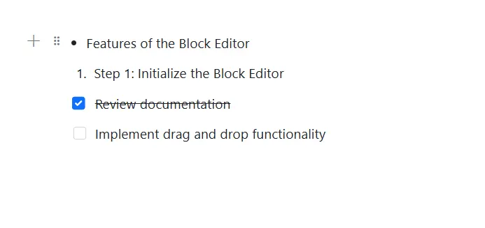
The following example demonstrates how to render the different types of list blocks in the Block Editor.
@using Syncfusion.Blazor.BlockEditor

<div id="container">
    <SfBlockEditor Blocks="BlockData"></SfBlockEditor>
</div>

@code {
    private List<BlockModel> BlockData = new()
    {
        new BlockModel
        {
            BlockType = BlockType.BulletList,
            Content = new() {new ContentModel{ContentType = ContentType.Text, Content = "Features of the Block Editor"}}
        },
        new BlockModel
        {
            BlockType = BlockType.NumberedList,
            Content = new() {new ContentModel{ContentType = ContentType.Text, Content = "Step 1: Initialize the Block Editor"}}
        },
        new BlockModel
        {
            BlockType = BlockType.Checklist,
            Content = new() {new ContentModel{ContentType = ContentType.Text, Content = "Review documentation"}},
            Properties = new ChecklistBlockSettings {IsChecked = true}
        },
        new BlockModel
        {
            BlockType = BlockType.Checklist,
            Content = new() {new ContentModel{ContentType = ContentType.Text, Content = "Implement drag and drop functionality"}},
            Properties = new ChecklistBlockSettings {IsChecked = false}
        }
    };
}