Styles and Appearances in Blazor Breadcrumb Component
10 Jan 20252 minutes to read
To modify the Breadcrumb appearance, you need to override the default CSS of Breadcrumb component. Find the list of CSS classes and its corresponding section in Breadcrumb component. Also, you have an option to create your own custom theme for the controls using our Theme Studio.
| CSS Class | Purpose of Class |
|---|---|
| .e-breadcrumb .e-breadcrumb-item | To customize the background of breadcrumb item. |
| .e-breadcrumb .e-breadcrumb-text | To customize the color of breadcrumb text. |
| .e-breadcrumb .e-breadcrumb-icon | To customize the color of breadcrumb icon. |
| .e-breadcrumb .e-breadcrumb-separator | To customize the breadcrumb separator. |
| .e-breadcrumb | To customize the entire background of breadcrumb. |
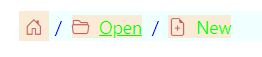
Customizing the appearance of Breadcrumb
Use the following CSS to customize the background and text color of Breadcrumb.
@using Syncfusion.Blazor.Navigations

<SfBreadcrumb class="e-custom">
    <BreadcrumbItems>
        <BreadcrumbItem IconCss="e-icons e-home"></BreadcrumbItem>
        <BreadcrumbItem IconCss="e-icons e-folder-open" Text="Open" Url="https://blazor.syncfusion.com/demos/datagrid/overview"></BreadcrumbItem>
        <BreadcrumbItem IconCss="e-icons e-file-new" Text="New"></BreadcrumbItem>
    </BreadcrumbItems>
</SfBreadcrumb>

<style>
    .e-custom.e-breadcrumb .e-breadcrumb-item {
        background: antiquewhite;
    }
    .e-custom.e-breadcrumb .e-breadcrumb-text {
        color: lime !important;
    }
    .e-custom.e-breadcrumb .e-breadcrumb-icon {
        color: indianred !important;
    }
    .e-custom.e-breadcrumb .e-breadcrumb-separator {
        color: blue;
    }
    .e-custom.e-breadcrumb {
        background-color: azure;
    }
</style>