Axis Customization in Blazor Bullet Chart Component
18 Jun 20268 minutes to read
MajorTickLines and MinorTickLines Customization
The following properties can be used to customize MajorTicklines and MinorTicklines.
- Width - Specifies the width of ticklines.
- Height - Specifies the height of ticklines.
- Color - Specifies the color of ticklines.
- EnableRangeColor - Specifies the color of ticklines and represents the color from corresponding range colors.
@using Syncfusion.Blazor.Charts

<SfBulletChart DataSource="@BulletChartData" ValueField="FieldValue" TargetField="Target" Minimum="0" Maximum="30" Interval="5">
    <BulletChartMinorTickLines Width="4" Height="10" EnableRangeColor="true"></BulletChartMinorTickLines>
    <BulletChartMajorTickLines Width="5" Height="15" Color="red"></BulletChartMajorTickLines>
    <BulletChartRangeCollection>
        <BulletChartRange End=20 Color="#DBE7F3"></BulletChartRange>
        <BulletChartRange End=25 Color="#BBCEE7"></BulletChartRange>
        <BulletChartRange End=30 Color="#96B2D7"></BulletChartRange>
    </BulletChartRangeCollection>
</SfBulletChart>

@code{
    public class ChartData
    {
        public double FieldValue { get; set; }
        public double Target { get; set; }
    }
    public List<ChartData> BulletChartData = new List<ChartData>
    {
        new ChartData { FieldValue = 25, Target = 20 }
    };
}
Tick placement
The major and the minor ticks can be placed Inside or Outside the ranges using the TickPosition property.
@using Syncfusion.Blazor.Charts

<SfBulletChart DataSource="@BulletChartData" TickPosition="TickPosition.Inside" ValueField="FieldValue" TargetField="Target" Minimum="0" Maximum="30" Interval="5">
    <BulletChartRangeCollection>
        <BulletChartRange End=20> </BulletChartRange>
        <BulletChartRange End=25></BulletChartRange>
        <BulletChartRange End=30></BulletChartRange>
    </BulletChartRangeCollection>
</SfBulletChart>
NOTE
Refer to the code block to know about the property value of BulletChartData.

Label format
The axis labels support all the globalize formats and can be changed using the Format property. The following code shows the axis label in the currency format.
@using Syncfusion.Blazor.Charts

<SfBulletChart DataSource="@BulletChartData" Format="C" ValueField="FieldValue" TargetField="Target" Minimum="0" Maximum="30" Interval="5">
    <BulletChartRangeCollection>
        <BulletChartRange End=20> </BulletChartRange>
        <BulletChartRange End=25></BulletChartRange>
        <BulletChartRange End=30></BulletChartRange>
    </BulletChartRangeCollection>
</SfBulletChart>
NOTE
Refer to the code block to know about the property value of BulletChartData.

The following table describes the result of applying some commonly used formats to numeric axis values.
| Label Value | Label Format property value | Result | Description |
| 1000 | n1 | 1000.0 | The result is rounded to 1 decimal place. |
| 1000 | n2 | 1000.00 | The result is rounded to 2 decimal places. |
| 1000 | n3 | 1000.000 | The result is rounded to 3 decimal places. |
| 0.01 | p1 | 1.0% | The result is converted to percentage with 1 decimal place. |
| 0.01 | p2 | 1.00% | The result is converted to percentage with 2 decimal places. |
| 0.01 | p3 | 1.000% | The result is converted to percentage with 3 decimal places. |
| 1000 | c1 | $1000.0 | The currency symbol is appended to the result and it is rounded to 1 decimal place. |
| 1000 | c2 | $1000.00 | The currency symbol is appended to the result and it is rounded to 2 decimal places. |
Grouping separator
To separate the groups of thousands, set the EnableGroupSeparator property to true, and specify the numeric axis label by setting the Format property to N0.
@using Syncfusion.Blazor.Charts

<SfBulletChart DataSource="@BulletChartData" EnableGroupSeparator="true" Format="N0" ValueField="FieldValue" TargetField="Target" Minimum="0" Maximum="2500" Interval="250">
    <BulletChartRangeCollection>
        <BulletChartRange End=500> </BulletChartRange>
        <BulletChartRange End=1500></BulletChartRange>
        <BulletChartRange End=2500></BulletChartRange>
    </BulletChartRangeCollection>
</SfBulletChart>

@code{
    public class ChartData
    {
        public double FieldValue { get; set; }
        public double Target { get; set; }
    }
    public List<ChartData> BulletChartData = new List<ChartData>
    {
        new ChartData { FieldValue = 1500, Target = 1300 }
    };
}
Custom label format
Using the LabelFormat property, axis labels can be specified with a custom defined format in addition to the axis value. The label format uses a placeholder such as ${value}K, which represents the axis label.
@using Syncfusion.Blazor.Charts

<SfBulletChart DataSource="@BulletChartData" LabelFormat="${value}K" ValueField="FieldValue" TargetField="Target" Minimum="0" Maximum="2500" Interval="250">
    <BulletChartRangeCollection>
        <BulletChartRange End=500> </BulletChartRange>
        <BulletChartRange End=1500></BulletChartRange>
        <BulletChartRange End=2500></BulletChartRange>
    </BulletChartRangeCollection>
</SfBulletChart>
NOTE
Refer to the code block to know about the property value of BulletChartData.

Label placement
Label can be placed Inside or Outside of the ranges using the LabelPosition property.
@using Syncfusion.Blazor.Charts

<SfBulletChart DataSource="@BulletChartData" LabelPosition="LabelsPlacement.Inside" ValueField="FieldValue" TargetField="Target" Minimum="0" Maximum="30" Interval="5">
    <BulletChartRangeCollection>
        <BulletChartRange End=20></BulletChartRange>
        <BulletChartRange End=25></BulletChartRange>
        <BulletChartRange End=30></BulletChartRange>
    </BulletChartRangeCollection>
</SfBulletChart>
NOTE
Refer to the code block to know about the property value of BulletChartData.

Opposed position
To place an axis opposite to its original position, set the OpposedPosition property to true.
@using Syncfusion.Blazor.Charts

<SfBulletChart DataSource="@BulletChartData" OpposedPosition="true" ValueField="FieldValue" TargetField="Target" Minimum="0" Maximum="30" Interval="5">
    <BulletChartRangeCollection>
        <BulletChartRange End=20></BulletChartRange>
        <BulletChartRange End=25></BulletChartRange>
        <BulletChartRange End=30></BulletChartRange>
    </BulletChartRangeCollection>
</SfBulletChart>
NOTE
Refer to the code block to know about the property value of BulletChartData.

Category label
The Bullet Chart supports X-axis label by specifying the property from the data source to the CategoryField. It helps to understand the input data in a more efficient way.
@using Syncfusion.Blazor.Charts

<SfBulletChart DataSource="@BulletChartData" CategoryField="Category" ValueField="FieldValue" TargetField="Target" Minimum="0" Maximum="30" Interval="5">
    <BulletChartRangeCollection>
        <BulletChartRange End=20></BulletChartRange>
        <BulletChartRange End=25></BulletChartRange>
        <BulletChartRange End=30></BulletChartRange>
    </BulletChartRangeCollection>
</SfBulletChart>

@code{
    public class ChartData
    {
        public double FieldValue { get; set; }
        public double Target { get; set; }
        public string Category { get; set; }
    }
    public List<ChartData> BulletChartData = new List<ChartData>
    {
        new ChartData { FieldValue = 23, Target = 25, Category="Product A" }
    };
}
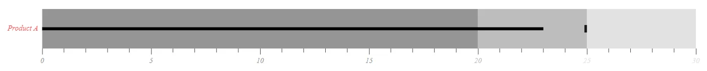
Axis label and category label customization
The label color, opacity, font size, font family, font weight, and font style can be customized by using the BulletChartCategoryLabelStyle setting for category and the BulletChartLabelStyle setting for axis label. The EnableRangeColor property specifies the color of the axis label and represents the color from the corresponding range colors.
@using Syncfusion.Blazor.Charts

<SfBulletChart DataSource="@BulletChartData" CategoryField="Category" ValueField="FieldValue" TargetField="Target" Minimum="0" Maximum="30" Interval="5">
    <BulletChartCategoryLabelStyle Color="red" Opacity="0.8" Size="15px" FontStyle="italic"></BulletChartCategoryLabelStyle>
    <BulletChartLabelStyle Color="red" Opacity="1" Size="15px" FontStyle="italic" EnableRangeColor="true"></BulletChartLabelStyle>
    <BulletChartRangeCollection>
        <BulletChartRange End=20 Color="#959595"></BulletChartRange>
        <BulletChartRange End=25 Color="#BDBDBD"></BulletChartRange>
        <BulletChartRange End=30 Color="#E3E2E2"></BulletChartRange>
    </BulletChartRangeCollection>
</SfBulletChart>
NOTE
Refer to the code block to know about the property value of BulletChartData.