Bullet Chart Dimensions in Blazor Bullet Chart Component
17 Jul 20263 minutes to read
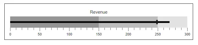
Size for container
The size of the Blazor Bullet Chart is determined by the container size, and it can be changed inline or via CSS as follows.
@using Syncfusion.Blazor.Charts

<div style="width:650px; height:100px;">
    <SfBulletChart DataSource="@BulletChartData" ValueField="FieldValue" TargetField="Target" Minimum="0" Maximum="300" Interval="50" Title="Revenue">
        <BulletChartTooltip TValue="ChartData" Enable="true"></BulletChartTooltip>
        <BulletChartRangeCollection>
            <BulletChartRange End=150> </BulletChartRange>
            <BulletChartRange End=250></BulletChartRange>
            <BulletChartRange End=300></BulletChartRange>
        </BulletChartRangeCollection>
    </SfBulletChart>
</div>

@code{
    public class ChartData
    {
        public double FieldValue { get; set; }
        public double Target { get; set; }
    }
    public List<ChartData> BulletChartData = new List<ChartData>
    {
        new ChartData { FieldValue = 270, Target = 250 }
    };
}Size for Bullet Chart
The Width and the Height properties are used to adjust the size of the Bullet Chart. Both the pixel and the percentage values are accepted. If the value is expressed as a percentage, the dimension of the Bullet Chart is determined by its container.
NOTE
If the size is not specified, the Bullet Chart will be rendered with a height of 126px and a width of the window.
@using Syncfusion.Blazor.Charts

<div style="width:1000px; height:150px;">
    <SfBulletChart DataSource="@BulletChartData" Height="70%" Width="50%" ValueField="FieldValue" TargetField="Target" Minimum="0" Maximum="300" Interval="50" Title="Revenue">
        <BulletChartTooltip TValue="ChartData" Enable="true"></BulletChartTooltip>
        <BulletChartRangeCollection>
            <BulletChartRange End=150> </BulletChartRange>
            <BulletChartRange End=250></BulletChartRange>
            <BulletChartRange End=300></BulletChartRange>
        </BulletChartRangeCollection>
    </SfBulletChart>
</div>NOTE
Refer to the code block to know about the property value of BulletChartData.
Margin
The BulletChartMargin is used to customize the bottom, the left, the right, and the top margins of the Bullet Chart.
@using Syncfusion.Blazor.Charts

<div style="width:650px; height:100px;">
    <SfBulletChart DataSource="@BulletChartData" ValueField="FieldValue" TargetField="Target" Minimum="0" Maximum="300" Interval="50" Title="Revenue">
        <BulletChartMargin Bottom="20" Left="20" Right="20" Top="20"></BulletChartMargin>
        <BulletChartBorder Color="#000000" Width="2"></BulletChartBorder>
        <BulletChartTooltip TValue="ChartData" Enable="true"></BulletChartTooltip>
        <BulletChartRangeCollection>
            <BulletChartRange End=150> </BulletChartRange>
            <BulletChartRange End=250></BulletChartRange>
            <BulletChartRange End=300></BulletChartRange>
        </BulletChartRangeCollection>
    </SfBulletChart>
</div>
NOTE
Refer to the code block to know about the property value of BulletChartData.