Customization in Blazor Bullet Chart Component
18 Jun 20263 minutes to read
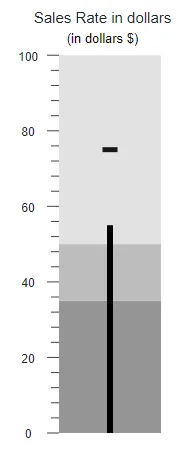
Orientation
The Blazor Bullet Chart can be rendered in different orientations such as Horizontal or Vertical via the Orientation property. By default, the Bullet Chart is rendered in the Horizontal orientation.
@using Syncfusion.Blazor.Charts

<SfBulletChart DataSource="@BulletChartData" Orientation="OrientationType.Vertical" Width="20%" Title="Sales Rate in dollars" Subtitle="(in dollars $)" ValueField="FieldValue" TargetField="TargetValue" Minimum="0" Maximum="100" Interval="20">
    <BulletChartRangeCollection>
        <BulletChartRange End=35></BulletChartRange>
        <BulletChartRange End=50></BulletChartRange>
        <BulletChartRange End=100></BulletChartRange>
    </BulletChartRangeCollection>
</SfBulletChart>

@code{
    public class ChartData
    {
        public double FieldValue { get; set; }
        public double TargetValue { get; set; }
    }
    public List<ChartData> BulletChartData = new List<ChartData>
    {
        new ChartData { FieldValue = 55, TargetValue = 75 }
    };
}
Right-to-left (RTL)
The Bullet Chart supports the right-to-left rendering that can be enabled by setting the EnableRtl property to true.
<SfBulletChart DataSource="@BulletChartData" EnableRtl="true" ValueField="FieldValue" TargetField="TargetValue" Minimum="0" Maximum="100" Interval="20">
    <BulletChartRangeCollection>
        <BulletChartRange End=35></BulletChartRange>
        <BulletChartRange End=50></BulletChartRange>
        <BulletChartRange End=100></BulletChartRange>
    </BulletChartRangeCollection>
</SfBulletChart>
NOTE
Refer to the code block to know about the property value of BulletChartData.

Animation
The actual and the target bar supports the linear animation via the BulletChartAnimation setting. The speed and the delay are controlled using the Duration and Delay properties respectively.
@using Syncfusion.Blazor.Charts

<SfBulletChart DataSource="@BulletChartData" ValueField="FieldValue" TargetField="TargetValue" Minimum="0" Maximum="100" Interval="20">
    <BulletChartAnimation Delay="0" Duration="2000"></BulletChartAnimation>
    <BulletChartRangeCollection>
        <BulletChartRange End=35></BulletChartRange>
        <BulletChartRange End=50></BulletChartRange>
        <BulletChartRange End=100></BulletChartRange>
    </BulletChartRangeCollection>
</SfBulletChart>
NOTE
Refer to the code block to know about the property value of BulletChartData.
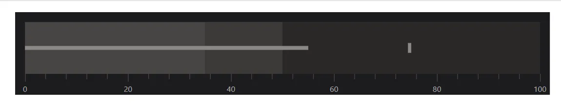
Theme
The Bullet Chart supports different type of themes via the Theme property.
@using Syncfusion.Blazor.Charts
@using Syncfusion.Blazor

<SfBulletChart DataSource="@BulletChartData" Theme="Theme.Fluent2Dark" ValueField="FieldValue" TargetField="TargetValue" Minimum="0" Maximum="100" Interval="20">
    <BulletChartRangeCollection>
        <BulletChartRange End=35></BulletChartRange>
        <BulletChartRange End=50></BulletChartRange>
        <BulletChartRange End=100></BulletChartRange>
    </BulletChartRangeCollection>
</SfBulletChart>
NOTE
Refer to the code block to know about the property value of BulletChartData.
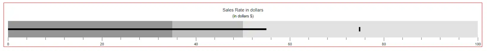
Border
The Bullet Chart border color can be enabled by setting the Color property in the BulletChartBorder, and the width of the border can be customized using the Width property.
@using Syncfusion.Blazor.Charts

<SfBulletChart DataSource="@BulletChartData" Height="150px" Title="Sales Rate in dollars" Subtitle="(in dollars $)" ValueField="FieldValue" TargetField="TargetValue" Minimum="0" Maximum="100" Interval="20">
    <BulletChartBorder Color="red" Width="2"></BulletChartBorder>
    <BulletChartRangeCollection>
        <BulletChartRange End=35> </BulletChartRange>
        <BulletChartRange End=50></BulletChartRange>
        <BulletChartRange End=100></BulletChartRange>
    </BulletChartRangeCollection>
</SfBulletChart>
NOTE
Refer to the code block to know about the property value of BulletChartData.