Legend in Blazor Bullet Chart Component
18 Jun 20268 minutes to read
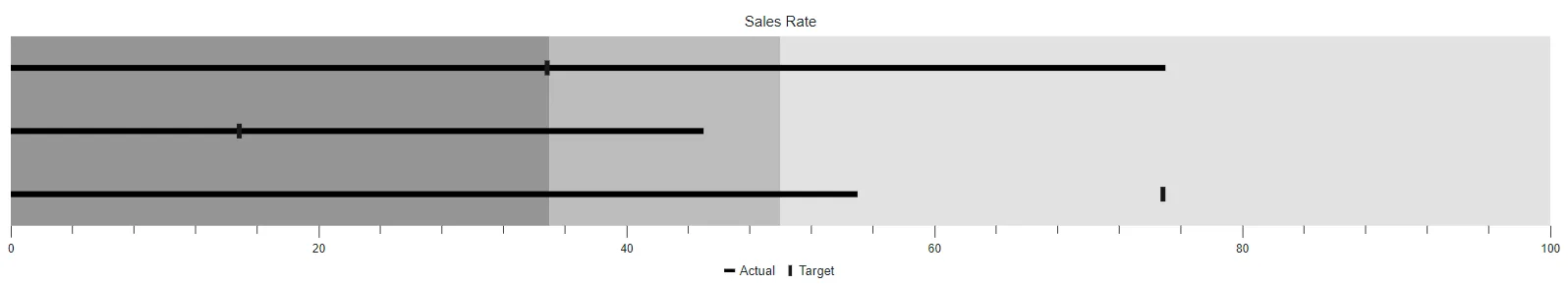
Legend is used to provide valuable information for interpreting what the Bullet Chart displays. The legends can be represented in various colors, positions, shapes or other identifiers based on the data and it can be enabled by setting the Visible property to true in the BulletChartLegendSettings.
@using Syncfusion.Blazor.Charts

<SfBulletChart DataSource="@BulletChartData" Height="300px" Title="Sales Rate" ValueField="FieldValue" TargetField="TargetValue" Minimum="0" Maximum="100" Interval="20">
    <BulletChartLegendSettings Visible="true"></BulletChartLegendSettings>
    <BulletChartRangeCollection>
        <BulletChartRange End=35> </BulletChartRange>
        <BulletChartRange End=50></BulletChartRange>
        <BulletChartRange End=100></BulletChartRange>
    </BulletChartRangeCollection>
</SfBulletChart>

@code{
    public class ChartData
    {
        public double FieldValue { get; set; }
        public double TargetValue { get; set; }
    }
    public List<ChartData> BulletChartData = new List<ChartData>
    {
        new ChartData { FieldValue = 55, TargetValue = 75 },
        new ChartData { FieldValue = 45, TargetValue = 15 },
        new ChartData { FieldValue = 75, TargetValue = 35 }
    };
}
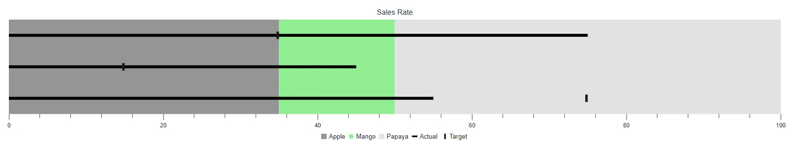
Legend items from color mapping
Legend items will be rendered based on the mapping ranges from the Bullet Chart. The legend item’s name can be determined from the Name property and the shape of legend item can be customized using the Shape property in the BulletChartRange. By default, the legend item is rendered on the Rectangle shape.
Legend item to be customized by the following properties.
- Padding - Specifies the padding between the legend items.
- ShapeHeight - Specifies the shape height of the legend items.
- ShapeWidth - Specifies the shape width of the legend items.
- ShapePadding - Specifies the padding between the shape and the text of the legend item.
- BulletChartLegendTextStyle - Specifies the text style of the legend item.
@using Syncfusion.Blazor.Charts

<SfBulletChart DataSource="@BulletChartData" Height="300px" Title="Sales Rate" ValueField="FieldValue" TargetField="TargetValue" Minimum="0" Maximum="100" Interval="20">
    <BulletChartLegendSettings Visible="true"></BulletChartLegendSettings>
    <BulletChartRangeCollection>
        <BulletChartRange End=35 Name="Apple"></BulletChartRange>
        <BulletChartRange End=50 Name="Mango" Color="lightgreen" Shape="LegendShape.Pentagon"></BulletChartRange>
        <BulletChartRange End=100 Name="Papaya"></BulletChartRange>
    </BulletChartRangeCollection>
</SfBulletChart>
NOTE
Refer to the code block to know the property value of the BulletChartData.
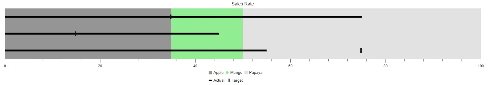
Legend size
Customize the legend size by modifying the Height and the Width properties in the BulletChartLegendSettings. It accepts values in both percentage and pixel.
@using Syncfusion.Blazor.Charts

<SfBulletChart DataSource="@BulletChartData" Height="300px" Title="Sales Rate" ValueField="FieldValue" TargetField="TargetValue" Minimum="0" Maximum="100" Interval="20">
    <BulletChartLegendSettings Visible="true" Width="15%"></BulletChartLegendSettings>
    <BulletChartRangeCollection>
        <BulletChartRange End=35 Name="Apple"></BulletChartRange>
        <BulletChartRange End=50 Name="Mango" Color="lightgreen" Shape="LegendShape.Pentagon"></BulletChartRange>
        <BulletChartRange End=100 Name="Papaya"></BulletChartRange>
    </BulletChartRangeCollection>
</SfBulletChart>
NOTE
Refer to the code block to know about the property value of the BulletChartData.
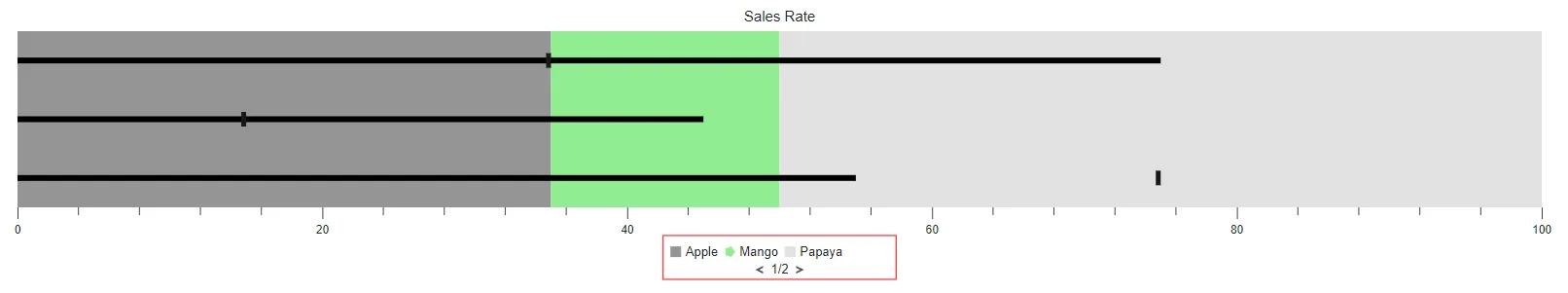
Legend with paging support
Bullet Chart supports the legend paging if the legend items cannot be placed within the provided Height and Width of the legend.
@using Syncfusion.Blazor.Charts

<SfBulletChart DataSource="@BulletChartData" Height="300px" Title="Sales Rate" ValueField="FieldValue" TargetField="TargetValue" Minimum="0" Maximum="100" Interval="20">
    <BulletChartLegendSettings Visible="true" Width="15%" Height="15%">
        <BulletChartLegendBorder Color="red" Width="1"></BulletChartLegendBorder>
    </BulletChartLegendSettings>
    <BulletChartRangeCollection>
        <BulletChartRange End=35 Name="Apple"></BulletChartRange>
        <BulletChartRange End=50 Name="Mango" Color="lightgreen" Shape="LegendShape.Pentagon"></BulletChartRange>
        <BulletChartRange End=100 Name="Papaya"></BulletChartRange>
    </BulletChartRangeCollection>
</SfBulletChart>
NOTE
Refer to the code block to know about the property value of the BulletChartData.
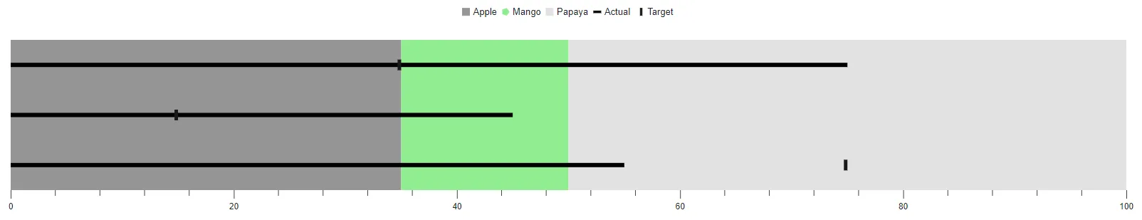
Position and alignment
The legend can be placed in various positions and the following options are available to customize the legend position using the Position property:
The following code example demonstrates the top legend position.
@using Syncfusion.Blazor.Charts

<SfBulletChart DataSource="@BulletChartData" Height="300px" ValueField="FieldValue" TargetField="TargetValue" Minimum="0" Maximum="100" Interval="20">
    <BulletChartLegendSettings Height="40px" Visible="true" Position="LegendPosition.Top"></BulletChartLegendSettings>
    <BulletChartRangeCollection>
        <BulletChartRange End=35 Name="Apple"></BulletChartRange>
        <BulletChartRange End=50 Name="Mango" Color="lightgreen" Shape="LegendShape.Pentagon"></BulletChartRange>
        <BulletChartRange End=100 Name="Papaya"></BulletChartRange>
    </BulletChartRangeCollection>
</SfBulletChart>
NOTE
Refer to the code block to know about the property value of the BulletChartData.
Auto position will be rendered with the responsive legend height to the Bottom of the component and the Custom position renders based on x and y coordinates by specified to X and Y properties in the BulletChartLegendLocation.
The following code example demonstrates the Custom legend position.
@using Syncfusion.Blazor.Charts

<SfBulletChart DataSource="@BulletChartData" Height="300px" ValueField="FieldValue" TargetField="TargetValue" Minimum="0" Maximum="100" Interval="20">
    <BulletChartMargin Top="30"></BulletChartMargin>
    <BulletChartLegendSettings Height="40px" Visible="true" Position="LegendPosition.Custom">
        <BulletChartLegendLocation X="5" Y="0"></BulletChartLegendLocation>
    </BulletChartLegendSettings>
    <BulletChartRangeCollection>
        <BulletChartRange End=35 Name="Apple"></BulletChartRange>
        <BulletChartRange End=50 Name="Mango" Color="lightgreen" Shape="LegendShape.Pentagon"></BulletChartRange>
        <BulletChartRange End=100 Name="Papaya"></BulletChartRange>
    </BulletChartRangeCollection>
</SfBulletChart>
NOTE
Refer to the code block to know about the property value of the BulletChartData.
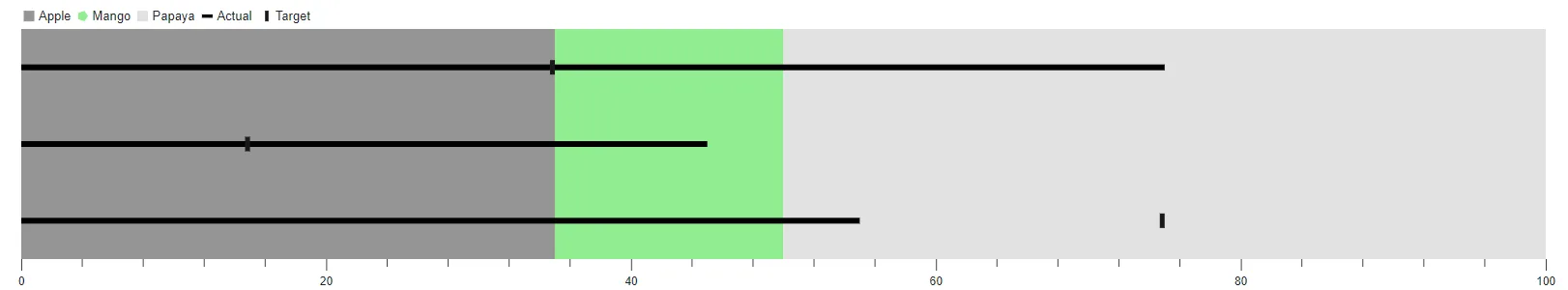
The legend alignment is used to align the legend items to the specific location. The following options are available to customize using the Alignment property:
The following code example demonstrates legend item alignment.
@using Syncfusion.Blazor.Charts

<SfBulletChart DataSource="@BulletChartData" Height="300px" ValueField="FieldValue" TargetField="TargetValue" Minimum="0" Maximum="100" Interval="20">
    <BulletChartLegendSettings Height="40px" Visible="true" Position="LegendPosition.Top" Alignment="Alignment.Near"></BulletChartLegendSettings>
    <BulletChartRangeCollection>
        <BulletChartRange End=35 Name="Apple"></BulletChartRange>
        <BulletChartRange End=50 Name="Mango" Color="lightgreen" Shape="LegendShape.Pentagon"></BulletChartRange>
        <BulletChartRange End=100 Name="Papaya"></BulletChartRange>
    </BulletChartRangeCollection>
</SfBulletChart>
NOTE
Refer to the code block to know about the property value of the BulletChartData.
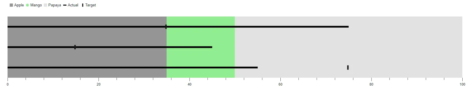
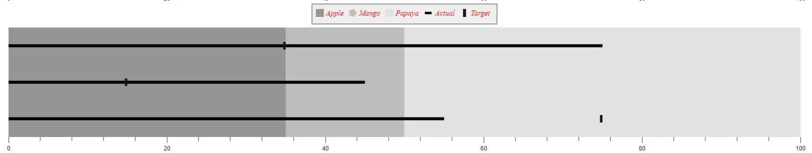
Customization
Legend can be customized by the following properties:
- Background - Specifies the fill color of the legend.
- Opacity - Specifies the opacity of the legend background.
- BulletChartLegendMargin - Specifies the bottom, left, right, and top margin of the legend.
- BulletChartLegendBorder - Specifies the color and the width of the legend border.
@using Syncfusion.Blazor.Charts

<SfBulletChart DataSource="@BulletChartData" Height="300px" ValueField="FieldValue" TargetField="TargetValue" Minimum="0" Maximum="100" Interval="20">
    <BulletChartLegendSettings Height="40px" Visible="true" Position="LegendPosition.Top" Background="lightgray" Opacity="0.4" ShapeHeight="15" ShapeWidth="15">
        <BulletChartMargin Top="5"></BulletChartMargin>
        <BulletChartLegendTextStyle Size="15px" Color="red" Opacity="1" FontStyle="italic"></BulletChartLegendTextStyle>
        <BulletChartLegendBorder Color="#000000" Width="2"></BulletChartLegendBorder>
    </BulletChartLegendSettings>
    <BulletChartRangeCollection>
        <BulletChartRange End=35 Name="Apple"></BulletChartRange>
        <BulletChartRange End=50 Name="Mango" Shape="LegendShape.Pentagon"></BulletChartRange>
        <BulletChartRange End=100 Name="Papaya"></BulletChartRange>
    </BulletChartRangeCollection>
</SfBulletChart>
NOTE
Refer to the code block to know about the property value of the BulletChartData.