Selection and Nesting in Blazor Button Group
27 Aug 20264 minutes to read
The Blazor Button Group component provides two-way binding support in both single and multiple selection modes through the Selected property of Button Group Button. The @bind-Selected directive enables two-way data binding, allowing the state of each button (selected or not) to synchronize between the UI and the backing properties. To disable selection entirely, set Mode="SelectionMode.None" (the default).
Single selection
The Blazor Button Group supports a single selection type in which only one button can be selected at a time. The following example illustrates the single selection behavior in the Blazor Button Group.
@using Syncfusion.Blazor
@using Syncfusion.Blazor.SplitButtons

<SfButtonGroup Mode="Syncfusion.Blazor.SplitButtons.SelectionMode.Single">
    <ButtonGroupButton @bind-Selected="@FirstSelected">First</ButtonGroupButton>
    <ButtonGroupButton @bind-Selected="@SecondSelected">Second</ButtonGroupButton>
    <ButtonGroupButton @bind-Selected="@ThirdSelected">Third</ButtonGroupButton>
</SfButtonGroup>
@if (FirstSelected)
{
    <div class="alert alert-info">First button is selected</div>
}
@if (SecondSelected)
{
    <div class="text-danger">Second button is selected</div>
}
@if (ThirdSelected)
{
    <div class="alert alert-success">Third button is selected</div>
}
@code{
    bool FirstSelected { get; set; }
    bool SecondSelected { get; set; }
    bool ThirdSelected { get; set; } = true; // pre-select the Third button
}
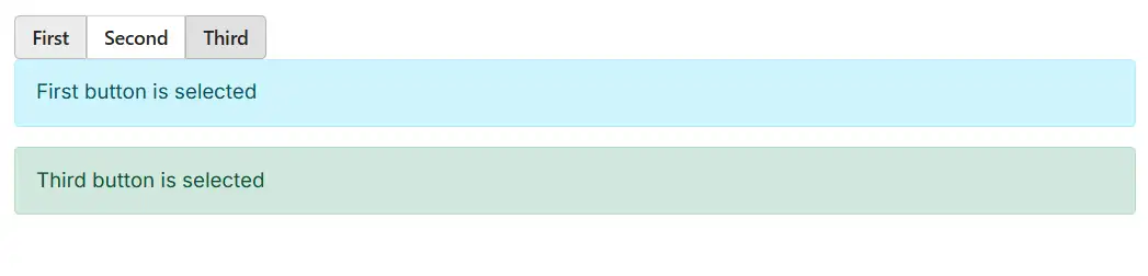
Multiple selection
The Blazor Button Group supports a multiple selection type in which multiple buttons can be selected at the same time. The following example illustrates the multiple selection behavior in the Blazor Button Group.
@using Syncfusion.Blazor
@using Syncfusion.Blazor.SplitButtons

<SfButtonGroup Mode="Syncfusion.Blazor.SplitButtons.SelectionMode.Multiple">
    <ButtonGroupButton @bind-Selected="@FirstSelected">First</ButtonGroupButton>
    <ButtonGroupButton @bind-Selected="@SecondSelected">Second</ButtonGroupButton>
    <ButtonGroupButton @bind-Selected="@ThirdSelected">Third</ButtonGroupButton>
</SfButtonGroup>
@if (FirstSelected)
{
    <div class="alert alert-info">First button is selected</div>
}
@if (SecondSelected)
{
    <div class="text-danger">Second button is selected</div>
}
@if (ThirdSelected)
{
    <div class="alert alert-success">Third button is selected</div>
}
@code{
    bool FirstSelected { get; set; }
    bool SecondSelected { get; set; }
    bool ThirdSelected { get; set; } = true; // pre-select the Third button
}
Nesting
Other components can be nested inside a Blazor Button Group. The following components can be nested in a Blazor Button Group:
To make the nested components visually match the surrounding buttons, the same CssClass (for example, e-btn e-success) should be applied to the nested component, as shown in the following examples.
DropDownButton
In the following example, the DropDownButton component is added inside the SfButtonGroup tag.
@using Syncfusion.Blazor.SplitButtons

  <SfButtonGroup>
    <ButtonGroupButton CssClass="e-btn e-success">View</ButtonGroupButton>
    <ButtonGroupButton CssClass="e-btn e-success">Edit</ButtonGroupButton>
        <SfDropDownButton Content="Profile">
            <DropDownMenuItems>
                <DropDownMenuItem Text="Dashboard"></DropDownMenuItem>
                <DropDownMenuItem Text="Notifications"></DropDownMenuItem>
                <DropDownMenuItem Text="User Settings"></DropDownMenuItem>
                <DropDownMenuItem Text="Log Out"></DropDownMenuItem>
            </DropDownMenuItems>
        </SfDropDownButton>
</SfButtonGroup>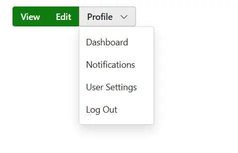
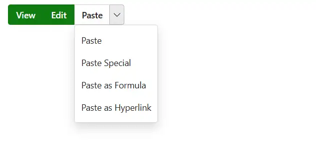
SplitButton
In the following example, the SplitButton component is added inside the SfButtonGroup tag.
@using Syncfusion.Blazor.SplitButtons

  <SfButtonGroup>
    <ButtonGroupButton CssClass="e-btn e-success">View</ButtonGroupButton>
    <ButtonGroupButton CssClass="e-btn e-success">Edit</ButtonGroupButton>
        <SfSplitButton Content="Paste">
            <DropDownMenuItems>
                <DropDownMenuItem Text="Paste"></DropDownMenuItem>
                <DropDownMenuItem Text="Paste Special"></DropDownMenuItem>
                <DropDownMenuItem Text="Paste as Formula"></DropDownMenuItem>
                <DropDownMenuItem Text="Paste as Hyperlink"></DropDownMenuItem>
            </DropDownMenuItems>
        </SfSplitButton>
</SfButtonGroup>