Styles and Appearances in Blazor Button Component
24 Jun 20261 minute to read
To modify the Button appearance, you need to override the default CSS of Button component. Find the list of CSS classes and its corresponding section in Button component. Also, you have an option to create your own custom theme for the controls using our Theme Studio.
| CSS Class | Purpose of Class |
|---|---|
| .e-btn | To customize the button. |
| .e-btn:hover | To customize the button on hover. |
| .e-btn:focus | To customize the button on focus. |
| .e-btn:active | To customize the button on active. |
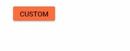
Customizing the appearance of button
Use the following CSS to customize the background color of button while clicking, hovering and focusing.
@using Syncfusion.Blazor.Buttons

<SfButton CssClass="e-btn">CUSTOM</SfButton>

<style>
    .e-btn {
        background-color: #ff6e40;
    }

    .e-btn:hover {
        background-color: #0b6a0b;
    }

    .e-btn:focus, .e-btn:active {
       background-color: #0078d4;
    }
</style>