Header and Content in Blazor Card Component
24 Jun 20263 minutes to read
Header
The Card can be created with header title, sub title and images. For adding header you need to add CardHeader Component. Card provides below elements and corresponding class definitions to include header.
| Elements | Description |
|---|---|
| Caption | It is the wrapper element to include title and sub-title. |
| Image | It supports to include header images with the specified dimensions. |
| Class | Description |
|---|---|
Title |
Main title text within the header. |
SubTitle |
A sub-title within the header. |
CardImage |
To include heading image within the header. |
Title and Subtitle
For adding header to the Card, Title Property.
-
Add
TitleProperty inside the header caption for adding main title. -
Add
SubTitleProperty inside the header caption element for adding Title.
Image
Card header has an option for adding images in the header. It is aligned with either before or after the header based on the HTML element positioned in the header structure. The header image can be added by ImageUrl component which can be placed before or after the header caption wrapper element.
@using Syncfusion.Blazor.Cards

<SfCard ID="HugeImage">
    <CardHeader Title="Laura Callahan" SubTitle="Sales Coordinator and Representative" ImageUrl="images/cards/football.png" />
</SfCard>
<SfCard ID="SecondCard">
    <CardHeader Title="Laura Callahan" SubTitle="Sales Coordinator and Representative" ImageUrl="images/cards/football.png" />
</SfCard>Content
Content in Card holds texts, images, links, and all possible HTML elements. It is adaptable within the Card root element.
- Create a
Contentcomponent. - Place content
divelement in the Card root element or within any Card inner elements.
@using Syncfusion.Blazor.Cards

<SfCard ID="HugeImage">
    <CardHeader Title="Laura Callahan" SubTitle="Sales Coordinator and Representative" ImageUrl="images/cards/football.png" />
</SfCard>

<SfCard ID="SecondCard">
    <CardContent Content="Laura received a BA in psychology from the University of Washington. She has also completed a course in business French. She reads and writes French."/>
</SfCard>Image
Card content is designed to display an image tag within it. You can wrap an image element inside the card content to create a visually appealing layout. Additionally, CSS styling can be used to further customize the appearance of card content.
@using Syncfusion.Blazor.Cards
<SfCard ID="Card">
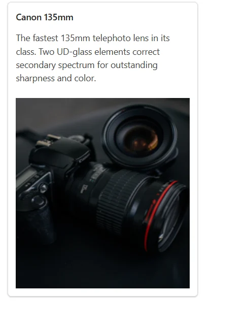
<CardHeader Title="Canon 135mm"/>
<CardContent>
<div>
The fastest 135mm telephoto lens in its class. Two UD-glass elements correct secondary spectrum for outstanding sharpness and color.
</div><br>
<img src="https://ej2.syncfusion.com/demos/src/card/images/Camera.png" alt="Canon 135mm" height="300px" width="100%" />
</CardContent>
</SfCard>
<style>
#Card {
width: 300px;
}
</style>