Horizontal Card in Blazor Card Component
24 Jun 20261 minute to read
By default, all the card elements are aligned vertically one after the other as in the DOM. You can achieve the element to align horizontally as well by using Orientation property.
Stacked cards
A horizontally aligned card can push a specific column to align vertically using the CardStacked component. This will align the stacked section vertically to differentiate from horizontal layout.
@using Syncfusion.Blazor.Cards
<SfCard Orientation="CardOrientation.Horizontal" ID="Trimmer">
<CardStacked>
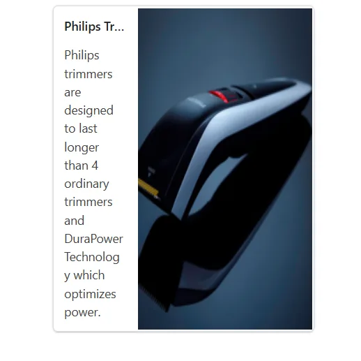
<CardHeader Title="Philips Trimmer" />
<CardContent Content="Philips trimmers are designed to last longer than 4 ordinary trimmers and DuraPower Technology which optimizes power." />
</CardStacked>
<img src="//ej2.syncfusion.com/demos/src/card/images/Trimmer.png">
</SfCard>
<style>
.e-card-image {
background: url('./sample.jpg');
height: 160px;;
}
.e-card {
width: 300px;
margin: auto;
}
</style>