Customization in Blazor CheckBox
27 Aug 20269 minutes to read
Customize styles and appearances
To modify the Blazor CheckBox appearance, override the default CSS of the Blazor CheckBox component. The list of CSS classes and their corresponding sections in the Blazor CheckBox is shown below. A custom theme can also be created using the Theme Studio.
| CSS Class | Purpose of Class |
|---|---|
| .e-checkbox-wrapper .e-frame | To customize the checkbox frame. |
| .e-checkbox-wrapper:hover .e-frame | To customize the checkbox frame on hover. |
| .e-checkbox-wrapper .e-label | To customize the checkbox label. |
| .e-checkbox-wrapper:hover .e-label | To customize the checkbox label on hover. |
| .e-checkbox-wrapper .e-frame.e-check | To customize the checked checkbox. |
| .e-checkbox-wrapper:hover .e-frame.e-check | To customize the checked checkbox on hover. |
Customize CheckBox appearance
The appearance of the Blazor CheckBox component is customized using CSS rules. Custom CSS rules are defined according to requirements and the class name is assigned to the
CssClass property.
The background and border colors of the Blazor CheckBox are customized through custom classes to create primary, success, info, warning, and danger variants.
@using Syncfusion.Blazor.Buttons

<SfCheckBox @bind-Checked="isPrimaryChecked" Label="Primary" CssClass="e-primary"></SfCheckBox><br />
<SfCheckBox @bind-Checked="isSuccessChecked" Label="Success" CssClass="e-success"></SfCheckBox><br />
<SfCheckBox @bind-Checked="isInfoChecked" Label="Info" CssClass="e-info"></SfCheckBox><br />
<SfCheckBox @bind-Checked="isWarningChecked" Label="Warning" CssClass="e-warning"></SfCheckBox><br />
<SfCheckBox @bind-Checked="isDangerChecked" Label="Danger" CssClass="e-danger"></SfCheckBox>

@code {
    private bool isPrimaryChecked = true;
    private bool isSuccessChecked = true;
    private bool isInfoChecked = true;
    private bool isWarningChecked = true;
    private bool isDangerChecked = true;
}

<style>
    .e-checkbox-wrapper.e-primary:hover .e-frame.e-check { /* csslint allow: adjoining-classes */
        background-color: #e03872;
    }

    .e-checkbox-wrapper.e-success .e-frame.e-check,
    .e-checkbox-wrapper.e-success .e-checkbox:focus + .e-frame.e-check { /* csslint allow: adjoining-classes */
        background-color: #689f38;
    }

    .e-checkbox-wrapper.e-success:hover .e-frame.e-check { /* csslint allow: adjoining-classes */
        background-color: #449d44;
    }

    .e-checkbox-wrapper.e-info .e-frame.e-check,
    .e-checkbox-wrapper.e-info .e-checkbox:focus + .e-frame.e-check { /* csslint allow: adjoining-classes */
        background-color: #2196f3;
    }

    .e-checkbox-wrapper.e-info:hover .e-frame.e-check { /* csslint allow: adjoining-classes */
         background-color: #0b7dda;
    }

    .e-checkbox-wrapper.e-warning .e-frame.e-check,
    .e-checkbox-wrapper.e-warning .e-checkbox:focus + .e-frame.e-check { /* csslint allow: adjoining-classes */
        background-color: #ef6c00;
    }

    .e-checkbox-wrapper.e-warning:hover .e-frame.e-check { /* csslint allow: adjoining-classes */
        background-color: #cc5c00;
    }

    .e-checkbox-wrapper.e-danger .e-frame.e-check,
    .e-checkbox-wrapper.e-danger .e-checkbox:focus + .e-frame.e-check { /* csslint allow: adjoining-classes */
        background-color: #d84315;
    }

    .e-checkbox-wrapper.e-danger:hover .e-frame.e-check { /* csslint allow: adjoining-classes */
        background-color: #ba3912;
    }
</style>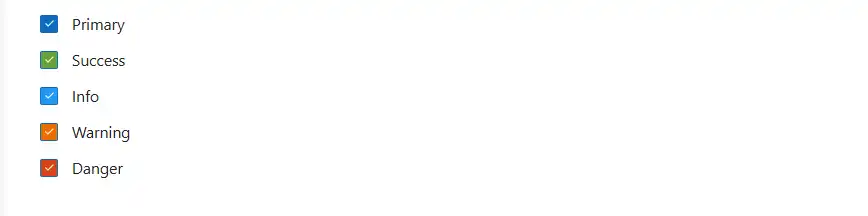
Customize width and height
The height and width of the Blazor CheckBox component can be customized using CSS. The following example shows how to apply a custom size by setting height and width on the .e-frame selector.
The HtmlAttributes parameter can also be used to set inline style directly on the rendered input:
<SfCheckBox Label="Inline" HtmlAttributes="@(new Dictionary<string, object> { { "style", "width:30px;height:30px;" } })"></SfCheckBox>@using Syncfusion.Blazor.Buttons
<SfCheckBox CssClass="e-customsize" Label="Default" @bind-Checked="isChecked"></SfCheckBox>
@code {
private bool isChecked = true;
}
<style>
.e-customsize.e-checkbox-wrapper .e-frame {
height: 30px;
width: 30px;
padding: 8px 0;
}
.e-customsize.e-checkbox-wrapper .e-check {
font-size: 20px;
}
.e-customsize.e-checkbox-wrapper .e-ripple-container {
height: 52px;
top: -11px;
width: 47px;
}
.e-customsize.e-checkbox-wrapper .e-label {
line-height: 30px;
font-size: 20px;
}
</style>
Custom frame
The Blazor CheckBox frame can be customized by adding CSS rules.
In the following example, to-do list is displayed with round checkbox by changing border-radius as 100% by adding e-custom class.
@using Syncfusion.Blazor.Buttons

<SfCheckBox Label="Buy Groceries" @bind-Checked="isChecked" CssClass="e-custom"></SfCheckBox><br />
<SfCheckBox Label="Pay Rent" @bind-Checked="isRentChecked" CssClass="e-custom"></SfCheckBox><br />
<SfCheckBox Label="Make Dinner" @bind-Checked="isDinnerChecked" CssClass="e-custom"></SfCheckBox><br />
<SfCheckBox Label="Finish To-do List Article" @bind-Checked="isArticleChecked" CssClass="e-custom"></SfCheckBox>

@code {
    private bool isChecked = true;
    private bool isRentChecked = true;
    private bool isDinnerChecked = false;
    private bool isArticleChecked = false;
}

<style>
        .e-custom .e-frame {
            border-radius: 100%;
        }
</style>
Custom check icon
The Blazor CheckBox check icon can be customized by adding CSS rules.
In the following example, the check icon can be customized by changing check icon content, background and border color in focus and hovered states by adding e-checkicon class.
@using Syncfusion.Blazor.Buttons

<SfCheckBox Label="Buy Groceries" @bind-Checked="isChecked" CssClass="e-checkicon"></SfCheckBox><br />
<SfCheckBox Label="Pay Rent"  @bind-Checked="isRentChecked" CssClass="e-checkicon"></SfCheckBox><br />
<SfCheckBox Label="Make Dinner" @bind-Checked="isDinnerChecked" CssClass="e-checkicon"></SfCheckBox><br />
<SfCheckBox Label="Finish To-do List Article" @bind-Checked="isArticleChecked" CssClass="e-checkicon"></SfCheckBox>

@code {
    private bool isChecked = true;
    private bool isRentChecked = true;
    private bool isDinnerChecked = true;
    private bool isArticleChecked = false;
}

<style>
    .e-checkicon.e-checkbox-wrapper .e-frame.e-check::before {
        content: '\e917';
    }
    .e-checkicon.e-checkbox-wrapper .e-check {
        font-size: 12px;
    }
    .e-checkicon.e-checkbox-wrapper .e-frame.e-check,
    .e-checkicon.e-checkbox-wrapper:hover .e-frame.e-check {
        background-color: white;
        border-color: grey;
        color: grey;
    }
    .e-checkicon.e-checkbox-wrapper .e-checkbox:focus + .e-frame.e-check {
        background-color: white;
        border-color: grey;
        box-shadow: none;
        color: grey;
    }
    .e-checkicon.e-checkbox-wrapper .e-ripple-element {
        background: grey;
    }
</style>
Right-to-left in Blazor CheckBox Component
The Blazor CheckBox component has RTL (right-to-left) support. This can be achieved by setting the EnableRtl property to true.
The following example illustrates how to enable right-to-left support in the Blazor CheckBox component.
@using Syncfusion.Blazor.Buttons

<SfCheckBox Label="Default" @bind-Checked="isChecked" EnableRtl="true"></SfCheckBox>

@code {
    private bool isChecked = true;
}
Model binding in Blazor CheckBox Component
To get started quickly with model binding in the Blazor CheckBox component, refer to the following video:
The following sample demonstrates model binding with the Blazor CheckBox. A view that can bind to any model is called a strongly typed view. Any class can be bound as a model to the view, the model properties can be accessed on that view, and the data associated with the model can be used to render the component. The validation uses the standard Blazor EditForm with DataAnnotationsValidator (no additional Syncfusion registration is required).
In this sample, the option is checked and the Submit button is clicked to post the selected value. When the Blazor CheckBox is not checked, the validation error message is shown below it.
@using Syncfusion.Blazor.Buttons
@using System.ComponentModel.DataAnnotations

<EditForm Model="Annotate" OnValidSubmit="HandleValidSubmit">
    <DataAnnotationsValidator></DataAnnotationsValidator>
    <div class="form-group">
        <SfCheckBox Label="Option 1" @bind-Checked="@Annotate.Check"></SfCheckBox>
        <ValidationMessage For="@(() => Annotate.Check)" />
    </div>
    <button type="submit" class="e-btn e-primary">Submit</button>
</EditForm>

@code {
    public Annotation Annotate = new Annotation();
    public class Annotation
    {
        [Range(typeof(bool), "true", "true", ErrorMessage = "You need to agree to the Terms and Conditions")]
        public bool Check { get; set; }
    }
    private void HandleValidSubmit()
    {
        // Submit the form when validation passes
    }
}