How can I help you?
Label and Size in Blazor CheckBox Component
18 Jun 20261 minute to read
This section explains the different sizes and labels.
Label
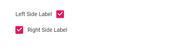
The Blazor Checkbox caption can be defined by using the Label property. This reduces the manual addition of label for Checkbox. You can customize the label position before or after the Checkbox through the LabelPosition property.
@using Syncfusion.Blazor.Buttons

<SfCheckBox Label="Left Side Label" LabelPosition="LabelPosition.Before" @bind-Checked="isLeftChecked"></SfCheckBox><br />
<SfCheckBox Label="Right Side Label" LabelPosition="LabelPosition.After" @bind-Checked="isRightChecked"></SfCheckBox>

@code {
    private bool isLeftChecked = true;
    private bool isRightChecked = true;
}
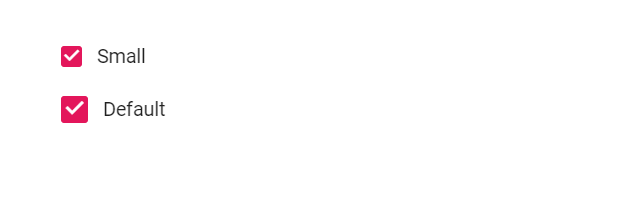
Size
The different Checkbox sizes available are default and small. To reduce the size of default Checkbox to small, set the CssClass property to e-small.
@using Syncfusion.Blazor.Buttons

<SfCheckBox @bind-Checked="isSmallChecked" Label="Small" CssClass="e-small"></SfCheckBox><br />
<SfCheckBox @bind-Checked="isDefaultChecked" Label="Default"></SfCheckBox>

@code {
    private bool isSmallChecked = true;
     private bool isDefaultChecked = true;
}

<style>
    .e-checkbox-wrapper {
        margin-top: 18px;
    }
</style>