Accessibility in Blazor Chip Component
18 Jun 20264 minutes to read
The Blazor Chips component followed the accessibility guidelines and standards, including ADA, Section 508, WCAG 2.2 standards, and WCAG roles that are commonly used to evaluate accessibility.
The accessibility compliance for the Blazor Chips component is outlined below.
| Accessibility Criteria | Compatibility |
|---|---|
| WCAG 2.2 Support | AA |
| Section 508 Support |  |
| Screen Reader Support | |
| Right-To-Left Support | |
| Color Contrast | |
| Mobile Device Support | |
| Keyboard Navigation Support | |
| Axe-core Accessibility Validation | |
- All features of the component meet the requirement. - Some features of the component do not meet the requirement.
 - The component does not meet the requirement.
WAI-ARIA attributes
The Blazor Chips component followed the WAI-ARIA patterns to meet the accessibility. The following ARIA attributes are used in the Chips component:
| Attributes | Purpose |
|---|---|
role=listbox |
Indicates the ChipList component wrapper element as listbox. |
role=option |
Used to convey a significant and contextual message to the user(ChipList). |
role=button |
Used to convey a significant and contextual message to the user(Single Chip). |
aria-label |
Provides an accessible name for the Chip. |
aria-selected |
Indicates the element is selected. |
aria-disabled |
Indicates element is perceivable but disabled. |
aria-multiselectable |
Indicates multiple items to be selected. |
Keyboard interaction
The following shortcut keys are used to access the Blazor Chip component without any interruption.
| Windows | Mac | Actions |
|---|---|---|
| Enter | Enter | Selects the targeted chip from the Chip/ChipItems. |
| Delete | Delete | Deletes the targeted chip from the Chip/ChipItems. |
Ensuring accessibility
The Blazor Chips component’s accessibility levels are ensured through an axe-core software tool during automated testing.
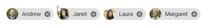
The accessibility compliance of the Chip component is shown in the following sample. Open the sample in a new window to evaluate the accessibility of the Chip component with accessibility tools.
@using Syncfusion.Blazor.Buttons
<SfChip ID="chip-avatar" EnableDelete="true" CssClass="e-chip-avatar" Selection="SelectionType.Single">
    <ChipItems>
        <ChipItem Text="Andrew" LeadingIconCss='andrew'></ChipItem>
        <ChipItem Text="Janet" LeadingIconCss='janet'></ChipItem>
        <ChipItem Text="Laura" LeadingIconCss='laura'></ChipItem>
        <ChipItem Text="Margaret" LeadingIconCss='margaret'></ChipItem>
    </ChipItems>
</SfChip>

<style>
    #chip-avatar .andrew {
        background-image: url('./andrew.png')
    }

    #chip-avatar .margaret {
        background-image: url('./margaret.png')
    }

    #chip-avatar .laura {
        background-image: url('./laura.png')
    }

    #chip-avatar .janet {
        background-image: url('./janet.png')
    }
</style>