How can I help you?
Appearance in Blazor Circular Gauge Component
12 Nov 20255 minutes to read
Circular gauge title
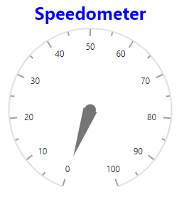
You can add a title to the Circular Gauge using the Title property. The title can be customized using the CircularGaugeTitleStyle tag.
@using Syncfusion.Blazor.CircularGauge

<SfCircularGauge Title="Speedometer">
    <CircularGaugeTitleStyle Color="blue" FontWeight="bold" Size="25"></CircularGaugeTitleStyle>
    <CircularGaugeAxes>
       <CircularGaugeAxis>
           <CircularGaugePointers>
              <CircularGaugePointer></CircularGaugePointer>
           </CircularGaugePointers>
        </CircularGaugeAxis>
    </CircularGaugeAxes>
</SfCircularGauge>
Circular gauge position
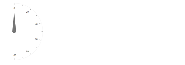
The Circular Gauge can be positioned anywhere in the container using the CenterX and CenterY properties which accept values either in percentage or in pixels. The default value of the CenterX and CenterY properties are 50%, so the Circular Gauge will get rendered to the center of the container.
In pixel
You can set the mid point of the Circular Gauge in pixel as shown below.
@using Syncfusion.Blazor.CircularGauge

<SfCircularGauge CenterX="20px" CenterY="20px">
    <CircularGaugeAxes>
        <CircularGaugeAxis StartAngle="90" EndAngle="180"></CircularGaugeAxis>
    </CircularGaugeAxes>
</SfCircularGauge>
In percentage
By setting the value in percentage, Circular Gauge gets its mid point with respect to its plot area. For example, when setting the value of CenterX to ‘1%’ and the value of CenterY to ‘50%’, the gauge will be positioned at the top-left corner of the plot area.
@using Syncfusion.Blazor.CircularGauge

<SfCircularGauge CenterX="1%" CenterY="50%">
    <CircularGaugeAxes>
        <CircularGaugeAxis StartAngle="0" EndAngle="180"></CircularGaugeAxis>
    </CircularGaugeAxes>
</SfCircularGauge>
Background customization
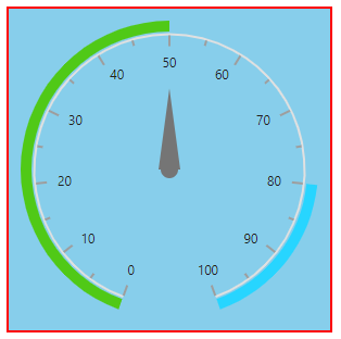
Using the Background and CircularGaugeBorder properties, you can change the background color and border of the Circular Gauge.
@using Syncfusion.Blazor.CircularGauge

<SfCircularGauge Background="skyblue">
    <CircularGaugeBorder Color="#FF0000"
                         Width="2">
    </CircularGaugeBorder>
    <CircularGaugeAxes>
        <CircularGaugeAxis>
            <CircularGaugeRanges>
                <CircularGaugeRange Start="1"
                                    End="50"
                                    Radius="110%">
                </CircularGaugeRange>
                <CircularGaugeRange Start="80"
                                    End="100"
                                    Radius="110%">
                </CircularGaugeRange>
            </CircularGaugeRanges>
            <CircularGaugePointers>
                <CircularGaugePointer Value="50"
                                      Radius="60%">
                </CircularGaugePointer>
            </CircularGaugePointers>
        </CircularGaugeAxis>
    </CircularGaugeAxes>
</SfCircularGauge>
Radius calculation based on angles
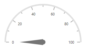
You can render semi or quarter Circular Gauge by modifying the start and end angles. By enabling the radius based on angle option, the radius of circular gauge will be calculated based on the start and end angles to avoid excess white space.
@using Syncfusion.Blazor.CircularGauge

<SfCircularGauge>
    <CircularGaugeAxes>
        <CircularGaugeAxis Radius="60%" StartAngle="270" EndAngle="90">
            <CircularGaugeAxisLineStyle Width="5">
            </CircularGaugeAxisLineStyle>
        </CircularGaugeAxis>
    </CircularGaugeAxes>
</SfCircularGauge>