Axes in Blazor Circular Gauge Component
26 Jun 202617 minutes to read
By default, the Circular Gauge will be displayed with an axis. Each axis contains its own ranges, pointers, and annotations.
Axis customization
You can customize the Width and Color of an axis line using the CircularGaugeAxisLineStyle tag. The background for an axis can be customized using the Background property.
@using Syncfusion.Blazor.CircularGauge

<SfCircularGauge>
    <CircularGaugeAxes>
        <CircularGaugeAxis Background= "rgba(0, 128, 128, 0.3)">
            <CircularGaugePointers><CircularGaugePointer Value="0"></CircularGaugePointer></CircularGaugePointers>
            <CircularGaugeAxisLineStyle Width="2" Color="red">
            </CircularGaugeAxisLineStyle>
        </CircularGaugeAxis>
    </CircularGaugeAxes>
</SfCircularGauge>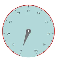
Minimum and maximum
The Minimum and Maximum properties enables you to customize the start and end values of an axis.
@using Syncfusion.Blazor.CircularGauge

<SfCircularGauge>
    <CircularGaugeAxes>
        <CircularGaugeAxis Minimum= "50" Maximum= "250">
        <CircularGaugePointers><CircularGaugePointer Value="50"></CircularGaugePointer></CircularGaugePointers>
         </CircularGaugeAxis>
    </CircularGaugeAxes>
</SfCircularGauge>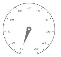
Start and end angle
You can sweep the Circular Gauge axis from 0 to 360 degrees. By default, the start angle of an axis is 200 degrees and end angle of an axis is 160 degrees. You can customize this option using the StartAngle and EndAngle properties.
@using Syncfusion.Blazor.CircularGauge

<SfCircularGauge>
    <CircularGaugeAxes>
        <CircularGaugeAxis StartAngle= "270" EndAngle= "90">
        <CircularGaugePointers><CircularGaugePointer Value="0"></CircularGaugePointer></CircularGaugePointers>
        </CircularGaugeAxis>
    </CircularGaugeAxes>
</SfCircularGauge>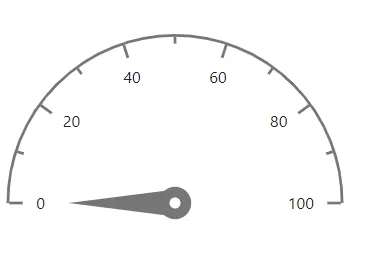
Axis radius
By default, the radius of an axis is calculated based on the available size. You can customize the axis radius using the Radius property. It takes values either in percentage or in pixel.
In pixel
You can set the radius of the Circular Gauge in pixel as shown below.
@using Syncfusion.Blazor.CircularGauge

<SfCircularGauge>
    <CircularGaugeAxes>
        <CircularGaugeAxis Radius="150px">
        <CircularGaugePointers><CircularGaugePointer Value="0"></CircularGaugePointer></CircularGaugePointers>
        </CircularGaugeAxis>
    </CircularGaugeAxes>
</SfCircularGauge>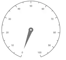
In percentage
By setting value in percentage, Circular Gauge gets its dimension with respect to its available size. For example, when the Radius is ‘50%’, gauge renders to the half of the available size.
@using Syncfusion.Blazor.CircularGauge

<SfCircularGauge>
    <CircularGaugeAxes>
        <CircularGaugeAxis Radius="50%">
        <CircularGaugePointers>
                <CircularGaugePointer Value="0"></CircularGaugePointer>
            </CircularGaugePointers>
        </CircularGaugeAxis>
    </CircularGaugeAxes>
</SfCircularGauge>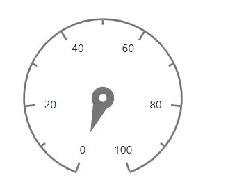
Ticks
You can customize the Height, Color, and Width of major ticks and minor ticks using the CircularGaugeAxisMajorTicks and CircularGaugeAxisMinorTicks tags.
By default, Interval for CircularGaugeAxisMajorTicks will be calculated automatically. You can customize the interval for major ticks and minor ticks using the Interval property.
@using Syncfusion.Blazor.CircularGauge

<SfCircularGauge>
    <CircularGaugeAxes>
        <CircularGaugeAxis>
             <CircularGaugePointers>
                <CircularGaugePointer Value="0"></CircularGaugePointer>
            </CircularGaugePointers>
            <CircularGaugeAxisMajorTicks Interval="10" Color="red" Height="10" Width="3">
            </CircularGaugeAxisMajorTicks>
            <CircularGaugeAxisMinorTicks Interval="5" Color="green" Height="5" Width="2">
            </CircularGaugeAxisMinorTicks>
        </CircularGaugeAxis>
    </CircularGaugeAxes>
</SfCircularGauge>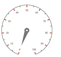
Tick position
The minor ticks and major ticks can be positioned using the Offset and Position properties.
-
The Offset defines the distance between the axis and ticks. By default, offset value is 0.
-
The Position will place the ticks on the axis. By default, ticks will be placed inside the axis. Its possible values are ‘Position.Inside’, ‘Position.Outside’, and ‘Position.Cross’.
@using Syncfusion.Blazor.CircularGauge

<SfCircularGauge>
    <CircularGaugeAxes>
        <CircularGaugeAxis>
            <CircularGaugePointers>
                <CircularGaugePointer Value="0"></CircularGaugePointer>
            </CircularGaugePointers>
            <CircularGaugeAxisMajorTicks Color="red"
                                         Height="10" Width="3"
                                         Position = "Position.Inside"
                                         Offset="5">
            </CircularGaugeAxisMajorTicks>
            <CircularGaugeAxisMinorTicks Color="green"
                                         Height="5" Width="2"
                                         Position = "Position.Inside"
                                         Offset="5">
            </CircularGaugeAxisMinorTicks>
        </CircularGaugeAxis>
    </CircularGaugeAxes>
</SfCircularGauge>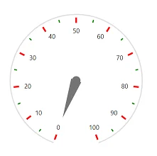
Labels
The labels of an axis can be customized using the CircularGaugeAxisLabelFont tag in CircularGaugeAxisLabelStyle option.
@using Syncfusion.Blazor.CircularGauge

<SfCircularGauge>
    <CircularGaugeAxes>
        <CircularGaugeAxis>
        <CircularGaugePointers><CircularGaugePointer Value="0"></CircularGaugePointer></CircularGaugePointers>
            <CircularGaugeAxisLabelStyle>
                <CircularGaugeAxisLabelFont Color="red" Size="20px" FontWeight="Bold">
                </CircularGaugeAxisLabelFont>
            </CircularGaugeAxisLabelStyle>
        </CircularGaugeAxis>
    </CircularGaugeAxes>
</SfCircularGauge>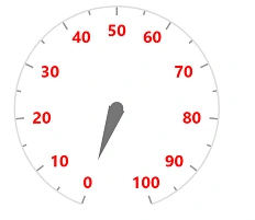
Label position
The labels can be moved using the Offset or Position property.
-
The Offset defines the distance between the labels and ticks. By default, offset value is 0.
-
The Position specifies the label position. By default, the labels will be placed inside the axis. Its possible values are ‘Position.Inside’, ‘Position.Outside’ and ‘Position.Cross’.
@using Syncfusion.Blazor.CircularGauge

<SfCircularGauge>
    <CircularGaugeAxes>
        <CircularGaugeAxis>
        <CircularGaugePointers><CircularGaugePointer Value="0"></CircularGaugePointer></CircularGaugePointers>
            <CircularGaugeAxisLabelStyle Position="Position.Outside"
                                Offset="5">
            </CircularGaugeAxisLabelStyle>
        </CircularGaugeAxis>
    </CircularGaugeAxes>
</SfCircularGauge>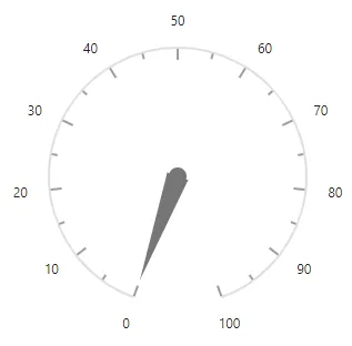
Auto angle
The labels can be swept along the axis angle by enabling the AutoAngle property.
@using Syncfusion.Blazor.CircularGauge

<SfCircularGauge>
    <CircularGaugeAxes>
        <CircularGaugeAxis>
            <CircularGaugePointers><CircularGaugePointer Value="0"></CircularGaugePointer></CircularGaugePointers>
            <CircularGaugeAxisLabelStyle AutoAngle="true"></CircularGaugeAxisLabelStyle>
        </CircularGaugeAxis>
    </CircularGaugeAxes>
</SfCircularGauge>
Smart labels
When an axis makes a complete circle, then the first and last labels of the axis will overlap with each other. So, you need to either hide first or last label using the HiddenLabel property. When ‘HiddenLabel’ value is First, the first label will be hidden and when the ‘HiddenLabel’ value is Last, the last label will be hidden.
@using Syncfusion.Blazor.CircularGauge

<SfCircularGauge>
    <CircularGaugeAxes>
        <CircularGaugeAxis Minimum="0"
                           Maximum="12"
                           EndAngle="360"
                           StartAngle="0">
                           <CircularGaugePointers>
                <CircularGaugePointer Value="0"></CircularGaugePointer>
            </CircularGaugePointers>
            <CircularGaugeAxisLabelStyle Position="Position.Inside"
                                HiddenLabel="HiddenLabel.First">
            </CircularGaugeAxisLabelStyle>
            <CircularGaugeAxisMajorTicks Interval="1"
                                         Height="10"
                                         Position="Position.Inside">
            </CircularGaugeAxisMajorTicks>
            <CircularGaugeAxisMinorTicks Interval="0.2"
                                         Height="5"
                                         Position="Position.Inside">
            </CircularGaugeAxisMinorTicks>
        </CircularGaugeAxis>
    </CircularGaugeAxes>
</SfCircularGauge>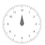
Label format
The axis labels can be formatted using the Format property in CircularGaugeAxisLabelStyle, it supports all globalize format.
@using Syncfusion.Blazor.CircularGauge

<SfCircularGauge>
    <CircularGaugeAxes>
        <CircularGaugeAxis>
        <CircularGaugePointers><CircularGaugePointer Value="0"></CircularGaugePointer></CircularGaugePointers>
            <CircularGaugeAxisLabelStyle Format="p1"></CircularGaugeAxisLabelStyle>
        </CircularGaugeAxis>
    </CircularGaugeAxes>
</SfCircularGauge>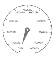
The following table describes the result of applying some commonly used label formats on numeric values.
| Label Value | Label Format property value | Result | Description |
| 1000 | n1 | 1000.0 | The number is rounded to 1 decimal place. |
| 1000 | n2 | 1000.00 | The number is rounded to 2 decimal places. |
| 1000 | n3 | 1000.000 | The number is rounded to 3 decimal places. |
| 0.01 | p1 | 1.0% | The number is converted to percentage with 1 decimal place. |
| 0.01 | p2 | 1.00% | The number is converted to percentage with 2 decimal places. |
| 0.01 | p3 | 1.000% | The number is converted to percentage with 3 decimal places. |
| 1000 | c1 | $1,000.0 | The currency symbol is appended to number, and the number is rounded to 1 decimal place. |
| 1000 | c2 | $1,000.00 | The currency symbol is appended to number, and the number is rounded to 2 decimal places. |
Custom label format
Axis labels support custom label format using placeholder like {value}°C, in which the value represent the axis label. e.g., 20°C.
@using Syncfusion.Blazor.CircularGauge

<SfCircularGauge>
    <CircularGaugeAxes>
        <CircularGaugeAxis>
        <CircularGaugePointers><CircularGaugePointer Value="0"></CircularGaugePointer></CircularGaugePointers>
            <CircularGaugeAxisLabelStyle Format="{value}°C"></CircularGaugeAxisLabelStyle>
        </CircularGaugeAxis>
    </CircularGaugeAxes>
</SfCircularGauge>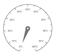
Show last label
If the maximum value does not enter the interval of major ticks, the last label will be hidden by default. If you want to display the last label, set the property value ShowLastLabel to true.
@using Syncfusion.Blazor.CircularGauge

<SfCircularGauge>
    <CircularGaugeAxes>
        <CircularGaugeAxis Maximum="100"
                           ShowLastLabel="true">
            <CircularGaugePointers><CircularGaugePointer Value="0"></CircularGaugePointer></CircularGaugePointers>
            <CircularGaugeAxisMajorTicks Interval="30"></CircularGaugeAxisMajorTicks>
        </CircularGaugeAxis>
    </CircularGaugeAxes>
</SfCircularGauge>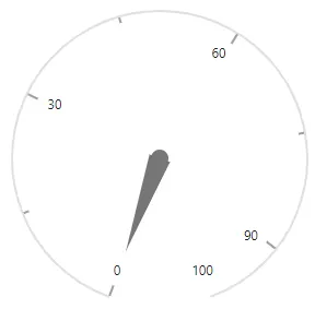
Hide intersecting axis labels
When the axis labels overlap with each other, you can hide the intersected labels by setting the HideIntersectingLabel property to true in the axis.
<SfCircularGauge>
    <CircularGaugeAxes>
        <CircularGaugeAxis Maximum="200" StartAngle="270" EndAngle="90" Minimum="0" HideIntersectingLabel="true">
        <CircularGaugePointers><CircularGaugePointer Value="0"></CircularGaugePointer></CircularGaugePointers>
            <CircularGaugeAxisMajorTicks Interval="4"></CircularGaugeAxisMajorTicks>
            <CircularGaugeAxisMinorTicks Interval="2"></CircularGaugeAxisMinorTicks>
        </CircularGaugeAxis>
    </CircularGaugeAxes>
</SfCircularGauge>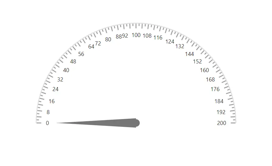
Axis direction
You can change the axis direction of the circular gauge using Direction property. Following axis directions are available in the circular gauge.
- ClockWise
- AntiClockWise
@using Syncfusion.Blazor.CircularGauge

<SfCircularGauge>
    <CircularGaugeAxes>
           <CircularGaugeAxis Direction="GaugeDirection.AntiClockWise">
                <CircularGaugePointers><CircularGaugePointer Value="0"></CircularGaugePointer></CircularGaugePointers>
        </CircularGaugeAxis>
    </CircularGaugeAxes>
</SfCircularGauge>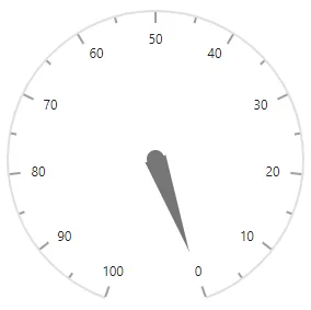
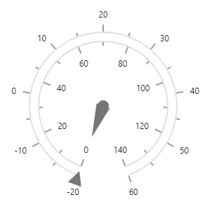
Multiple axes
In addition to the default axis, you can add n number of axis to a gauge. Each axis will have its own ranges, pointers, annotations, and customization options.
@using Syncfusion.Blazor.CircularGauge

<SfCircularGauge>
    <CircularGaugeAxes>
        <CircularGaugeAxis Minimum="0"
                           Maximum="140">
            <CircularGaugePointers>
                <CircularGaugePointer Type="PointerType.Needle">
                </CircularGaugePointer>
            </CircularGaugePointers>
        </CircularGaugeAxis>
        <CircularGaugeAxis Minimum="-20"
                           Maximum="60">
            <CircularGaugePointers>
                <CircularGaugePointer Type="PointerType.Marker"
                                      MarkerShape="GaugeShape.InvertedTriangle"
                                      MarkerHeight="20"
                                      MarkerWidth="20">
                </CircularGaugePointer>
            </CircularGaugePointers>
            <CircularGaugeAxisMajorTicks Position="Position.Outside">
            </CircularGaugeAxisMajorTicks>
            <CircularGaugeAxisMinorTicks Position="Position.Outside">
            </CircularGaugeAxisMinorTicks>
            <CircularGaugeAxisLabelStyle Position="Position.Outside">
            </CircularGaugeAxisLabelStyle>
        </CircularGaugeAxis>
    </CircularGaugeAxes>
</SfCircularGauge>