Legend in Blazor Circular Gauge Component
26 Jun 20268 minutes to read
Legend provides valuable information for interpreting what the circular gauge axis range displays, and they can be represented in various colors, shapes, and other identifiers based on the data. It gives a breakdown of what each symbol represents in the axis range of circular gauge.
You can add the legend for circular gauge ranges by setting the visible property of CircularGaugeLegendSettings to true.
Legend customization
Customization option is also provided for the legend shape, alignment, and position.
Position and alignment
The position of the legend is used to place legend in various positions. You can use the Position property in CircularGaugeLegendSettings. Based on the position, the legend item will be aligned. The following options are available to customize the legend position:
- Top
- Bottom
- Left
- Right
- Custom
- Auto
The legend alignment is used to align the legend items in specific location. You can use the alignment property in CircularGaugeLegendSettings to align the legend items. The following options are available to customize the legend alignment:
- Near
- Center
- Far
The legends can also be positioned to absolute position using the Location properties available in legendSettings.
Legend size
The legend size can be modified using the Height and Width properties in CircularGaugeLegendSettings.
Legend opacity
To specify the transparency for legend shape, set the Opacity property in CircularGaugeLegendSettings.
Legend shape
To change the legend item shape, specify the desired Shape in the shape property of the legend. By default, the shape of the legend is Circle.
It also supports the following shapes:
- Circle
- Rectangle
- Diamond
- Triangle
- InvertedTriangle
- Image
You can customize a shape using the ShapeWidth and ShapeHeight properties.
Legend padding
You can control the spacing between the legend items using the Padding option of the legend. The default value of padding is 5.
Legend border
You can customize the legend border using the Border option in the legend. The legend border can be customized using the border Color and Width properties.
Font of the legend text
The Font of the legend item text can be customized using the following properties:
- fontFamily
- fontStyle
- fontWeight
- opacity
- color
- size
The following code example shows how to add legend in the gauge.
@using Syncfusion.Blazor.CircularGauge

<SfCircularGauge>
<CircularGaugeLegendSettings Visible="true" ShapeWidth="30" ShapeHeight="30" Padding="15">
    <CircularGaugeLegendBorder Color="green" Width="3"></CircularGaugeLegendBorder>
</CircularGaugeLegendSettings>
<CircularGaugeAxes>
    <CircularGaugeAxis Minimum="0" Maximum="100">
        <CircularGaugePointers><CircularGaugePointer Value="0"></CircularGaugePointer></CircularGaugePointers>
        <CircularGaugeAxisMajorTicks UseRangeColor="true">
        </CircularGaugeAxisMajorTicks>
        <CircularGaugeAxisMinorTicks UseRangeColor="true">
        </CircularGaugeAxisMinorTicks>
        <CircularGaugeAxisLabelStyle UseRangeColor="true">
        </CircularGaugeAxisLabelStyle>
        <CircularGaugeRanges>
            <CircularGaugeRange Start="0" End="25" Radius="108%">
            </CircularGaugeRange>
            <CircularGaugeRange Start="25" End="50" Radius="108%">
            </CircularGaugeRange>
            <CircularGaugeRange Start="50" End="75" Radius="108%">
            </CircularGaugeRange>
            <CircularGaugeRange Start="75" End="100" Radius="108%">
            </CircularGaugeRange>
        </CircularGaugeRanges>
    </CircularGaugeAxis>
</CircularGaugeAxes>
</SfCircularGauge>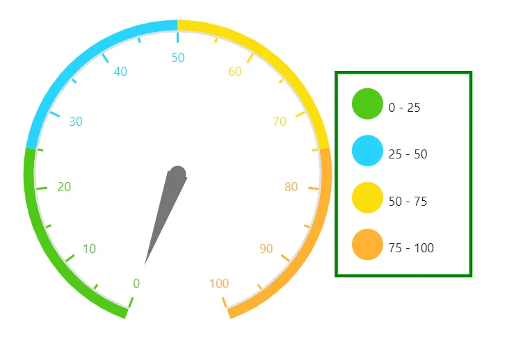
Toggle option in legend
The toggle option has been provided for legend. So, if you toggle the legend, the given color will be changed to the corresponding circular gauge range. You can enable the toggle option using ToggleVisibility in the CircularGaugeLegendSettings property.
@using Syncfusion.Blazor.CircularGauge

<SfCircularGauge>
<CircularGaugeLegendSettings Visible="true" ToggleVisibility="true">
    <CircularGaugeLegendBorder Color="green" Width="3"></CircularGaugeLegendBorder>
</CircularGaugeLegendSettings>
<CircularGaugeAxes>
    <CircularGaugeAxis Minimum="0" Maximum="100">
        <CircularGaugePointers><CircularGaugePointer Value="0"></CircularGaugePointer></CircularGaugePointers>
        <CircularGaugeAxisMajorTicks UseRangeColor="true">
        </CircularGaugeAxisMajorTicks>
        <CircularGaugeAxisMinorTicks UseRangeColor="true">
        </CircularGaugeAxisMinorTicks>
        <CircularGaugeAxisLabelStyle UseRangeColor="true">
        </CircularGaugeAxisLabelStyle>
        <CircularGaugeRanges>
            <CircularGaugeRange Start="0" End="25" Radius="108%">
            </CircularGaugeRange>
            <CircularGaugeRange Start="25" End="50" Radius="108%">
            </CircularGaugeRange>
            <CircularGaugeRange Start="50" End="75" Radius="108%">
            </CircularGaugeRange>
            <CircularGaugeRange Start="75" End="100" Radius="108%">
            </CircularGaugeRange>
        </CircularGaugeRanges>
    </CircularGaugeAxis>
</CircularGaugeAxes>
</SfCircularGauge>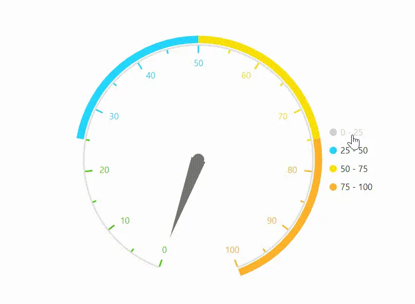
Paging support in legend
By default, paging will be enabled if the legend items exceed the legend bounds. You can view each legend item by navigating between the pages using navigation buttons.
@using Syncfusion.Blazor.CircularGauge

<SfCircularGauge>
<CircularGaugeLegendSettings Visible="true" Height="50">
    <CircularGaugeLegendBorder Color="green" Width="3"></CircularGaugeLegendBorder>
</CircularGaugeLegendSettings>
<CircularGaugeAxes>
    <CircularGaugeAxis Minimum="0" Maximum="100">
        <CircularGaugePointers><CircularGaugePointer Value="0"></CircularGaugePointer></CircularGaugePointers>
        <CircularGaugeAxisMajorTicks UseRangeColor="true">
        </CircularGaugeAxisMajorTicks>
        <CircularGaugeAxisMinorTicks UseRangeColor="true">
        </CircularGaugeAxisMinorTicks>
        <CircularGaugeAxisLabelStyle UseRangeColor="true">
        </CircularGaugeAxisLabelStyle>
        <CircularGaugeRanges>
            <CircularGaugeRange Start="0" End="25" Radius="108%">
            </CircularGaugeRange>
            <CircularGaugeRange Start="25" End="50" Radius="108%">
            </CircularGaugeRange>
            <CircularGaugeRange Start="50" End="75" Radius="108%">
            </CircularGaugeRange>
            <CircularGaugeRange Start="75" End="100" Radius="108%">
            </CircularGaugeRange>
        </CircularGaugeRanges>
    </CircularGaugeAxis>
</CircularGaugeAxes>
</SfCircularGauge>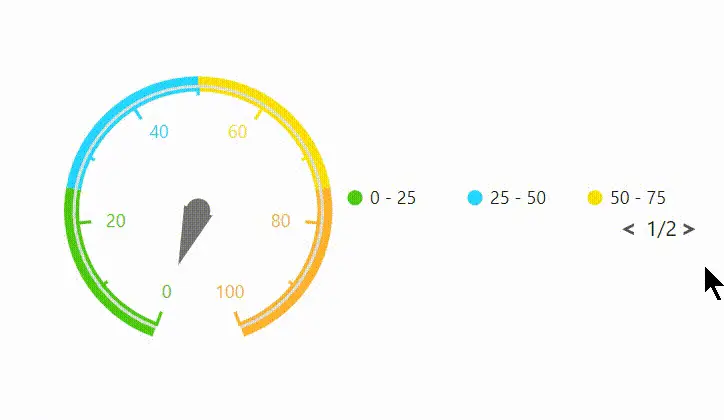
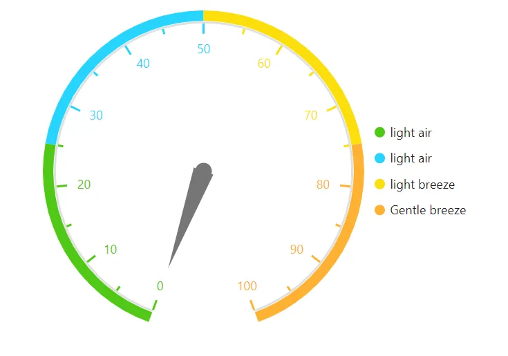
Legend text customization
You can customize the legend text using LegendText property in CircularGaugeRange.
@using Syncfusion.Blazor.CircularGauge

<SfCircularGauge>
<CircularGaugeLegendSettings Visible="true" Height="125">
    <CircularGaugeLegendBorder Color="green" Width="3"></CircularGaugeLegendBorder>
</CircularGaugeLegendSettings>
<CircularGaugeAxes>
    <CircularGaugeAxis Minimum="0" Maximum="100">
        <CircularGaugePointers><CircularGaugePointer Value="0"></CircularGaugePointer></CircularGaugePointers>
        <CircularGaugeAxisMajorTicks UseRangeColor="true">
        </CircularGaugeAxisMajorTicks>
        <CircularGaugeAxisMinorTicks UseRangeColor="true">
        </CircularGaugeAxisMinorTicks>
        <CircularGaugeAxisLabelStyle UseRangeColor="true">
        </CircularGaugeAxisLabelStyle>
        <CircularGaugeRanges>
            <CircularGaugeRange Start="0" End="25" Radius="108%" LegendText="light air">
            </CircularGaugeRange>
            <CircularGaugeRange Start="25" End="50" Radius="108%" LegendText="light air">
            </CircularGaugeRange>
            <CircularGaugeRange Start="50" End="75" Radius="108%" LegendText="light breez">
            </CircularGaugeRange>
            <CircularGaugeRange Start="75" End="100" Radius="108%" LegendText="Gentle breez">
            </CircularGaugeRange>
        </CircularGaugeRanges>
    </CircularGaugeAxis>
</CircularGaugeAxes>
</SfCircularGauge>