Pointers in Blazor Circular Gauge Component
26 Jun 202624 minutes to read
Pointers are used to indicate values on an axis. The value of a pointer can be modified using the Value property.
@using Syncfusion.Blazor.CircularGauge

<SfCircularGauge>
    <CircularGaugeAxes>
        <CircularGaugeAxis>
            <CircularGaugePointers>
                <CircularGaugePointer Value="90">
                </CircularGaugePointer>
            </CircularGaugePointers>
        </CircularGaugeAxis>
    </CircularGaugeAxes>
</SfCircularGauge>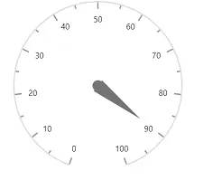
The Circular Gauge supports three types of pointers such as Needle, RangeBar, and Marker. You can choose any pointer using the Type property.
Needle pointer
The circular gauge’s default pointer type will be needle. A needle point contains three parts, a needle, a cap/knob, and a tail.
@using Syncfusion.Blazor.CircularGauge

<SfCircularGauge>
    <CircularGaugeAxes>
        <CircularGaugeAxis>
            <CircularGaugePointers>
                <CircularGaugePointer Value="90">
                </CircularGaugePointer>
            </CircularGaugePointers>
        </CircularGaugeAxis>
    </CircularGaugeAxes>
</SfCircularGauge>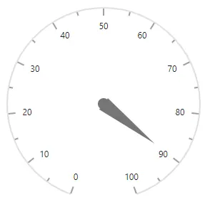
Customization
The needle, tail and cap of the pointer can be customized with the following properties.
-
CircularGaugePointer - Customize the pointer’s needle.
- Radius - sets the needle length.
- PointerWidth - sets the needle width.
- Color - sets the needle color.
-
CircularGaugeNeedleTail - Customize the pointer’s tail.
- Length - sets pointer’s tail length.
- Color - sets pointer’s tail color.
- CircularGaugeNeedleTailBorder - Sets pointer’s tail border.
-
CircularGaugeCap - Customize the pointer’s cap.
- Color - sets pointer’s cap color.
- Radius - sets pointer’s cap radius.
- CircularGaugeCapBorder - sets pointer’s cap border.
- [Position`] - specifies the position of the Pointer. Its possible values are ‘PointerRangePosition.Inside’, ‘PointerRangePosition.Outside’ and ‘PointerRangePosition.Cross’.
@using Syncfusion.Blazor.CircularGauge

<SfCircularGauge Height="250px" Width="250px">
    <CircularGaugeAxes>
        <CircularGaugeAxis>
            <CircularGaugePointers>
                <CircularGaugePointer Value="90"
                                      Radius="40%"
                                      PointerWidth="30"
                                      Color="#007DD1"
                                      Position="PointerRangePosition.Inside">
                    <CircularGaugeCap Radius="15"
                                      Color="white">
                        <CircularGaugeCapBorder Width="4"
                                                Color="#007DD1">
                        </CircularGaugeCapBorder>
                    </CircularGaugeCap>
                    <CircularGaugeNeedleTail Length="35%"
                                             Color="#007DD1">
                    </CircularGaugeNeedleTail>
                </CircularGaugePointer>
            </CircularGaugePointers>
        </CircularGaugeAxis>
    </CircularGaugeAxes>
</SfCircularGauge>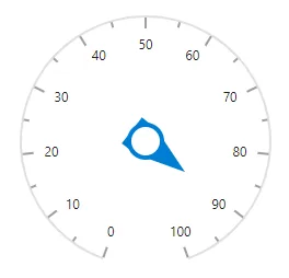
The appearance of the needle pointer can be customized by using NeedleStartWidth and NeedleEndWidth.
@using Syncfusion.Blazor.CircularGauge

<SfCircularGauge>
    <CircularGaugeAxes>
        <CircularGaugeAxis StartAngle="270" EndAngle="90" Radius="90%" Minimum="0" Maximum="100">
		<CircularGaugeAxisLineStyle Width="3" Color="#1E7145">
            </CircularGaugeAxisLineStyle>
			 <CircularGaugeAxisLabelStyle>
                <CircularGaugeAxisLabelFont Color="#1E7145" Size="0px">
                </CircularGaugeAxisLabelFont>
            </CircularGaugeAxisLabelStyle>
			<CircularGaugeAxisMajorTicks Interval="100"
                                         Height="0"
                                         Width="1">
            </CircularGaugeAxisMajorTicks>
            <CircularGaugeAxisMinorTicks Width="0"
                                         Height="0"
                                         >
            </CircularGaugeAxisMinorTicks>
            <CircularGaugePointers>
                <CircularGaugePointer Value="70"
                                      Radius="80%" Color="green" PointerWidth="2" NeedleStartWidth="4" NeedleEndWidth="4">
				 <CircularGaugeCap Radius="8" Color="green">
                    </CircularGaugeCap>
                    <CircularGaugeNeedleTail Length="0%">
                    </CircularGaugeNeedleTail>
                </CircularGaugePointer>
            </CircularGaugePointers>
			<CircularGaugeAnnotations>
                <CircularGaugeAnnotation Angle="180" ZIndex="1">
                    <ContentTemplate>
                        <div class="custom-annotation">Customized Needle</div>
                    </ContentTemplate>
                </CircularGaugeAnnotation>
            </CircularGaugeAnnotations>
        </CircularGaugeAxis>
    </CircularGaugeAxes>
</SfCircularGauge>
<style type="text/css">
    .custom-annotation {
        color: #757575;
        font-family:Roboto; font-size:14px;padding-top: 26px;
    }
</style>Range bar pointer
The range bar pointer is like a range in an axis that can be placed on gauge to mark the pointer value. The range bar starts from the beginning of the gauge and ends at the pointer value. You can set the pointer type using Type property in CircularGaugePointer.
@using Syncfusion.Blazor.CircularGauge

<SfCircularGauge>
    <CircularGaugeAxes>
        <CircularGaugeAxis>
            <CircularGaugePointers>
                <CircularGaugePointer Value="50"
                                      Type="PointerType.RangeBar">
                </CircularGaugePointer>
            </CircularGaugePointers>
        </CircularGaugeAxis>
    </CircularGaugeAxes>
</SfCircularGauge>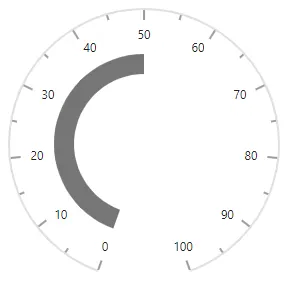
Customization
You can customize the range bar using the following properties.
- PointerWidth - Specifies the width of the range bar.
- Color - Specifies the color of the range bar.
- Radius - Specifies the range bar radius
- RoundedCornerRadius - Specifies the rounded corner of the range bar.
- CircularGaugePointerBorder - Specifies the border of the range bar.
@using Syncfusion.Blazor.CircularGauge

<SfCircularGauge>
    <CircularGaugeAxes>
        <CircularGaugeAxis>
            <CircularGaugePointers>
                <CircularGaugePointer Value="46"
                                      Type="PointerType.RangeBar"
                                      PointerWidth="8"
                                      Radius="95%"
                                      Color="lightgray">
                    <CircularGaugePointerBorder Color="darkgray"
                                                Width="2">
                    </CircularGaugePointerBorder>
                </CircularGaugePointer>
            </CircularGaugePointers>
        </CircularGaugeAxis>
    </CircularGaugeAxes>
</SfCircularGauge>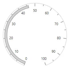
Rounded corners
The start and end pointers of a range bar in the Circular Gauge are rounded to form arc using the RoundedCornerRadius property.
@using Syncfusion.Blazor.CircularGauge

<SfCircularGauge>
    <CircularGaugeAxes>
        <CircularGaugeAxis>
            <CircularGaugePointers>
                <CircularGaugePointer Value="46"
                                      RoundedCornerRadius="20"
                                      Type="PointerType.RangeBar">
                </CircularGaugePointer>
            </CircularGaugePointers>
        </CircularGaugeAxis>
    </CircularGaugeAxes>
</SfCircularGauge>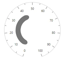
Marker pointer
The different types of marker shapes can be used to mark the pointer value in an axis. You can change the marker shape using the MarkerShape property in pointer. The Circular Gauge supports the following marker shapes:
- Circle
- Rectangle
- Triangle
- InvertedTriangle
- Diamond
@using Syncfusion.Blazor.CircularGauge

<SfCircularGauge>
    <CircularGaugeAxes>
        <CircularGaugeAxis>
            <CircularGaugePointers>
                <CircularGaugePointer Value="90"
                                      Type="PointerType.Marker"
                                      MarkerShape="GaugeShape.Diamond"
                                      MarkerHeight="15"
                                      MarkerWidth="15">
                </CircularGaugePointer>
            </CircularGaugePointers>
        </CircularGaugeAxis>
    </CircularGaugeAxes>
</SfCircularGauge>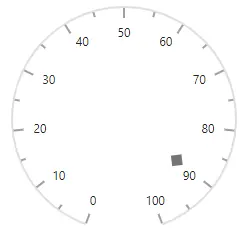
Customization
You can customize the marker pointer using the following properties.
- Color - specifies marker pointer color.
- MarkerWidth - specifies marker pointer width.
- MarkerHeight - specifies marker pointer height.
- Radius - specifies marker pointer radius.
- CircularGaugePointerBorder - specifies marker pointer’s border color and width.
@using Syncfusion.Blazor.CircularGauge

<SfCircularGauge>
    <CircularGaugeAxes>
        <CircularGaugeAxis>
            <CircularGaugePointers>
                <CircularGaugePointer Value="90"
                                      Type="PointerType.Marker"
                                      MarkerShape="GaugeShape.InvertedTriangle"
                                      MarkerHeight="15"
                                      MarkerWidth="15"
                                      Color="white"
                                      Radius="110%">
                    <CircularGaugePointerBorder Width="2" Color="#007DD1"></CircularGaugePointerBorder>
                </CircularGaugePointer>
            </CircularGaugePointers>
        </CircularGaugeAxis>
    </CircularGaugeAxes>
</SfCircularGauge>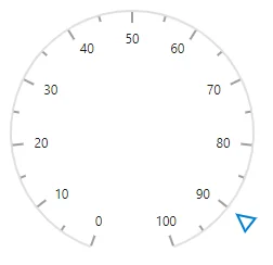
Image marker pointer
You can use image instead of rendering marker shape to denote the pointer value. It can be achieved by setting MarkerShape to ’GaugeShape.Image’ and assigning image path to ImageUrl as shown in following example.
@using Syncfusion.Blazor.CircularGauge

<SfCircularGauge>
    <CircularGaugeAxes>
        <CircularGaugeAxis>
            <CircularGaugePointers>
                <CircularGaugePointer Value="90"
                                      Type="PointerType.Marker"
                                      MarkerShape="GaugeShape.Image"
                                      ImageUrl="football.png"
                                      MarkerHeight="20"
                                      MarkerWidth="20"
                                      Radius="100%">
                </CircularGaugePointer>
            </CircularGaugePointers>
        </CircularGaugeAxis>
    </CircularGaugeAxes>
</SfCircularGauge>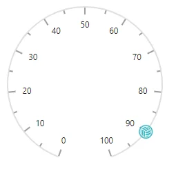
Dragging pointer
The pointers can be dragged over the axis values by clicking and dragging the same. To enable or disable the pointer drag, use the EnablePointerDrag property.
@using Syncfusion.Blazor.CircularGauge

<SfCircularGauge EnablePointerDrag="true" Height="250px" Width="250px">
    <CircularGaugeAxes>
        <CircularGaugeAxis>
            <CircularGaugePointers>
                <CircularGaugePointer Value="50">
                </CircularGaugePointer>
            </CircularGaugePointers>
        </CircularGaugeAxis>
    </CircularGaugeAxes>
</SfCircularGauge>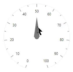
Multiple pointers
In addition to the default pointer, you can add n number of pointers to an axis using the CircularGaugePointers tag.
@using Syncfusion.Blazor.CircularGauge

<SfCircularGauge>
    <CircularGaugeAxes>
        <CircularGaugeAxis>
            <CircularGaugePointers>
                <CircularGaugePointer Value="90"
                                      MarkerShape="GaugeShape.InvertedTriangle"
                                      Radius="100%"
                                      MarkerHeight="15"
                                      MarkerWidth="15">
                </CircularGaugePointer>
                <CircularGaugePointer Value="90"
                                      Type="PointerType.RangeBar"
                                      Radius="60%"
                                      MarkerWidth="10">
                </CircularGaugePointer>
                <CircularGaugePointer Value="90"
                                      Radius="50%"
                                      PointerWidth="25"
                                      Color="#007DD1">
                    <CircularGaugeCap Radius="15">
                        <CircularGaugeCapBorder Width="5">
                        </CircularGaugeCapBorder>
                    </CircularGaugeCap>
                    <CircularGaugeNeedleTail Length="25%">
                    </CircularGaugeNeedleTail>
                </CircularGaugePointer>
            </CircularGaugePointers>
        </CircularGaugeAxis>
    </CircularGaugeAxes>
</SfCircularGauge>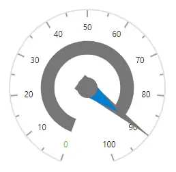
Pointer animation
The pointers are animated on loading the gauge using the CircularGaugePointerAnimation tag in pointer. The Enable property in animation allows you to enable or disable the animation. The Duration property specifies the duration of the animation in milliseconds.
@using Syncfusion.Blazor.CircularGauge

<SfCircularGauge Height="250px" Width="250px">
    <CircularGaugeAxes>
        <CircularGaugeAxis>
            <CircularGaugePointers>
                <CircularGaugePointer Value="70">
                    <CircularGaugePointerAnimation Enable="true" Duration="1500">
                    </CircularGaugePointerAnimation>
                </CircularGaugePointer>
            </CircularGaugePointers>
        </CircularGaugeAxis>
    </CircularGaugeAxes>
</SfCircularGauge>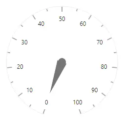
Gradient color
Gradient support allows to add multiple colors in the ranges and pointers of the circular gauge. The following gradient types are supported in the circular gauge.
- Linear Gradient
- Radial Gradient
Linear gradient
Using linear gradient, colors will be applied in a linear progression. The start value of the linear gradient can be set using the StartValue property. The end value of the linear gradient will be set using the EndValue property. The color stop values such as color, opacity and offset are set using ColorStop property.
The linear gradient can be applied to all pointer types like marker, range bar, and needle. To do so, follow the below code sample.
@using Syncfusion.Blazor.CircularGauge

<SfCircularGauge>
    <CircularGaugeAxes>
        <CircularGaugeAxis StartAngle="270" EndAngle="90" Radius="90%" Minimum="0" Maximum="100">
            <CircularGaugeAxisLineStyle Width="3" Color="#E63B86" />
            <CircularGaugeAxisLabelStyle>
                <CircularGaugeAxisLabelFont Size="0px" />
            </CircularGaugeAxisLabelStyle>
            <CircularGaugeAxisMajorTicks Height="0.01" />
            <CircularGaugeAxisMinorTicks Height="0.01" />
            <CircularGaugePointers>
                <CircularGaugePointer Value="80" Radius="80%" PointerWidth="10">
                    <LinearGradient StartValue="1%" EndValue="99%">
                        <ColorStops>
                            <ColorStop Opacity="0.9" Offset="0%" Color="#fef3f9"></ColorStop>
                            <ColorStop Opacity="0.9" Offset="100%" Color="#f54ea2"></ColorStop>
                        </ColorStops>
                    </LinearGradient>
                    <CircularGaugeCap Radius="8" Color="White">
                        <CircularGaugeCapBorder Color="#E63B86" Width="1" />
                    </CircularGaugeCap>
                    <CircularGaugeNeedleTail Length="20%">
                        <LinearGradient StartValue="1%" EndValue="99%">
                            <ColorStops>
                                <ColorStop Opacity="0.9" Offset="0%" Color="#fef3f9"></ColorStop>
                                <ColorStop Opacity="0.9" Offset="100%" Color="#f54ea2"></ColorStop>
                            </ColorStops>
                        </LinearGradient>
                        </CircularGaugeNeedleTail>
                        <CircularGaugePointerAnimation Enable="true" Duration="1000" />
                </CircularGaugePointer>
                <CircularGaugePointer Value="40" Radius="60%" MarkerWidth="5" MarkerHeight="5" PointerWidth="10">
                    <LinearGradient StartValue="1%" EndValue="99%">
                        <ColorStops>
                            <ColorStop Opacity="0.9" Offset="0%" Color="#fef3f9"></ColorStop>
                            <ColorStop Opacity="0.9" Offset="100%" Color="#f54ea2"></ColorStop>
                        </ColorStops>
                    </LinearGradient>
                    <CircularGaugeCap Radius="8" Color="White">
                        <CircularGaugeCapBorder Color="#E63B86" Width="1" />
                    </CircularGaugeCap>
                    <CircularGaugeNeedleTail Length="20%">
                        <LinearGradient StartValue="1%" EndValue="99%">
                            <ColorStops>
                                <ColorStop Opacity="0.9" Offset="0%" Color="#fef3f9"></ColorStop>
                                <ColorStop Opacity="0.9" Offset="100%" Color="#f54ea2"></ColorStop>
                            </ColorStops>
                        </LinearGradient>
                    </CircularGaugeNeedleTail>
                    <CircularGaugePointerAnimation Enable="true" Duration="1000" />
                </CircularGaugePointer>
            </CircularGaugePointers>
        </CircularGaugeAxis>
    </CircularGaugeAxes>
</SfCircularGauge>Radial gradient
Using radial gradient, colors will be applied in circular progression. The inner circle position of the radial gradient will be set using the InnerPosition property. The outer circle position of the radial gradient can be set using the OuterPosition property. The color stop values such as color, opacity and offset are set using ColorStop property.
The radial gradient can be applied to all pointer types like marker, range bar, and needle. To do so, follow the below code sample.
@using Syncfusion.Blazor.CircularGauge

<SfCircularGauge>
    <CircularGaugeAxes>
        <CircularGaugeAxis StartAngle="270" EndAngle="90" Radius="90%" Minimum="0" Maximum="100">
            <CircularGaugeAxisLineStyle Width="3" Color="#E63B86" />
            <CircularGaugeAxisLabelStyle>
                <CircularGaugeAxisLabelFont Size="0px" />
            </CircularGaugeAxisLabelStyle>
            <CircularGaugeAxisMajorTicks Height="0.01" />
            <CircularGaugeAxisMinorTicks Height="0.01" />
            <CircularGaugePointers>
                <CircularGaugePointer Value="80" Radius="80%" PointerWidth="10">
                    <RadialGradient Radius="65%">
                        <InnerPosition X="60%" Y="60%"></InnerPosition>
                        <OuterPosition X="50%" Y="70%"></OuterPosition>
                        <ColorStops>
                            <ColorStop Opacity="0.9" Offset="5%" Color="#fff5f5"></ColorStop>
                            <ColorStop Opacity="0.9" Offset="99%" Color="#f54ea2"></ColorStop>
                        </ColorStops>
                    </RadialGradient>
                    <CircularGaugeCap Radius="8" Color="White">
                        <CircularGaugeCapBorder Color="#E63B86" Width="1" />
                    </CircularGaugeCap>
                    <CircularGaugeNeedleTail Length="20%">
                        <RadialGradient Radius="65%">
                            <InnerPosition X="60%" Y="60%"></InnerPosition>
                            <OuterPosition X="50%" Y="70%"></OuterPosition>
                            <ColorStops>
                                <ColorStop Opacity="0.9" Offset="5%" Color="#fff5f5"></ColorStop>
                                <ColorStop Opacity="0.9" Offset="99%" Color="#f54ea2"></ColorStop>
                            </ColorStops>
                        </RadialGradient>
                        </CircularGaugeNeedleTail>
                        <CircularGaugePointerAnimation Enable="true" Duration="1000" />
                </CircularGaugePointer>
                <CircularGaugePointer Value="40" Radius="60%" MarkerWidth="5" MarkerHeight="5" PointerWidth="10">
                    <RadialGradient Radius="65%">
                        <InnerPosition X="60%" Y="60%"></InnerPosition>
                        <OuterPosition X="50%" Y="70%"></OuterPosition>
                        <ColorStops>
                            <ColorStop Opacity="0.9" Offset="5%" Color="#fff5f5"></ColorStop>
                            <ColorStop Opacity="0.9" Offset="99%" Color="#f54ea2"></ColorStop>
                        </ColorStops>
                    </RadialGradient>
                    <CircularGaugeCap Radius="8" Color="White">
                        <CircularGaugeCapBorder Color="#E63B86" Width="1" />
                    </CircularGaugeCap>
                    <CircularGaugeNeedleTail Length="20%">
                        <RadialGradient Radius="65%">
                            <InnerPosition X="60%" Y="60%"></InnerPosition>
                            <OuterPosition X="50%" Y="70%"></OuterPosition>
                            <ColorStops>
                                <ColorStop Opacity="0.9" Offset="5%" Color="#fff5f5"></ColorStop>
                                <ColorStop Opacity="0.9" Offset="99%" Color="#f54ea2"></ColorStop>
                            </ColorStops>
                        </RadialGradient>
                        </CircularGaugeNeedleTail>
                        <CircularGaugePointerAnimation Enable="true" Duration="1000" />
                </CircularGaugePointer>
            </CircularGaugePointers>
        </CircularGaugeAxis>
    </CircularGaugeAxes>
</SfCircularGauge>