Ranges in Blazor Circular Gauge Component
17 Jul 202624 minutes to read
You can categorize certain interval on Circular Gauge axis using the CircularGaugeRanges tag.
Range start and end
The start and end values of a range in an axis can be customized using the Start and End properties.
@using Syncfusion.Blazor.CircularGauge

<SfCircularGauge>
    <CircularGaugeAxes>
        <CircularGaugeAxis>
        <CircularGaugePointers><CircularGaugePointer Value="0"></CircularGaugePointer></CircularGaugePointers>
            <CircularGaugeRanges>
                <CircularGaugeRange Start="40" End="80">
                </CircularGaugeRange>
            </CircularGaugeRanges>
        </CircularGaugeAxis>
    </CircularGaugeAxes>
</SfCircularGauge>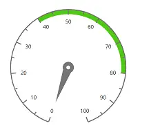
Start width and end width
Using StartWidth and EndWidth properties, you can customize the start width and end width of the range.
@using Syncfusion.Blazor.CircularGauge

<SfCircularGauge>
    <CircularGaugeAxes>
        <CircularGaugeAxis>
        <CircularGaugePointers>
                <CircularGaugePointer Value="0"></CircularGaugePointer>
            </CircularGaugePointers>
            <CircularGaugeRanges>
                <CircularGaugeRange Start="40"
                                    End="80"
                                    StartWidth="2"
                                    EndWidth="20">
                </CircularGaugeRange>
            </CircularGaugeRanges>
        </CircularGaugeAxis>
    </CircularGaugeAxes>
</SfCircularGauge>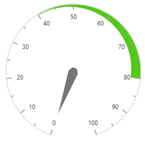
Changing color
The color of a range can be customized using the Color and Opacity properties.
@using Syncfusion.Blazor.CircularGauge

<SfCircularGauge>
    <CircularGaugeAxes>
        <CircularGaugeAxis>
         <CircularGaugePointers>
                <CircularGaugePointer Value="0"></CircularGaugePointer>
            </CircularGaugePointers>
            <CircularGaugeRanges>
                <CircularGaugeRange Start="40"
                                    End="80"
                                    StartWidth="2"
                                    EndWidth="20"
                                    Color="blue"
                                    Opacity="0.2">
                </CircularGaugeRange>
            </CircularGaugeRanges>
        </CircularGaugeAxis>
    </CircularGaugeAxes>
</SfCircularGauge>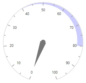
Range position
The ranges can be placed either inside, outside or center of the axis using the [Position`] property in CircularGaugeRange. Its possible values are ‘PointerRangePosition.Inside’, ‘PointerRangePosition.Outside’ and ‘PointerRangePosition.Cross’.
@using Syncfusion.Blazor.CircularGauge

<SfCircularGauge>
    <CircularGaugeAxes>
        <CircularGaugeAxis>
        <CircularGaugePointers>
                <CircularGaugePointer Value="0"></CircularGaugePointer>
            </CircularGaugePointers>
            <CircularGaugeRanges>
                <CircularGaugeRange Start="40" End="80" StartWidth="15" EndWidth="15" Color="#ff5985" Position="PointerRangePosition.Cross">
                </CircularGaugeRange>
            </CircularGaugeRanges>
        </CircularGaugeAxis>
    </CircularGaugeAxes>
</SfCircularGauge>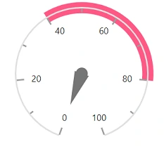
Rounded corners
You can customize the corner radius using the RoundedCornerRadius property in CircularGaugeRange.
@using Syncfusion.Blazor.CircularGauge

<SfCircularGauge>
    <CircularGaugeAxes>
        <CircularGaugeAxis>
         <CircularGaugePointers>
                <CircularGaugePointer Value="0"></CircularGaugePointer>
            </CircularGaugePointers>
            <CircularGaugeRanges>
                <CircularGaugeRange Start="40" End="80" RoundedCornerRadius="5">
                </CircularGaugeRange>
            </CircularGaugeRanges>
        </CircularGaugeAxis>
    </CircularGaugeAxes>
</SfCircularGauge>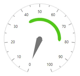
Radius
You can place a range inside or outside the axis using the Radius property. The radius of a range takes value either in percentage or in pixels. By default, a range take 100% of the axis radius.
In pixel
You can set a radius of the range in pixel as demonstrated below.
@using Syncfusion.Blazor.CircularGauge

<SfCircularGauge>
    <CircularGaugeAxes>
        <CircularGaugeAxis>
            <CircularGaugeRanges>
                <CircularGaugeRange Start="40" End="80" Radius="100px">
                </CircularGaugeRange>
            </CircularGaugeRanges>
        </CircularGaugeAxis>
    </CircularGaugeAxes>
</SfCircularGauge>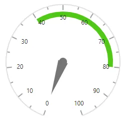
In percentage
By setting value in percentage, a range gets its dimension with respect to its axis radius. For example, when the radius is ‘50%’,the range is rendered to half of the axis radius.
@using Syncfusion.Blazor.CircularGauge

<SfCircularGauge>
    <CircularGaugeAxes>
        <CircularGaugeAxis>
        <CircularGaugePointers>
                <CircularGaugePointer Value="0"></CircularGaugePointer>
            </CircularGaugePointers>
            <CircularGaugeRanges>
                <CircularGaugeRange Start="40" End="80" Radius="50%">
                </CircularGaugeRange>
            </CircularGaugeRanges>
        </CircularGaugeAxis>
    </CircularGaugeAxes>
</SfCircularGauge>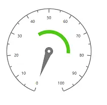
Dragging ranges
The ranges can be dragged over the axis line by clicking and dragging the same. To enable or disable the range drag, use the EnableRangeDrag property.
@using Syncfusion.Blazor.CircularGauge

<SfCircularGauge EnableRangeDrag="true" Height="250px" Width="250px">
    <CircularGaugeAxes>
        <CircularGaugeAxis>
            <CircularGaugePointers>
                <CircularGaugePointer Value="50">
                </CircularGaugePointer>
            </CircularGaugePointers>
			<CircularGaugeRanges>
                <CircularGaugeRange Start="0" End="100" Radius="108%" Color="#30B32D" StartWidth="8" EndWidth="8">
                </CircularGaugeRange>
			</CircularGaugeRanges>
        </CircularGaugeAxis>
    </CircularGaugeAxes>
</SfCircularGauge>Multiple ranges
You can add multiple ranges to an axis with the above customization as demonstrated below.
You can set the range color to ticks and labels of an axis by enabling the UseRangeColor property in CircularGaugeAxisMajorTicks, CircularGaugeAxisMinorTicks and CircularGaugeAxisLabelStyle tags.
@using Syncfusion.Blazor.CircularGauge

<SfCircularGauge>
    <CircularGaugeAxes>
        <CircularGaugeAxis>
        <CircularGaugePointers>
                <CircularGaugePointer Value="0"></CircularGaugePointer>
            </CircularGaugePointers>
            <CircularGaugeRanges>
                <CircularGaugeRange Start="0" End="25" Radius="108%">
                </CircularGaugeRange>
                <CircularGaugeRange Start="25" End="50" Radius="70%">
                </CircularGaugeRange>
                <CircularGaugeRange Start="50" End="75" Radius="70%">
                </CircularGaugeRange>
                <CircularGaugeRange Start="75" End="100" Radius="108%">
                </CircularGaugeRange>
            </CircularGaugeRanges>
            <CircularGaugeAxisLabelStyle UseRangeColor="true">
            </CircularGaugeAxisLabelStyle>
            <CircularGaugeAxisMinorTicks UseRangeColor="true"></CircularGaugeAxisMinorTicks>
        </CircularGaugeAxis>
    </CircularGaugeAxes>
</SfCircularGauge>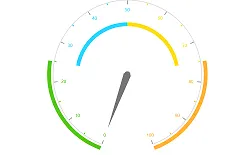
Gradient color
Gradient support allows to add multiple colors in the range and pointer of the circular gauge. The following gradient types are supported in the circular gauge.
- Linear Gradient
- Radial Gradient
Linear gradient
Using linear gradient, colors will be applied in a linear progression. The start value of the linear gradient can be set using the StartValue property. The end value of the linear gradient will be set using the EndValue property. The color stop values such as color, opacity and offset are set using ColorStop property.
To apply linear gradient to the range, follow the below code sample.
@using Syncfusion.Blazor.CircularGauge

<SfCircularGauge CenterY="57%" Title="Shot Put Distance">
    <CircularGaugeAxes>
        <CircularGaugeAxis StartAngle="200" EndAngle="130" Minimum="0" Maximum="14" Radius="80%">
            <CircularGaugeAxisLineStyle Width="0.001" />
            <CircularGaugeAxisMajorTicks Width="0.01" />
            <CircularGaugeAxisMinorTicks Width="0.01" />
            <CircularGaugeAxisLabelStyle>
                <CircularGaugeAxisLabelFont Size="0px" />
            </CircularGaugeAxisLabelStyle>
            <CircularGaugePointers>
                <CircularGaugePointer Type="PointerType.Marker" Value="12" MarkerShape="GaugeShape.Image"
                ImageUrl="https://blazor.syncfusion.com/demos/_content/blazor_server_common_net8/images/circular-gauge/football.png" Radius="100%" MarkerWidth="28" MarkerHeight="28">
                      <CircularGaugePointerAnimation Enable="true" Duration="1500" />
                </CircularGaugePointer>
                <CircularGaugePointer Type="PointerType.Marker" Value="11" MarkerShape="GaugeShape.Image"
                ImageUrl="https://blazor.syncfusion.com/demos/_content/blazor_server_common_net8/images/circular-gauge/basketball.png" Radius="70%" MarkerWidth="28" MarkerHeight="28">
                     <CircularGaugePointerAnimation Enable="true" Duration="1200" />
                </CircularGaugePointer>
                <CircularGaugePointer Type="PointerType.Marker" Value="10" MarkerShape="GaugeShape.Image"
                ImageUrl="https://blazor.syncfusion.com/demos/_content/blazor_server_common_net8/images/circular-gauge/golf-ball.png" Radius="40%" MarkerWidth="28" MarkerHeight="28">
                    <CircularGaugePointerAnimation Enable="true" Duration="900" />
               </CircularGaugePointer>
               <CircularGaugePointer Type="PointerType.Marker" Value="12" MarkerShape="GaugeShape.Image"
                ImageUrl="https://blazor.syncfusion.com/demos/_content/blazor_server_common_net8/images/circular-gauge/athletics.png" Radius="0%" MarkerWidth="90" MarkerHeight="90">
                   <CircularGaugePointerAnimation Enable="true" Duration="0" />
               </CircularGaugePointer>
               <CircularGaugePointer Type="PointerType.Marker" Value="0" MarkerShape="GaugeShape.Image"
                ImageUrl="https://blazor.syncfusion.com/demos/_content/blazor_server_common_net8/images/circular-gauge/girl1.png" Radius="100%" MarkerWidth="28" MarkerHeight="28">
                   <CircularGaugePointerAnimation Enable="true" Duration="1500" />
                </CircularGaugePointer>
                <CircularGaugePointer Type="PointerType.Marker" Value="0" MarkerShape="GaugeShape.Image"
                ImageUrl="https://blazor.syncfusion.com/demos/_content/blazor_server_common_net8/images/circular-gauge/man1.png" Radius="70%" MarkerWidth="28" MarkerHeight="28">
                   <CircularGaugePointerAnimation Enable="true" Duration="1500" />
               </CircularGaugePointer>
               <CircularGaugePointer Type="PointerType.Marker" Value="0" MarkerShape="GaugeShape.Image"
                ImageUrl="https://blazor.syncfusion.com/demos/_content/blazor_server_common_net8/images/circular-gauge/man2.png" Radius="40%" MarkerWidth="28" MarkerHeight="28">
                    <CircularGaugePointerAnimation Enable="true" Duration="1500" />
               </CircularGaugePointer>
            </CircularGaugePointers>
            <CircularGaugeRanges>
                <CircularGaugeRange Start="0" End="12" Radius="105%" Color="#01aebe" StartWidth="25" EndWidth="25">
                    <LinearGradient StartValue="1%" EndValue="99%">
                        <ColorStops>
                            <ColorStop Opacity="0.9" Offset="0%" Color="#fef3f9"></ColorStop>
                            <ColorStop Opacity="0.9" Offset="100%" Color="#f54ea2"></ColorStop>
                        </ColorStops>
                    </LinearGradient>
                    </CircularGaugeRange>
                <CircularGaugeRange Start="0" End="11" Radius="75%" Color="#3bceac" StartWidth="25" EndWidth="25">
                    <LinearGradient StartValue="1%" EndValue="99%">
                        <ColorStops>
                            <ColorStop Opacity="0.9" Offset="0%" Color="#fef3f9"></ColorStop>
                            <ColorStop Opacity="0.9" Offset="100%" Color="#f54ea2"></ColorStop>
                        </ColorStops>
                    </LinearGradient>
                </CircularGaugeRange>
                <CircularGaugeRange Start="0" End="10" Radius="45%" Color="#ee4266" StartWidth="25" EndWidth="25">
                    <LinearGradient StartValue="1%" EndValue="99%">
                        <ColorStops>
                            <ColorStop Opacity="0.9" Offset="0%" Color="#fef3f9"></ColorStop>
                            <ColorStop Opacity="0.9" Offset="100%" Color="#f54ea2"></ColorStop>
                        </ColorStops>
                    </LinearGradient>
                </CircularGaugeRange>
              </CircularGaugeRanges>
            <CircularGaugeAnnotations>
                <CircularGaugeAnnotation Content="12 M" Radius="100%" Angle="97" ZIndex="1" />
                <CircularGaugeAnnotation Content="11 M" Radius="72%" Angle="80" ZIndex="1" />
                <CircularGaugeAnnotation Content="10 M" Radius="40%" Angle="68" ZIndex="1" />
                <CircularGaugeAnnotation Radius="108%" Angle="185" ZIndex="1">
                    <ContentTemplate>
                        <div class="annotationText"><span class="templateAlign">Doe</span></div>
                    </ContentTemplate>
                </CircularGaugeAnnotation>
                <CircularGaugeAnnotation Radius="80%" Angle="175" ZIndex="1">
                    <ContentTemplate>
                        <div class="annotationText"><span class="templateAlign">Almaida</span></div>
                    </ContentTemplate>
                </CircularGaugeAnnotation>
                <CircularGaugeAnnotation Radius="50%" Angle="168" ZIndex="1">
                    <ContentTemplate>
                        <div class="annotationText"><span class="templateAlign">John</span></div>
                    </ContentTemplate>
                </CircularGaugeAnnotation>
            </CircularGaugeAnnotations>
        </CircularGaugeAxis>
    </CircularGaugeAxes>
</SfCircularGauge>

<style>
    .templateAlign {
        font-size: 14px;
        color: #9E9E9E;
        font-family: Regular;
        margin-left: -20px;
    }
    .annotationText {
        margin-top: -30px;
    }
</style>
Radial gradient
Using radial gradient, colors will be applied in circular progression. The inner circle position of the radial gradient will be set using the InnerPosition property. The outer circle position of the radial gradient can be set using the OuterPosition property. The color stop values such as color, opacity and offset are set using ColorStop property.
To apply radial gradient to the range, follow the below code sample.
@using Syncfusion.Blazor.CircularGauge

<SfCircularGauge CenterY="57%" Title="Shot Put Distance">
    <CircularGaugeAxes>
        <CircularGaugeAxis StartAngle="200" EndAngle="130" Minimum="0" Maximum="14" Radius="80%">
            <CircularGaugeAxisLineStyle Width="0.001" />
            <CircularGaugeAxisMajorTicks Width="0.01" />
            <CircularGaugeAxisMinorTicks Width="0.01" />
            <CircularGaugeAxisLabelStyle>
                <CircularGaugeAxisLabelFont Size="0px" />
            </CircularGaugeAxisLabelStyle>
            <CircularGaugePointers>
                <CircularGaugePointer Type="PointerType.Marker" Value="12" MarkerShape="GaugeShape.Image" ImageUrl="https://blazor.syncfusion.com/demos/_content/blazor_server_common_net8/images/circular-gauge/football.png" Radius="100%" MarkerWidth="28" MarkerHeight="28">
                    <CircularGaugePointerAnimation Enable="true" Duration="1500" />
                </CircularGaugePointer>
                <CircularGaugePointer Type="PointerType.Marker" Value="11" MarkerShape="GaugeShape.Image" ImageUrl="https://blazor.syncfusion.com/demos/_content/blazor_server_common_net8/images/circular-gauge/basketball.png" Radius="70%" MarkerWidth="28" MarkerHeight="28">
                    <CircularGaugePointerAnimation Enable="true" Duration="1200" />
                </CircularGaugePointer>
                <CircularGaugePointer Type="PointerType.Marker" Value="10" MarkerShape="GaugeShape.Image" ImageUrl="https://blazor.syncfusion.com/demos/_content/blazor_server_common_net8/images/circular-gauge/golfball.png" Radius="40%" MarkerWidth="28" MarkerHeight="28">
                    <CircularGaugePointerAnimation Enable="true" Duration="900" />
                </CircularGaugePointer>
                <CircularGaugePointer Type="PointerType.Marker" Value="12" MarkerShape="GaugeShape.Image" ImageUrl="https://blazor.syncfusion.com/demos/_content/blazor_server_common_net8/images/circular-gauge/athletics.png" Radius="0%" MarkerWidth="90" MarkerHeight="90">
                    <CircularGaugePointerAnimation Enable="true" Duration="0" />
                </CircularGaugePointer>
                <CircularGaugePointer Type="PointerType.Marker" Value="0" MarkerShape="GaugeShape.Image" ImageUrl="https://blazor.syncfusion.com/demos/_content/blazor_server_common_net8/images/circular-gauge/girl1.png" Radius="100%" MarkerWidth="28" MarkerHeight="28">
                    <CircularGaugePointerAnimation Enable="true" Duration="1500" />
                </CircularGaugePointer>
                <CircularGaugePointer Type="PointerType.Marker" Value="0" MarkerShape="GaugeShape.Image" ImageUrl="https://blazor.syncfusion.com/demos/_content/blazor_server_common_net8/images/circular-gauge/man1.png" Radius="70%" MarkerWidth="28" MarkerHeight="28">
                    <CircularGaugePointerAnimation Enable="true" Duration="1500" />
                </CircularGaugePointer>
                <CircularGaugePointer Type="PointerType.Marker" Value="0" MarkerShape="GaugeShape.Image" ImageUrl="https://blazor.syncfusion.com/demos/_content/blazor_server_common_net8/images/circular-gauge/man2.png" Radius="40%" MarkerWidth="28" MarkerHeight="28">
                    <CircularGaugePointerAnimation Enable="true" Duration="1500" />
                </CircularGaugePointer>
            </CircularGaugePointers>
            <CircularGaugeRanges>
                <CircularGaugeRange Start="0" End="12" Radius="105%" Color="#01aebe" StartWidth="25" EndWidth="25">
                    <RadialGradient Radius="65%">
                        <InnerPosition X="60%" Y="60%"></InnerPosition>
                        <OuterPosition X="50%" Y="70%"></OuterPosition>
                        <ColorStops>
                            <ColorStop Opacity="0.9" Offset="5%" Color="#fff5f5"></ColorStop>
                            <ColorStop Opacity="0.9" Offset="99%" Color="#f54ea2"></ColorStop>
                        </ColorStops>
                    </RadialGradient>
                    </CircularGaugeRange>
                <CircularGaugeRange Start="0" End="11" Radius="75%" Color="#3bceac" StartWidth="25" EndWidth="25">
                    <RadialGradient Radius="65%">
                        <InnerPosition X="60%" Y="60%"></InnerPosition>
                        <OuterPosition X="50%" Y="70%"></OuterPosition>
                        <ColorStops>
                            <ColorStop Opacity="0.9" Offset="5%" Color="#fff5f5"></ColorStop>
                            <ColorStop Opacity="0.9" Offset="99%" Color="#f54ea2"></ColorStop>
                        </ColorStops>
                    </RadialGradient>
                </CircularGaugeRange>
                <CircularGaugeRange Start="0" End="10" Radius="45%" Color="#ee4266" StartWidth="25" EndWidth="25">
                    <RadialGradient Radius="65%">
                        <InnerPosition X="60%" Y="60%"></InnerPosition>
                        <OuterPosition X="50%" Y="70%"></OuterPosition>
                        <ColorStops>
                            <ColorStop Opacity="0.9" Offset="5%" Color="#fff5f5"></ColorStop>
                            <ColorStop Opacity="0.9" Offset="99%" Color="#f54ea2"></ColorStop>
                        </ColorStops>
                    </RadialGradient>
                </CircularGaugeRange>
            </CircularGaugeRanges>
            <CircularGaugeAnnotations>
                <CircularGaugeAnnotation Content="12 M" Radius="100%" Angle="97" ZIndex="1" />
                <CircularGaugeAnnotation Content="11 M" Radius="72%" Angle="80" ZIndex="1" />
                <CircularGaugeAnnotation Content="10 M" Radius="40%" Angle="68" ZIndex="1" />
                <CircularGaugeAnnotation Radius="108%" Angle="185" ZIndex="1">
                    <ContentTemplate>
                        <div class="annotationText"><span class="templateAlign">Doe</span></div>
                    </ContentTemplate>
                </CircularGaugeAnnotation>
                <CircularGaugeAnnotation Radius="80%" Angle="175" ZIndex="1">
                    <ContentTemplate>
                        <div class="annotationText"><span class="templateAlign">Almaida</span></div>
                    </ContentTemplate>
                </CircularGaugeAnnotation>
                <CircularGaugeAnnotation Radius="50%" Angle="168" ZIndex="1">
                    <ContentTemplate>
                        <div class="annotationText"><span class="templateAlign">John</span></div>
                    </ContentTemplate>
                </CircularGaugeAnnotation>
            </CircularGaugeAnnotations>
        </CircularGaugeAxis>
    </CircularGaugeAxes>
</SfCircularGauge>

<style>
    .templateAlign {
        font-size: 14px;
        color: #9E9E9E;
        font-family: Regular;
        margin-left: -20px;
    }
    .annotationText {
        margin-top: -30px;
    }
</style>