Property Customizations in Blazor Color Picker
27 Aug 20263 minutes to read
Inline rendering in Blazor Color Picker Component
By default, the Blazor Color Picker renders with a button that opens a popup to access the selector. To display the Blazor Color Picker directly on the page (without a popup), render it inline by setting the Inline property to true.
The following sample shows inline rendering of the Blazor Color Picker.
@using Syncfusion.Blazor.Inputs

<h4>Choose a color</h4>
<SfColorPicker Value="035a" Inline="true" ShowButtons="false"></SfColorPicker>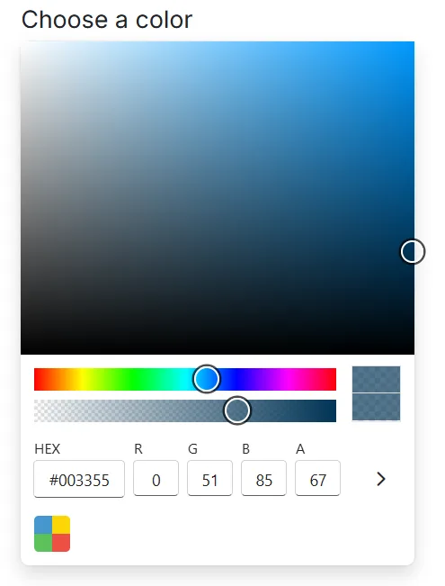
The ShowButtons property is disabled in this sample because control buttons are not needed for inline rendering.
RTL in Blazor Color Picker Component
The Blazor Color Picker supports right-to-left (RTL) layout to improve usability for languages such as Arabic, Farsi, and Urdu. Enable RTL by setting the EnableRtl property to true. RTL affects layout direction but does not translate text; use localization to provide translated strings.
In the following example, the Blazor Color Picker is rendered in RTL mode with an Arabic locale configured at the app level.
@using Syncfusion.Blazor.Inputs

<SfColorPicker EnableRtl="true"></SfColorPicker>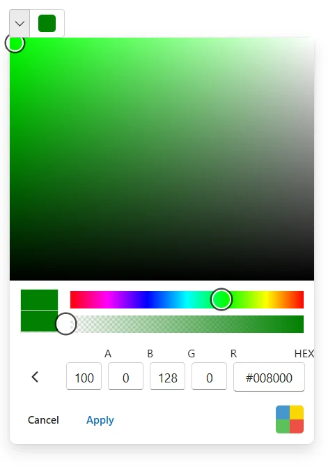
Show palette at initial load
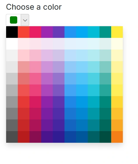
By default, the Picker view is shown initially. To display the palette view when opening the Blazor Color Picker popup, set the Mode property to ColorPickerMode.Palette.
In the following example, the palette is displayed at initial load.
@using Syncfusion.Blazor.Inputs

<h4>Choose a color</h4>
<SfColorPicker Mode="ColorPickerMode.Palette"></SfColorPicker>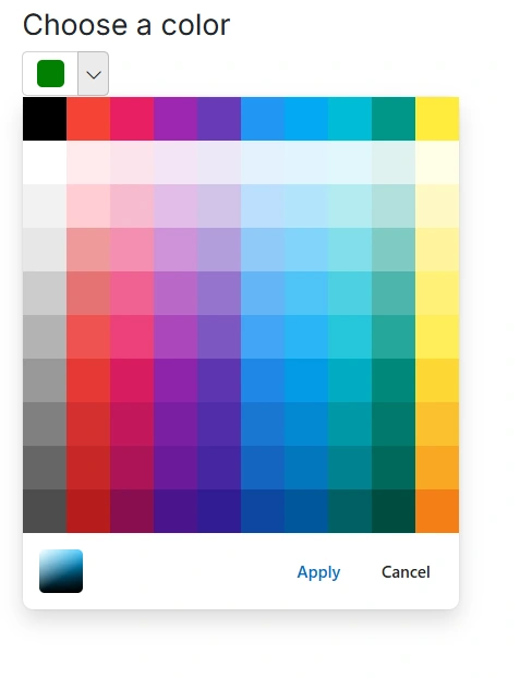
Color value in Blazor Color Picker Component
The Value property can be used to specify the color value to the Blazor Color Picker. It supports either three or six digit hex codes. To include opacity, set the color value as four or eight digit hex code.
In the following example, a 4-digit hex value is used, where the last digit represents the opacity.
@using Syncfusion.Blazor.Inputs

<h4>Choose a color</h4>
<SfColorPicker Value="035a" ModeSwitcher="false"></SfColorPicker>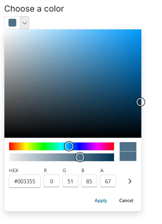
The Value property supports hex codes with or without the
#prefix.
Disable the Blazor Color Picker Component
Set the Disabled property to true to disable the Blazor Color Picker. In the disabled state, the input and popup cannot receive focus or user interaction, and the ValueChange event does not fire.
The following example shows the disabled state of the Blazor Color Picker component.
@using Syncfusion.Blazor.Inputs

<h4>Choose a color</h4>
<SfColorPicker Disabled="true"></SfColorPicker>
Hide control buttons in Blazor Color Picker Component
Render the Blazor Color Picker without control buttons (Apply and Cancel) by setting the ShowButtons property to false.
@using Syncfusion.Blazor.Inputs

<h4>Choose a color</h4>
<SfColorPicker ShowButtons="false"></SfColorPicker>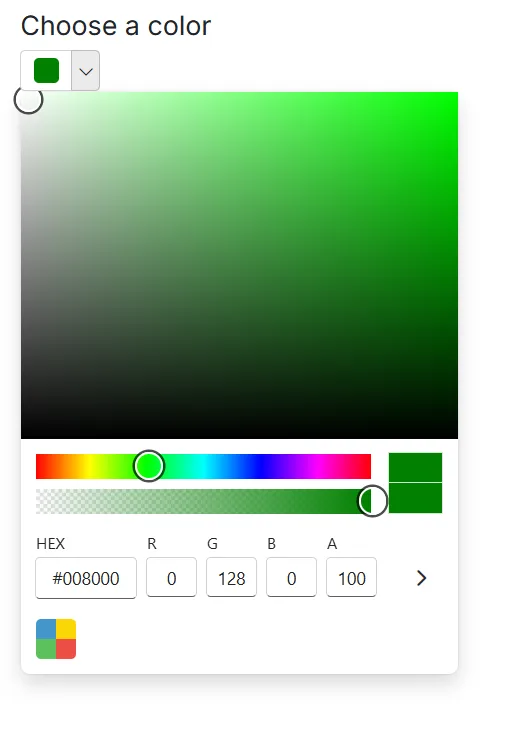
Show recent colors in Blazor Color Picker Component
The ShowRecentColors property displays recently selected colors in the Blazor Color Picker when using palette mode. This feature helps users quickly reuse frequently chosen colors.
The ShowRecentColors feature shows up to 10 recent colors as tiles and is available only in palette mode. Recent colors are stored for the current browser session and are cleared when the page is reloaded.
In the following sample, the ShowRecentColors property is enabled alongside palette mode to display recent colors in the palette area.
@using Syncfusion.Blazor.Inputs

<h4>Choose a color</h4>
<SfColorPicker Mode="ColorPickerMode.Palette" ShowRecentColors="true"></SfColorPicker>