How can I help you?
Placeholder and Float Label in ComboBox
24 Feb 20263 minutes to read
Placeholder
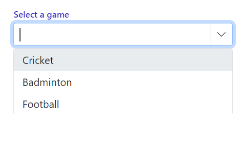
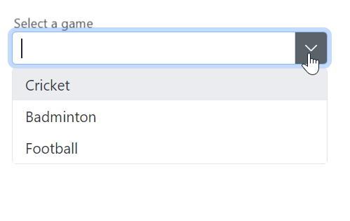
Use the Placeholder property to display a hint describing the expected value in the input. In the following example, “Select a game” is set as the placeholder, which applies the corresponding attribute to the input element in the DOM.
@using Syncfusion.Blazor.DropDowns;
<SfComboBox TValue="string" TItem="string" Placeholder="Select a game" DataSource="@data" Width="300px"></SfComboBox>

@code{
    List<string> data = new List<string>() { "Cricket", "Badminton","Football" };
}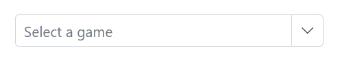
Color of the placeholder text
Change the color of the placeholder by targeting its CSS class input.e-input::placeholder, which indicates the placeholder text, and set the desired color using the color property.
@using Syncfusion.Blazor.DropDowns

<SfComboBox TValue="string" TItem="string" Placeholder="Select a game" DataSource="@data" Width="300px"></SfComboBox>

@code{
    List<string> data = new List<string>() { "Cricket", "Badminton","Football" };
}
<style>
    .e-ddl.e-input-group input.e-input::placeholder {
    color: red;
}
</style>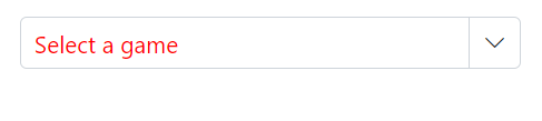
Add mandatory indicator using placeholder
The mandatory indicator * can be applied to the placeholder by targeting its CSS class .e-float-text::after using the content style.
@using Syncfusion.Blazor.DropDowns
@using Syncfusion.Blazor.Inputs

<SfComboBox TValue="string" TItem="string" Placeholder="Select a game" FloatLabelType="FloatLabelType.Auto" DataSource="@data" Width="300px"></SfComboBox>

@code {
    List<string> data = new List<string>() { "Cricket", "Badminton", "Football" };
}
<style>
    .e-input-group.e-control-wrapper.e-control-container.e-float-input .e-float-text::after {
        content: "*";
        color: red;
        padding:4px;
    }
</style>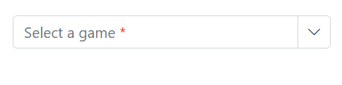
FloatLabel
Use the FloatLabelType property to specify the floating label behavior of the DropDownList that the Placeholder text floats above the TextBox based on the following values. FloatLabelType is applicable only when Placeholder is used. FloatLabelType is depends on Placeholder. Default value of FloatLabelType is Never.
The floating label supports the types of actions as follow.
| Type | Description |
|---|---|
| Auto | The label floats above the input when it is focused or a value is entered. |
| Always | The label always floats above the input. |
| Never | The label never floats above the input when the placeholder is available. |
The FloatLabelType set to Auto is demonstrated in the following example.
@using Syncfusion.Blazor.DropDowns
@using Syncfusion.Blazor.Inputs

<SfComboBox TValue="string" TItem="string" Placeholder="Select a game" FloatLabelType="FloatLabelType.Auto" DataSource="@data" Width="300px"></SfComboBox>

@code {
    List<string> data = new List<string>() { "Cricket", "Badminton", "Football" };
}
Customizing the float label element’s focusing color
Change the text color of the floating label when it is focused by targeting its CSS classes .e-input-focus and .e-float-text.e-label-top. These classes indicate the floating label text while it is focused state and set the desired color using the color property.
@using Syncfusion.Blazor.DropDowns
@using Syncfusion.Blazor.Inputs

<SfComboBox TValue="string" TItem="string" Placeholder="Select a game" FloatLabelType="FloatLabelType.Auto" DataSource="@data" Width="300px"></SfComboBox>

@code {
    List<string> data = new List<string>() { "Cricket", "Badminton", "Football" };
}
<style>
    .e-float-input.e-input-group:not(.e-float-icon-left) .e-float-line::before, .e-float-input.e-control-wrapper.e-input-group:not(.e-float-icon-left) .e-float-line::before, .e-float-input.e-input-group:not(.e-float-icon-left) .e-float-line::after, .e-float-input.e-control-wrapper.e-input-group:not(.e-float-icon-left) .e-float-line::after {
        background-color: #2319b8;
    }

    .e-ddl.e-lib.e-input-group.e-control-wrapper.e-control-container.e-float-input.e-input-focus .e-float-text.e-label-top {
        color: #2319b8;
    }
</style>