How can I help you?
Popup Setting in ComboBox
24 Feb 202614 minutes to read
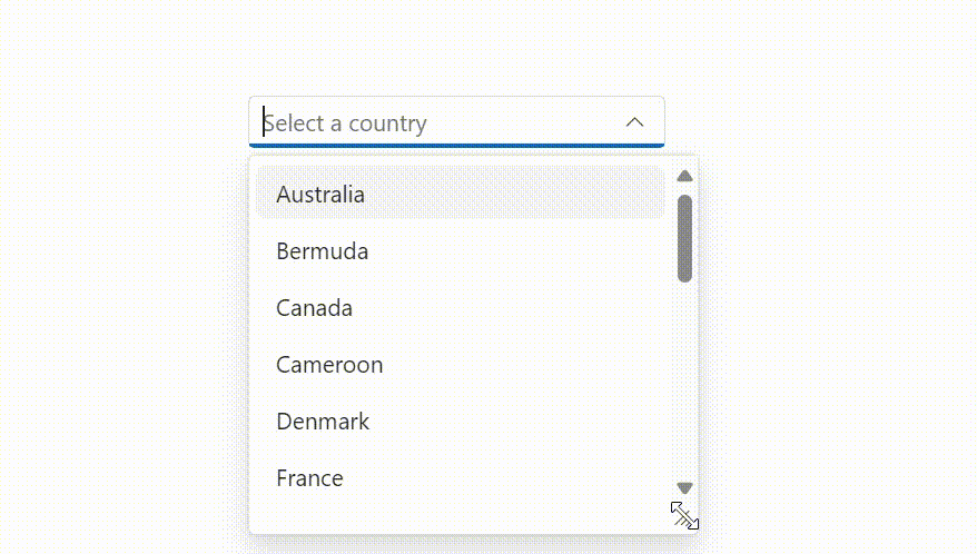
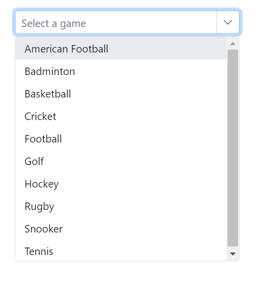
Popup resize
Dynamically adjust the size of the popup by using the AllowResize property. When enabled, users can resize the popup to improve visibility and control. The resized dimensions are preserved while the component instance remains active.
@using Syncfusion.Blazor.DropDowns;

<SfComboBox TValue="string" TItem="Countries" Placeholder="e.g. Australia" AllowResize="true" DataSource="@Country">
            <ComboBoxFieldSettings Text="Name" Value="Code"/>
</SfComboBox>


@code{

    public class Countries
    {
        public string Name { get; set; }
        public string Code { get; set; }
    }

    private List<Countries> Country = new List<Countries>
    {
        new Countries() { Name = "Australia", Code = "AU" },
        new Countries() { Name = "Bermuda", Code = "BM" },
        new Countries() { Name = "Canada", Code = "CA" },
        new Countries() { Name = "Cameroon", Code = "CM" },
        new Countries() { Name = "Denmark", Code = "DK" },
        new Countries() { Name = "France", Code = "FR" },
        new Countries() { Name = "Finland", Code = "FI" },
        new Countries() { Name = "Germany", Code = "DE" },
        new Countries() { Name = "Greenland", Code = "GL" },
        new Countries() { Name = "Hong Kong", Code = "HK" },
        new Countries() { Name = "India", Code = "IN" },
        new Countries() { Name = "Italy", Code = "IT" },
        new Countries() { Name = "Japan", Code = "JP" },
        new Countries() { Name = "Mexico", Code = "MX" },
        new Countries() { Name = "Norway", Code = "NO" },
        new Countries() { Name = "Poland", Code = "PL" },
        new Countries() { Name = "Switzerland", Code = "CH" },
        new Countries() { Name = "United Kingdom", Code = "GB" },
        new Countries() { Name = "United States", Code = "US" }
    };
}
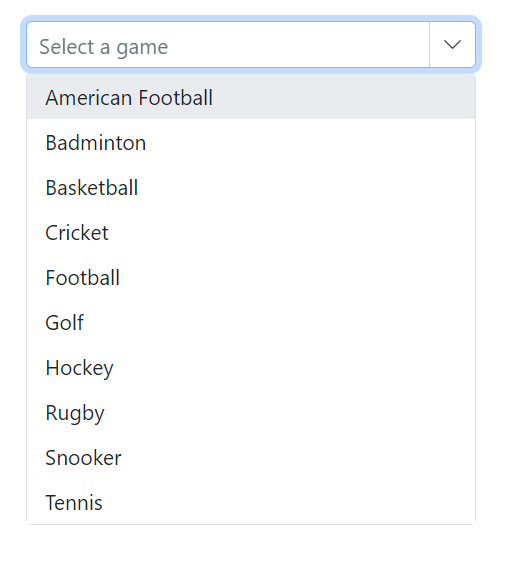
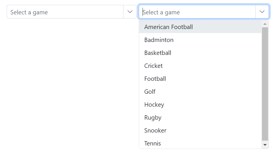
Change the popup width
Customize the width of the popup using the PopupWidth property. The default value of the PopupWidth is 100%. If popup width unspecified, it sets based on the width of the ComboBox component.
In the following sample, PopupWidth is set to 300px.
@using Syncfusion.Blazor.DropDowns;

<SfComboBox TValue="string" TItem="Games" Placeholder="Select a game" DataSource="@LocalData" PopupWidth="300px">
    <ComboBoxFieldSettings Value="ID" Text="Text"></ComboBoxFieldSettings>
</SfComboBox>

@code {
    public class Games
    {
        public string ID { get; set; }
        public string Text { get; set; }
    }

    List<Games> LocalData = new List<Games> {
    new Games() { ID= "Game1", Text= "American Football" },
    new Games() { ID= "Game2", Text= "Badminton" },
    new Games() { ID= "Game3", Text= "Basketball" },
    new Games() { ID= "Game4", Text= "Cricket" },
    new Games() { ID= "Game5", Text= "Football" },
    new Games() { ID= "Game6", Text= "Golf" },
    new Games() { ID= "Game7", Text= "Hockey" },
    new Games() { ID= "Game8", Text= "Rugby"},
    new Games() { ID= "Game9", Text= "Snooker" },
    new Games() { ID= "Game10", Text= "Tennis"},
    };

}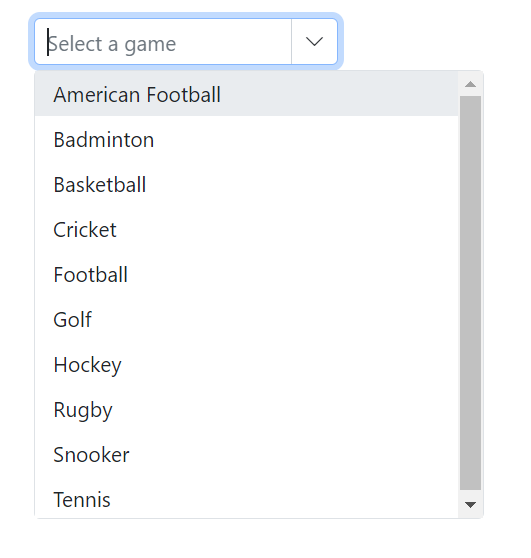
Change the popup height
Customize the height of the popup using the PopupHeight property. The default value of the PopupHeight is 300px.
In the following sample, PopupHeight is set to 500px.
@using Syncfusion.Blazor.DropDowns;

<SfComboBox TValue="string" TItem="Games" Placeholder="Select a game" Width="300px" DataSource="@LocalData" PopupHeight="500px">
    <ComboBoxFieldSettings Value="ID" Text="Text"></ComboBoxFieldSettings>
</SfComboBox>

@code {
    public class Games
    {
        public string ID { get; set; }
        public string Text { get; set; }
    }

    List<Games> LocalData = new List<Games> {
    new Games() { ID= "Game1", Text= "American Football" },
    new Games() { ID= "Game2", Text= "Badminton" },
    new Games() { ID= "Game3", Text= "Basketball" },
    new Games() { ID= "Game4", Text= "Cricket" },
    new Games() { ID= "Game5", Text= "Football" },
    new Games() { ID= "Game6", Text= "Golf" },
    new Games() { ID= "Game7", Text= "Hockey" },
    new Games() { ID= "Game8", Text= "Rugby"},
    new Games() { ID= "Game9", Text= "Snooker" },
    new Games() { ID= "Game10", Text= "Tennis"},
    };

}
Change the popup z-index
Customize the ZIndex value of the component’s popup element to control stacking order.
Defaults to 1000.
Show popup on initial loading
Show the popup when the component is initialized by calling ShowPopupAsync() in the Created event.
Preventing opening and closing
Prevent the popup from opening or closing by setting BeforeOpenEventArgs.Cancel or PopupEventArgs.Cancel to true in the corresponding OnOpen and OnClose events.
@using Syncfusion.Blazor.DropDowns;


<SfComboBox TValue="string" TItem="Games" Placeholder="Select a game" Width="300px" DataSource="@LocalData">
    <ComboBoxFieldSettings Value="ID" Text="Text"></ComboBoxFieldSettings>
    <ComboBoxEvents TValue="string" TItem="Games" OnOpen="OnOpenHandler"></ComboBoxEvents>
</SfComboBox>


<SfComboBox TValue="string" TItem="Games" Placeholder="Select a game" Width="300px" DataSource="@LocalData">
    <ComboBoxFieldSettings Value="ID" Text="Text"></ComboBoxFieldSettings>
    <ComboBoxEvents TValue="string" TItem="Games" OnClose="OnCloseHandler"></ComboBoxEvents>
</SfComboBox>

@code {

    public class Games
    {
        public string ID { get; set; }
        public string Text { get; set; }
    }

    List<Games> LocalData = new List<Games> {
    new Games() { ID= "Game1", Text= "American Football" },
    new Games() { ID= "Game2", Text= "Badminton" },
    new Games() { ID= "Game3", Text= "Basketball" },
    new Games() { ID= "Game4", Text= "Cricket" },
    new Games() { ID= "Game5", Text= "Football" },
    new Games() { ID= "Game6", Text= "Golf" },
    new Games() { ID= "Game7", Text= "Hockey" },
    new Games() { ID= "Game8", Text= "Rugby"},
    new Games() { ID= "Game9", Text= "Snooker" },
    new Games() { ID= "Game10", Text= "Tennis"},
    };

    private void OnOpenHandler(BeforeOpenEventArgs args)
    {
        args.Cancel = true;
    }
    private void OnCloseHandler(PopupEventArgs args)
    {
        args.Cancel = true;
    }

}
The following events are used when opening and closing the popup.
OnOpen event
The OnOpen event triggers before the popup opens. If this event is canceled, the popup remains closed.
@using Syncfusion.Blazor.DropDowns

<SfComboBox TItem="GameFields" TValue="string" DataSource="@Games">
    <ComboBoxEvents TItem="GameFields" TValue="string" OnOpen="@OnOpenHandler"></ComboBoxEvents>
    <ComboBoxFieldSettings Text="Text" Value="ID"></ComboBoxFieldSettings>
</SfComboBox>

@code {
    public class GameFields
    {
        public string ID { get; set; }
        public string Text { get; set; }
    }

    private List<GameFields> Games = new List<GameFields>() {
        new GameFields(){ ID= "Game1", Text= "American Football" },
        new GameFields(){ ID= "Game2", Text= "Badminton" },
        new GameFields(){ ID= "Game3", Text= "Basketball" },
        new GameFields(){ ID= "Game4", Text= "Cricket" },
     };

    private void OnOpenHandler(BeforeOpenEventArgs args)
    {
        // Here, you can customize your code.
    }
}
Opened event
The Opened event triggers when the popup opens.
OnClose event
The OnClose event triggers before the popup closes. If this event is canceled, the popup remains open.
@using Syncfusion.Blazor.DropDowns

<SfComboBox TItem="GameFields" TValue="string" DataSource="@Games">
    <ComboBoxEvents TItem="GameFields" TValue="string" OnClose="@OnCloseHandler"></ComboBoxEvents>
    <ComboBoxFieldSettings Text="Text" Value="ID"></ComboBoxFieldSettings>
</SfComboBox>

@code {
    public class GameFields
    {
        public string ID { get; set; }
        public string Text { get; set; }
    }

    private List<GameFields> Games = new List<GameFields>() {
        new GameFields(){ ID= "Game1", Text= "American Football" },
        new GameFields(){ ID= "Game2", Text= "Badminton" },
        new GameFields(){ ID= "Game3", Text= "Basketball" },
        new GameFields(){ ID= "Game4", Text= "Cricket" },
     };

    private void OnCloseHandler(PopupEventArgs args)
    {
        // Here, you can customize your code.
    }
}
Closed event
The Closed event triggers after the popup has been closed.
@using Syncfusion.Blazor.DropDowns
<SfComboBox TItem="GameFields" TValue="string" DataSource="@Games">
<ComboBoxEvents TItem="GameFields" TValue="string" Closed="@OnClosedHandler"></ComboBoxEvents>
<ComboBoxFieldSettings Text="Text" Value="ID"></ComboBoxFieldSettings>
</SfComboBox>
@code {
public class GameFields
{
public string ID { get; set; }
public string Text { get; set; }
}
private List<GameFields> Games = new List<GameFields>() {
new GameFields(){ ID= "Game1", Text= "American Football" },
new GameFields(){ ID= "Game2", Text= "Badminton" },
new GameFields(){ ID= "Game3", Text= "Basketball" },
new GameFields(){ ID= "Game4", Text= "Cricket" },
};
private void OnClosedHandler(ClosedEventArgs args)
{
// Here, you can customize your code.
}
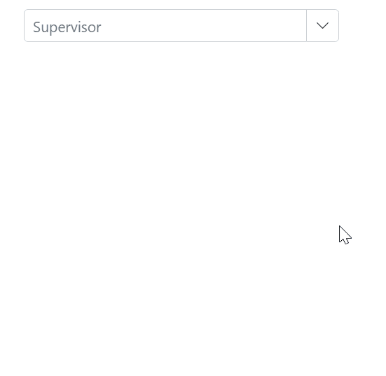
}Popup height based on available space
Adjust the popup height based on the available viewport space by handling the window resize event and updating the popup element’s height at runtime.
@using Syncfusion.Blazor.DropDowns

@inject IJSRuntime JsRuntime
<div class="game-drop-down-wrapper">
    <SfComboBox TValue="string"
                    TItem="GameField"
                    ID="combobox"
                    Width="300px"
                    Placeholder="Supervisor"
                    @bind-Value="@ComboVal"
                    DataSource="@Games">
        <ComboBoxFieldSettings Value="id" Text="text"></ComboBoxFieldSettings>
    </SfComboBox>

</div>

<style>

</style>

@code {

    public string ComboVal { get; set; }
    public GameField CurrentSelection { get; set; }

    public class GameField
    {
        public string id { get; set; }
        public string text { get; set; }
        public bool isAvailable { get; set; }
    }

    List<GameField> Games = new List<GameField>() {
        new GameField(){ id= "Game1", text= "American Football", isAvailable = true },
        new GameField(){ id= "Game2", text= "Badminton", isAvailable = false },
        new GameField(){ id= "Game3", text= "Basketball", isAvailable = false  },
        new GameField(){ id= "Game4", text= "Cricket", isAvailable = true  },
        new GameField(){ id= "Game5", text= "Football", isAvailable = true  },
        new GameField(){ id= "Game6", text= "Golf", isAvailable = false  },
        new GameField(){ id= "Game7", text= "Hockey", isAvailable = true  },
        new GameField(){ id= "Game8", text= "Rugby", isAvailable = true },
        new GameField(){ id= "Game9", text= "Snooker", isAvailable = false },
        new GameField(){ id= "Game10", text= "Tennis", isAvailable = false }
        };
}<script>
window.addEventListener("resize", function (e) {
var wrapper = document.getElementById("combobox").parentElement;
var popupEle = document.getElementById("combobox_popup");
var topVal = wrapper.getBoundingClientRect().top;
window.innerHeight - topVal;
if (popupEle) {
popupEle.style.maxHeight = (window.innerHeight - topVal-50) + "px";
popupEle.style.height = (window.innerHeight - topVal-50) + "px";
}
})
</script>