Style and appearance in Blazor ComboBox Component
23 Jun 202624 minutes to read
The following content provides the CSS structure and options that can be used to modify the component’s appearance based on user preference.
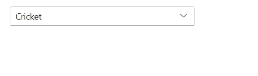
Read-only mode
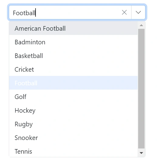
Specify the boolean value to the Readonly whether the ComboBox allows the user to change the value or not.
@using Syncfusion.Blazor.DropDowns;
<SfComboBox TValue="string" TItem="Games" Placeholder="Select a game" Width="300px" DataSource="@LocalData" @bind-Value="GameValue" Readonly=true>
<ComboBoxFieldSettings Value="ID" Text="Text"></ComboBoxFieldSettings>
</SfComboBox>
@code {
public string GameValue { get; set; } = "Game4";
public class Games
{
public string ID { get; set; }
public string Text { get; set; }
}
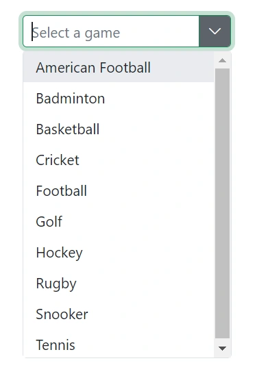
List<Games> LocalData = new List<Games> {
new Games() { ID= "Game1", Text= "American Football" },
new Games() { ID= "Game2", Text= "Badminton" },
new Games() { ID= "Game3", Text= "Basketball" },
new Games() { ID= "Game4", Text= "Cricket" },
new Games() { ID= "Game5", Text= "Football" },
new Games() { ID= "Game6", Text= "Golf" },
new Games() { ID= "Game7", Text= "Hockey" },
new Games() { ID= "Game8", Text= "Rugby"},
new Games() { ID= "Game9", Text= "Snooker" },
new Games() { ID= "Game10", Text= "Tennis"},
};
}
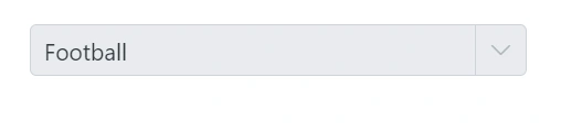
Disabled state
Specify a boolean value for the Enabled property to indicate whether the component is enabled.
@using Syncfusion.Blazor.DropDowns

<SfComboBox TValue="string" TItem="Games" Placeholder="Select a game" Width="300px" DataSource="@LocalData" @bind-Value="GameValue" Enabled=false>
    <ComboBoxFieldSettings Value="ID" Text="Text"></ComboBoxFieldSettings>
</SfComboBox>


@code {
    public string GameValue { get; set; } = "Game5";

    public class Games
    {
        public string ID { get; set; }
        public string Text { get; set; }
    }

    List<Games> LocalData = new List<Games> {
    new Games() { ID= "Game1", Text= "American Football" },
    new Games() { ID= "Game2", Text= "Badminton" },
    new Games() { ID= "Game3", Text= "Basketball" },
    new Games() { ID= "Game4", Text= "Cricket" },
    new Games() { ID= "Game5", Text= "Football" },
    new Games() { ID= "Game6", Text= "Golf" },
    new Games() { ID= "Game7", Text= "Hockey" },
    new Games() { ID= "Game8", Text= "Rugby"},
    new Games() { ID= "Game9", Text= "Snooker" },
    new Games() { ID= "Game10", Text= "Tennis"},
    };

}
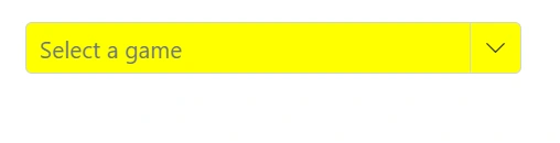
CssClass
Specifies the CSS class name that can be appended to the root element of the ComboBox. One or more custom CSS classes can be added to a ComboBox.
Some of the possible values are:
-e-success: Denotes a success state, applying a green style to the input.
-
e-warning: Denotes a warning state, applying an orange style to the input. -
e-error: Denotes an error state, applying a red style to the input. -
e-outline: Applies outline styles (supported in Material theme). -
e-multi-column: Lays out two or more columns in the popup.
@using Syncfusion.Blazor.DropDowns;

<SfComboBox TValue="string" TItem="Games" Placeholder="Select a game" DataSource="@LocalData" CssClass='@CssClass'>
  <ComboBoxFieldSettings Value="ID" Text="Text"></ComboBoxFieldSettings>
</SfComboBox>

@code {
    public class Games
    {
        public string ID { get; set; }
        public string Text { get; set; }
    }

    List<Games> LocalData = new List<Games> {
    new Games() { ID= "Game1", Text= "American Football" },
    new Games() { ID= "Game2", Text= "Badminton" },
    new Games() { ID= "Game3", Text= "Basketball" },
    new Games() { ID= "Game4", Text= "Cricket" },
    new Games() { ID= "Game5", Text= "Football" },
    new Games() { ID= "Game6", Text= "Golf" },
    new Games() { ID= "Game7", Text= "Hockey" },
    new Games() { ID= "Game8", Text= "Rugby"},
    new Games() { ID= "Game9", Text= "Snooker" },
    new Games() { ID= "Game10", Text= "Tennis"},
    };

    public string CssClass { get; set; } = "e-success";
}
Customizing the disabled component’s text color
Customize the text color of a disabled component by targeting its CSS class .e-input[disabled], which indicates the input element in a disabled state, and set the desired color to the -webkit-text-fill-color property.
@using Syncfusion.Blazor.DropDowns;

<SfComboBox TValue="string" TItem="Games" Placeholder="Select a game" DataSource="@LocalData" Width="300px" Enabled=false>
    <ComboBoxFieldSettings Value="ID" Text="Text"></ComboBoxFieldSettings>
</SfComboBox>

@code {
  public class Games
  {
    public string ID { get; set; }
    public string Text { get; set; }
  }
  List<Games> LocalData = new List<Games> {
    new Games() { ID= "Game1", Text= "American Football" },
    new Games() { ID= "Game2", Text= "Badminton" },
    new Games() { ID= "Game3", Text= "Basketball" },
    new Games() { ID= "Game4", Text= "Cricket" },
    new Games() { ID= "Game5", Text= "Football" },
    new Games() { ID= "Game6", Text= "Golf" },
    new Games() { ID= "Game7", Text= "Hockey" },
    new Games() { ID= "Game8", Text= "Rugby"},
    new Games() { ID= "Game9", Text= "Snooker" },
    new Games() { ID= "Game10", Text= "Tennis"},
  };
}

<style>
.e-input-group.e-control-wrapper .e-input[disabled] {
    -webkit-text-fill-color: #0d9133;
}
</style>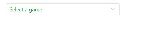
Customizing the appearance of the container element
Customize the ComboBox container by targeting the .e-input selector (the parent of the input), and apply the desired styles.
@using Syncfusion.Blazor.DropDowns;

<SfComboBox TValue="string" TItem="Games" Placeholder="Select a game" DataSource="@LocalData" Width="300px">
    <ComboBoxFieldSettings Value="ID" Text="Text"></ComboBoxFieldSettings>
</SfComboBox>

@code {
  public class Games
  {
    public string ID { get; set; }
    public string Text { get; set; }
  }
  List<Games> LocalData = new List<Games> {
    new Games() { ID= "Game1", Text= "American Football" },
    new Games() { ID= "Game2", Text= "Badminton" },
    new Games() { ID= "Game3", Text= "Basketball" },
    new Games() { ID= "Game4", Text= "Cricket" },
    new Games() { ID= "Game5", Text= "Football" },
    new Games() { ID= "Game6", Text= "Golf" },
    new Games() { ID= "Game7", Text= "Hockey" },
    new Games() { ID= "Game8", Text= "Rugby"},
    new Games() { ID= "Game9", Text= "Snooker" },
    new Games() { ID= "Game10", Text= "Tennis"},
  };
}

<style>
.e-ddl.e-input-group.e-control-wrapper .e-input {
    font-size: 20px;
    font-family: emoji;
    color: #ab3243;
    background: #32a5ab;
}
</style>
Customizing the dropdown icon’s color
Customize the dropdown icon by targeting the .e-ddl-icon.e-icons selector and setting the desired color.
@using Syncfusion.Blazor.DropDowns;

<SfComboBox TValue="string" TItem="Games" Placeholder="Select a game" DataSource="@LocalData" Width="300px">
    <ComboBoxFieldSettings Value="ID" Text="Text"></ComboBoxFieldSettings>
</SfComboBox>

@code {
  public class Games
  {
    public string ID { get; set; }
    public string Text { get; set; }
  }
  List<Games> LocalData = new List<Games> {
    new Games() { ID= "Game1", Text= "American Football" },
    new Games() { ID= "Game2", Text= "Badminton" },
    new Games() { ID= "Game3", Text= "Basketball" },
    new Games() { ID= "Game4", Text= "Cricket" },
    new Games() { ID= "Game5", Text= "Football" },
    new Games() { ID= "Game6", Text= "Golf" },
    new Games() { ID= "Game7", Text= "Hockey" },
    new Games() { ID= "Game8", Text= "Rugby"},
    new Games() { ID= "Game9", Text= "Snooker" },
    new Games() { ID= "Game10", Text= "Tennis"},
  };
}

<style>
.e-ddl .e-input-group-icon.e-ddl-icon.e-icons, .e-ddl .e-input-group-icon.e-ddl-icon.e-icons:hover {
    color: #bb233d;
    font-size: 13px;
}
</style>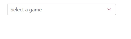
Customizing the focus color
Customize the component color when it is focused by targeting its CSS class .e-input-focus::after, which indicates the input element when it is focused, and set the desired color to the background property.
@using Syncfusion.Blazor.DropDowns;

<SfComboBox TValue="string" TItem="Games" Placeholder="Select a game" DataSource="@LocalData" Width="300px">
    <ComboBoxFieldSettings Value="ID" Text="Text"></ComboBoxFieldSettings>
</SfComboBox>

@code {
  public class Games
  {
    public string ID { get; set; }
    public string Text { get; set; }
  }
  List<Games> LocalData = new List<Games> {
    new Games() { ID= "Game1", Text= "American Football" },
    new Games() { ID= "Game2", Text= "Badminton" },
    new Games() { ID= "Game3", Text= "Basketball" },
    new Games() { ID= "Game4", Text= "Cricket" },
    new Games() { ID= "Game5", Text= "Football" },
    new Games() { ID= "Game6", Text= "Golf" },
    new Games() { ID= "Game7", Text= "Hockey" },
    new Games() { ID= "Game8", Text= "Rugby"},
    new Games() { ID= "Game9", Text= "Snooker" },
    new Games() { ID= "Game10", Text= "Tennis"},
  };
}

<style>
.e-ddl.e-input-group.e-control-wrapper.e-input-focus::before, .e-ddl.e-input-group.e-control-wrapper.e-input-focus::after {
    background: #c000ff;
}
</style>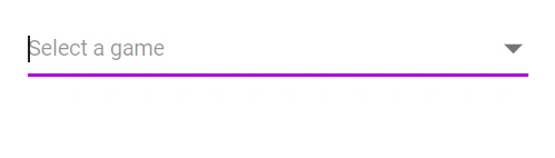
Customizing the outline theme’s focus color
Customize the color of the combobox component when it is in a focused state and rendered with an outline theme, by targeting its CSS class e-outline which indicates the input element when it is focused, and allows you to set the desired color to the color property.
@using Syncfusion.Blazor.DropDowns;

<SfComboBox TValue="string" TItem="Games" Placeholder="Select a game" DataSource="@LocalData" Width="300px" CssClass="e-outline">
    <ComboBoxFieldSettings Value="ID" Text="Text"></ComboBoxFieldSettings>
</SfComboBox>

@code {
  public class Games
  {
    public string ID { get; set; }
    public string Text { get; set; }
  }
  List<Games> LocalData = new List<Games> {
    new Games() { ID= "Game1", Text= "American Football" },
    new Games() { ID= "Game2", Text= "Badminton" },
    new Games() { ID= "Game3", Text= "Basketball" },
    new Games() { ID= "Game4", Text= "Cricket" },
    new Games() { ID= "Game5", Text= "Football" },
    new Games() { ID= "Game6", Text= "Golf" },
    new Games() { ID= "Game7", Text= "Hockey" },
    new Games() { ID= "Game8", Text= "Rugby"},
    new Games() { ID= "Game9", Text= "Snooker" },
    new Games() { ID= "Game10", Text= "Tennis"},
  };
}

<style>
.e-outline.e-input-group.e-input-focus:hover:not(.e-success):not(.e-warning):not(.e-error):not(.e-disabled):not(.e-float-icon-left),.e-outline.e-input-group.e-input-focus.e-control-wrapper:hover:not(.e-success):not(.e-warning):not(.e-error):not(.e-disabled):not(.e-float-icon-left),.e-outline.e-input-group.e-input-focus:not(.e-success):not(.e-warning):not(.e-error):not(.e-disabled),.e-outline.e-input-group.e-control-wrapper.e-input-focus:not(.e-success):not(.e-warning):not(.e-error):not(.e-disabled) {
    border-color: #b1bd15;
    box-shadow: inset 1px 1px #b1bd15, inset -1px 0 #b1bd15, inset 0 -1px #b1bd15;
}
</style>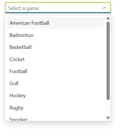
Customizing the background color of focused, hovered, and active items
Customize background and text colors of list items in focused, hovered, or active states by targeting .e-list-item.e-item-focus, .e-list-item.e-active, and .e-list-item.e-hover, and setting background-color and color.
@using Syncfusion.Blazor.DropDowns;
@using Syncfusion.Blazor.Inputs;

<SfComboBox TValue="string" TItem="Games" Placeholder="Select a game" DataSource="@LocalData" Width="300px">
    <ComboBoxFieldSettings Value="ID" Text="Text"></ComboBoxFieldSettings>
</SfComboBox>

@code {
  public class Games
  {
    public string ID { get; set; }
    public string Text { get; set; }
  }
  List<Games> LocalData = new List<Games> {
    new Games() { ID= "Game1", Text= "American Football" },
    new Games() { ID= "Game2", Text= "Badminton" },
    new Games() { ID= "Game3", Text= "Basketball" },
    new Games() { ID= "Game4", Text= "Cricket" },
    new Games() { ID= "Game5", Text= "Football" },
    new Games() { ID= "Game6", Text= "Golf" },
    new Games() { ID= "Game7", Text= "Hockey" },
    new Games() { ID= "Game8", Text= "Rugby"},
    new Games() { ID= "Game9", Text= "Snooker" },
    new Games() { ID= "Game10", Text= "Tennis"},
  };
}

<style>
.e-dropdownbase .e-list-item.e-item-focus, .e-dropdownbase .e-list-item.e-active, .e-dropdownbase .e-list-item.e-active.e-hover, .e-dropdownbase .e-list-item.e-hover {
    background-color: #1f9c99;
    color: #2319b8;
}
</style>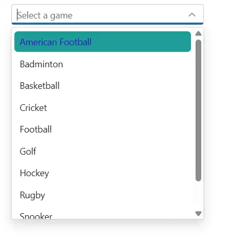
Customizing the appearance of the popup element
Customize the popup’s appearance by targeting list item selectors within the popup and applying the desired styles. For example, use .e-list-item.e-item-focus to style a focused list item.
@using Syncfusion.Blazor.DropDowns;

<SfComboBox TValue="string" TItem="Games" Placeholder="Select a game" DataSource="@LocalData" Width="300px">
    <ComboBoxFieldSettings Value="ID" Text="Text"></ComboBoxFieldSettings>
</SfComboBox>

@code {
  public class Games
  {
    public string ID { get; set; }
    public string Text { get; set; }
  }
  List<Games> LocalData = new List<Games> {
    new Games() { ID= "Game1", Text= "American Football" },
    new Games() { ID= "Game2", Text= "Badminton" },
    new Games() { ID= "Game3", Text= "Basketball" },
    new Games() { ID= "Game4", Text= "Cricket" },
    new Games() { ID= "Game5", Text= "Football" },
    new Games() { ID= "Game6", Text= "Golf" },
    new Games() { ID= "Game7", Text= "Hockey" },
    new Games() { ID= "Game8", Text= "Rugby"},
    new Games() { ID= "Game9", Text= "Snooker" },
    new Games() { ID= "Game10", Text= "Tennis"},
  };
}

<style>
.e-dropdownbase .e-list-item, .e-dropdownbase .e-list-item.e-item-focus {
    background-color: #29c2b8;
    color: #207cd9;
    font-family: emoji;
    min-height: 29px;
}
</style>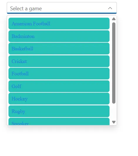
Change the HTML attributes
Add additional HTML attributes such as styles and class to the root element using the HtmlAttributes property, which accepts any number of key–value pairs.
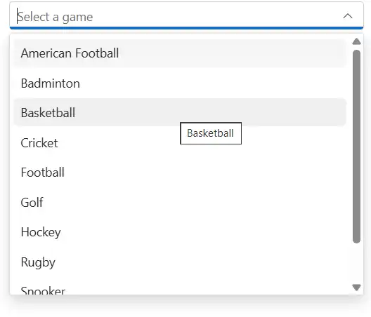
Show tooltip on list item
Display a tooltip when hovering over ComboBox options by integrating the Tooltip component and binding it to list items.
@using Syncfusion.Blazor.DropDowns;
@using Syncfusion.Blazor.Popups;

<SfTooltip @ref="TooltipObj" ID="Tooltip" Target=".e-list-item .name[title]">
</SfTooltip>

<SfComboBox TItem="GameFields" TValue="string" Placeholder="Select a game" DataSource="@Games">
    <ComboBoxFieldSettings Text="Text" Value="ID"></ComboBoxFieldSettings>
    <ComboBoxTemplates TItem="GameFields">
        <ItemTemplate>
            <div class="name" title="@((context as GameFields).Text)"> @((context as GameFields).Text) </div>
        </ItemTemplate>
    </ComboBoxTemplates>
    <ComboBoxEvents TValue="string" TItem="GameFields" Opened="OnOpen" OnClose="OnClose"></ComboBoxEvents>
</SfComboBox>

@code {

    SfTooltip TooltipObj;
    public Boolean isOpen { get; set; } = false;

    public class GameFields
    {
        public string ID { get; set; }
        public string Text { get; set; }
    }

    private List<GameFields> Games = new List<GameFields>() {
        new GameFields(){ ID= "Game1", Text= "American Football" },
        new GameFields(){ ID= "Game2", Text= "Badminton" },
        new GameFields(){ ID= "Game3", Text= "Basketball" },
        new GameFields(){ ID= "Game4", Text= "Cricket" },
        new GameFields(){ ID= "Game5", Text= "Football" },
        new GameFields(){ ID= "Game6", Text= "Golf" },
        new GameFields(){ ID= "Game7", Text= "Hockey" },
        new GameFields(){ ID= "Game8", Text= "Rugby"},
        new GameFields(){ ID= "Game9", Text= "Snooker" },
        new GameFields(){ ID= "Game10", Text= "Tennis"},
    };

    public void OnOpen(PopupEventArgs args)
    {
        isOpen = true;
    }

    public void OnClose(PopupEventArgs args)
    {
        TooltipObj.CloseAsync();
    }

    protected override async Task OnAfterRenderAsync(bool firstRender)
    {
        if (isOpen)
        {
            await TooltipObj.RefreshAsync();
        }
    }
}
Customize selected item opacity
In the following code , the CSS style that targets the .e-list-item class within the .e-dropdownbase class when it is in an active or active and hovered state. It sets the opacity property , which will make the elements appear transparent. This can be used to change the appearance of the dropdown list items when they are in a certain state.
Disable specific items in ComboBox
Prevent certain items from being selected by marking them disabled via a custom class on the popup using the CssClass property, and then applying styles or script logic. In the following example, a single list item is disabled using JavaScript interop.
@inject IJSRuntime JSRuntime;
@using Syncfusion.Blazor.DropDowns

<SfComboBox ID="mydropdown" TValue="string" TItem="Countries" Width="300px" Placeholder="e.g. Australia" DataSource="@Country" CssClass="e-custom-class">
    <ComboBoxFieldSettings Text="Name" Value="Code"></ComboBoxFieldSettings>
    <ComboBoxEvents TItem="Countries" TValue="string" Opened="OnOpen"></ComboBoxEvents>
</SfComboBox>

@code {

    public async Task OnOpen()
    {
        await this.JSRuntime.InvokeVoidAsync("disable", "mydropdown");
    }
    public class Countries
    {
        public string Name { get; set; }

        public string Code { get; set; }
    }

    List<Countries> Country = new List<Countries>
{
        new Countries() { Name = "Australia", Code = "AU" },
        new Countries() { Name = "Bermuda", Code = "BM" },
        new Countries() { Name = "Canada", Code = "CA" },
        new Countries() { Name = "Cameroon", Code = "CM" },
        new Countries() { Name = "Denmark", Code = "DK" },
        new Countries() { Name = "France", Code = "FR" },
        new Countries() { Name = "Finland", Code = "FI" },
        new Countries() { Name = "Germany", Code = "DE" },
        new Countries() { Name = "Greenland", Code = "GL" },
        new Countries() { Name = "Hong Kong", Code = "HK" },
        new Countries() { Name = "India", Code = "IN" },
        new Countries() { Name = "Italy", Code = "IT" },
        new Countries() { Name = "Japan", Code = "JP" },
        new Countries() { Name = "Mexico", Code = "MX" },
        new Countries() { Name = "Norway", Code = "NO" },
        new Countries() { Name = "Poland", Code = "PL" },
        new Countries() { Name = "Switzerland", Code = "CH" },
        new Countries() { Name = "United Kingdom", Code = "GB" },
        new Countries() { Name = "United States", Code = "US" },
    };
}
<script>
window.disable = function (id) {
setTimeout(function (e) {
var liCollections = document.querySelectorAll('.e-popup.e-custom-class .e-list-item')
if (liCollections && liCollections.length > 0)
liCollections[1].classList.add('e-disabled');
liCollections[1].classList.add('e-overlay');
}, 30);
}
</script>Customizing the float label element’s focusing color
Change the floating label text color when focused by targeting .e-input-focus and .e-float-text.e-label-top. These selectors represent the floating label in a focused state; set the desired color.
@using Syncfusion.Blazor.DropDowns;
@using Syncfusion.Blazor.Inputs;

<SfComboBox TValue="string" TItem="Games" Placeholder="Select a game" DataSource="@LocalData" Width="300px" FloatLabelType="FloatLabelType.Auto">
    <ComboBoxFieldSettings Value="ID" Text="Text"></ComboBoxFieldSettings>
</SfComboBox>

@code {
  public class Games
  {
    public string ID { get; set; }
    public string Text { get; set; }
  }
  List<Games> LocalData = new List<Games> {
    new Games() { ID= "Game1", Text= "American Football" },
    new Games() { ID= "Game2", Text= "Badminton" },
    new Games() { ID= "Game3", Text= "Basketball" },
    new Games() { ID= "Game4", Text= "Cricket" },
    new Games() { ID= "Game5", Text= "Football" },
    new Games() { ID= "Game6", Text= "Golf" },
    new Games() { ID= "Game7", Text= "Hockey" },
    new Games() { ID= "Game8", Text= "Rugby"},
    new Games() { ID= "Game9", Text= "Snooker" },
    new Games() { ID= "Game10", Text= "Tennis"},
  };
}

<style>
.e-float-input.e-input-group:not(.e-float-icon-left) .e-float-line::before,.e-float-input.e-control-wrapper.e-input-group:not(.e-float-icon-left) .e-float-line::before,.e-float-input.e-input-group:not(.e-float-icon-left) .e-float-line::after,.e-float-input.e-control-wrapper.e-input-group:not(.e-float-icon-left) .e-float-line::after {
    background-color: #2319b8;
}

.e-ddl.e-lib.e-input-group.e-control-wrapper.e-control-container.e-float-input.e-input-focus .e-float-text.e-label-top {
    color: #2319b8;
}
</style>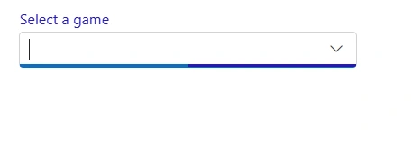
Customizing the color of the placeholder text
Change the placeholder color by targeting input.e-input::placeholder (scope within the ComboBox as needed) and setting the desired color.
@using Syncfusion.Blazor.DropDowns

<SfComboBox TValue="string" TItem="Games" Placeholder="Select a game" DataSource="@LocalData" Width="300px">
    <ComboBoxFieldSettings Value="ID" Text="Text"></ComboBoxFieldSettings>
</SfComboBox>

@code {
  public class Games
  {
    public string ID { get; set; }
    public string Text { get; set; }
  }
  List<Games> LocalData = new List<Games> {
    new Games() { ID= "Game1", Text= "American Football" },
    new Games() { ID= "Game2", Text= "Badminton" },
    new Games() { ID= "Game3", Text= "Basketball" },
    new Games() { ID= "Game4", Text= "Cricket" },
    new Games() { ID= "Game5", Text= "Football" },
    new Games() { ID= "Game6", Text= "Golf" },
    new Games() { ID= "Game7", Text= "Hockey" },
    new Games() { ID= "Game8", Text= "Rugby"},
    new Games() { ID= "Game9", Text= "Snooker" },
    new Games() { ID= "Game10", Text= "Tennis"},
  };
}

<style>
.e-ddl.e-input-group input.e-input::placeholder {
    color: red;
}
</style>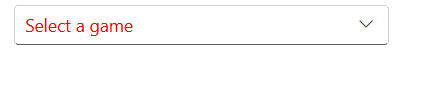
Customizing the placeholder to add a mandatory indicator (*)
Append a visual mandatory indicator to the floating placeholder by targeting .e-float-text::after and setting the content style. This affects appearance only; use form validation to enforce required input.
@using Syncfusion.Blazor.DropDowns;
@using Syncfusion.Blazor.Inputs;

<SfComboBox TValue="string" TItem="Games" Placeholder="Select a game" DataSource="@LocalData" Width="300px" FloatLabelType="FloatLabelType.Auto">
    <ComboBoxFieldSettings Value="ID" Text="Text"></ComboBoxFieldSettings>
</SfComboBox>

@code {
  public class Games
  {
    public string ID { get; set; }
    public string Text { get; set; }
  }
  List<Games> LocalData = new List<Games> {
    new Games() { ID= "Game1", Text= "American Football" },
    new Games() { ID= "Game2", Text= "Badminton" },
    new Games() { ID= "Game3", Text= "Basketball" },
    new Games() { ID= "Game4", Text= "Cricket" },
    new Games() { ID= "Game5", Text= "Football" },
    new Games() { ID= "Game6", Text= "Golf" },
    new Games() { ID= "Game7", Text= "Hockey" },
    new Games() { ID= "Game8", Text= "Rugby"},
    new Games() { ID= "Game9", Text= "Snooker" },
    new Games() { ID= "Game10", Text= "Tennis"},
  };
}

<style>
.e-input-group.e-control-wrapper.e-control-container.e-float-input .e-float-text::after {
    content: "*";
    color: red;
}
</style>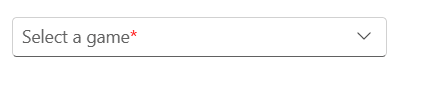
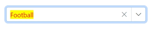
Customizing the text selection color
The appearance of a selected item within a combobox component can be customized by targeting the CSS class input.e-input::selection and set the desired background color and text color. This customization will only be applied when the item is selected manually. To achieve this, use the background-color and color properties of the CSS class input.e-input::selection.
@using Syncfusion.Blazor.DropDowns;

<SfComboBox TValue="string" TItem="Games" Placeholder="Select a game" DataSource="@LocalData" Width="300px">
    <ComboBoxFieldSettings Value="ID" Text="Text"></ComboBoxFieldSettings>
</SfComboBox>

@code {
  public class Games
  {
    public string ID { get; set; }
    public string Text { get; set; }
  }
  List<Games> LocalData = new List<Games> {
    new Games() { ID= "Game1", Text= "American Football" },
    new Games() { ID= "Game2", Text= "Badminton" },
    new Games() { ID= "Game3", Text= "Basketball" },
    new Games() { ID= "Game4", Text= "Cricket" },
    new Games() { ID= "Game5", Text= "Football" },
    new Games() { ID= "Game6", Text= "Golf" },
    new Games() { ID= "Game7", Text= "Hockey" },
    new Games() { ID= "Game8", Text= "Rugby"},
    new Games() { ID= "Game9", Text= "Snooker" },
    new Games() { ID= "Game10", Text= "Tennis"},
  };
}

<style>
.e-ddl.e-input-group input.e-input::selection {
    color: red;
    background: yellow;
}
</style>