Templates in Blazor ComboBox Component
25 Jun 202613 minutes to read
The ComboBox provides several options to customize the appearance and content of list items, group headers, the selected value, and the popup’s header and footer elements.
To quickly get started with templates in the Blazor ComboBox component, watch the following video.
Item template
Customize the content of each list item using the ItemTemplate property.
In the following example, each list item is split into two columns to display relevant data.
@using Syncfusion.Blazor.Data
@using Syncfusion.Blazor.DropDowns

<SfComboBox TValue="string" TItem="EmployeeData" Placeholder="Select a customer" DataSource="@Data">
    <ComboBoxTemplates TItem="EmployeeData">
        <ItemTemplate>
            <span><span class='name'>@((context as EmployeeData).FirstName)</span><span class='country'>@((context as EmployeeData).Country)</span></span>
        </ItemTemplate>
    </ComboBoxTemplates>
    <ComboBoxFieldSettings Text="FirstName" Value="Country"></ComboBoxFieldSettings>
</SfComboBox>

@code {
    public class EmployeeData
    {
        public string FirstName { get; set; }
        public string Country { get; set; }
    }

    List<EmployeeData> Data = new List<EmployeeData>
    {
        new EmployeeData() { FirstName = "Andrew Fuller",  Country = "England" },
        new EmployeeData() { FirstName = "Anne Dodsworth", Country = "USA" },
        new EmployeeData() { FirstName = "Janet Leverling", Country = "USA" },
        new EmployeeData() { FirstName = "Laura Callahan", Country = "USA"},
        new EmployeeData() { FirstName = "Margaret Peacock", Country = "USA"},
        new EmployeeData() { FirstName = "Michael Suyama", Country = "USA", },
        new EmployeeData() { FirstName = "Nancy Davolio", Country = "USA"},
        new EmployeeData() { FirstName = "Robert King", Country = "England"},
        new EmployeeData() { FirstName = "Steven Buchanan", Country = "England"},
    };
}

<style>
    .country {
        right: 15px;
        position: absolute;
    }
</style>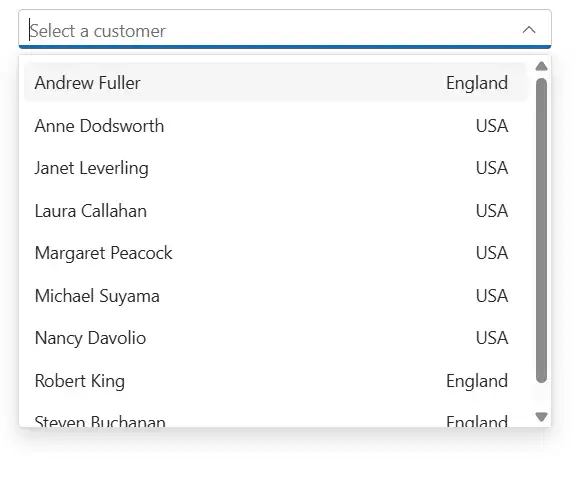
Group template
Customize the group header text under which sub-items are categorized using the GroupTemplate property. This template is applied to both inline and floating group headers.
In the following example, employees are grouped by country.
@using Syncfusion.Blazor.Data
@using Syncfusion.Blazor.DropDowns

<SfComboBox TValue="string" TItem="EmployeeData" Placeholder="Select a customer" DataSource="@Data">
    <ComboBoxTemplates TItem="EmployeeData">
        <GroupTemplate>
            <span class="group">@(context.Text)</span>
        </GroupTemplate>
    </ComboBoxTemplates>
    <ComboBoxFieldSettings Value="FirstName" GroupBy="Country"></ComboBoxFieldSettings>
</SfComboBox>

@code {
    public class EmployeeData
    {
        public string FirstName { get; set; }
        public string Country { get; set; }
    }

    List<EmployeeData> Data = new List<EmployeeData>
    {
        new EmployeeData() { FirstName = "Andrew Fuller",  Country = "England" },
        new EmployeeData() { FirstName = "Anne Dodsworth", Country = "USA" },
        new EmployeeData() { FirstName = "Janet Leverling", Country = "USA" },
        new EmployeeData() { FirstName = "Laura Callahan", Country = "USA"},
        new EmployeeData() { FirstName = "Margaret Peacock", Country = "USA"},
        new EmployeeData() { FirstName = "Michael Suyama", Country = "USA", },
        new EmployeeData() { FirstName = "Nancy Davolio", Country = "USA"},
        new EmployeeData() { FirstName = "Robert King", Country = "England"},
        new EmployeeData() { FirstName = "Steven Buchanan", Country = "England"},
    };
}

<style>
    .group {
        color: slategrey;
    }
</style>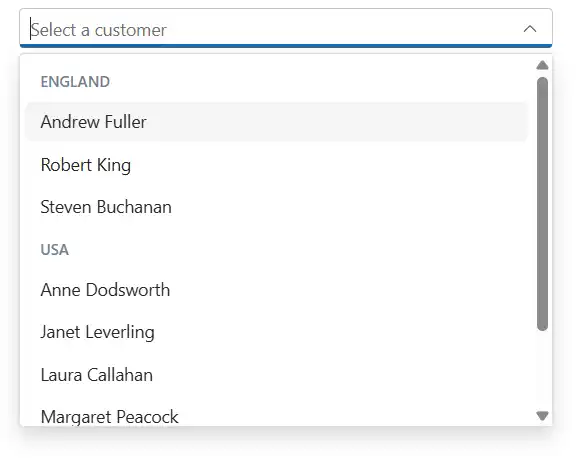
Header template
The header element is shown statically at the top of the popup list items within the ComboBox, and any custom element can be placed as a header element using the HeaderTemplate property.
In the following sample, the list items and its headers are designed and displayed as two columns similar to multiple columns of the grid.
@using Syncfusion.Blazor.Data
@using Syncfusion.Blazor.DropDowns

<SfComboBox TValue="string" TItem="EmployeeData" Placeholder="Select a customer" DataSource="@Data">
    <ComboBoxTemplates TItem="EmployeeData">
        <ItemTemplate>
            <span class='item'><span class='name'>@((context as EmployeeData).FirstName)</span><span class='city'>@((context as EmployeeData).Country)</span></span>
        </ItemTemplate>
        <HeaderTemplate>
            <span class='head'><span class='name'>Name</span><span class='city'>Country</span></span>
        </HeaderTemplate>
    </ComboBoxTemplates>
    <ComboBoxFieldSettings Value="Country" Text="FirstName"></ComboBoxFieldSettings>
</SfComboBox>

@code {
    public class EmployeeData
    {
        public string FirstName { get; set; }
        public string Country { get; set; }
    }

    List<EmployeeData> Data = new List<EmployeeData>
    {
        new EmployeeData() { FirstName = "Andrew Fuller",  Country = "England" },
        new EmployeeData() { FirstName = "Anne Dodsworth", Country = "USA" },
        new EmployeeData() { FirstName = "Janet Leverling", Country = "USA" },
        new EmployeeData() { FirstName = "Laura Callahan", Country = "USA"},
        new EmployeeData() { FirstName = "Margaret Peacock", Country = "USA"},
        new EmployeeData() { FirstName = "Michael Suyama", Country = "USA", },
        new EmployeeData() { FirstName = "Nancy Davolio", Country = "USA"},
        new EmployeeData() { FirstName = "Robert King", Country = "England"},
        new EmployeeData() { FirstName = "Steven Buchanan", Country = "England"},
    };
}

<style>
    .head, .item {
        display: table;
        width: 100%;
        margin: auto;
    }

    .head {
        height: 40px;
        font-size: 15px;
        font-weight: 600;
    }

    .name, .city {
        display: table-cell;
        vertical-align: middle;
        width: 50%;
    }

    .head .name {
        text-indent: 16px;
    }

</style>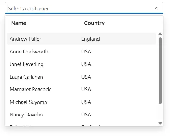
Footer template
The ComboBox has options to show a footer element at the bottom of the list items in the popup list. Here, you can place any custom element as a footer element using the FooterTemplate property.
In the following sample, footer element displays the total number of list items present in the ComboBox.
@using Syncfusion.Blazor.Data
@using Syncfusion.Blazor.DropDowns

<SfComboBox TValue="string" TItem="EmployeeData" DataSource="@Data" Placeholder="Select a customer">
    <ComboBoxTemplates TItem="EmployeeData">
        <FooterTemplate>
            <span class='footer'>Total list Item: 6 </span>
        </FooterTemplate>
    </ComboBoxTemplates>
    <ComboBoxFieldSettings Value="Country" Text="FirstName"></ComboBoxFieldSettings>
</SfComboBox>

@code {
    public class EmployeeData
    {
        public string FirstName { get; set; }
        public string Country { get; set; }
    }

    List<EmployeeData> Data = new List<EmployeeData>
    {
       new EmployeeData() { FirstName = "Andrew Fuller",  Country = "England" },
        new EmployeeData() { FirstName = "Anne Dodsworth", Country = "USA" },
        new EmployeeData() { FirstName = "Janet Leverling", Country = "USA" },
        new EmployeeData() { FirstName = "Laura Callahan", Country = "USA"},
        new EmployeeData() { FirstName = "Margaret Peacock", Country = "USA"},
        new EmployeeData() { FirstName = "Michael Suyama", Country = "USA", },
    };
}

<style>
    .footer {
        text-indent: 1.2em;
        display: block;
        font-size: 15px;
        line-height: 40px;
        border-top: 1px solid #e0e0e0;
    }
</style>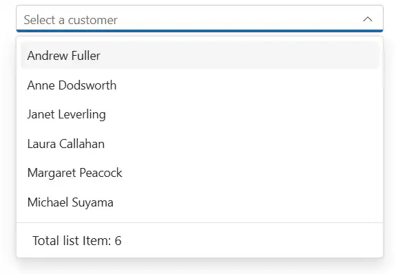
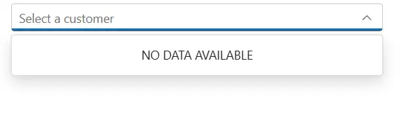
No records template
The ComboBox is provided with support to custom design the popup list content when no data is found and no matches found on search with the help of NoRecordsTemplate property.
In the following sample, popup list content displays the notification of no data available.
@using Syncfusion.Blazor.DropDowns

<SfComboBox TValue="string" TItem="Country" Placeholder="Select a customer" DataSource="@Countries">
    <ComboBoxTemplates TItem="Country">
        <NoRecordsTemplate>
            <span class='norecord'> NO DATA AVAILABLE</span>
        </NoRecordsTemplate>
    </ComboBoxTemplates>
</SfComboBox>

@code {

    public class EmployeeData { }
    public EmployeeData Data = new EmployeeData();

    public class Country { }

    List<Country> Countries = new List<Country> { };
}
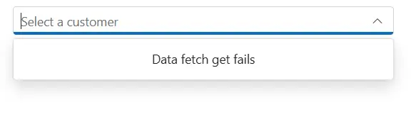
Action failure template
There is also an option to custom design the popup list content when the data fetch request fails at the remote server. This can be achieved using the ActionFailureTemplate property.
In the following sample, when the data fetch request fails, the ComboBox displays the notification.
@using Syncfusion.Blazor.Data
@using Syncfusion.Blazor.DropDowns

<SfComboBox TValue="string" TItem="EmployeeData" Placeholder="Select a customer" Query="@Query">
    <ComboBoxTemplates TItem="EmployeeData">
        <ActionFailureTemplate>
            <span class='norecord'>Data fetch get fails </span>
        </ActionFailureTemplate>
    </ComboBoxTemplates>
    <SfDataManager Url="https://services.odata.org/V4/Northwind/Northwind.svcs/Employees" Adaptor="Adaptors.ODataV4Adaptor" CrossDomain=true></SfDataManager>
    <ComboBoxFieldSettings Value="Country" Text="FirstName"></ComboBoxFieldSettings>
</SfComboBox>

@code {

    public class EmployeeData
    {
        public string FirstName { get; set; }
    }

    public EmployeeData Data = new EmployeeData();
    public Query Query = new Query().Select(new List<string> {"FirstName", "Country"}).Take(6).RequiresCount();
}
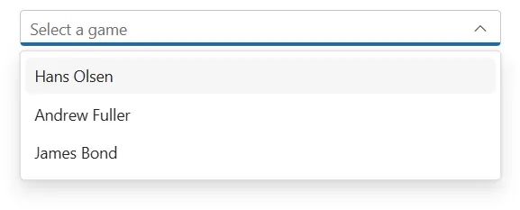
Combine two fields without Templates
To display multiple fields in the combobox without using templates, which is achieved by defining a new variable and passing the value with the desired format with the help of the get and set methods.
In the GameFields class, the Name property is defined with the get and set methods.
- The
getmethod is used to retrieve the value of the Name property. In this example, it concatenates the FirstName and LastName variables, with a space in between and returns the full name as a string. - The
setmethod is used to update the value of the Name property. In this example, it is not being used, as the value of the Name property is determined by the get method based on the FirstName and LastName properties.
@using Syncfusion.Blazor.DropDowns

<SfComboBox TValue="string" TItem="GameFields" PopupHeight="230px" Placeholder="Select a game" DataSource="@Games">
    <ComboBoxFieldSettings Text="Name" Value="ID"></ComboBoxFieldSettings>
</SfComboBox>

@code {
    public class GameFields
    {
        public string ID { get; set; }
        public string FirstName  { get; set; }
        public string LastName  { get; set; }


        public string _Name;
        public string  Name
        {
            get
            {
                _Name = $"{FirstName} {LastName}";
                return _Name;
            }
            set
            {
                _Name = value;
            }
        }
    }
    private List<GameFields> Games = new List<GameFields>() {
        new GameFields(){ ID= "Game1", LastName= "Olsen", FirstName="Hans" },
        new GameFields(){ ID= "Game2", LastName= "Fuller", FirstName="Andrew" },
        new GameFields(){ ID= "Game3", LastName= "Bond", FirstName="James" },
     };

}