Input Form Validation and Data Annotation
19 Jun 202624 minutes to read
The Blazor UI input and editor components can be validated by the standards defined in the Blazor Form Validation. The user’s input value can be validated based on the DataAnnotation attributes defined in the model class.
How to validate Blazor UI components
-
Create a model class and apply data annotation attributes to its properties.
@using System.ComponentModel.DataAnnotations; @code { private EmployeeDetails employeeModel = new EmployeeDetails(); public class EmployeeDetails { [Required(ErrorMessage = "Please enter {0}.")] public string FirstName { get; set; } [Required(ErrorMessage = "Please enter {0}.")] public string LastName { get; set; } .... .... } } -
Add the
EditFormcomponent to the page and assign the model object to itsModelproperty. Include theDataAnnotationsValidatorandValidationSummarycomponents insideEditForm.<EditForm Model="@employeeDetails"> <DataAnnotationsValidator /> <ValidationSummary/> </EditForm>
NOTE
DataAnnotationsValidator: Attaches validation support to the
EditContextusing data annotations.
ValidationSummary: Displays a summarized list of all validation messages.
-
Add any desired components inside the
EditFormand provide values via the appropriate@bind-parameter.<EditForm Model="@employeeModel"> <DataAnnotationsValidator /> <ValidationSummary /> <div class="form-group"> <label for="first-name">First Name:</label> <SfTextBox ID="first-name" @bind-Value="employeeModel.FirstName"></SfTextBox> </div> <div class="form-group"> <label for="last-name">Last Name:</label> <SfTextBox ID="last-name" @bind-Value="employeeModel.LastName"></SfTextBox> </div> <SfButton>Submit</SfButton> </EditForm>
NOTE
Refer to this table for Blazor components that support form validation and their corresponding
@bindparameter details.
-
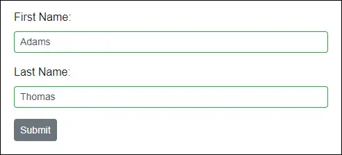
The
EditFormvalidates input values based on itsEditContextand displays validation messages in theValidationSummarycomponent when the form is submitted.Validation Failure:
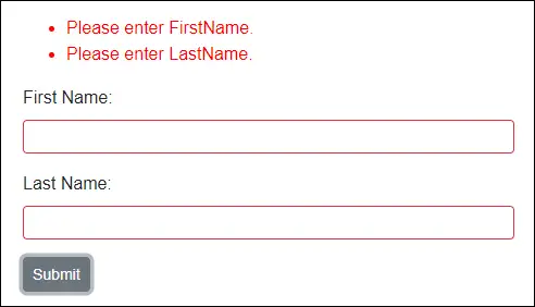
Validation Success:
NOTE
Green color border around the textbox indicates validation success state and Red color indicates validation failure state.
-
You can also use the
ValidationMessagecomponent to display the validation error message for each input component instead of displaying a validation summary using theValidationSummarycomponent.<EditForm Model="@employeeModel"> <DataAnnotationsValidator /> <div class="form-group"> <label for="first-name">First Name:</label> <SfTextBox ID="first-name" @bind-Value="employeeModel.FirstName"></SfTextBox> <ValidationMessage For="@(() => employeeModel.FirstName)"></ValidationMessage> </div> <div class="form-group"> <label for="last-name">Last Name:</label> <SfTextBox ID="last-name" @bind-Value="employeeModel.LastName"></SfTextBox> <ValidationMessage For="@(() => employeeModel.LastName)"></ValidationMessage> </div> <SfButton>Submit</SfButton> </EditForm>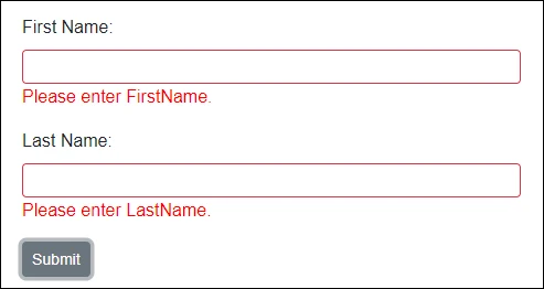
-
The
EditFormsubmit events OnValidSubmit and OnInvalidSubmit provide theEditContexton validation success or failure.<EditForm Model="@employeeDetails" OnValidSubmit="FormValidSubmit" OnInvalidSubmit="FormInvalidSubmit"> .... .... </EditForm> @code { private void FormValidSubmit(EditContext context) { // Triggers when form input has valid values. } private void FormInvalidSubmit(EditContext context) { // Triggers when form input has invalid values. } }You can also replace the above two events with OnSubmit handler and validate the form manually.
 <EditForm Model="@employeeDetails" OnSubmit="FormSubmit">
     ....
     ....
 <EditForm>

 @code {
     private void FormSubmit(EditContext context)
     {
         // Validates the EditContext and returns bool to indicate whether it has valid or invalid input values.
         bool isValid = context.Validate();
         if (isValid)
         {
             // Form has valid inputs.
         }
         else
         {
             // Form has invalid inputs.
         }
     }
 }
WARNING
Do not use the
OnSubmithandler together withOnValidSubmitandOnInvalidSubmitin the sameEditForm. This causes a runtime error.
Blazor form validation supported components
The following section lists the Blazor UI components that support form validation, the corresponding @bind parameters, and validation examples.
| NuGet Package Name | Component Name | Property Name |
| Syncfusion.Blazor.Buttons |
|
|
| Syncfusion.Blazor.Calendars |
|
|
|
||
| Syncfusion.Blazor.DropDowns |
|
|
| Syncfusion.Blazor.InPlaceEditor |
|
|
| Syncfusion.Blazor.Inputs |
|
|
| Syncfusion.Blazor.RichTextEditor |
|
NOTE
Use a nullable integer
int?when applyingRequiredto aValueproperty of typeint. The default value ofintis 0, which would otherwise pass validation.
SfAutoComplete
The AutoComplete component provides a list of suggestions as the user types in the input field. It uses the @bind-Value parameter to participate in the form model EditContext validation.
@using System.ComponentModel.DataAnnotations;

<EditForm Model="@dropdownModel">
    <DataAnnotationsValidator />
    <div class="form-group">
        <label for="country">Country:</label>
        <SfAutoComplete ID="country" @bind-Value="@dropdownModel.Country" DataSource="@Countries">
            <AutoCompleteFieldSettings Value="Name"></AutoCompleteFieldSettings>
        </SfAutoComplete>
        <ValidationMessage For="@(() => dropdownModel.Country)"></ValidationMessage>
    </div>
    <SfButton>Submit</SfButton>
</EditForm>

@code {
    private DropdownModel dropdownModel = new DropdownModel();

    public class DropdownModel
    {
        [Required(ErrorMessage = "Please select your country.")]
        public string Country { get; set; }
    }

    public class Country
    {
        public string Name { get; set; }
        public string Code { get; set; }
    }

    public List<Country> Countries = new List<Country>
    {
        new Country() { Name = "Australia", Code = "AU" },
        new Country() { Name = "Bermuda", Code = "BM" },
        new Country() { Name = "Canada", Code = "CA" }
    };
}
SfCalendar
The Calendar is a component to display the date and days of the week. It uses the @bind-Value parameter to validate the form model EditContext.
If you are using the Required attribute, make sure to use the DateTime? type. You can also specify the Range attribute to validate between two specific date values.
@using System.ComponentModel.DataAnnotations;

<EditForm Model="@dateModel">
    <DataAnnotationsValidator />
    <div class="form-group">
        <label for="calendar">Calendar:</label>
        <SfCalendar ID="calendar" @bind-Value="@dateModel.Date"></SfCalendar>
        <ValidationMessage For="@(() => dateModel.Date)"></ValidationMessage>
    </div>
    <SfButton>Submit</SfButton>
</EditForm>

@code {
    private DateModel dateModel = new DateModel();

    public class DateModel
    {
        [Required]
        [Range(typeof(DateTime), "1/1/1950", "12/31/2000",
        ErrorMessage = "The {0} value must be between {1:dd/MM/yyyy} and {2:dd/MM/yyyy}.")]
        public DateTime? Date { get; set; }
    }
}
SfCheckBox
The Checkbox component is used to select one or more options from a list of predefined choices. It uses the @bind-Checked parameter to validate the form model EditContext.
@using System.ComponentModel.DataAnnotations;

<EditForm Model="@myModel">
    <DataAnnotationsValidator />
    <div class="form-group">
        <SfCheckBox Label="I accept the Terms and Conditions" @bind-Checked="@myModel.IsAccepted"></SfCheckBox>
        <ValidationMessage For="@(() => myModel.IsAccepted)"></ValidationMessage>
    </div>
    <SfButton>Submit</SfButton>
</EditForm>

@code {
    private MyModel myModel = new MyModel();

    public class MyModel
    {
        [Required]
        [Range(typeof(bool), "true", "true",
        ErrorMessage = "You need to accept the Terms and Conditions.")]
        public bool IsAccepted { get; set; }
    }
}
SfColorPicker
The ColorPicker component allows you to choose a specific color value instead of input. It uses the @bind-Value parameter to validate the form model EditContext.
@using System.ComponentModel.DataAnnotations;

<EditForm Model="@personal">
    <DataAnnotationsValidator />
    <div class="form-group">
        <label for="fav-color">Favorite Color:</label>
        <SfColorPicker ID="fav-color" @bind-Value="@personal.FavoriteColor"></SfColorPicker>
        <ValidationMessage For="@(() => personal.FavoriteColor)"></ValidationMessage>
    </div>
    <SfButton>Submit</SfButton>
</EditForm>

@code {
    private Personal personal = new Personal();

    public class Personal
    {
        [Required(ErrorMessage = "Please specify your favorite color.")]
        public string FavoriteColor { get; set; }
    }
}
SfComboBox
The ComboBox component is an editable drop-down list that also allows users to select an option from a predefined popup list. It uses the @bind-Value parameter to participate in EditContext validation.
@using System.ComponentModel.DataAnnotations;

<EditForm Model="@dropdownModel">
    <DataAnnotationsValidator />
    <div class="form-group">
        <label for="country">Country:</label>
        <SfComboBox ID="country" @bind-Value="@dropdownModel.Country" DataSource="@Countries">
            <ComboBoxFieldSettings Value="Name"></ComboBoxFieldSettings>
        </SfComboBox>
        <ValidationMessage For="@(() => dropdownModel.Country)"></ValidationMessage>
    </div>
    <SfButton>Submit</SfButton>
</EditForm>

@code {
    private DropdownModel dropdownModel = new DropdownModel();

    public class DropdownModel
    {
        [Required(ErrorMessage = "Please select your country.")]
        public string Country { get; set; }
    }

    public class Country
    {
        public string Name { get; set; }
        public string Code { get; set; }
    }

    public List<Country> Countries = new List<Country>
    {
        new Country() { Name = "Australia", Code = "AU" },
        new Country() { Name = "Bermuda", Code = "BM" },
        new Country() { Name = "Canada", Code = "CA" },
        new Country() { Name = "Cameroon", Code = "CM" }
    };
}
SfDatePicker
The DatePicker component allows you to enter or select a date value on the input field. It uses the @bind-Value parameter to validate the form model EditContext.
If you are using the Required attribute, make sure to use the DateTime? type. You can also specify the Range attribute to validate between two specific date values.
@using System.ComponentModel.DataAnnotations;

<EditForm Model="@dateModel">
    <DataAnnotationsValidator />
    <div class="form-group">
        <label for="dob">Date of Birth:</label>
        <SfDatePicker ID="dob" @bind-Value="@dateModel.Date"></SfDatePicker>
        <ValidationMessage For="@(() => dateModel.Date)"></ValidationMessage>
    </div>
    <SfButton>Submit</SfButton>
</EditForm>

@code {
    private DateModel dateModel = new DateModel();

    public class DateModel
    {
        [Required]
        [Range(typeof(DateTime), "1/1/1950", "12/31/2000",
        ErrorMessage = "The {0} value must be between {1:dd/MM/yyyy} and {2:dd/MM/yyyy}.")]
        public DateTime? Date { get; set; }
    }
}
SfDateRangePicker
The DateRangePicker component allows you to enter or select a range of start and end date values on the input field. It uses @bind-StartDate and @bind-EndDate parameters to validate the form model EditContext.
If you are using the Required attribute, make sure to use the DateTime? type. You can also specify the Range attribute to validate between two specific date values.
@using System.ComponentModel.DataAnnotations;

<EditForm Model="@dateRange">
    <DataAnnotationsValidator />
    <div class="form-group">
        <label for="date-range">Date Range:</label>
        <ValidationMessage For="@(() => dateRange.StartDate)"></ValidationMessage>
        <SfDateRangePicker ID="date-range" @bind-StartDate="@dateRange.StartDate" @bind-EndDate="@dateRange.EndDate"></SfDateRangePicker>
        <ValidationMessage For="@(() => dateRange.EndDate)"></ValidationMessage>
    </div>
    <SfButton>Submit</SfButton>
</EditForm>

@code {
    private DateModel dateRange = new DateModel();

    public class DateModel
    {
        [Required]
        [Range(typeof(DateTime), "1/1/1990", "12/31/2000",
        ErrorMessage = "The {0} value should be between {1:dd/MM/yyyy} and {2:dd/MM/yyyy}.")]
        public DateTime? StartDate { get; set; }

        [Required]
        [Range(typeof(DateTime), "1/1/1990", "12/31/2000",
        ErrorMessage = "The {0} value should be between {1:dd/MM/yyyy} and {2:dd/MM/yyyy}.")]
        public DateTime? EndDate { get; set; }
    }
}
SfDateTimePicker
The DateTimePicker component allows you to enter or select date and time values on the input field. It uses the @bind-Value parameter to validate the form model EditContext.
If you are using the Required attribute, make sure to use the DateTime? type. You can also specify the Range attribute to validate between two specific date values.
@using System.ComponentModel.DataAnnotations;

<EditForm Model="@dateModel">
    <DataAnnotationsValidator />
    <div class="form-group">
        <label for="date-time">Date and Time:</label>
        <SfDateTimePicker ID="date-time" @bind-Value="@dateModel.DateTime"></SfDateTimePicker>
        <ValidationMessage For="@(() => dateModel.DateTime)"></ValidationMessage>
    </div>
    <SfButton>Submit</SfButton>
</EditForm>

@code {
    private DateModel dateModel = new DateModel();

    public class DateModel
    {
        [Required]
        [Range(typeof(DateTime), "1/1/1990 09:00:00 AM", "12/31/2000 06:00:00 PM",
        ErrorMessage = "The {0} value should be between {1:dd/MM/yyyy hh:mm tt} and {2:dd/MM/yyyy hh:mm tt}.")]
        public DateTime? DateTime { get; set; }
    }
}
SfDropDownList
The DropDownList component allows users to select an option from a predefined popup list. It uses the @bind-Value parameter to participate in EditContext validation.
@using System.ComponentModel.DataAnnotations;

<EditForm Model="@dropdownModel">
    <DataAnnotationsValidator />
    <div class="form-group">
        <label for="country">Country:</label>
        <SfDropDownList ID="country" @bind-Value="@dropdownModel.Country" DataSource="@Countries">
            <DropDownListFieldSettings Value="Name"></DropDownListFieldSettings>
        </SfDropDownList>
        <ValidationMessage For="@(() => dropdownModel.Country)"></ValidationMessage>
    </div>
    <SfButton>Submit</SfButton>
</EditForm>

@code {
    private DropdownModel dropdownModel = new DropdownModel();

    public class DropdownModel
    {
        [Required(ErrorMessage = "Please select your country.")]
        public string Country { get; set; }
    }

    public class Country
    {
        public string Name { get; set; }
        public string Code { get; set; }
    }

    public List<Country> Countries = new List<Country>
    {
        new Country() { Name = "Australia", Code = "AU" },
        new Country() { Name = "Bermuda", Code = "BM" },
        new Country() { Name = "Canada", Code = "CA" },
        new Country() { Name = "Cameroon", Code = "CM" }
    };
}
SfInPlaceEditor
The In-PlaceEditor component allows users to dynamically edit within its context. It uses the @bind-Value parameter to validate the form model EditContext.
@using System.ComponentModel.DataAnnotations;

<EditForm Model="@editorModel">
    <DataAnnotationsValidator />
    <div class="form-group">
        <label for="name">Employee Name:</label>
        <SfInPlaceEditor ID="name" Type="Syncfusion.Blazor.InPlaceEditor.InputType.Text" @bind-Value="@editorModel.Name">
            <EditorComponent>
                <SfTextBox @bind-Value="@editorModel.Name"></SfTextBox>
            </EditorComponent>
        </SfInPlaceEditor>
        <ValidationMessage For="@(() => editorModel.Name)"></ValidationMessage>
    </div>
    <SfButton>Submit</SfButton>
</EditForm>

@code {
    private EditorModel editorModel = new EditorModel();
    public class EditorModel
    {
        [Required(ErrorMessage = "Employee name is required.")]
        public string Name { get; set; }
    }
}
SfListBox
The ListBox component allows users to select multiple options from a list of predefined values. It uses the @bind-Value parameter to validate the form model EditContext.
@using System.ComponentModel.DataAnnotations;

<EditForm Model="@dropdownModel">
    <DataAnnotationsValidator />
    <div class="form-group">
        <label for="games">Sports:</label>
        <SfListBox ID="games" DataSource="@Games" @bind-Value="@dropdownModel.Games">
            <ListBoxFieldSettings Text="Text" Value="ID" />
        </SfListBox>
        <ValidationMessage For="@(() => dropdownModel.Games)"></ValidationMessage>
    </div>
    <SfButton>Submit</SfButton>
</EditForm>

@code {
    private DropdownModel dropdownModel = new DropdownModel();

    public class DropdownModel
    {
        [Required]
        [MinLength(3, ErrorMessage = "Please select atleast 3 games.")]
        public string[] Games { get; set; }
    }

    public class GameFields
    {
        public string ID { get; set; }
        public string Text { get; set; }
    }

    public List<GameFields> Games = new List<GameFields>()
    {
        new GameFields(){ ID= "Game1", Text= "American Football" },
        new GameFields(){ ID= "Game2", Text= "Badminton" },
        new GameFields(){ ID= "Game3", Text= "Basketball" },
        new GameFields(){ ID= "Game4", Text= "Cricket" },
        new GameFields(){ ID= "Game5", Text= "Football" },
        new GameFields(){ ID= "Game6", Text= "Golf" },
        new GameFields(){ ID= "Game7", Text= "Hockey" },
        new GameFields(){ ID= "Game8", Text= "Rugby"},
        new GameFields(){ ID= "Game9", Text= "Snooker" },
        new GameFields(){ ID= "Game10", Text= "Tennis"},
    };
}
SfMaskedTextBox
The MaskedTextBox component provides an easy and reliable way to collect user input based on a standard mask. It uses the @bind-Value parameter to participate in EditContext validation.
@using System.ComponentModel.DataAnnotations;

<EditForm Model="@cardModel">
    <DataAnnotationsValidator />
    <div class="form-group">
        <label for="credit-card">Credit Card:</label>
        <SfMaskedTextBox ID="credit-card" Mask="0000-0000-0000-0000" @bind-Value="@cardModel.CreditCard"></SfMaskedTextBox>
        <ValidationMessage For="@(() => cardModel.CreditCard)"></ValidationMessage>
    </div>
    <div class="form-group">
        <label for="pin-number">Pin Number:</label>
        <SfMaskedTextBox ID="pin-number" Mask="0000" @bind-Value="@cardModel.Pin"></SfMaskedTextBox>
        <ValidationMessage For="@(() => cardModel.Pin)"></ValidationMessage>
    </div>
    <div class="form-group">
        <label for="phone">Phone:</label>
        <SfMaskedTextBox ID="phone" Mask="+1-000-000-0000" @bind-Value="@cardModel.Phone"></SfMaskedTextBox>
        <ValidationMessage For="@(() => cardModel.Phone)"></ValidationMessage>
    </div>
    <SfButton>Submit</SfButton>
</EditForm>

@code {
    private CardModel cardModel = new CardModel();
    public class CardModel
    {
        [Required]
        [RegularExpression("^4[0-9]{12}(?:[0-9]{3})?$", ErrorMessage = "Please enter a valid credit card number.")]
        public string CreditCard { get; set; }

        [Required]
        [RegularExpression("^[0-9]{4}$", ErrorMessage = "Invalid pin number.")]
        public string Pin { get; set; }

        [MinLength(10, ErrorMessage = "Please enter a valid phone number.")]
        public string Phone { get; set; }
    }
}
SfMultiSelect
The MultiSelect component allows the user to type or select multiple values from a list of predefined options. It uses the @bind-Value parameter to validate the form model EditContext.
@using System.ComponentModel.DataAnnotations;

<EditForm Model="@dropdownModel">
    <DataAnnotationsValidator />
    <div class="form-group">
        <label for="sports">Favorite Sports:</label>
        <SfMultiSelect ID="sports" @bind-Value="@dropdownModel.Games" DataSource="@Games">
            <MultiSelectFieldSettings Text="Text" Value="ID"></MultiSelectFieldSettings>
        </SfMultiSelect>
        <ValidationMessage For="@(() => dropdownModel.Games)"></ValidationMessage>
    </div>
    <SfButton>Submit</SfButton>
</EditForm>

@code {
    private DropdownModel dropdownModel = new DropdownModel();

    public class DropdownModel
    {
        [Required]
        [MinLength(3, ErrorMessage = "Please select atleast 3 games.")]
        public string[] Games { get; set; }
    }

    public class GameFields
    {
        public string ID { get; set; }

        public string Text { get; set; }
    }

    public List<GameFields> Games = new List<GameFields>()
    {
        new GameFields(){ ID= "Game1", Text= "American Football" },
        new GameFields(){ ID= "Game2", Text= "Badminton" },
        new GameFields(){ ID= "Game3", Text= "Basketball" },
        new GameFields(){ ID= "Game4", Text= "Cricket" },
        new GameFields(){ ID= "Game5", Text= "Football" },
        new GameFields(){ ID= "Game6", Text= "Golf" },
        new GameFields(){ ID= "Game7", Text= "Hockey" },
        new GameFields(){ ID= "Game8", Text= "Rugby"},
        new GameFields(){ ID= "Game9", Text= "Snooker" },
        new GameFields(){ ID= "Game10", Text= "Tennis"},
    };
}
SfNumericTextBox
The NumericTextBox component is used to get numeric input from users. It uses the @bind-Value parameter to participate in EditContext validation.
@using System.ComponentModel.DataAnnotations;

<EditForm Model="@numericModel">
    <DataAnnotationsValidator />
    <div class="form-group">
        <label for="age">Age:</label>
        <SfNumericTextBox ID="age" @bind-Value=@numericModel.Age></SfNumericTextBox>
        <ValidationMessage For="@(() => numericModel.Age)"></ValidationMessage>
    </div>
    <SfButton>Submit</SfButton>
</EditForm>

@code {
    private NumericModel numericModel = new NumericModel();

    public class NumericModel
    {
        [Required]
        [Range(typeof(int), "22", "50", ErrorMessage = "The {0} value should be between {1} and {2}.")]
        public int Age { get; set; }
    }
}
SfRadioButton
The RadioButton component allows users to select one option from a list of predefined choices. It uses the @bind-Checked parameter to participate in EditContext validation.
@using System.ComponentModel.DataAnnotations;

<EditForm Model="@myModel">
    <DataAnnotationsValidator />
    <div class="form-group">
        <SfRadioButton Label="Small" Name="size" Value="1" @bind-Checked="@myModel.Value"></SfRadioButton>
        <SfRadioButton Label="Medium" Name="size" Value="2" @bind-Checked="@myModel.Value"></SfRadioButton>
        <SfRadioButton Label="Large" Name="size" Value="3" @bind-Checked="@myModel.Value"></SfRadioButton>
        <SfRadioButton Label="Extra Large" Name="size" Value="4" @bind-Checked="@myModel.Value"></SfRadioButton>
        <ValidationMessage For="@(() => myModel.Value)"></ValidationMessage>
    </div>
    <SfButton>Submit</SfButton>
</EditForm>

@code {
    private MyModel myModel = new MyModel();

    public class MyModel
    {
        [Required]
        [Range(typeof(int), "1", "3", ErrorMessage = "Extra-large size product is currently unavailable. Please select any other size.")]
        public int Value { get; set; } = 1;
    }
}
SfRichTextEditor
The Rich Text Editor is used to create blogs, forum posts, notes sections, support tickets, comment sections, messaging applications, and more. It uses the @bind-Value parameter to participate in EditContext validation.
@using System.ComponentModel.DataAnnotations;

<EditForm Model="@editorModel">
    <DataAnnotationsValidator />
    <div class="form-group">
        <label for="comments">Comments:</label>
        <SfRichTextEditor ID="comments" @bind-Value="@editorModel.Feedback" />
        <ValidationMessage For="(() => editorModel.Feedback)"></ValidationMessage>
    </div>
    <SfButton>Submit</SfButton>
</EditForm>

@code {
    private EditorModel editorModel = new EditorModel();

    public class EditorModel
    {
        [Required]
        [MaxLength(100, ErrorMessage = "The maximum length of this field is {1} character.")]
        public string Feedback { get; set; }
    }
}
SfSlider
The Slider component allows selecting a value or range of values between specified min and max values. It uses the @bind-Value parameter to participate in EditContext validation.
NOTE
You can create your own custom validation logic to validate the
Rangetype slider.
@using System.ComponentModel.DataAnnotations;

<EditForm Model="@myModel">
    <DataAnnotationsValidator />
    <div class="form-group">
        <label for="volume">Volume:</label>
        <SfSlider ID="volume" @bind-Value="@myModel.Volume" Type="SliderType.MinRange">
            <SliderTicks Placement="Placement.After" ShowSmallTicks="true" LargeStep="10" SmallStep="5"></SliderTicks>
        </SfSlider>
        <ValidationMessage For="(() => myModel.Volume)"></ValidationMessage>
    </div>
    <SfButton>Submit</SfButton>
</EditForm>

@code {
    private MyModel myModel = new MyModel();

    public class MyModel
    {
        [Required]
        [Range(0, 70, ErrorMessage = "Reached higher volume limit. Please reduce to below {2}.")]
        public int Volume { get; set; }
    }
}
SfSwitch
The Switch component allows toggling between checked and unchecked states. It uses the @bind-Checked parameter to participate in EditContext validation.
@using System.ComponentModel.DataAnnotations;

<EditForm Model="@myModel">
    <DataAnnotationsValidator />
    <div class="form-group">
        <SfSwitch @bind-Checked="@myModel.IsAccepted">I agree to receive the newsletter.</SfSwitch>
        <ValidationMessage For="@(() => myModel.IsAccepted)"></ValidationMessage>
    </div>
    <SfButton>Submit</SfButton>
</EditForm>

@code {
    private MyModel myModel = new MyModel();
    public class MyModel
    {
        [Range(typeof(bool), "true", "true", ErrorMessage = "You need to agree to receive the newsletter.")]
        public bool IsAccepted { get; set; }
    }
}
SfTextBox
The TextBox is used for editing, displaying, or entering plain text on forms to capture names, phone numbers, email, and more. It uses the @bind-Value parameter to participate in EditContext validation.
@using System.ComponentModel.DataAnnotations;

<EditForm Model="@editorModel">
    <DataAnnotationsValidator />
    <div class="form-group">
        <label for="employee-name">Employee Name:</label>
        <SfTextBox ID="employee-name" @bind-Value="editorModel.Name"></SfTextBox>
        <ValidationMessage For="@(() => editorModel.Name)"></ValidationMessage>
    </div>
    <SfButton>Submit</SfButton>
</EditForm>

@code {
    private EditorModel editorModel = new EditorModel();
    public class EditorModel
    {
        [Required(ErrorMessage = "Enter employee name.")]
        [MinLength(3, ErrorMessage = "Name should have more than 2 characters.")]
        public string Name { get; set; }
    }
}
SfTimePicker
The TimePicker component allows selecting a time value from a pop-up list or by typing directly. It uses the @bind-Value parameter to participate in EditContext validation.
If you are using the Required attribute, make sure to use the DateTime? type. You can also specify the Range attribute to validate between two specific date and time values.
@using System.ComponentModel.DataAnnotations;

<EditForm Model="@dateModel">
    <DataAnnotationsValidator />
    <div class="form-group">
        <label for="work-hours">Work Hours:</label>
        <SfTimePicker ID="work-hours" @bind-Value="@dateModel.WorkHours"></SfTimePicker>
        <ValidationMessage For="@(() => dateModel.WorkHours)"></ValidationMessage>
    </div>
    <SfButton>Submit</SfButton>
</EditForm>

@code {
    private DateModel dateModel = new DateModel();
    public class DateModel
    {
        [Required]
        [Range(typeof(DateTime), "09:00:00 AM", "06:00:00 PM", ErrorMessage = "The work hours should be between {1} to {2}.")]
        public DateTime? WorkHours { get; set; }
    }
}
Apply custom validation attributes
Custom validation logic can be implemented by applying custom attributes to model class properties. Use the following steps to create and apply a custom attribute to a model property.
-
Create a class that inherits from ValidationAttribute.
-
Override the IsValid method to implement custom validation logic.
-
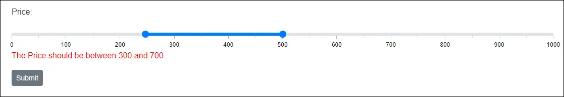
Apply the custom attribute to the model class property.
@using System.ComponentModel.DataAnnotations;

<EditForm Model="@rangeModel">
    <DataAnnotationsValidator />
    <div class="form-group">
        <label for="price">Price:</label>
        <SfSlider ID="price" @bind-Value="@rangeModel.Price" Type="SliderType.Range" Min="0" Max="1000">
            <SliderTicks Placement="Placement.After" ShowSmallTicks="true" LargeStep="100" SmallStep="50"></SliderTicks>
        </SfSlider>
        <ValidationMessage For="@(() => rangeModel.Price)"></ValidationMessage>
    </div>
    <SfButton>Submit</SfButton>
</EditForm>

@code {
    private RangeModel rangeModel = new RangeModel();

    public class RangeModel
    {
        [Required]
        [CustomRange(300, 700)]
        public int[] Price { get; set; } = { 500, 600 };
    }

    public class CustomRangeAttribute : ValidationAttribute
    {
        public int StartRange { get; }
        public int EndRange { get; }

        public CustomRangeAttribute(int startRange, int endRange)
        {
            StartRange = startRange;
            EndRange = endRange;
        }

        protected override ValidationResult IsValid(object value, ValidationContext validationContext)
        {
            var inputValues = (int[])value;
            if (inputValues[0] < StartRange || inputValues[1] > EndRange)
            {
                return new ValidationResult($"The {validationContext.DisplayName} should be between {StartRange} and {EndRange}.");
            }
            return ValidationResult.Success;
        }
    }
}
Validate components inside another component
You can create a new Blazor component and use Blazor components on top of it for your custom implementation. In this case, you may need to validate your Blazor component that should validate the Blazor components.
Refer to the following steps to create and validate the Blazor component on your custom Blazor component.
-
Right-click on the
~/Pages/folder in the Visual Studio and navigate toAdd -> Razor Component. Specify the component name and create it. -
Add a Blazor component in the new component and assign the
Value,ValueChanged, andValueExpressionparameters. Refer to the data binding with component parameters documentation for details.@using System.Linq.Expressions; <label for="@ID">@Label</label> <SfTextBox ID="@ID" Value="@Text" ValueChanged="@((text) => Text = text)" ValueExpression="@TextExpression"></SfTextBox> @code { [Parameter] public string ID { get; set; } [Parameter] public string Label { get; set; } [Parameter] public string Text { get => text; set { if (text != value) { text = value; TextChanged.InvokeAsync(value); } } } private string text; [Parameter] public EventCallback<string> TextChanged { get; set; } [Parameter] public Expression<Func<string>> TextExpression { get; set; } } -
Add your new component in the view page
~/Pages/Index.razorand implement validation using DataAnnotation.@using System.ComponentModel.DataAnnotations; <EditForm Model="@editorModel"> <DataAnnotationsValidator /> <div class="form-group"> <MyTextBox ID="name" Label="Name" @bind-Text="@editorModel.Name"></MyTextBox> <ValidationMessage For="@(() => editorModel.Name)"></ValidationMessage> </div> <SfButton>Submit</SfButton> </EditForm> @code { private EditorModel editorModel = new EditorModel(); public class EditorModel { [Required(ErrorMessage = "Enter employee name.")] [MinLength(3, ErrorMessage = "Name should have more than 2 characters.")] public string Name { get; set; } } }