Drag and Drop in Blazor Dashboard Layout Component
19 Jun 20263 minutes to read
The Dashboard Layout component provides built-in drag-and-drop functionality, enabling users to reorder and rearrange panels dynamically within the layout. As a panel is dragged, a placeholder area is highlighted, indicating the potential placement location when the panel is dropped. This visual feedback assists users in determining optimal panel positioning.
When multiple panels collide during a drag operation, the colliding panels are automatically adjusted by being pushed to the left, right, top, or bottom to create adaptive space for the moving panel. These positional adjustments are updated in real-time, allowing users to anticipate the final layout before releasing the dragged panel.
NOTE
By default, the entire panel acts as the draggable handle, meaning a dragging action can be initiated by clicking anywhere on the panel.
@using Syncfusion.Blazor.Layouts
<SfDashboardLayout CellSpacing="@(new double[]{10 ,10 })" CellAspectRatio="2" Columns="5">
<DashboardLayoutPanels>
<DashboardLayoutPanel>
<ContentTemplate><div>0</div></ContentTemplate>
</DashboardLayoutPanel>
<DashboardLayoutPanel SizeX=2 SizeY=2 Column=1>
<ContentTemplate><div>1</div></ContentTemplate>
</DashboardLayoutPanel>
<DashboardLayoutPanel SizeY=2 Column=3>
<ContentTemplate><div>2</div></ContentTemplate>
</DashboardLayoutPanel>
<DashboardLayoutPanel Row=1>
<ContentTemplate><div>3</div></ContentTemplate>
</DashboardLayoutPanel>
</DashboardLayoutPanels>
</SfDashboardLayout>
<style>
.e-panel-content {
text-align: center;
margin-top: 10px;
}
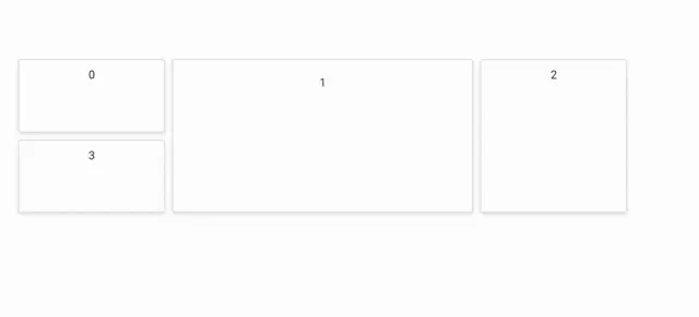
</style>The sample above demonstrates both dragging and the automatic pushing of panels. For instance, when panel 0 is dragged over panel 1, they collide, and panel 1 is pushed to a feasible direction, allowing panel 0 to occupy its new position.
The following output illustrates the dragging functionality of the dashboard component:
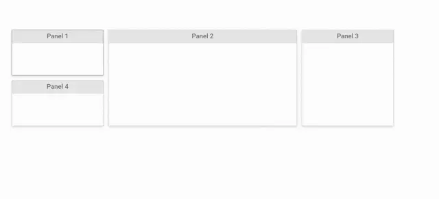
Customizing the Drag Handle
The draggable handle for panels can be customized using the DraggableHandle property. This property allows you to restrict the dragging action to a specific element within the panel, rather than the entire panel.
@using Syncfusion.Blazor.Layouts

    <SfDashboardLayout CellSpacing="@(new double[]{10 ,10 })" CellAspectRatio="2" Columns="5" DraggableHandle=".e-panel-header">
        <DashboardLayoutPanels>
            <DashboardLayoutPanel>
                <HeaderTemplate><div>Panel 1</div></HeaderTemplate>
            </DashboardLayoutPanel>
            <DashboardLayoutPanel SizeX=2 SizeY=2 Column=1>
                <HeaderTemplate><div>Panel 2</div></HeaderTemplate>
            </DashboardLayoutPanel>
            <DashboardLayoutPanel SizeY=2 Column=3>
                <HeaderTemplate><div>Panel 3</div></HeaderTemplate>
            </DashboardLayoutPanel>
            <DashboardLayoutPanel Row=1>
                <HeaderTemplate><div>Panel 4</div></HeaderTemplate>
            </DashboardLayoutPanel>
        </DashboardLayoutPanels>
    </SfDashboardLayout>

<style>
    .e-panel-header {
        background-color: rgba(0, 0, 0, .1);
        text-align: center;
    }
    .e-panel-content {
        text-align: center;
        margin-top: 10px;
    }
</style>
The following output demonstrates customizing the dragging handle, where panels can only be dragged by interacting with their header section.