Size and Position of Panels in Blazor Dashboard Layout Component
17 Jul 20266 minutes to read
Panels are fundamental building blocks within the Blazor Dashboard Layout component, serving as containers for data visualization and presentation.
Panels are fundamental building blocks within the Blazor Dashboard Layout component, serving as containers for data visualization and presentation.
| Panel Property | Default Value | Description |
|---|---|---|
| Id | null | Specifies the ID value of the panel. |
| Row | 0 | Specifies the row value in which the panel to be placed. |
| Column | 0 | Specifies the column value in which the panel to be placed. |
| SizeX | 1 | Specifies the width of the panel in cells count. |
| SizeY | 1 | Specifies the height of the panel in cells count. |
| MinSizeX | 1 | Specifies the minimum width of the panel in cells count. |
| MinSizeY | 1 | Specifies the minimum height of the panel in cells count. |
| MaxSizeX | null | Specifies the maximum width of the panel in cells count. |
| MaxSizeY | null | Specifies the maximum height of the panel in cells count. |
| HeaderTemplate | null | Specifies the header template of the panel. |
| ContentTemplate | null | Specifies the content template of the panel. |
| CssClass | null | Specifies the CSS class name that can be appended with each panel element. |
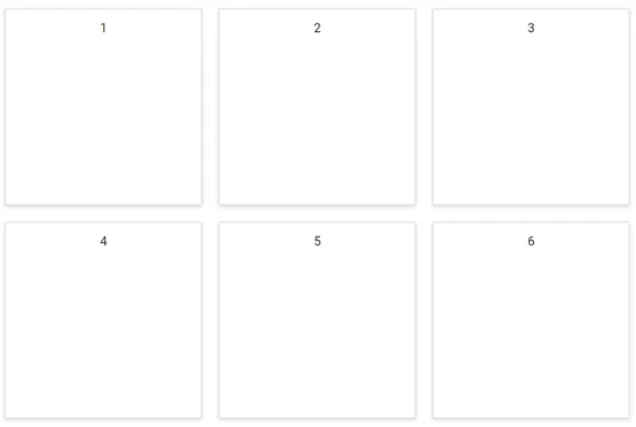
Positioning of Panels
Panels within the layout can be precisely positioned and ordered using the Row and Column properties of each DashboardLayoutPanel. This capability is essential for arranging data in any desired layout or order.
@using Syncfusion.Blazor.Layouts

<SfDashboardLayout CellSpacing="@(new double[]{20 ,20 })" Columns="4">
    <DashboardLayoutPanels>
        <DashboardLayoutPanel>
            <ContentTemplate><div>1</div></ContentTemplate>
        </DashboardLayoutPanel>
        <DashboardLayoutPanel  Column=1>
            <ContentTemplate><div>2</div></ContentTemplate>
        </DashboardLayoutPanel>
        <DashboardLayoutPanel Column=2>
            <ContentTemplate><div>3</div></ContentTemplate>
        </DashboardLayoutPanel>
        <DashboardLayoutPanel Row=1>
            <ContentTemplate><div>4</div></ContentTemplate>
        </DashboardLayoutPanel>
        <DashboardLayoutPanel Row=1 Column=1>
            <ContentTemplate><div>5</div></ContentTemplate>
        </DashboardLayoutPanel>
        <DashboardLayoutPanel Row=1 Column=2>
            <ContentTemplate><div>6</div></ContentTemplate>
        </DashboardLayoutPanel>
    </DashboardLayoutPanels>
</SfDashboardLayout>

<style>
    .e-panel-content {
        text-align: center;
        margin-top: 10px;
    }
</style>
The following screenshot illustrates panel positioning within the Dashboard Layout, utilizing the Row and Column properties:
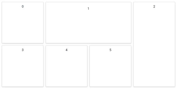
Sizing of Panels
A panel’s size can be easily adjusted by defining its SizeX and SizeY properties.
-
SizeX: Defines the width of a panel in cells count. -
SizeY: Defines the height of a panel in cells count.
These properties are invaluable when designing dashboards where the content and layout of each panel may vary significantly in size, allowing for flexible and responsive designs.
@using Syncfusion.Blazor.Layouts

<SfDashboardLayout CellSpacing="@(new double[]{10 ,10 })" Columns="5">
    <DashboardLayoutPanels>
        <DashboardLayoutPanel>
            <ContentTemplate><div>0</div></ContentTemplate>
        </DashboardLayoutPanel>
        <DashboardLayoutPanel SizeX=2 Column=1>
            <ContentTemplate><div>1</div></ContentTemplate>
        </DashboardLayoutPanel>
        <DashboardLayoutPanel SizeY=2 Column=3>
            <ContentTemplate><div>2</div></ContentTemplate>
        </DashboardLayoutPanel>
        <DashboardLayoutPanel Row=1>
            <ContentTemplate><div>3</div></ContentTemplate>
        </DashboardLayoutPanel>
        <DashboardLayoutPanel Row=1 Column=1>
            <ContentTemplate><div>4</div></ContentTemplate>
        </DashboardLayoutPanel>
        <DashboardLayoutPanel Row=1 Column=2>
            <ContentTemplate><div>5</div></ContentTemplate>
        </DashboardLayoutPanel>
    </DashboardLayoutPanels>
</SfDashboardLayout>

<style>
    .e-panel-content {
        text-align: center;
        margin-top: 10px;
    }
</style>
The following screenshot demonstrates the sizing of panels within the Dashboard Layout, using the SizeX and SizeY properties: