Header and Content Templates in Blazor Dashboard Layout Component
17 Jul 20261 minute to read
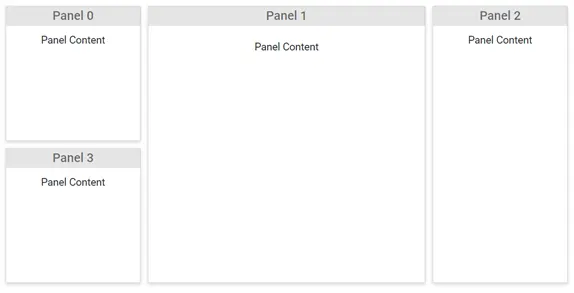
The Blazor Dashboard Layout component utilizes two primary templates for rendering data within its panels:
-
ContentTemplate: Used to render data or any HTML structure as the main content of a panel. -
HeaderTemplate: Enables the display of a word or phrase that summarizes the panel’s content, positioned at the top of each panel.
@using Syncfusion.Blazor.Layouts

<SfDashboardLayout CellSpacing="@(new double[]{10 ,10 })" Columns="5">
    <DashboardLayoutPanels>
        <DashboardLayoutPanel>
            <HeaderTemplate><div>Panel 0</div></HeaderTemplate>
            <ContentTemplate><div>Panel Content</div></ContentTemplate>
        </DashboardLayoutPanel>
        <DashboardLayoutPanel SizeX=2 SizeY=2 Column=1>
            <HeaderTemplate><div>Panel 1</div></HeaderTemplate>
            <ContentTemplate><div>Panel Content</div></ContentTemplate>
        </DashboardLayoutPanel>
        <DashboardLayoutPanel SizeY=2 Column=3>
            <HeaderTemplate><div>Panel 2</div></HeaderTemplate>
            <ContentTemplate><div>Panel Content</div></ContentTemplate>
        </DashboardLayoutPanel>
        <DashboardLayoutPanel Row=1>
            <HeaderTemplate><div>Panel 3</div></HeaderTemplate>
            <ContentTemplate><div>Panel Content</div></ContentTemplate>
        </DashboardLayoutPanel>
    </DashboardLayoutPanels>
</SfDashboardLayout>

<style>
    .e-panel-header {
        background-color: rgba(0, 0, 0, .1);
        text-align: center;
    }
    .e-panel-content {
        text-align: center;
        margin-top: 10px;
    }
</style>
The following output demonstrates the use of HeaderTemplate and ContentTemplate to define the header and content of panels: