Responsive and Adaptive Layout in Blazor Dashboard Layout Component
23 Jun 20261 minute to read
The Blazor Dashboard Layout component offers built-in responsive support, automatically adjusting panels based on their parent element’s dimensions. This eliminates the need for manual configuration of responsive dashboards across various resolutions.
The Dashboard Layout is designed to adapt to lower resolutions by transforming itself into a stacked layout, where panels are displayed in a single vertical column. By default, this layout transformation occurs when the screen resolution is 600px or lower. You can customize this breakpoint for any desired resolution by defining the MediaQuery property of the component.
@using Syncfusion.Blazor.Layouts

<SfDashboardLayout CellSpacing="@(new double[]{20 ,20 })" Columns="5" MediaQuery="max-width:700px">
    <DashboardLayoutPanels>
        <DashboardLayoutPanel>
            <ContentTemplate><div>0</div></ContentTemplate>
        </DashboardLayoutPanel>
        <DashboardLayoutPanel SizeX=2 SizeY=2 Column=1>
            <ContentTemplate><div>1</div></ContentTemplate>
        </DashboardLayoutPanel>
        <DashboardLayoutPanel SizeY=2 Column=3>
            <ContentTemplate><div>2</div></ContentTemplate>
        </DashboardLayoutPanel>
        <DashboardLayoutPanel Row=1>
            <ContentTemplate><div>3</div></ContentTemplate>
        </DashboardLayoutPanel>
    </DashboardLayoutPanels>
</SfDashboardLayout>

<style>
    .e-panel-content {
        text-align: center;
        margin-top: 10px;
    }
</style>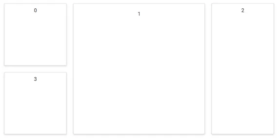
The sample above demonstrates the usage of the MediaQuery property to transform the layout into a stacked view at a user-defined resolution. Here, when the window size reaches 700px or less, the layout automatically switches to a stacked arrangement.