Configuring the Grid Layout in Blazor Dashboard Layout Component
23 Jun 20264 minutes to read
The Dashboard Layout component is built upon a grid structure, which is divided into equally sized subsections known as cells.
| Properties | Description |
|---|---|
| Columns | Specifies the total number of cells in each row. |
| CellAspectRatio | Specifies the height of cells to any desired size. |
Modifying Cell Size
The size of individual grid cells can be modified to suit your design requirements using the Columns and CellAspectRatio properties.
@using Syncfusion.Blazor.Layouts
<SfDashboardLayout CellSpacing="@(new double[]{10 ,10 })" CellAspectRatio="2" Columns="5">
<DashboardLayoutPanels>
<DashboardLayoutPanel>
<ContentTemplate><div>0</div></ContentTemplate>
</DashboardLayoutPanel>
<DashboardLayoutPanel SizeX=2 SizeY=2 Column=1>
<ContentTemplate><div>1</div></ContentTemplate>
</DashboardLayoutPanel>
<DashboardLayoutPanel SizeY=2 Column=3>
<ContentTemplate><div>2</div></ContentTemplate>
</DashboardLayoutPanel>
<DashboardLayoutPanel Row=1>
<ContentTemplate><div>3</div></ContentTemplate>
</DashboardLayoutPanel>
</DashboardLayoutPanels>
</SfDashboardLayout>
<style>
.e-panel-content {
text-align: center;
margin-top: 10px;
}
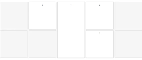
</style>In the sample above, the width of the parent element is divided into five equal cells based on the Columns property value. The CellAspectRatio is set to 2, meaning for every 100px of cell width, the height will be 50px (width / height = 2).
The following output demonstrates the effect of setting CellAspectRatio and Columns properties in the Dashboard Layout:
Setting Cell Spacing
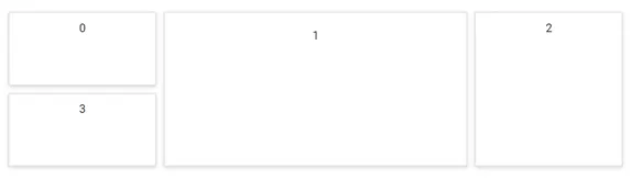
The spacing between individual panels in both rows and columns can be defined using the CellSpacing property. Adding spacing between panels significantly enhances layout clarity and provides a cleaner representation of your data.
@using Syncfusion.Blazor.Layouts

<SfDashboardLayout CellSpacing="@(new double[]{20 ,20 })" Columns="5">
    <DashboardLayoutPanels>
        <DashboardLayoutPanel>
            <ContentTemplate><div>0</div></ContentTemplate>
        </DashboardLayoutPanel>
        <DashboardLayoutPanel SizeX=2 SizeY=2 Column=1>
            <ContentTemplate><div>1</div></ContentTemplate>
        </DashboardLayoutPanel>
        <DashboardLayoutPanel SizeY=2 Column=3>
            <ContentTemplate><div>2</div></ContentTemplate>
        </DashboardLayoutPanel>
        <DashboardLayoutPanel Row=1>
            <ContentTemplate><div>3</div></ContentTemplate>
        </DashboardLayoutPanel>
    </DashboardLayoutPanels>
</SfDashboardLayout>

<style>
    .e-panel-content {
        text-align: center;
        margin-top: 10px;
    }
</style>
The following output demonstrates the clear representation of data achieved by setting the CellSpacing property in the Dashboard Layout component:
Graphical Representation of Grid Layout
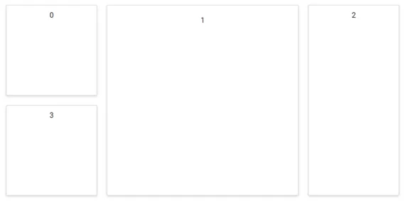
The underlying grid structure of the Dashboard Layout is initially hidden. This grid can be made visible by enabling the ShowGridLines property. Visualizing these grid lines is particularly helpful during the initial design phase for accurately sizing and positioning panels within the layout.
@using Syncfusion.Blazor.Layouts

<SfDashboardLayout CellSpacing="@(new double[]{10 ,10 })" Columns="5" ShowGridLines="true">
    <DashboardLayoutPanels>
        <DashboardLayoutPanel Column=1>
            <ContentTemplate><div>0</div></ContentTemplate>
        </DashboardLayoutPanel>
        <DashboardLayoutPanel SizeX=1 SizeY=2 Column=2>
            <ContentTemplate><div>1</div></ContentTemplate>
        </DashboardLayoutPanel>
        <DashboardLayoutPanel SizeY=1 Column=3>
            <ContentTemplate><div>2</div></ContentTemplate>
        </DashboardLayoutPanel>
        <DashboardLayoutPanel Row=1 Column=3>
            <ContentTemplate><div>3</div></ContentTemplate>
        </DashboardLayoutPanel>
    </DashboardLayoutPanels>
</SfDashboardLayout>

<style>
    .e-panel-content {
        text-align: center;
        margin-top: 10px;
    }
</style>
The following output illustrates the visible gridlines, indicating the cell division of the layout, with data containers (panels) placed over these cells: