Data annotation attributes
22 Jun 202619 minutes to read
The DataForm component supports .NET data annotation attributes from System.ComponentModel.DataAnnotations to control labels, placeholders, auto-generation, editable, and validation behavior.
Display attribute
The DisplayAttribute class specifies display-related metadata for a property. If a form item does not set a label explicitly, the DataForm uses the display name as the label for the corresponding editor.
Name property
The Name property sets the display name used as the editor label when a form item does not define label text.
[Display(Name = "First Name")]
public string FirstName { get; set; }
Short name property
The ShortName property sets a shorter display name that can be used as the editor label when label text is not specified for the form item.
[Display(ShortName = "First Name")]
public string FirstName { get; set; }
NOTE
DataForm gives priority to the ShortName property over the Name property of
DisplayAttributeand the LabelText property of theFormItem.
Prompt property
The Prompt property specifies placeholder text for the corresponding editor.
[Display(Prompt = "Enter your first name")]
public string FirstName { get; set; }
Auto generate field property
The AutoGenerateField property indicates whether the property should be automatically generated as a field in the DataForm.
[Display(AutoGenerateField = false)]
public string ID { get; set; }
Validation attributes
The DataForm component supports the following validation attributes from the System.ComponentModel.DataAnnotations namespace. When validation fails, the DataForm displays the associated error message.
Required attribute
The RequiredAttribute class specifies that a property value is mandatory.
[Required(ErrorMessage = "Name is required")]
public string Name { get; set; }
Range attribute
The RangeAttribute class defines numeric range constraints for a property.
[Range(0, 100, ErrorMessage = "Age must be between 0 and 100")]
public int Age { get; set; }
Regular expression attribute
The RegularExpressionAttribute class enforces that a property value matches a specified regular expression pattern.
[RegularExpression(@"^[a-zA-Z]+$", ErrorMessage = "Name must contain only alphabets")]
public string Name { get; set; }
String length Attribute
The StringLengthAttribute class specifies minimum and maximum length constraints for a property value.
[StringLength(100, MinimumLength = 3, ErrorMessage = "Name must be between 5 and 10 characters")]
 public string Name { get; set; }
Minimum length Attribute
The MinLengthAttribute class defines the minimum length constraint for a property value.
[MinLength(3, ErrorMessage = "Name must be at least 3 characters")]
public string Name { get; set; }
Maximum length Attribute
The MaxLengthAttribute class defines the maximum length constraint for a property value.
[MaxLength(10, ErrorMessage = "Name must be at most 10 characters")]
public string Name { get; set; }
Phone number attribute
The PhoneAttribute class validates a property value against a phone number pattern.
[Phone(ErrorMessage = "Phone number is not valid")]
public string PhoneNumber { get; set; }
Email address attribute
The EmailAddressAttribute class validates that a property value matches an email address pattern.
[EmailAddress(ErrorMessage = "Email address is not valid")]
public string Email { get; set; }
URL attribute
The UrlAttribute class validates that a property value matches a URL pattern.
[Url(ErrorMessage = "URL is not valid")]
public string Url { get; set; }
Enum data type attribute
The EnumDataTypeAttribute class enforces that a property value is a member of the specified enumeration.
[EnumDataType(typeof(Gender), ErrorMessage = "Please enter a valid gender")]
 public string Gender { get; set; }
Compare attribute
The CompareAttribute class validates that a property value matches another property’s value (for example, confirming a password).
[Compare("Password", ErrorMessage = "Passwords do not match")]
public string ConfirmPassword { get; set; }
String length attribute
The StringLengthAttribute class limits the length of input values and can display a validation message when limits are exceeded. Additionally, the editor component prevents entering characters beyond the specified maximum length. Note that the error message shown in the example is user-defined and may not mirror the exact minimum/maximum values configured in the attribute.
[StringLength(100, MinimumLength = 3, ErrorMessage = "Name must be between 5 and 10 characters")]
public string Name { get; set; }
Data type attribute
The DataTypeAttribute class specifies the semantic data type of a property. The DataForm uses this attribute to determine the editor type for the property. The following table lists supported data types and their corresponding editors.
| Data type | Editor type | Image |
|---|---|---|
DataType.Date |
SfDatePicker | 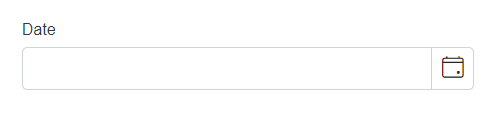 |
DataType.Time |
SfTimePicker | 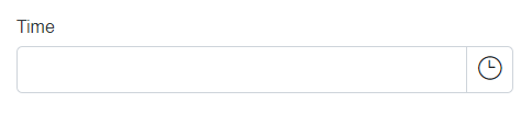 |
DataType.DateTime |
SfDateTimePicker | 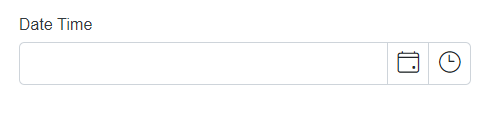 |
DataType.Currency |
SfNumericTextBox | 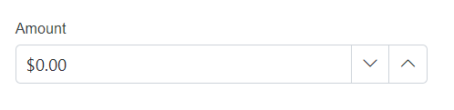 |
DataType.PhoneNumber |
SfMaskedTextBox | 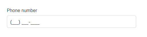 |
DataType.CreditCard |
SfMaskedTextBox | 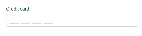 |
DataType.MultilineText |
SfTextBox | 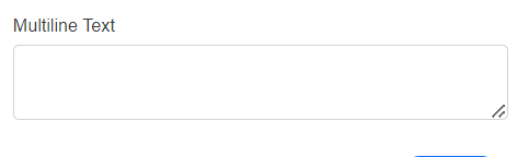 |
DataType.Password |
SfTextBox | 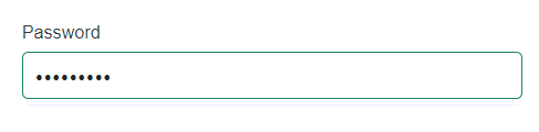 |
<ul><li>DataType.EmailAddress</li><li>DataType.Url</li><li>DataType.Text</li><li> DataType.ImageUrl</li><li> DataType.Html</li></ul> |
SfTextBox | 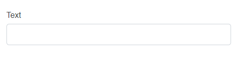 |
If a different data type is specified that is not listed above, the DataForm uses the SfTextBox editor by default.
[DataType(DataType.Date)]
public DateTime? DateOfBirth { get; set; }
Editable attribute
The EditableAttribute class specifies whether a property is editable in the DataForm.
[Editable(false)]
public string ID { get; set; }
Bindable attribute
The BindableAttribute class controls automatic field generation, similar to the AutoGenerateField setting in the Display attribute. When set to false, the property is not generated as a field in the DataForm.
[Bindable(false)]
public string ID { get; set; }
Read only attribute
The ReadOnlyAttribute class specifies whether the property should be read-only in the DataForm.
[ReadOnly(true)]
public string ID { get; set; }
Custom attributes
Data form display options attribute
The DataFormDisplayOptionsAttribute attribute configures display options for a property in the DataForm. The DataForm uses this attribute to determine ColumnSpan for the property.
<SfDataForm ID="MyForm"
            EditContext="@UserEditContext"
            ColumnCount=6
            ColumnSpacing="10px"
            Width="70%"
            ButtonsAlignment="FormButtonsAlignment.Right">
    <FormValidator>
        <DataAnnotationsValidator></DataAnnotationsValidator>
    </FormValidator>
    <FormItems>
        <FormAutoGenerateItems></FormAutoGenerateItems>
    </FormItems>
    <FormButtons>
        <SfButton>Pay [email protected] </SfButton>
    </FormButtons>
</SfDataForm>

@code {
    EditContext UserEditContext { get; set; }
    public char PromptCharacter = ' ';
    protected override Task OnInitializedAsync()
    {
        UserEditContext = new EditContext(PaymentDetails);
        return base.OnInitializedAsync();
    }
    private PaymentDetailsModel PaymentDetails = new PaymentDetailsModel();
}
public class ZipCodes
{
public int? Code { get; set; }
public string City { get; set; }
}
private List<ZipCodes> ZipData = new List<ZipCodes>()
{
new ZipCodes(){ Code=90210 , City="Beverly Hills, 90210 (California)" },
new ZipCodes(){ Code=94558, City="Napa Valley, 94558 (California)" },
new ZipCodes(){ Code=33139, City="South Beach, 33139 (Florida)" },
new ZipCodes(){ Code=10019, City="Manhattan, 10019 (New York)" },
new ZipCodes(){ Code=94043, City="Silicon Valley, 94043 (California)" },
};
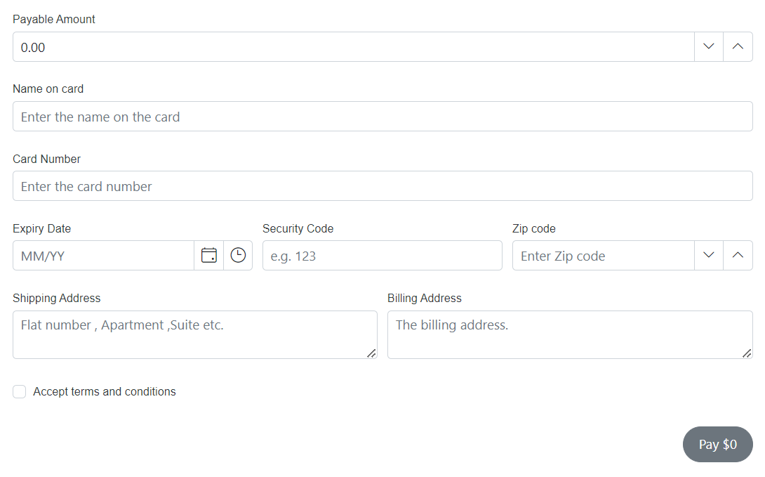
public class PaymentDetailsModel
{
[Required(ErrorMessage = "Please enter your payment amount.")]
[Display(Name = "Payable Amount", Prompt = "Currency format")]
[Range(1, 10000000)]
[DataFormDisplayOptions(ColumnSpan = 6)]
public double PaymentAmount { get; set; }
[Required(ErrorMessage = "Please enter your name.")]
[Display(Name = "Name on card", Prompt = "Enter the name on the card")]
[DataFormDisplayOptions(ColumnSpan = 6)]
public string NameOnCard { get; set; }
[Required(ErrorMessage = "Please enter your card number.")]
[Display(Name = "Card Number", Prompt = "Enter the card number")]
[DataFormDisplayOptions(ColumnSpan = 6)]
public string CardNumber { get; set; }
[Required(ErrorMessage = "Please enter card expiry date.")]
[Display(Name = "Expiry Date", Prompt = "MM/YY")]
[DataFormDisplayOptions(ColumnSpan = 2)]
public DateTime? ExpiryDate { get; set; }
[Required(ErrorMessage = "Please enter security code.")]
[Display(Name = "Security Code", Prompt = "e.g. 123")]
[DataFormDisplayOptions(ColumnSpan = 2)]
public string SecurityCode { get; set; }
[Required(ErrorMessage = "Please enter your zip code.")]
[Display(Name = "Zip code", Prompt = "Enter Zip code")]
[DataFormDisplayOptions(ColumnSpan = 2)]
public int? ZipCode { get; set; }
[Required(ErrorMessage = "Please enter your shipping address.")]
[Display(Name = "Shipping Address", Prompt = "Flat number , Apartment ,Suite etc.")]
[DataFormDisplayOptions(ColumnSpan = 3)]
[DataType(DataType.MultilineText)]
public string ShippingAddress { get; set; }
[Display(Name = "Billing Address", Prompt = "The billing address.")]
[DataFormDisplayOptions(ColumnSpan = 3)]
[DataType(DataType.MultilineText)]
public string BillingAddress { get; set; }
[Required(ErrorMessage = "Please agree with the terms.")]
[Display(Name = "Accept terms and conditions", Prompt = "Please agree with the terms.")]
[DataFormDisplayOptions(ColumnSpan = 6)]
[Range(typeof(bool), "true", "true", ErrorMessage = "Please agree with the terms.")]
public bool AcceptTerms { get; set; }
}
Custom validation
A custom validation attribute in .NET is a class that inherits from the ValidationAttribute abstract class and overrides the IsValid method. This method is called when the attribute is applied to a property and the property’s value is being validated.
In the IsValid method, implement the validation logic. When validation fails, return a ValidationResult with an error message; when it succeeds, return ValidationResult.Success.
@using System;
@using System.ComponentModel.DataAnnotations;
@using Syncfusion.Blazor.DataForm;
@using System.Text.RegularExpressions;
<SfDataForm ID="MyForm"
Model="@EmployeeModel"
Width="50%">
<FormValidator>
<DataAnnotationsValidator></DataAnnotationsValidator>
</FormValidator>
<FormItems>
<FormGroup LabelText="Sign Up Details">
<FormItem Field="@nameof(EmployeeModel.Name)" LabelText="Name"></FormItem>
<FormItem Field="@nameof(EmployeeModel.Email)" LabelText="Email Id"></FormItem>
<FormItem Field="@nameof(EmployeeModel.Password)" LabelText="Password" EditorType="FormEditorType.Password"> </FormItem>
<FormItem Field="@nameof(EmployeeModel.ConfirmPassword)" LabelText="Confirm Password" EditorType="FormEditorType.Password"> </FormItem>
</FormGroup>
</FormItems>
</SfDataForm>
@code {
private EmployeeDetails EmployeeModel = new EmployeeDetails();
public class EmployeeDetails
{
[Required]
public string? Name { get; set; }
[Required]
[PasswordValidation(ErrorMessage = "This field should not be Empty")]
public string? Password { get; set; }
[Required]
[Compare("Password", ErrorMessage = "Confirm Password must match Password")]
public string? ConfirmPassword { get; set; }
[Required]
[EmailValidation(ErrorMessage = "This field should not be Empty")]
public string? Email { get; set; }
}
public class PasswordValidationAttribute : ValidationAttribute
{
protected override ValidationResult IsValid(object value, ValidationContext validationContext)
{
string fieldValue = value as string;
if (fieldValue.Length < 10)
{
return new ValidationResult("Password should have at least 10 characters", new[] { validationContext.MemberName });
}
if (!Regex.IsMatch(fieldValue, @"[A-Z]"))
{
return new ValidationResult("Password should contain at least one uppercase letter", new[] { validationContext.MemberName });
}
if (!Regex.IsMatch(fieldValue, @"[a-z]"))
{
return new ValidationResult("Password should contain at least one lowercase letter", new[] { validationContext.MemberName });
}
if (!Regex.IsMatch(fieldValue, @"[@#$%^&+=]"))
{
return new ValidationResult("Password should contain at least one special character", new[] { validationContext.MemberName });
}
return ValidationResult.Success;
}
}
public class EmailValidationAttribute : ValidationAttribute
{
protected override ValidationResult IsValid(object value, ValidationContext validationContext)
{
string email = value as string;
if (!IsValidEmail(email))
{
return new ValidationResult("Email address is not valid..", new[] { validationContext.MemberName });
}
return ValidationResult.Success;
}
private bool IsValidEmail(string email)
{
return Regex.IsMatch(email, @"^[A-Za-z0-9._%+-]+@[A-Za-z0-9.-]+\.[A-Za-z]{2,4}$");
}
}
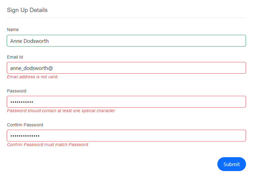
}In the example, the PasswordValidationAttribute checks whether the password meets the required criteria (length, uppercase, lowercase, and special character). If not, it returns a ValidationResult with an appropriate message. The EmailValidationAttribute validates the email format and returns a ValidationResult with an error message when invalid.