Form items in DataForm component
9 Jun 202612 minutes to read
The FormItem configures the editor for a specific model field. It supports setting a unique identifier (ID), selecting the editor type, applying CSS classes, specifying placeholder and label text, and enabling or disabling the field. The following sections demonstrate common property usage:
- Field: map the model property to an editor
- ID: assign a unique identifier
- Placeholder: set hint text inside the editor
- EditorType: choose the editor control
- IsEnabled: enable or disable the form item
- Label/LabelText: set the editor’s label text
- CssClass: apply custom styles to the editor wrapper
Configuring the model field and ID
The Field property maps the model field to the corresponding editor. The ID property sets a unique identifier for the editor component.
@using Syncfusion.Blazor.DataForm
@using System.ComponentModel.DataAnnotations

<SfDataForm ID="MyForm"
            Model="@EventRegistrationModel">
    <FormValidator>
        <DataAnnotationsValidator></DataAnnotationsValidator>
    </FormValidator>
    <FormItems>
        <FormItem Field="@nameof(EventRegistration.Name)" ID="firstname"></FormItem>
        <FormItem Field="@nameof(EventRegistration.Email)" ID="email"></FormItem>
    </FormItems>
</SfDataForm>


@code {
    private EventRegistration EventRegistrationModel = new EventRegistration();
}
public class EventRegistration
{
[Required(ErrorMessage = "Please enter your name.")]
[Display(Name = "Name")]
public string Name { get; set; }
[Required(ErrorMessage = "Please enter your email address.")]
[Display(Name = "Email ID")]
public string Email { get; set; }
}
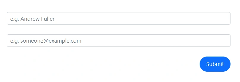
Set the placeholder
The Placeholder property sets the placeholder text for the editor.
@using Syncfusion.Blazor.DataForm
@using System.ComponentModel.DataAnnotations

<SfDataForm ID="MyForm"
            Width="50%"
            Model="@EventRegistrationModel">
    <FormValidator>
        <DataAnnotationsValidator></DataAnnotationsValidator>
    </FormValidator>
    <FormItems>
        <FormItem Field="@nameof(EventRegistration.Name)" Placeholder="e.g. Andrew Fuller"></FormItem>
        <FormItem Field="@nameof(EventRegistration.Email)" Placeholder="e.g. [email protected]"></FormItem>
    </FormItems>
</SfDataForm>


@code {
    private EventRegistration EventRegistrationModel = new EventRegistration();
}
public class EventRegistration
{
[Required(ErrorMessage = "Please enter your name.")]
public string Name { get; set; }
[Required(ErrorMessage = "Please enter your email address.")]
public string Email { get; set; }
}
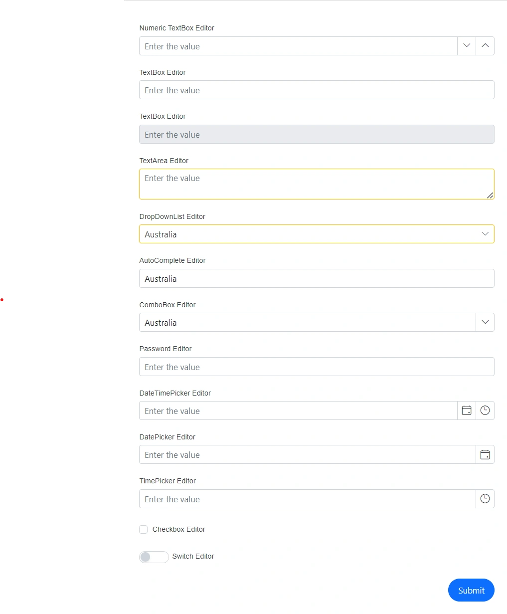
Change the editor type
The EditorType property selects the editor used for the field. Set the value from the FormEditorType enumeration to override the default editor inferred from the field type.
| Field Type | Supported editor types |
|---|---|
string |
TextBox, TextArea, Password |
int, float, decimal, double, long
|
NumericTextBox |
bool |
CheckBox, Switch |
DateTime |
DatePicker, DateTimePicker, TimePicker |
enum |
DropDownList, ComboBox, AutoComplete |
DateOnly |
DatePicker |
TimeOnly |
TimePicker |
@using Syncfusion.Blazor.DataForm
@using System.ComponentModel.DataAnnotations


<SfDataForm ID="MyForm"
            Model="@EditorTypeModel"
            Width="50%"
            AutoComplete="on">

    <FormValidator>
        <DataAnnotationsValidator></DataAnnotationsValidator>
    </FormValidator>

    <FormItems>
        <FormItem Field="@nameof(EditorTypeModel.NumericTextBoxField)" ID="numeric-textbox" Placeholder="Enter the value" LabelText="Numeric TextBox Editor"></FormItem>
        <FormItem Field="@nameof(EditorTypeModel.TextBoxField)" ID="textbox" Placeholder="Enter the value" LabelText="TextBox Editor"></FormItem>
        <FormItem Field="@nameof(EditorTypeModel.DisabledTextBoxField)" ID="diabled" IsEnabled="false" Placeholder="Enter the value" LabelText="TextBox Editor"></FormItem>
        <FormItem Field="@nameof(EditorTypeModel.TextAreaField)" CssClass="e-warning" LabelText="TextArea Editor" Placeholder="Enter the value" EditorType="FormEditorType.TextArea"></FormItem>
        <FormItem Field="@nameof(EditorTypeModel.DropDownListField)" LabelText="DropDownList Editor" CssClass="e-warning" Placeholder="Select the value" EditorType="FormEditorType.DropDownList"></FormItem>
        <FormItem Field="@nameof(EditorTypeModel.AutoCompleteField)" LabelText="AutoComplete Editor" Placeholder="Select the value" EditorType="FormEditorType.AutoComplete"></FormItem>
        <FormItem Field="@nameof(EditorTypeModel.ComboBoxField)" LabelText="ComboBox Editor" Placeholder="Select the value" EditorType="FormEditorType.ComboBox"></FormItem>
        <FormItem Field="@nameof(EditorTypeModel.PasswordField)" LabelText="Password Editor" Placeholder="Enter the value" EditorType="FormEditorType.Password"></FormItem>
        <FormItem Field="@nameof(EditorTypeModel.DateTimePickerField)" LabelText="DateTimePicker Editor" Placeholder="Enter the value" EditorType="FormEditorType.DateTimePicker"></FormItem>
        <FormItem Field="@nameof(EditorTypeModel.DatePickerField)" LabelText="DatePicker Editor" Placeholder="Enter the value" EditorType="FormEditorType.DatePicker"></FormItem>
        <FormItem Field="@nameof(EditorTypeModel.TimePickerField)" LabelText="TimePicker Editor" Placeholder="Enter the value" EditorType="FormEditorType.TimePicker"></FormItem>
        <FormItem Field="@nameof(EditorTypeModel.CheckBoxField)" LabelText="Checkbox Editor"></FormItem>
        <FormItem Field="@nameof(EditorTypeModel.SwitchField)" LabelText="Switch Editor" EditorType="FormEditorType.Switch"></FormItem>
    </FormItems>
</SfDataForm>


@code {
    private EditorTypes EditorTypeModel = new EditorTypes();
}
public enum Countries
{
Australia,
Bermuda,
Canada
}
public class EditorTypes
{
[Required(ErrorMessage = "Please enter a value for NumericTextBoxField")]
public int? NumericTextBoxField { get; set; }
[Required(ErrorMessage = "Please enter a value for TextBoxField")]
public string TextBoxField { get; set; }
[Required(ErrorMessage = "Please enter a value for TextBoxField")]
public string DisabledTextBoxField { get; set; }
[Required(ErrorMessage = "Please enter a value for TextAreaField")]
public string TextAreaField { get; set; }
[Required(ErrorMessage = "Please select a value for DropDownListField")]
public Countries DropDownListField { get; set; }
[Required(ErrorMessage = "Please enter a value for AutoCompleteField")]
public Countries AutoCompleteField { get; set; }
[Required(ErrorMessage = "Please select a value for ComboBoxField")]
public Countries ComboBoxField { get; set; }
[Required(ErrorMessage = "Please enter a value for PasswordField")]
public string PasswordField { get; set; }
[Required(ErrorMessage = "Please select a date for DateTimePickerField")]
public DateTime? DateTimePickerField { get; set; }
[Required(ErrorMessage = "Please select a date for DatePickerField")]
public DateTime? DatePickerField { get; set; }
[Required(ErrorMessage = "Please select a time for TimePickerField")]
public DateTime? TimePickerField { get; set; }
[Required(ErrorMessage = "Please check the CheckBoxField")]
[Range(typeof(bool), "true", "true", ErrorMessage = "CheckBoxField must be checked")]
public bool CheckBoxField { get; set; }
[Required(ErrorMessage = "Please toggle the SwitchField")]
[Range(typeof(bool), "true", "true", ErrorMessage = "SwitchField must be toggled")]
public bool SwitchField { get; set; }
}
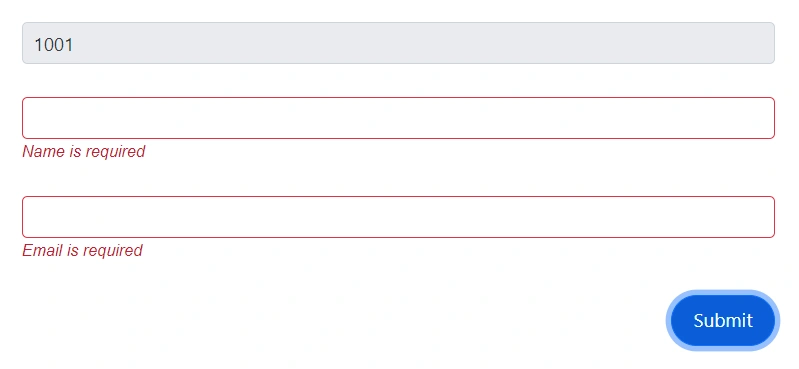
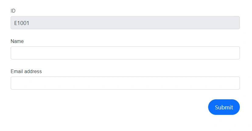
Disable a form item
The IsEnabled property disables a specific form item.
@using Syncfusion.Blazor.DataForm
@using System.ComponentModel.DataAnnotations

<SfDataForm ID="MyForm"
            Model="@EventRegistrationModel">
    <FormValidator>
        <DataAnnotationsValidator></DataAnnotationsValidator>
    </FormValidator>
    <FormItems>
        <FormItem Field="@nameof(EventRegistration.ID)" IsEnabled="false"></FormItem>
        <FormItem Field="@nameof(EventRegistration.Name)"></FormItem>
        <FormItem Field="@nameof(EventRegistration.Email)"></FormItem>
    </FormItems>
</SfDataForm>


@code {
    private EventRegistration EventRegistrationModel = new EventRegistration()
        {
            ID = "1001"
        };
}
public class EventRegistration
{
public string ID { get; set; }
[Required(ErrorMessage = "Name is required")]
public string Name { get; set; }
[Required(ErrorMessage = "Email is required")]
[EmailAddress(ErrorMessage = "Invalid Email Address")]
public string Email { get; set; }
}
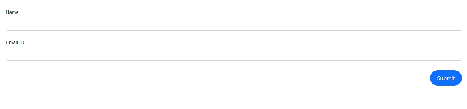
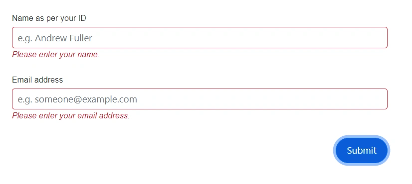
Change the label text
Set the label using the LabelText property. When not set, the label is derived from data annotations on the bound model property, giving priority to DisplayAttribute.ShortName and then DisplayAttribute.Name.
@using Syncfusion.Blazor.DataForm
@using System.ComponentModel.DataAnnotations

<SfDataForm ID="MyForm"
            Width="50%"
            Model="@EventRegistrationModel">
    <FormValidator>
        <DataAnnotationsValidator></DataAnnotationsValidator>
    </FormValidator>
    <FormItems>
        <FormItem Field="@nameof(EventRegistration.Name)" Placeholder="e.g. Andrew Fuller" LabelText="Name as per your ID"></FormItem>
        <FormItem Field="@nameof(EventRegistration.Email)" Placeholder="e.g. [email protected]" LabelText="Email address"></FormItem>
    </FormItems>
</SfDataForm>


@code {
    private EventRegistration EventRegistrationModel = new EventRegistration();
}
public class EventRegistration
{
[Required(ErrorMessage = "Please enter your name.")]
public string Name { get; set; }
[Required(ErrorMessage = "Please enter your email address.")]
public string Email { get; set; }
}
Change the appearance of the field editor
Use the CssClass property to apply a custom CSS class to the editor wrapper and customize the appearance.
@using Syncfusion.Blazor.DataForm
@using System.ComponentModel.DataAnnotations

<SfDataForm ID="MyForm"
            Model="@EventRegistrationModel">
    <FormValidator>
        <DataAnnotationsValidator></DataAnnotationsValidator>
    </FormValidator>
    <FormItems>
        <FormItem Field="@nameof(EventRegistration.Name)" CssClass="e-warning"></FormItem>
        <FormItem Field="@nameof(EventRegistration.Email)"></FormItem>
    </FormItems>
    </SfDataForm>

@code {

    private EventRegistration EventRegistrationModel = new EventRegistration();
}
public class EventRegistration
{
[Required(ErrorMessage = "Please enter your name.")]
[Display(Name = "Name")]
public string Name { get; set; }
[Required(ErrorMessage = "Please enter your email address.")]
[Display(Name = "Email address")]
public string Email { get; set; }
}