How can I help you?
Layout customization
4 Nov 20259 minutes to read
This section explains how to position buttons and labels in the DataForm component, customize button areas, and display validation messages. It also describes how to enable floating labels and adjust the overall form width.
Button alignment
The DataForm component can align form buttons horizontally within the form container by using the ButtonsAlignment property. The ButtonsAlignment options are:
- Center: centers the buttons within the container
- Left: left-aligns the buttons
- Right: right-aligns the buttons
- Stretch: stretches buttons to fill the available width
| FormButtonsAlignment | Snapshot |
|---|---|
| FormButtonsAlignment.Center | 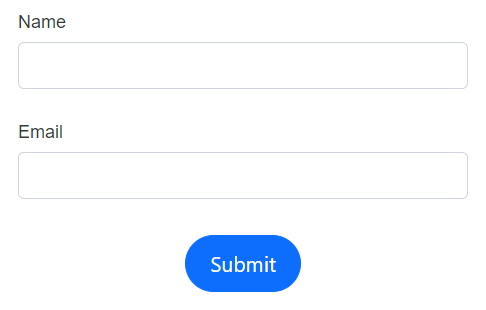 |
| FormButtonsAlignment.Left | 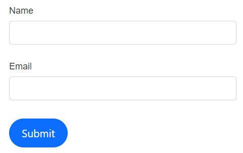 |
| FormButtonsAlignment.Right | 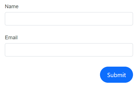 |
| FormButtonsAlignment.Stretch | 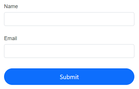 |
The following example shows how to use the ButtonsAlignment property in the DataForm component.
@using Syncfusion.Blazor.DataForm
@using System.ComponentModel.DataAnnotations
<SfDataForm Model="@RegistrationDetailsModel"
ButtonsAlignment="FormButtonsAlignment.Center">
<FormValidator>
<DataAnnotationsValidator></DataAnnotationsValidator>
</FormValidator>
<FormItems>
<FormAutoGenerateItems></FormAutoGenerateItems>
</FormItems>
</SfDataForm>
@code {
public class RegistrationDetails
{
[Required(ErrorMessage = "Please enter your name")]
public string Name { get; set; }
[Required(ErrorMessage = "Please enter your email address")]
[EmailAddress(ErrorMessage = "Please enter valid email address")]
public string Email { get; set; }
}
private RegistrationDetails RegistrationDetailsModel = new RegistrationDetails();
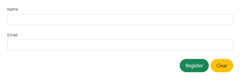
}Add additional buttons and customization
Add custom buttons or other elements by using the FormButtons RenderFragment within the DataForm component.
In the following example, an additional button is added to reset input fields by handling the OnClick event of the SfButton.
@using Syncfusion.Blazor.DataForm
@using System.ComponentModel.DataAnnotations
@using Syncfusion.Blazor.Buttons


<SfDataForm EditContext="@RegistrationEditContext">

    <FormValidator>
        <DataAnnotationsValidator></DataAnnotationsValidator>
    </FormValidator>

    <FormItems>
        <FormAutoGenerateItems></FormAutoGenerateItems>
    </FormItems>

    <FormButtons>
        <SfButton type="submit" CssClass="e-success">Register</SfButton>
        <SfButton type="button" CssClass="e-warning" OnClick="ClickHandler">Clear</SfButton>
    </FormButtons>

</SfDataForm>

<style>
    .e-data-form .e-btn.e-success {
        margin-right: 5px;
    }
</style>

@code {
    public EditContext RegistrationEditContext { get; set; }

    protected override void OnInitialized()
    {
        RegistrationEditContext = new EditContext(RegistrationDetailsModel);
        base.OnInitialized();
    }

    public class RegistrationDetails
    {

        [Required(ErrorMessage = "Please enter your name")]
        public string Name { get; set; }

        [Required(ErrorMessage = "Please enter your email address")]
        [EmailAddress(ErrorMessage = "Please enter valid email address")]
        public string Email { get; set; }
    }

    private RegistrationDetails RegistrationDetailsModel = new RegistrationDetails();

    public void ClickHandler()
    {
        RegistrationDetailsModel = new RegistrationDetails();
        RegistrationEditContext = new EditContext(RegistrationDetailsModel);
    }
}
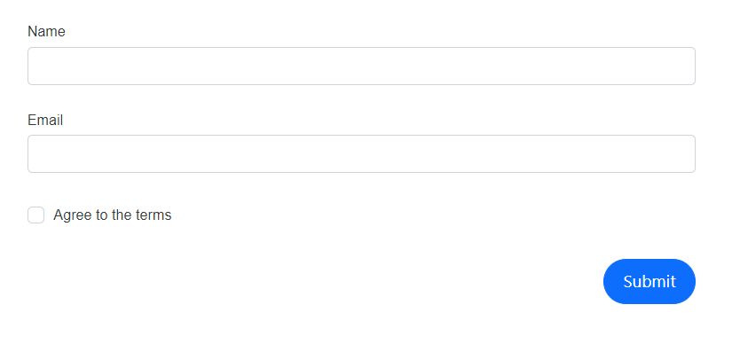
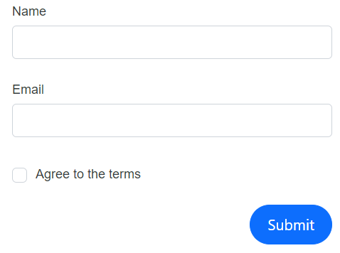
Label position
The DataForm component aligns labels either at the top or to the left of the field editors using the LabelPosition property. The available options are shown below.
| LabelPosition | Snapshot |
|---|---|
| FormLabelPosition.Top | 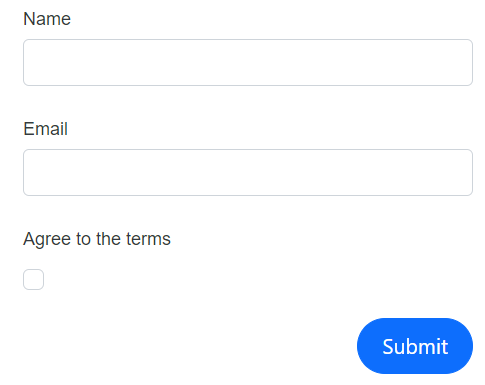 |
| FormLabelPosition.Left | 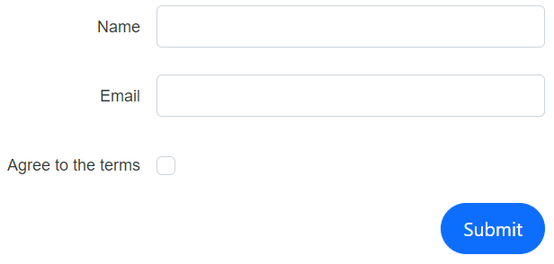 |
When no specific value is provided, the layout defaults to FormLabelPosition.Top. For boolean editors such as SfCheckBox and SfSwitch, labels are positioned to the right of the control. |
 |
The following example demonstrates how to configure the LabelPosition in the DataForm component.
@using Syncfusion.Blazor.DataForm
@using System.ComponentModel.DataAnnotations
<SfDataForm Model="@RegistrationDetailsModel"
LabelPosition="FormLabelPosition.Left">
<FormValidator>
<DataAnnotationsValidator></DataAnnotationsValidator>
</FormValidator>
<FormItems>
<FormAutoGenerateItems></FormAutoGenerateItems>
</FormItems>
</SfDataForm>
@code {
public class RegistrationDetails
{
[Required(ErrorMessage = "Please enter your name")]
public string Name { get; set; }
[Required(ErrorMessage = "Please enter your email address")]
[EmailAddress(ErrorMessage = "Please enter valid email address")]
public string Email { get; set; }
[Required(ErrorMessage = "You need to agree to the Terms and Conditions")]
[Range(typeof(bool), "true", "true", ErrorMessage = "You need to agree to the Terms and Conditions")]
[Display(Name="Agree to the terms")]
public bool Accept { get; set; }
}
private RegistrationDetails RegistrationDetailsModel = new RegistrationDetails();
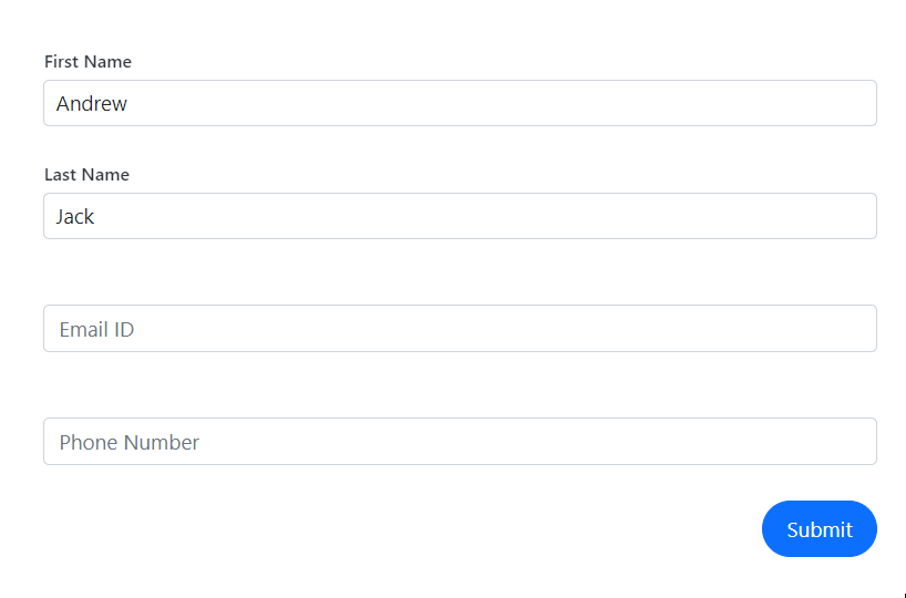
}Floating label
Enable floating labels to move the label to the top of the input when focused by setting EnableFloatingLabel to true. The following code example and GIF demonstrate floating label behavior.
@using Syncfusion.Blazor.DataForm;
@using System.ComponentModel.DataAnnotations

<SfDataForm ID="MyForm1"  Model="@EventRegistrationModel"  EnableFloatingLabel="true" Width="50%">

    <FormValidator>
        <DataAnnotationsValidator></DataAnnotationsValidator>
    </FormValidator>

</SfDataForm>

@code {

    private EventRegistration EventRegistrationModel = new EventRegistration()
        {
            FirstName = "Andrew",
            LastName = "Jack"
        };
}
public class EventRegistration
{
[Required(ErrorMessage = "Please enter your name.")]
[Display(Name = "First Name")]
public string FirstName { get; set; }
[Required(ErrorMessage = "Please enter your last name.")]
[Display(Name = "Last Name")]
public string LastName { get; set; }
[Required(ErrorMessage = "Please enter your email address.")]
[EmailAddress(ErrorMessage = "Please enter a valid email address.")]
[Display(Name = "Email ID")]
public string Email { get; set; }
[Required(ErrorMessage = "Please enter your phone number.")]
[Display(Name = "Phone Number")]
[RegularExpression(@"^\d{10}$", ErrorMessage = "Please enter a valid 10-digit phone number.")]
public string PhoneNumber { get; set; }
}
NOTE
The floating label feature applies only when LabelPosition is set to FormLabelPosition.Top.
Change the form width
Customize the width of the form container by using the Width property.
@using Syncfusion.Blazor.DataForm
@using System.ComponentModel.DataAnnotations


<SfDataForm Width="50%"
            Model="@RegistrationDetailsModel">

    <FormValidator>
        <DataAnnotationsValidator></DataAnnotationsValidator>
    </FormValidator>

    <FormItems>
        <FormAutoGenerateItems></FormAutoGenerateItems>
    </FormItems>

</SfDataForm>

@code {

    public class RegistrationDetails
    {

        [Required(ErrorMessage = "Please enter your name")]
        public string Name { get; set; }

        [Required(ErrorMessage = "Please enter your email address")]
        [EmailAddress(ErrorMessage = "Please enter valid email address")]
        public string Email { get; set; }

        [Required(ErrorMessage = "You need to agree to the Terms and Conditions")]
        [Range(typeof(bool), "true", "true", ErrorMessage = "You need to agree to the Terms and Conditions")]
        [Display(Name = "Agree to the terms")]
        public bool Accept { get; set; }
    }

    private RegistrationDetails RegistrationDetailsModel = new RegistrationDetails();
}