Column Chooser in Blazor DataGrid
8 Jul 202624 minutes to read
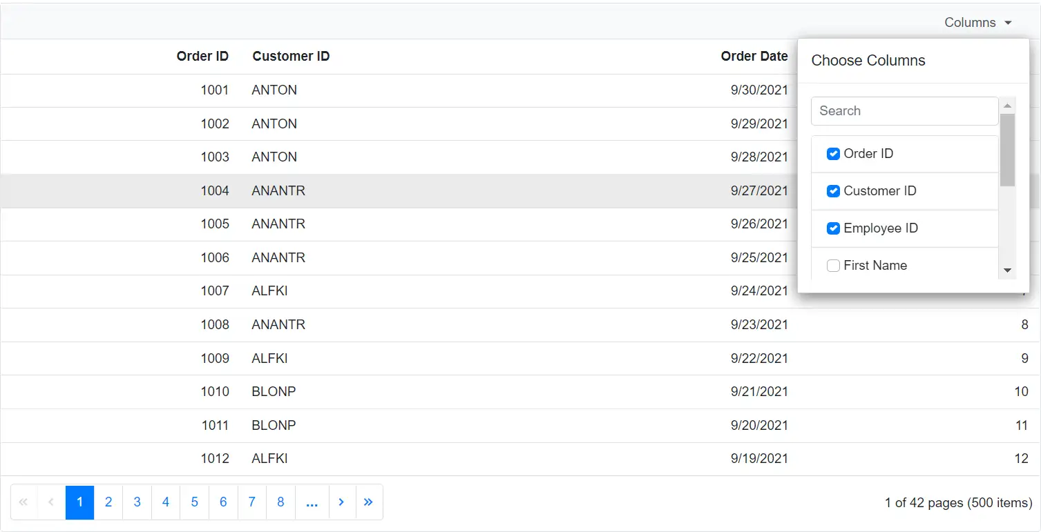
The Blazor DataGrid provides a column chooser feature that allows dynamically showing or hiding columns.
To enable this feature, set the ShowColumnChooser property of the Grid component to true.
@using Syncfusion.Blazor.Grids

<SfGrid DataSource="@Orders" ShowColumnChooser="true" Toolbar=@ToolbarItems>
    <GridColumns>
        <GridColumn Field=@nameof(OrderData.OrderID) HeaderText="Order ID" TextAlign="TextAlign.Right" Width="120"></GridColumn>
        <GridColumn Field=@nameof(OrderData.OrderDate) HeaderText="Order Date" Format="d" Type="ColumnType.DateOnly" TextAlign="TextAlign.Right" Width="130"></GridColumn>
        <GridColumn Field=@nameof(OrderData.Freight) HeaderText="Freight" Format="C2" TextAlign="TextAlign.Right" Width="120"></GridColumn>
        <GridColumn Field=@nameof(OrderData.ShipCountry) HeaderText="Ship Country" TextAlign="TextAlign.Right" Width="120"></GridColumn>
        <GridColumn Field=@nameof(OrderData.ShipCity) HeaderText="Ship City" Visible="false" Width="120"></GridColumn>
    </GridColumns>
</SfGrid>
@code {
    public string[] ToolbarItems = new string[] { "ColumnChooser" };
    public List<OrderData> Orders { get; set; }
    protected override void OnInitialized()
    {
        Orders = OrderData.GetAllRecords();
    }
}
public class OrderData
{
public static List<OrderData> Order = new List<OrderData>();
public OrderData(int OrderID, double Freight, DateTime OrderDate, string ShipCity, string ShipCountry)
{
this.OrderID = OrderID;
this.Freight = Freight;
this.ShipCity = ShipCity;
this.OrderDate = OrderDate;
this.ShipCountry = ShipCountry;
}
public static List<OrderData> GetAllRecords()
{
if (Order.Count == 0)
{
Order.Add(new OrderData(10248, 32.38, new DateTime(1996, 7, 4), "Reims", "Australia"));
Order.Add(new OrderData(10249, 11.61, new DateTime(1996, 7, 5), "Münster", "Australia"));
Order.Add(new OrderData(10250, 65.83, new DateTime(1996, 7, 8), "Rio de Janeiro", "United States"));
Order.Add(new OrderData(10251, 41.34, new DateTime(1996, 7, 8), "Lyon", "Australia"));
Order.Add(new OrderData(10252, 51.3, new DateTime(1996, 7, 9), "Charleroi","United States"));
Order.Add(new OrderData(10253, 58.17, new DateTime(1996, 7, 10), "Rio de Janeiro","United States"));
Order.Add(new OrderData(10254, 22.98, new DateTime(1996, 7, 11), "Bern", "Switzerland"));
Order.Add(new OrderData(10255, 148.33, new DateTime(1996, 7, 12), "Genève", "Switzerland"));
Order.Add(new OrderData(10256, 13.97, new DateTime(1996, 7, 15), "Resende", "Brazil"));
Order.Add(new OrderData(10257, 81.91, new DateTime(1996, 7, 16), "San Cristóbal", "Venezuela"));
Order.Add(new OrderData(10258, 140.51, new DateTime(1996, 7, 17), "Graz", "Austria"));
Order.Add(new OrderData(10259, 3.25, new DateTime(1996, 7, 18), "México D.F.", "Mexico"));
Order.Add(new OrderData(10260, 55.09, new DateTime(1996, 7, 19), "Köln", "Germany"));
Order.Add(new OrderData(10261, 3.05, new DateTime(1996, 7, 19), "Rio de Janeiro", "Brazil"));
Order.Add(new OrderData(10262, 48.29, new DateTime(1996, 7, 22), "Albuquerque", "USA"));
}
return Order;
}
public int OrderID { get; set; }
public double Freight { get; set; }
public string ShipCity { get; set; }
public DateTime OrderDate { get; set; }
public string ShipCountry { get; set; }
}The column chooser dialog displays the header text of each column by default. If the HeaderText is not defined, the corresponding Field name is shown instead.
Hide column in column chooser dialog
The Blazor DataGrid allows hiding specific columns from the column chooser dialog. This is useful when working with a large number of columns or when limiting the columns available for selection.
To enable this, set the ShowInColumnChooser property of the GridColumn to false.
In this configuration, the ShowInColumnChooser property is set to false for the OrderID column. As a result, the OrderID column will not appear in the column chooser dialog.
@using Syncfusion.Blazor.Grids

<SfGrid DataSource="@Orders" ShowColumnChooser="true" Toolbar=@ToolbarItems>
    <GridColumns>
        <GridColumn Field=@nameof(OrderData.OrderID) HeaderText="Order ID" ShowInColumnChooser="false" TextAlign="TextAlign.Right" Width="120"></GridColumn>
        <GridColumn Field=@nameof(OrderData.OrderDate) HeaderText="Order Date" Format="d" Type="ColumnType.DateOnly" TextAlign="TextAlign.Right" Width="130"></GridColumn>
        <GridColumn Field=@nameof(OrderData.Freight) HeaderText="Freight" Format="C2" TextAlign="TextAlign.Right" Width="120"></GridColumn>
        <GridColumn Field=@nameof(OrderData.ShipCountry) HeaderText="Ship Country" Visible="false" Width="120"></GridColumn>
        <GridColumn Field=@nameof(OrderData.ShipCity) HeaderText="Ship City" Visible="false" Width="120"></GridColumn>
    </GridColumns>
</SfGrid>
@code {
    public string[] ToolbarItems = new string[] { "ColumnChooser" };
    public List<OrderData> Orders { get; set; }
    protected override void OnInitialized()
    {
        Orders = OrderData.GetAllRecords();
    }
}
public class OrderData
{
public static List<OrderData> Order = new List<OrderData>();
public OrderData(int OrderID, double Freight, DateTime OrderDate, string ShipCity, string ShipCountry)
{
this.OrderID = OrderID;
this.Freight = Freight;
this.ShipCity = ShipCity;
this.OrderDate = OrderDate;
this.ShipCountry = ShipCountry;
}
public static List<OrderData> GetAllRecords()
{
if (Order.Count == 0)
{
Order.Add(new OrderData(10248, 32.38, new DateTime(1996, 7, 4), "Reims", "Australia"));
Order.Add(new OrderData(10249, 11.61, new DateTime(1996, 7, 5), "Münster", "Australia"));
Order.Add(new OrderData(10250, 65.83, new DateTime(1996, 7, 8), "Rio de Janeiro", "United States"));
Order.Add(new OrderData(10251, 41.34, new DateTime(1996, 7, 8), "Lyon", "Australia"));
Order.Add(new OrderData(10252, 51.3, new DateTime(1996, 7, 9), "Charleroi","United States"));
Order.Add(new OrderData(10253, 58.17, new DateTime(1996, 7, 10), "Rio de Janeiro","United States"));
Order.Add(new OrderData(10254, 22.98, new DateTime(1996, 7, 11), "Bern", "Switzerland"));
Order.Add(new OrderData(10255, 148.33, new DateTime(1996, 7, 12), "Genève", "Switzerland"));
Order.Add(new OrderData(10256, 13.97, new DateTime(1996, 7, 15), "Resende", "Brazil"));
Order.Add(new OrderData(10257, 81.91, new DateTime(1996, 7, 16), "San Cristóbal", "Venezuela"));
Order.Add(new OrderData(10258, 140.51, new DateTime(1996, 7, 17), "Graz", "Austria"));
Order.Add(new OrderData(10259, 3.25, new DateTime(1996, 7, 18), "México D.F.", "Mexico"));
Order.Add(new OrderData(10260, 55.09, new DateTime(1996, 7, 19), "Köln", "Germany"));
Order.Add(new OrderData(10261, 3.05, new DateTime(1996, 7, 19), "Rio de Janeiro", "Brazil"));
Order.Add(new OrderData(10262, 48.29, new DateTime(1996, 7, 22), "Albuquerque", "USA"));
}
return Order;
}
public int OrderID { get; set; }
public double Freight { get; set; }
public string ShipCity { get; set; }
public DateTime OrderDate { get; set; }
public string ShipCountry { get; set; }
}
- The
ShowInColumnChooserproperty is applied to each column individually. By setting it to false, specific columns can be excluded from the column chooser dialog.- At least one column must remain visible in the Grid to ensure proper rendering and interaction.
Open column chooser via programmatically
The Blazor DataGrid allows opening the column chooser dialog programmatically using an external button. Use the OpenColumnChooserAsync method to display the dialog at a specific position on the page.
| Parameter | Type | Description |
|---|---|---|
| x | double? | Specifies the horizontal position (X-axis) where the dialog should appear. |
| y | double? | Specifies the vertical position (Y-axis) where the dialog should appear. |
@using Syncfusion.Blazor.Grids
@using Syncfusion.Blazor.Buttons

<SfButton style="margin-bottom:5px" OnClick="Show" CssClass="e-outline" Content="Open column chooser"></SfButton>
<SfGrid @ref="Grid" DataSource="@Orders" ShowColumnChooser="true">
    <GridColumns>
        <GridColumn Field=@nameof(OrderData.OrderID) HeaderText="Order ID" ShowInColumnChooser="false" TextAlign="TextAlign.Right" Width="120"></GridColumn>
        <GridColumn Field=@nameof(OrderData.OrderDate) HeaderText="Order Date" Format="d" Type="ColumnType.DateOnly" TextAlign="TextAlign.Right" Width="130"></GridColumn>
        <GridColumn Field=@nameof(OrderData.Freight) HeaderText="Freight" Format="C2" TextAlign="TextAlign.Right" Width="120"></GridColumn>
        <GridColumn Field=@nameof(OrderData.ShipCountry) HeaderText="Ship Country" Width="120"></GridColumn>
        <GridColumn Field=@nameof(OrderData.ShipCity) HeaderText="Ship City" Visible="false" Width="120"></GridColumn>
    </GridColumns>
</SfGrid>
@code {
    private SfGrid<OrderData> Grid;
    public List<OrderData> Orders { get; set; }
    protected override void OnInitialized()
    {
        Orders = OrderData.GetAllRecords();
    }
    public void Show()
    {
        Grid.OpenColumnChooserAsync(100, 40);
    }
}
public class OrderData
{
public static List<OrderData> Order = new List<OrderData>();
public OrderData(int OrderID, double Freight, DateTime OrderDate, string ShipCity, string ShipCountry)
{
this.OrderID = OrderID;
this.Freight = Freight;
this.ShipCity = ShipCity;
this.OrderDate = OrderDate;
this.ShipCountry = ShipCountry;
}
public static List<OrderData> GetAllRecords()
{
if (Order.Count == 0)
{
Order.Add(new OrderData(10248, 32.38, new DateTime(1996, 7, 4), "Reims", "Australia"));
Order.Add(new OrderData(10249, 11.61, new DateTime(1996, 7, 5), "Münster", "Australia"));
Order.Add(new OrderData(10250, 65.83, new DateTime(1996, 7, 8), "Rio de Janeiro", "United States"));
Order.Add(new OrderData(10251, 41.34, new DateTime(1996, 7, 8), "Lyon", "Australia"));
Order.Add(new OrderData(10252, 51.3, new DateTime(1996, 7, 9), "Charleroi","United States"));
Order.Add(new OrderData(10253, 58.17, new DateTime(1996, 7, 10), "Rio de Janeiro","United States"));
Order.Add(new OrderData(10254, 22.98, new DateTime(1996, 7, 11), "Bern", "Switzerland"));
Order.Add(new OrderData(10255, 148.33, new DateTime(1996, 7, 12), "Genève", "Switzerland"));
Order.Add(new OrderData(10256, 13.97, new DateTime(1996, 7, 15), "Resende", "Brazil"));
Order.Add(new OrderData(10257, 81.91, new DateTime(1996, 7, 16), "San Cristóbal", "Venezuela"));
Order.Add(new OrderData(10258, 140.51, new DateTime(1996, 7, 17), "Graz", "Austria"));
Order.Add(new OrderData(10259, 3.25, new DateTime(1996, 7, 18), "México D.F.", "Mexico"));
Order.Add(new OrderData(10260, 55.09, new DateTime(1996, 7, 19), "Köln", "Germany"));
Order.Add(new OrderData(10261, 3.05, new DateTime(1996, 7, 19), "Rio de Janeiro", "Brazil"));
Order.Add(new OrderData(10262, 48.29, new DateTime(1996, 7, 22), "Albuquerque", "USA"));
}
return Order;
}
public int OrderID { get; set; }
public double Freight { get; set; }
public string ShipCity { get; set; }
public DateTime OrderDate { get; set; }
public string ShipCountry { get; set; }
}Customize column chooser dialog size
The Blazor DataGrid displays the column chooser dialog with a default size. To adjust its dimensions, apply custom CSS styles to override the default height and width.
<style>
    .e-grid .e-dialog.e-ccdlg {
        max-height: 600px !important;
        width: 300px !important;
    }
    .e-grid .e-ccdlg .e-cc-contentdiv {
        height: 250px !important;
        width: 250px !important;
    }
</style>
The !important directive is used to ensure the custom styles override the dynamically calculated dimensions of the dialog.
@using Syncfusion.Blazor.Grids

<SfGrid DataSource="@Orders" ShowColumnChooser="true" Toolbar=@ToolbarItems>
    <GridColumns>
        <GridColumn Field=@nameof(OrderData.OrderID) HeaderText="Order ID" TextAlign="TextAlign.Right" Width="120"></GridColumn>
        <GridColumn Field=@nameof(OrderData.OrderDate) HeaderText="Order Date" Format="d" Type="ColumnType.DateOnly" TextAlign="TextAlign.Right" Width="130"></GridColumn>
        <GridColumn Field=@nameof(OrderData.Freight) HeaderText="Freight" Format="C2" TextAlign="TextAlign.Right" Width="120"></GridColumn>
        <GridColumn Field=@nameof(OrderData.ShipCountry) HeaderText="Ship Country" Visible="false" Width="120"></GridColumn>
        <GridColumn Field=@nameof(OrderData.ShipCity) HeaderText="Ship City" Visible="false" Width="120"></GridColumn>
    </GridColumns>
</SfGrid>
<style>
    .e-grid .e-dialog.e-ccdlg {
        max-height: 600px !important;
        width: 300px !important;
    }
    .e-grid .e-ccdlg .e-cc-contentdiv {
        height: 250px !important;
        width: 250px !important;
    }
</style>
@code {
    public string[] ToolbarItems = new string[] { "ColumnChooser" };
    public List<OrderData> Orders { get; set; }
    protected override void OnInitialized()
    {
        Orders = OrderData.GetAllRecords();
    }
}
public class OrderData
{
public static List<OrderData> Order = new List<OrderData>();
public OrderData(int OrderID, double Freight, DateTime OrderDate, string ShipCity, string ShipCountry)
{
this.OrderID = OrderID;
this.Freight = Freight;
this.ShipCity = ShipCity;
this.OrderDate = OrderDate;
this.ShipCountry = ShipCountry;
}
public static List<OrderData> GetAllRecords()
{
if (Order.Count == 0)
{
Order.Add(new OrderData(10248, 32.38, new DateTime(1996, 7, 4), "Reims", "Australia"));
Order.Add(new OrderData(10249, 11.61, new DateTime(1996, 7, 5), "Münster", "Australia"));
Order.Add(new OrderData(10250, 65.83, new DateTime(1996, 7, 8), "Rio de Janeiro", "United States"));
Order.Add(new OrderData(10251, 41.34, new DateTime(1996, 7, 8), "Lyon", "Australia"));
Order.Add(new OrderData(10252, 51.3, new DateTime(1996, 7, 9), "Charleroi","United States"));
Order.Add(new OrderData(10253, 58.17, new DateTime(1996, 7, 10), "Rio de Janeiro","United States"));
Order.Add(new OrderData(10254, 22.98, new DateTime(1996, 7, 11), "Bern", "Switzerland"));
Order.Add(new OrderData(10255, 148.33, new DateTime(1996, 7, 12), "Genève", "Switzerland"));
Order.Add(new OrderData(10256, 13.97, new DateTime(1996, 7, 15), "Resende", "Brazil"));
Order.Add(new OrderData(10257, 81.91, new DateTime(1996, 7, 16), "San Cristóbal", "Venezuela"));
Order.Add(new OrderData(10258, 140.51, new DateTime(1996, 7, 17), "Graz", "Austria"));
Order.Add(new OrderData(10259, 3.25, new DateTime(1996, 7, 18), "México D.F.", "Mexico"));
Order.Add(new OrderData(10260, 55.09, new DateTime(1996, 7, 19), "Köln", "Germany"));
Order.Add(new OrderData(10261, 3.05, new DateTime(1996, 7, 19), "Rio de Janeiro", "Brazil"));
Order.Add(new OrderData(10262, 48.29, new DateTime(1996, 7, 22), "Albuquerque", "USA"));
}
return Order;
}
public int OrderID { get; set; }
public double Freight { get; set; }
public string ShipCity { get; set; }
public DateTime OrderDate { get; set; }
public string ShipCountry { get; set; }
}Change default search operator of the column chooser
The Blazor DataGrid provides a search box in the column chooser dialog to filter column names. By default, the search uses the StartsWith operator.
To modify this behavior, use the Operator property of the GridColumnChooserSettings.
@using Syncfusion.Blazor.Grids

<SfGrid DataSource="@Orders" ShowColumnChooser="true" Toolbar=@ToolbarItems>
    <GridColumnChooserSettings Operator="Syncfusion.Blazor.Operator.Contains"></GridColumnChooserSettings>
    <GridColumns>
        <GridColumn Field=@nameof(OrderData.OrderID) HeaderText="Order ID" TextAlign="TextAlign.Right" Width="120"></GridColumn>
        <GridColumn Field=@nameof(OrderData.OrderDate) HeaderText="Order Date" Format="d" Type="ColumnType.DateOnly" TextAlign="TextAlign.Right" Width="130"></GridColumn>
        <GridColumn Field=@nameof(OrderData.Freight) HeaderText="Freight" Format="C2" TextAlign="TextAlign.Right" Width="120"></GridColumn>
        <GridColumn Field=@nameof(OrderData.ShipCountry) HeaderText="Ship Country" Width="120"></GridColumn>
        <GridColumn Field=@nameof(OrderData.ShipCity) HeaderText="Ship City" Visible="false" Width="120"></GridColumn>
    </GridColumns>
</SfGrid>
@code {
    public string[] ToolbarItems = new string[] { "ColumnChooser" };
    public List<OrderData> Orders { get; set; }
    protected override void OnInitialized()
    {
        Orders = OrderData.GetAllRecords();
    }
}
public class OrderData
{
public static List<OrderData> Order = new List<OrderData>();
public OrderData(int OrderID, double Freight, DateTime OrderDate, string ShipCity, string ShipCountry)
{
this.OrderID = OrderID;
this.Freight = Freight;
this.ShipCity = ShipCity;
this.OrderDate = OrderDate;
this.ShipCountry = ShipCountry;
}
public static List<OrderData> GetAllRecords()
{
if (Order.Count == 0)
{
Order.Add(new OrderData(10248, 32.38, new DateTime(1996, 7, 4), "Reims", "Australia"));
Order.Add(new OrderData(10249, 11.61, new DateTime(1996, 7, 5), "Münster", "Australia"));
Order.Add(new OrderData(10250, 65.83, new DateTime(1996, 7, 8), "Rio de Janeiro", "United States"));
Order.Add(new OrderData(10251, 41.34, new DateTime(1996, 7, 8), "Lyon", "Australia"));
Order.Add(new OrderData(10252, 51.3, new DateTime(1996, 7, 9), "Charleroi","United States"));
Order.Add(new OrderData(10253, 58.17, new DateTime(1996, 7, 10), "Rio de Janeiro","United States"));
Order.Add(new OrderData(10254, 22.98, new DateTime(1996, 7, 11), "Bern", "Switzerland"));
Order.Add(new OrderData(10255, 148.33, new DateTime(1996, 7, 12), "Genève", "Switzerland"));
Order.Add(new OrderData(10256, 13.97, new DateTime(1996, 7, 15), "Resende", "Brazil"));
Order.Add(new OrderData(10257, 81.91, new DateTime(1996, 7, 16), "San Cristóbal", "Venezuela"));
Order.Add(new OrderData(10258, 140.51, new DateTime(1996, 7, 17), "Graz", "Austria"));
Order.Add(new OrderData(10259, 3.25, new DateTime(1996, 7, 18), "México D.F.", "Mexico"));
Order.Add(new OrderData(10260, 55.09, new DateTime(1996, 7, 19), "Köln", "Germany"));
Order.Add(new OrderData(10261, 3.05, new DateTime(1996, 7, 19), "Rio de Janeiro", "Brazil"));
Order.Add(new OrderData(10262, 48.29, new DateTime(1996, 7, 22), "Albuquerque", "USA"));
}
return Order;
}
public int OrderID { get; set; }
public double Freight { get; set; }
public string ShipCity { get; set; }
public DateTime OrderDate { get; set; }
public string ShipCountry { get; set; }
}Column chooser template
The Blazor DataGrid allows customizing the column chooser dialog using the Template and FooterTemplate properties of the GridColumnChooserSettings. These templates enable injecting custom content into the body and footer of the column chooser.
The parameters passed to the templates can be accessed using the implicit context parameter.
Use the
e-ccdlg-mentionclass in the CSSClass property of the SfMention component when placing the SfMention component inside the column chooser template. This approach ensures proper functioning of the column chooser.
Customize the content of column chooser
The Template property of the GridColumnChooserSettings is used to customize the content of the column chooser dialog. The context parameter can be typecast to ColumnChooserTemplateContext to access the list of columns within the template.
@using Syncfusion.Blazor.Grids;
@using BlazorApp.Data

<SfGrid ID="Grid" @ref="Grid" AllowPaging="true" DataSource="@Orders" ShowColumnChooser="true" Toolbar="@ToolbarItems">
    <GridColumnChooserSettings>
        <Template>
            @{
                var ContextData = context as ColumnChooserTemplateContext;
                <CustomComponent @key="ContextData.Columns.Count" ColumnContext="ContextData"></CustomComponent>
            }
        </Template>
         <FooterTemplate>
        </FooterTemplate>
    </GridColumnChooserSettings>
    <GridColumns>
        <GridColumn Field=@nameof(OrderData.OrderID) HeaderText="Order ID" TextAlign="TextAlign.Right" Width="120"> </GridColumn>
        <GridColumn Field=@nameof(OrderData.CustomerID) HeaderText="Customer ID" Width="150"> </GridColumn>
        <GridColumn Field=@nameof(OrderData.OrderDate) HeaderText="Order Date" Visible="false" Format="d" Type="ColumnType.Date" TextAlign="TextAlign.Right" Width="130"></GridColumn>
        <GridColumn Field=@nameof(OrderData.Freight) Visible="false" HeaderText="Freight" Format="C2" TextAlign="TextAlign.Right" Width="120"></GridColumn>
        <GridColumn Field=@nameof(OrderData.EmployeeID) Visible="false" HeaderText="Employee ID" TextAlign="TextAlign.Right" Width="120"> </GridColumn>
        <GridColumn Field=@nameof(OrderData.FirstName) Visible="false" HeaderText="First Name" Width="150"> </GridColumn>
        <GridColumn Field=@nameof(OrderData.LastName) HeaderText="Last Name" Visible="false" Format="d" Type="ColumnType.Date" Width="130"> </GridColumn>
        <GridColumn Field=@nameof(OrderData.Title) HeaderText="Title" Visible="false" Width="120"> </GridColumn>
        <GridColumn Field=@nameof(OrderData.HireDate) HeaderText="Hire Date" TextAlign="TextAlign.Right" Width="120"></GridColumn>
    </GridColumns>
</SfGrid>
<style>
    #Grid.e-grid .e-ccdlg .e-dlg-content {
        margin-top: 0px;
    }
    #Grid.e-grid .e-ccdlg .e-dlg-content .e-list-container .e-list-item.e-level-1.e-checklist.e-focused {
        background-color: none;
    }
    #Grid_ccdlg .e-content {
        overflow-y: unset;
    }
</style>
@code
{
    public SfGrid<OrderData> Grid { get; set; }
    public string[] ToolbarItems = new string[] { "ColumnChooser" };
    public List<OrderData> Orders { get; set; }
    protected override void OnInitialized()
    {
        Orders = OrderData.GetAllRecords();
    }
}
public class OrderData
{
public static List<OrderData> Orders = new List<OrderData>();
public OrderData(int? OrderID, string CustomerID, double Freight, DateTime OrderDate, int? EmployeeID, string FirstName, string LastName, string Title, DateTime? HireDate)
{
this.OrderID = OrderID;
this.CustomerID = CustomerID;
this.Freight = Freight;
this.OrderDate = OrderDate;
this.EmployeeID = EmployeeID;
this.FirstName = FirstName;
this.LastName = LastName;
this.Title = Title;
this.HireDate = HireDate;
}
public static List<OrderData> GetAllRecords()
{
if (Orders.Count() == 0)
{
int code = 10247;
int EmployeeID = 0;
for (int i = 1; i < 5; i++)
{
Orders.Add(new OrderData(code + 1, "ALFKI", 33.33, new DateTime(1996, 07, 07), EmployeeID + 1, "Nancy", "Davolio", "Sales Representative", new DateTime(1992, 05, 01)));
Orders.Add(new OrderData(code + 2, "ANANTR", 89.76, new DateTime(1996, 07, 12), EmployeeID + 2, "Andrew", "Fuller", "Vice President, Sales", new DateTime(1992, 08, 14)));
Orders.Add(new OrderData(code + 3, "ANTON", 78.67, new DateTime(1996, 07, 13), EmployeeID + 3, "Janet", "Leverling", "Sales Manager", new DateTime(1993, 05, 03)));
Orders.Add(new OrderData(code + 4, "BLONP", 55.65, new DateTime(1996, 07, 14), EmployeeID + 4, "Margaret", "Peacock", "Inside Sales Coordinator", new DateTime(1963, 08, 30)));
Orders.Add(new OrderData(code + 5, "BOLID", 65.65, new DateTime(1996, 07, 15), EmployeeID + 5, "Steven", "Buchanan", "Sales Manager", new DateTime(1973, 08, 25)));
code += 5;
EmployeeID += 5;
}
}
return Orders;
}
public int? OrderID { get; set; }
public string CustomerID { get; set; }
public DateTime? OrderDate { get; set; }
public double? Freight { get; set; }
public int? EmployeeID { get; set; }
public string FirstName { get; set; }
public string LastName { get; set; }
public string Title { get; set; }
public DateTime? HireDate { get; set; }
}@using Syncfusion.Blazor.Lists;
@using Syncfusion.Blazor.Inputs;
@using Syncfusion.Blazor.Grids;
@using BlazorApp.Data
<div class="setMargin">
<SfTextBox Placeholder="Search" Input="@OnInput"></SfTextBox>
</div>
<SfListView @ref="ListView" Height="100%" ShowCheckBox="true" DataSource="@CloneData">
<ListViewFieldSettings TValue="DataModel" Id="Id" Text="Text"></ListViewFieldSettings>
<ListViewEvents Clicked="OnClicked" Created="@(()=>OnCreated(ColumnContext.Columns))" TValue="DataModel"></ListViewEvents>
</SfListView>
<style>
.setMargin {
margin-bottom: 10px;
}
</style>
@code
{
public List<DataModel> CloneData { get; set; } = new List<DataModel>();
[CascadingParameter]
public SfGrid<OrderData> Grid { get; set; }
[Parameter]
public ColumnChooserTemplateContext ColumnContext { get; set; }
public SfListView<DataModel> ListView { get; set; }
async Task OnInput(InputEventArgs eventArgs)
{
CloneData = DataSource.FindAll(e => e.Text.ToLower().StartsWith(eventArgs.Value.ToLower()));
await Task.Delay(100);
await Preselect();
}
protected override async Task OnInitializedAsync()
{
CloneData = DataSource;
await Task.Delay(100);
await Preselect();
}
List<DataModel> DataSource = new List<DataModel>
{
new DataModel() { Text = "Order ID", Id = "OrderID" },
new DataModel() { Text = "Customer ID", Id ="CustomerID"},
new DataModel() { Text = "Employee ID", Id = "EmployeeID" },
new DataModel() { Text = "First Name", Id = "FirstName"},
new DataModel() { Text = "Order Date", Id = "OrderDate" },
new DataModel() { Text = "Last Name", Id = "LastName" },
new DataModel() { Text = "Hire Date", Id = "HireDate"},
new DataModel() { Text = "Title", Id = "Title"},
new DataModel() { Text = "Freight", Id = "Freight"},
};
public async Task Preselect()
{
var cols = ColumnContext.Columns.FindAll(x => x.Visible == true).ToList();
var selectlist = new List<DataModel>();
foreach (var column in cols)
{
selectlist.Add(DataSource.Where(x => x.Text == column.HeaderText).FirstOrDefault());
}
if (selectlist.Count > 0)
{
if (ListView != null)
{
await ListView?.CheckItemsAsync(selectlist.AsEnumerable());
}
}
}
public async Task OnCreated(List<GridColumn> args)
{
await Preselect();
}
public async Task OnClicked(ClickEventArgs<DataModel> args)
{
if (args.IsChecked)
{
await Grid.ShowColumnAsync(args.Text);
}
else
{
await Grid.HideColumnAsync(args.Text);
}
}
public class DataModel
{
public string Id { get; set; }
public string Text { get; set; }
public string Type { get; set; }
}
public class OrderData {
public int? OrderID { get; set; }
public string CustomerID { get; set; }
public DateTime? OrderDate { get; set; }
public double? Freight { get; set; }
public int? EmployeeID { get; set; }
public string FirstName { get; set; }
public string LastName { get; set; }
public string Title { get; set; }
public DateTime? HireDate { get; set; }
}
}
Customize the footer of column chooser
The FooterTemplate property of the GridColumnChooserSettings allows customizing the footer area of the column chooser dialog. The context parameter can be typecast to ColumnChooserFooterTemplateContext to access the list of columns and perform actions such as applying or cancelling changes.
@using Syncfusion.Blazor.Grids
@using Syncfusion.Blazor.Buttons

<SfGrid @ref="grid" TValue="OrderData" DataSource="@GridData" ShowColumnChooser="true" Toolbar="@( new List<string>() { "ColumnChooser"})" AllowPaging="true">
    <GridColumnChooserSettings>
        <FooterTemplate>
            @{
                var ContextData = context as ColumnChooserFooterTemplateContext;
                var visibles = ContextData.Columns.Where(x => x.Visible).Select(x => x.HeaderText).ToArray();
                var hiddens = ContextData.Columns.Where(x => !x.Visible).Select(x => x.HeaderText).ToArray();
            }
            <SfButton IsPrimary="true" OnClick="@(async () => {
            await grid.ShowColumnsAsync(visibles);
            await grid.HideColumnsAsync(hiddens); })">Submit</SfButton>
            <SfButton @onclick="@(async () => await ContextData.CancelAsync())">Abort</SfButton>
        </FooterTemplate>
    </GridColumnChooserSettings>
    <GridColumns>
        <GridColumn Field=@nameof(OrderData.OrderID) HeaderText="Order ID" TextAlign="TextAlign.Right" IsPrimaryKey="true" Width="120"></GridColumn>
        <GridColumn Field=@nameof(OrderData.CustomerID) HeaderText="Customer Name" Width="150"></GridColumn>
        <GridColumn Field=@nameof(OrderData.OrderDate) HeaderText="Order Date" Format="d" Type="ColumnType.Date" TextAlign="TextAlign.Right" Width="130"></GridColumn>
        <GridColumn Field=@nameof(OrderData.Freight) HeaderText="Freight" Format="C2" TextAlign="TextAlign.Right" Width="120"></GridColumn>
        <GridColumn Field=@nameof(OrderData.ShippedDate) HeaderText="Shipped Date" Format="d" Type="ColumnType.Date" TextAlign="TextAlign.Right" Width="150"></GridColumn>
        <GridColumn Field=@nameof(OrderData.ShipCountry) HeaderText="Ship Country" Visible="false" Width="150"></GridColumn>
        <GridColumn Field=@nameof(OrderData.ShipCity) HeaderText="Ship City" Visible="false" Width="150"></GridColumn>
    </GridColumns>
</SfGrid>
@code {
    public List<OrderData> GridData { get; set; }
    SfGrid<OrderData> grid { get; set; }
    protected override void OnInitialized()
    {
        GridData = OrderData.GetAllRecords();
    }
}
public class OrderData
{
public static List<OrderData> Orders = new List<OrderData>();
public OrderData(int? OrderID,string CustomerID,string ShipCountry,double Freight,DateTime OrderDate,DateTime ShippedDate,string ShipCity)
{
this.OrderID = OrderID;
this.CustomerID = CustomerID;
this.ShipCountry = ShipCountry;
this.Freight = Freight;
this.OrderDate = OrderDate;
this.ShippedDate = ShippedDate;
this.ShipCity = ShipCity;
}
public static List<OrderData> GetAllRecords()
{
if (Orders.Count() == 0)
{
int code = 10;
for (int i = 1; i < 2; i++)
{
Orders.Add(new OrderData(10248, "ALFKI", "France", 33.33,new DateTime(1996,07,07), new DateTime(1996, 08, 07), "Reims"));
Orders.Add(new OrderData(10249, "ANANTR", "Germany", 89.76, new DateTime(1996, 07, 12), new DateTime(1996, 08, 08), "Münster"));
Orders.Add(new OrderData(10250, "ANTON", "Brazil", 78.67, new DateTime(1996, 07, 13), new DateTime(1996, 08, 09), "Rio de Janeiro"));
Orders.Add(new OrderData(10251, "BLONP", "Belgium", 55.65, new DateTime(1996, 07, 14), new DateTime(1996, 08, 10), "Lyon"));
Orders.Add(new OrderData(10252, "BOLID", "Venezuela",11.09, new DateTime(1996, 07, 15), new DateTime(1996, 08, 11), "Charleroi"));
Orders.Add(new OrderData(10253, "BLONP", "Venezuela",98.98, new DateTime(1996, 07, 16), new DateTime(1996, 08, 12), "Lyon"));
Orders.Add(new OrderData(10254, "ANTON", "Belgium", 78.75, new DateTime(1996, 07, 17), new DateTime(1996, 08, 13), "Rio de Janeiro"));
Orders.Add(new OrderData(10255, "ANANTR", "Germany", 44.07, new DateTime(1996, 07, 18), new DateTime(1996, 08, 14), "Münster"));
Orders.Add(new OrderData(10256, "ALFKI", "France", 67.74, new DateTime(1996, 07, 19), new DateTime(1996, 08, 15), "Reims"));
code += 5;
}
}
return Orders;
}
public int? OrderID { get; set; }
public string CustomerID { get; set; }
public DateTime OrderDate { get; set; }
public DateTime ShippedDate { get; set; }
public string ShipCountry { get; set; }
public double Freight { get; set; }
public string ShipCity { get; set; }
}Group column chooser items in Blazor DataGrid
The Blazor DataGrid supports grouping items in the column chooser dialog using the GridColumnChooserItemGroup component. This improves usability by organizing columns into logical sections.
To configure this:
- Set the ShowColumnChooser property to true and include “ColumnChooser” in the Toolbar collection.
- Use the Template property of GridColumnChooserSettings to define the layout of chooser items.
- Define logical groups using the
GridColumnChooserItemGroupcomponent and assign a Title for each group. - Use helper methods to filter and render columns dynamically within each group.
@using Syncfusion.Blazor.Grids
@using Syncfusion.Blazor.Buttons

<SfGrid @ref="grid" TValue="Order" DataSource="@GridData" ShowColumnChooser="true" Toolbar="@( new List<string>() { "ColumnChooser"})" AllowPaging="true">
    <GridColumnChooserSettings>
        <Template>
            @{
                var ContextData = context as ColumnChooserTemplateContext;
            }
            @if (ShouldRenderGroup("Order Details", ContextData.Columns))
            {
                <GridColumnChooserItemGroup Title="Order Details">
                    @foreach (var column in GetGroupColumns("Order Details", ContextData.Columns))
                    {
                        <GridColumnChooserItem Column="column"></GridColumnChooserItem>
                    }
                </GridColumnChooserItemGroup>
            }
            @if (ShouldRenderGroup("Ship Details", ContextData.Columns))
            {
                <GridColumnChooserItemGroup Title="Ship Details">
                    @foreach (var column in GetGroupColumns("Ship Details", ContextData.Columns))
                    {
                        <GridColumnChooserItem Column="column"></GridColumnChooserItem>
                    }
                </GridColumnChooserItemGroup>
            }
            @if (ShouldRenderGroup("Date Details", ContextData.Columns))
            {
                <GridColumnChooserItemGroup Title="Date Details">
                    @foreach (var column in GetGroupColumns("Date Details", ContextData.Columns))
                    {
                        <GridColumnChooserItem Column="column"></GridColumnChooserItem>
                    }
                </GridColumnChooserItemGroup>
            }
        </Template>
        <FooterTemplate>
            @{
                var ContextFooterData = context as ColumnChooserFooterTemplateContext;
                var visibles = ContextFooterData.Columns.Where(x => x.Visible).Select(x => x.HeaderText).ToArray();
                var hiddens = ContextFooterData.Columns.Where(x => !x.Visible).Select(x => x.HeaderText).ToArray();
            }
            <SfButton IsPrimary="true" OnClick="@(async () => { await grid.ShowColumnsAsync(visibles); await grid.HideColumnsAsync(hiddens); })"> Submit</SfButton>
            <SfButton @onclick="@(async () => await ContextFooterData.CancelAsync())">Abort</SfButton>
        </FooterTemplate>
    </GridColumnChooserSettings>
    <GridColumns>
        <GridColumn Field=@nameof(Order.OrderID) HeaderText="Order ID" TextAlign="TextAlign.Right" IsPrimaryKey="true" Width="120"></GridColumn>
        <GridColumn Field=@nameof(Order.CustomerID) HeaderText="Customer Name" Width="150"></GridColumn>
        <GridColumn Field=@nameof(Order.OrderDate) HeaderText="Order Date" Format="d" Type="ColumnType.Date" TextAlign="TextAlign.Right" Width="130"></GridColumn>
        <GridColumn Field=@nameof(Order.Freight) HeaderText="Freight" Format="C2" TextAlign="TextAlign.Right" Width="120"></GridColumn>
        <GridColumn Field=@nameof(Order.ShippedDate) HeaderText="Shipped Date" Format="d" Type="ColumnType.Date" TextAlign="TextAlign.Right" Width="150"></GridColumn>
        <GridColumn Field=@nameof(Order.ShipCountry) HeaderText="Ship Country" Visible="false" Width="150"></GridColumn>
        <GridColumn Field=@nameof(Order.ShipCity) HeaderText="Ship City" Visible="false" Width="150"></GridColumn>
    </GridColumns>
</SfGrid>

@code
{
    public List<Order> GridData { get; set; }
    SfGrid<Order> grid { get; set; }
    IDictionary<string, string[]> groups = new Dictionary<string, string[]>(){
        { "Order Details", new string[] { "OrderID", "CustomerID", "Freight" } }, { "Ship Details", new string[]{ "ShipCountry", "ShipCity" } }, {"Date Details", new string[]{"OrderDate", "ShippedDate"}}};
    private GridColumn GetColumn(string field, List<GridColumn> columns)
    {
        GridColumn column = null;
        if (columns.Any(x => { column = x; return x.Field == field; }))
        {
            return column;
        }
        return null;
    }
    private bool ShouldRenderGroup(string title, List<GridColumn> columns)
    {
        return groups[title].Any(x => columns.Any(y => y.Field == x));
    }
    private List<GridColumn> GetGroupColumns(string title, List<GridColumn> columns)
    {
        return columns.Where(x => groups[title].Contains(x.Field)).ToList();
    }

    protected override void OnInitialized()
    {
    GridData = Order.GetAllRecords();
    }

}
public class Order
{
public static List<Order> order = new List<Order>();
public Order(int orderId, string customerId, string shipCity, string shipName, double freight, DateTime orderDate, string shipCountry, DateTime shippedDate)
{
this.OrderID = orderId;
this.CustomerID = customerId;
this.ShipCity = shipCity;
this.ShipName = shipName;
this.Freight = freight;
this.OrderDate = orderDate;
this.ShipCountry = shipCountry;
this.ShippedDate = shippedDate;
}
public static List<Order> GetAllRecords()
{
if (order.Count == 0)
{
order.Add(new Order(10248, "VINET", "Reims", "Vins et alcools Chevalier", 32.38, new DateTime(2024, 1, 5), "France", new DateTime(2024, 1, 10)));
order.Add(new Order(10249, "TOMSP", "Münster", "Toms Spezialitäten", 11.61, new DateTime(2024, 1, 7), "Germany", new DateTime(2024, 1, 13)));
order.Add(new Order(10250, "HANAR", "Rio de Janeiro", "Hanari Carnes", 65.83, new DateTime(2024, 1, 10), "Brazil", new DateTime(2024, 1, 16)));
order.Add(new Order(10251, "VICTE", "Lyon", "Victuailles en stock", 41.34, new DateTime(2024, 1, 12), "France", new DateTime(2024, 1, 18)));
order.Add(new Order(10252, "SUPRD", "Charleroi", "Suprêmes délices", 51.30, new DateTime(2024, 1, 14), "Belgium", new DateTime(2024, 1, 20)));
order.Add(new Order(10253, "HANAR", "Rio de Janeiro", "Hanari Carnes", 58.17, new DateTime(2024, 1, 16), "Brazil", new DateTime(2024, 1, 22)));
order.Add(new Order(10254, "CHOPS", "Bern", "Chop-suey Chinese", 22.98, new DateTime(2024, 1, 18), "Switzerland", new DateTime(2024, 1, 24)));
order.Add(new Order(10255, "RICSU", "Genève", "Richter Supermarkt", 148.33, new DateTime(2024, 1, 20), "Switzerland", new DateTime(2024, 1, 26)));
order.Add(new Order(10256, "WELLI", "Resende", "Wellington Importadora", 13.97, new DateTime(2024, 1, 22), "Brazil", new DateTime(2024, 1, 28)));
order.Add(new Order(10257, "HILAA", "San Cristóbal", "HILARION-Abastos", 81.91, new DateTime(2024, 1, 24), "Venezuela", new DateTime(2024, 1, 30)));
}
return order;
}
public int OrderID { get; set; }
public string CustomerID { get; set; }
public string ShipCity { get; set; }
public string ShipName { get; set; }
public double Freight { get; set; }
public DateTime OrderDate { get; set; }
public string ShipCountry { get; set; }
public DateTime ShippedDate { get; set; }
}