Data Annotation in Blazor DataGrid
8 Jul 202610 minutes to read
Data annotations define validation and display rules for model classes or properties in the Blazor DataGrid. These attributes ensure that input values follow specific formats and constraints while providing clear error messages during editing operations.
When the DataGrid is bound to a model, data annotations automatically map to corresponding GridColumn settings. This enables built-in validation and metadata display during CRUD operations.
To enable data annotation in the Blazor DataGrid:
- Add the System.ComponentModel.DataAnnotations namespace in the Blazor application.
- Bind the DataGrid to a model using
TValueand DataSource. - Apply annotation attributes to model properties to enforce validation and display rules during CRUD operations.
Supported Data Annotation Attributes
The tables categorize supported attributes by display, formatting, metadata, and validation functionality.
Display Attributes
Use Display attributes to control how column headers, ordering, and metadata appear in the grid interface.
| Attribute Name | Properties | Functionality |
|---|---|---|
| Display | Name | Sets the header text for the DataGrid column |
| Display | ShortName | Sets a shorter version of the header text |
| Display | AutoGenerateField | Prevents the column from being auto-generated |
| Display | AutoGenerateFilter | Disables filtering for the column |
| Display | Description | Sets tooltip text shown on column ellipsis hover |
| Display | Order | Defines the display order of the column |
DisplayFormat Attributes
Apply DisplayFormat attributes when column values require specific formatting or null-handling behavior.
| Attribute Name | Properties | Functionality |
|---|---|---|
| DisplayFormat | FormatString | Sets the display format for column data |
| DisplayFormat | ApplyFormatInEditMode | Applies format during edit mode |
| DisplayFormat | NullDisplayText | Displays custom text when the value is null |
| DisplayFormat | ConvertEmptyStringToNull | Converts empty strings to null in the UI |
| DisplayFormat | HtmlEncode | Enables or disables HTML encoding for display |
Other Metadata Attributes
Use these attributes to manage column visibility, editing behavior, and key definitions.
| Attribute Name | Properties | Functionality |
|---|---|---|
| ScaffoldColumnAttribute | Scaffold | Controls column visibility in the UI |
| ReadOnlyAttribute | IsReadOnly | Prevents editing of the column |
| Key | Key | Marks the column as the primary key |
Validation Attributes
Add validation attributes to enforce rules that display inline Blazor DataGrid validation messages during CRUD operations.
- RequiredAttribute
- StringLengthAttribute
- RangeAttribute
- RegularExpressionAttribute
- MinLengthAttribute
- MaxLengthAttribute
- EmailAddressAttribute
- CompareAttribute
When both the
Displayattribute’sNameand the column’sHeaderTextproperty are defined, theHeaderTextvalue takes precedence and is shown in the column header.
The Display attribute can be used to show user-friendly labels for enum values. This improves readability by replacing raw enum values with descriptive names.
@using Syncfusion.Blazor.Grids
@using Syncfusion.Blazor.DropDowns
@using System.Reflection
@using System.ComponentModel.DataAnnotations
<SfGrid TValue="Order" DataSource="@Orders" Height="315" AllowPaging="true" AllowFiltering="true" Toolbar="@(new List<string>() { "Add", "Edit", "Delete", "Update", "Cancel" })">
<GridEditSettings AllowAdding="true" AllowEditing="true" AllowDeleting="true"></GridEditSettings>
<GridColumns>
<GridColumn Field=@nameof(Order.OrderID) IsPrimaryKey="true" TextAlign="TextAlign.Right" Width="115"></GridColumn>
<GridColumn Field=@nameof(Order.CustomerID) Width="120"></GridColumn>
<GridColumn Field=@nameof(Order.OrderDate) EditType="EditType.DatePickerEdit" Format="d" TextAlign="TextAlign.Right" Width="130" Type="ColumnType.Date"></GridColumn>
<GridColumn Field=@nameof(Order.Freight) HeaderText="Freight" TextAlign="TextAlign.Right" Format="C2" Width="115"></GridColumn>
<GridColumn Field=@nameof(Order.ShipCity) Width="120"></GridColumn>
<GridColumn Field=@nameof(Order.Verified) Width="110">
<EditTemplate>
@{
var CurrentOrder = (context as Order);
<SfDropDownList Placeholder="Type" ID="Type" @bind-Value="CurrentOrder.Verified" DataSource="@DropDownData" TValue="Status" TItem="Data">
<DropDownListFieldSettings Value="Value" Text="Type"></DropDownListFieldSettings>
</SfDropDownList>
}
</EditTemplate>
</GridColumn>
</GridColumns>
</SfGrid>
@code {
private List<Order> Orders { get; set; }
private List<Data> DropDownData { get; } = new();
protected override void OnInitialized()
{
var Rnd = new Random();
var Values = Enum.GetValues(typeof(Status));
foreach (Status Item in Values)
{
DropDownData.Add(new Data { Type = GetDisplayName(Item), Value = Item });
}
Orders = Enumerable.Range(1, 75).Select(x => new Order
{
OrderID = 1000 + x,
CustomerID = (new string[] { "ALFKI", "ANANTR", "ANTON", string.Empty, null })[Rnd.Next(5)],
Freight = 2.1 * x,
OrderDate = DateTime.Now.AddDays(-x),
ShipCity = (new string[] { "Berlin", "Madrid", "Cholchester", "Marseille", "Tsawassen" })[Rnd.Next(5)],
Verified = (Status)Values.GetValue(Rnd.Next(Values.Length)),
}).ToList();
}
private static string GetDisplayName(Enum EnumValue)
{
var DisplayName = EnumValue.GetType()
.GetMember(EnumValue.ToString())
.FirstOrDefault()
.GetCustomAttribute<DisplayAttribute>()?
.GetName();
if (string.IsNullOrEmpty(DisplayName))
{
DisplayName = EnumValue.ToString();
}
return DisplayName;
}
internal enum Status
{
[Display(Name = "Yeah")]
Yes = 0,
[Display(Name = "Nope")]
No = 1
}
internal sealed class Data
{
public string Type { get; set; }
public Status Value { get; set; }
}
internal sealed class Order
{
// Sets column as primary key.
[Key]
// Sets column as required and error message to be displayed when empty.
[Required(ErrorMessage = "Order ID should not be empty")]
// Sets header text to the column.
[Display(ShortName = "ID")]
public int OrderID { get; set; }
[Display(Name = "CustomerID", Description ="List of Customers")]
// Sets column as required and error message to be displayed when empty.
[Required(ErrorMessage = "Field should not be empty")]
[DisplayFormat(NullDisplayText = "Empty", ConvertEmptyStringToNull = true)]
public string CustomerID { get; set; }
// Sets data type of column as Date.
[DataType(DataType.Date)]
[Display(Name = "Order Date")]
// Sets column as read only.
[Editable(false)]
public DateTime? OrderDate { get; set; }
[Display(Name = "Freight", AutoGenerateFilter = false)]
public double? Freight { get; set; }
[ScaffoldColumn(false)]
public string ShipCity { get; set; }
public Status Verified { get; set; }
}
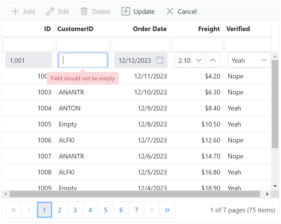
}The following image shows how Data Annotations are applied to Grid columns in a Blazor application:
NOTE
Refer to the Blazor DataGrid feature tour for an overview of available features. Explore the Blazor DataGrid example to see how data is presented and managed within an application.