Customization Using CssClass in Blazor DateRangePicker Component
10 Jun 20264 minutes to read
To customize UI, you can use CssClass that will be added to the DateRangePicker component as the root CSS class. With this CSS class, you can override existing styles of DateRangePicker.
Following is the list of classes that provides flexible way to customize the DateRangePicker component:
| Class Name | Description |
|---|---|
| e-date-range-wrapper | Applied to DateRangePicker wrapper. |
| e-range-icon | Applied to DateRangePicker icon. |
| e-popup | Applied to DateRangePicker popup wrapper. |
| e-calendar | Applied to both Calendar element. |
| e-right-calendar | Applied to right Calendar element. |
| e-left-calendar | Applied to left Calendar element. |
| e-start-label | Applied to start label in a popup. |
| e-end-calendar | Applied to end label in a popup. |
| e-day-span | Applied to day span details label in a popup. |
| e-footer | Applied to footer elements in a popup. |
| e-apply | Applied to apply button in footer in a popup. |
| e-cancel | Applied to cancel button in footer in a popup. |
| e-header | Applied to Calendar header. |
| e-title | Applied to Calendar title. |
| e-icon-container | Applied to Calendar previous and next icon container. |
| e-prev | Applied to Calendar previous icon. |
| e-next | Applied to Calendar next icon. |
| e-weekend | Applied to Calendar weekend dates. |
| e-other-month | Applied to Calendar other month dates. |
| e-day | Applied to each day cell of the Calendar. |
| e-selected | Applied to Calendar selected dates. |
| e-disabled | Applied to Calendar disabled dates. |
@using Syncfusion.Blazor.Calendars

<SfDateRangePicker TValue="DateTime?" Placeholder="Select a range" CssClass="CustomCSS" ></SfDateRangePicker>

<style>
     .CustomCSS .e-calendar .e-content .e-selected span.e-day,
    .CustomCSS .e-calendar .e-content .e-selected span.e-day:hover,
    .CustomCSS .e-calendar .e-content .e-today.e-selected:hover span.e-day,
    .CustomCSS .e-calendar .e-content .e-today.e-selected span.e-day,
    .CustomCSS .e-calendar .e-content .e-selected:hover span.e-day  {
        background-color: #35b86b;
    }

    .CustomCSS .e-calendar .e-content .e-today span.e-day,
    .CustomCSS .e-calendar .e-content .e-focused-date.e-today span.e-day {
        border: 1px solid #35b86b;
        color: #ff3337;
    }

    .CustomCSS .e-calendar .e-content .e-weekend span {
        color: #ff3337;
    }

    .CustomCSS.e-date-range-wrapper .e-input-group-icon.e-icons.e-active,
    .CustomCSS .e-btn.e-flat,
    .CustomCSS .e-btn.e-flat:hover {
        color: #35b86b;
    }
</style>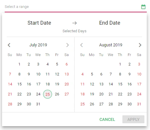
NOTE
You can refer to our Blazor Date Range Picker feature tour page for its groundbreaking feature representations. You can also explore our Blazor Date Range Picker example to understand how to present and manipulate data.