DateTime Format in Blazor DateTimePicker Component
10 Jun 20261 minute to read
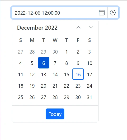
Display date and time format
The display format defines how the date and time value is shown (and parsed) in the DateTimePicker.
By default, the DateTimePicker’s format is based on the current culture. You can also apply a custom or standard .NET date and time format by using the Format property.
When a format string is specified, it is used consistently regardless of culture settings. This provides a predictable, standardized representation for both display and entry.
@using Syncfusion.Blazor.Calendars

<SfDateTimePicker TValue="DateTime?" Format="yyyy-MM-dd hh:mm:ss" @bind-Value="@Value"></SfDateTimePicker>


@code {
    public DateTime? Value { get; set; } = new DateTime(2022, 12, 11, 11, 30, 00);
}
Input Formats
The input format controls how users can type date and time values in the DateTimePicker.
The string formats specified for input determine acceptable user-entered patterns. When the user types a date and time in one of the input formats, it is automatically parsed and then displayed using the configured display format after pressing Enter/Tab or when the input loses focus. This allows flexible, intuitive entry using multiple patterns. Configure acceptable formats with the InputFormats property, using .NET custom or standard date/time format strings.
@using Syncfusion.Blazor.Calendars

<SfDateTimePicker TValue="DateTime?" Format="yyyy-MM-dd hh:mm:ss" InputFormats='new string[] { "dd/MM/yyyy hh:mm", "MM-dd-yyyy HH:mm", "yyyy/MM/dd hh mm tt" }' @bind-Value="@Value"></SfDateTimePicker>


@code {
    public DateTime? Value { get; set; } = new DateTime(2022, 12, 11, 11, 30, 00);
}