Special Dates in Blazor DateTime Picker
14 Aug 20263 minutes to read
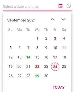
Customize specific dates in the DateTimePicker using the OnRenderDayCell event. This event is triggered for each day cell as it is created, allowing you to apply custom styles or disable specific dates. The handler receives a RenderDayCellEventArgs that exposes Date (the cell’s date), IsDisabled and IsOutOfRange flags, and a settable CellData used to customize the cell’s content and CSS classes. In the following example, specific days of the current month are styled by adding the CSS classes personal-appointment and official-appointment defined in the sample’s <style> block.
@using Syncfusion.Blazor.Calendars
<div class="control-wrapper">
    <SfDateTimePicker TValue="DateTime?" Placeholder="Select a date and time" ShowClearButton="true" @bind-Value="@SelectedDate">
        <DateTimePickerEvents TValue="DateTime?" OnRenderDayCell="CustomDates" ValueChange="OnChange"></DateTimePickerEvents>
    </SfDateTimePicker>
</div>
<div id="display-date">
    <span>Selected Day : @SelectedValue</span>
</div>
@code {
    public DateTime? SelectedDate { get; set; }
    public string SelectedValue { get; set; } = DateTime.Now.ToString("M/d/yyyy");
    public DateTime? CurrentDate { get; set; } = DateTime.Now;
    public void CustomDates(RenderDayCellEventArgs args)
    {
        var CurrentMonth = CurrentDate.Value.Month;
        if (args.Date.Month == CurrentMonth && (args.Date.Day == 7 || args.Date.Day == 14 || args.Date.Day == 24 || args.Date.Day == 29)) {
            args.CellData.ClassList += " personal-appointment";
        }
        if (args.Date.Month == CurrentMonth && (args.Date.Day == 3 || args.Date.Day == 11 || args.Date.Day == 17 || args.Date.Day == 22))
        {
            args.CellData.ClassList += " official-appointment";
        }
    }
    public void OnChange(ChangedEventArgs<DateTime?> args)
    {
        var Count = 0;
        var CurrentMonth = CurrentDate.Value.Month;
        if (args.Value.Value.Month == CurrentMonth && (args.Value.Value.Day == 7 || args.Value.Value.Day == 14 || args.Value.Value.Day == 24 || args.Value.Value.Day == 29))
        {
            this.SelectedValue = this.SelectedDate?.ToString("M/d/yyyy") + " (Personal appointment)";
            Count++;
        }
        if (args.Value.Value.Month == CurrentMonth && (args.Value.Value.Day == 3 || args.Value.Value.Day == 11 || args.Value.Value.Day == 17 || args.Value.Value.Day == 22))
        {
            this.SelectedValue = this.SelectedDate?.ToString("M/d/yyyy") + " (Official appointment)";
            Count++;
        }
        if (Count == 0)
        {
            this.SelectedValue = this.SelectedDate?.ToString("M/d/yyyy");
        }
    }
}
<style>
    #display-date {
        max-width: 270px;
        padding: 15px 0;
        font-size: 13px;
    }
    .control-wrapper {
        width: 300px;
        margin: 0 auto;
        padding-top: 50px;
    }
    .e-calendar .e-content .e-cell.personal-appointment span.e-day,
    .e-calendar .e-content td:hover.e-cell.personal-appointment span.e-day,
    .e-calendar .e-content td.e-selected.e-focused-date.e-cell.personal-appointment span.e-day {
        color: #28a745;
        font-weight: 800;
    }
    .e-calendar .e-content .e-cell.official-appointment span.e-day,
    .e-calendar .e-content td:hover.e-cell.official-appointment span.e-day,
    .e-calendar .e-content td.e-selected.e-focused-date.e-cell.official-appointment span.e-day {
        color: #dc3545;
        font-weight: 800;
    }
    .e-calendar .e-content td.e-selected.e-focused-date.e-cell.personal-appointment span.e-day,
    .e-calendar .e-content td.e-selected.e-focused-date.e-cell.official-appointment span.e-day {
        background-color: #b511485e;
    }
</style>