Style and Appearance in Blazor Datetime Picker Component
22 Jun 20261 minute to read
Use the following CSS selectors to modify the DateTimePicker component’s appearance based on user preferences.
Customizing the appearance of Datetime Picker container element
Apply the following CSS to adjust the input height and font size for the DateTimePicker container element.
/* To specify height and font size */
.e-input-group input.e-input, .e-input-group.e-control-wrapper input.e-input {
        font-size: 20px;
        height: 40px;
    }
Customizing the Datetime Picker icons element
Use the following CSS to style the DateTimePicker’s date and time icon elements.
/* To specify background color and font size */
.e-datetime-wrapper .e-input-group-icon.e-date-icon, .e-datetime-wrapper .e-input-group-icon.e-time-icon {
        font-size: 16px;
        background-color: blanchedalmond;
    }
Customizing the time picker popup in the Datetime Picker
Use the following CSS to adjust the height of the time picker popup in the DateTimePicker.
/* To specify height */
.e-datetimepicker.e-popup {
        height: 100px;
}
Full screen mode support in mobiles and tablets
The DateTimePicker supports a full-screen popup on mobile devices to improve visibility and user experience in both landscape and portrait orientations. To enable full-screen mode, set the FullScreen property to true. On mobile devices, the calendar and time popup expands to occupy the entire screen; desktop behavior is unchanged.
@using Syncfusion.Blazor.Calendars

<SfDateTimePicker TValue="DateTime?" FullScreen=true></SfDateTimePicker>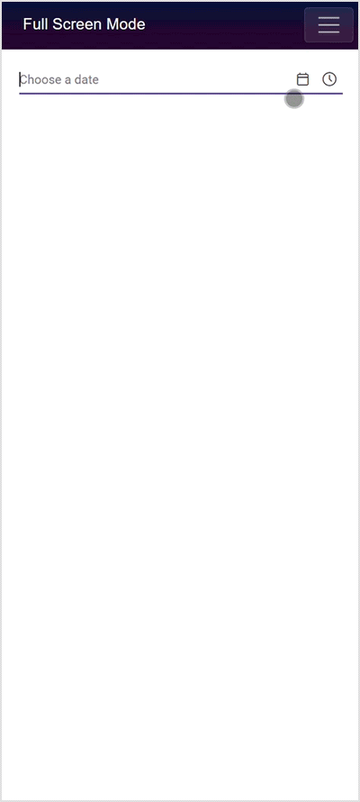
Customizing the Calendar popup of the Datetime Picker
See the following section to customize the Calendar’s style and appearance when used within the DateTimePicker.