How can I help you?
Appearance of a Node in Diagram Component
2 Feb 202624 minutes to read
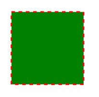
The appearance of a node can be customized by changing its Fill, StrokeDashArray, StrokeColor, StrokeWidth, and Shadow properties. The IsVisible property indicates whether the node is visible.
To learn more about node customization, refer to the below video link,
The following code shows how to customize the appearance of a shape.
@using Syncfusion.Blazor.Diagram

<SfDiagramComponent Height="600px" Nodes="@_nodes" />

@code
{
    //Define diagram's nodes collection
    private DiagramObjectCollection<Node> _nodes;

    protected override void OnInitialized()
    {
        _nodes = new DiagramObjectCollection<Node>();
        // A node is created and stored in nodes array.
        Node node = new Node()
        {
            // Position of the node
            OffsetX = 250,
            OffsetY = 250,
            // Size of the node
            Width = 100,
            Height = 100,
            // Add node
            Style = new ShapeStyle() { Fill = "Green", StrokeDashArray = "5,5", StrokeColor = "red", StrokeWidth = 2 },
        };
        _nodes.Add(node);
    }
}
A complete working sample can be downloaded from GitHub
NOTE
The ID for each node must be unique.
IDproperty is used to find nodes at runtime for further customization.
How to Update Common Node Properties Using the NodeCreating Event
Default values for all the nodes can be set by handling the NodeCreating method. For example, if all nodes have the same type or property then such properties can be moved into NodeCreating method.
The following code shows how to customize the appearance of a shape.
@using Syncfusion.Blazor.Diagram

<SfDiagramComponent Height="600px" @ref="_diagram" Nodes="@_nodes" NodeCreating="@NodeCreating" />

@code
{
    //Reference the diagram
    private SfDiagramComponent _diagram;
    //Define diagram's nodes collection
    private DiagramObjectCollection<Node> _nodes;

    protected override void OnInitialized()
    {
        _nodes = new DiagramObjectCollection<Node>();
        // A node is created and stored in nodes array.
        Node node1 = new Node()
        {
            // Position of the node
            OffsetX = 250,
            OffsetY = 250,
            // Shape of the Node
            Shape = new BasicShape() { Type = NodeShapes.Basic, Shape = NodeBasicShapes.Rectangle }
        };
        Node node2 = new Node()
        {
            // Position of the node
            OffsetX = 100,
            OffsetY = 100,
            // Shape of the Node
            Shape = new BasicShape() { Type = NodeShapes.Basic, Shape = NodeBasicShapes.Ellipse }
        };
        _nodes.Add(node1);
        _nodes.Add(node2);
    }

    //Method to define nodecreating event
    private void NodeCreating(IDiagramObject obj)
    {
        Node node = obj as Node;
        node.Style = new ShapeStyle() { Fill = "#6495ED" };
        // Size of the node
        node.Width = 100;
        node.Height = 100;
    }
}A complete working sample can be downloaded from GitHub
How to Update Node Templates
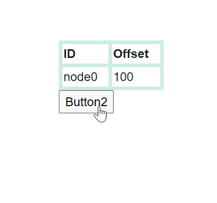
Define node style using a template in NodeTemplate at tag level. To apply different templates to individual nodes, differentiate the nodes by the ID property. The following code explains how to define template for a node.
@using Syncfusion.Blazor.Diagram
@using Syncfusion.Blazor.Buttons

<SfDiagramComponent @ref="_diagram" Width="1200px" Height="1000px" Nodes="@_nodes">
    <DiagramTemplates>
        <NodeTemplate>
            @{
                <style>
                    th {
                        border: 5px solid #c1dad7
                    }

                    td {
                        border: 5px solid #c1dad7
                    }

                    .c1 {
                        background: transparent
                    }

                    .c2 {
                        background: transparent
                    }

                    .c3 {
                        background: transparent
                    }

                    .c4 {
                        background: transparent
                    }
                </style>
                <div id="node0_content_html_element" class="foreign-object" style="height: 164px; width: 137px; left: 0px; top: 0px; position: absolute; transform: scale(1, 1) rotate(0deg); pointer-events: all; visibility: visible; opacity: 1;">
                    <div style="height: 100%; width: 100%;">
                        <table style="width:100%;">
                            <tbody>
                                <tr><th class="c1">ID</th><th class="c2">Offset</th></tr>
                                <tr><td class="c1">node0</td><td class="c2">100</td></tr>
                            </tbody>
                        </table>
                        <SfButton Content="Button2" OnClick="@OnClick" />
                    </div>
                </div>
             }
        </NodeTemplate>
    </DiagramTemplates>
</SfDiagramComponent>

@code
{
    //Reference the diagram
    private SfDiagramComponent _diagram;
    //Define diaram's nodes collection
    private DiagramObjectCollection<Node> _nodes;

    protected override void OnInitialized()
    {
        _nodes = new DiagramObjectCollection<Node>();
        Node node = new Node()
        {
            Width = 137,
            Height = 64,
            OffsetX = 300,
            OffsetY = 100,
            ID = "html1",
            Shape = new Shape() { Type = NodeShapes.HTML },
        };
        _nodes.Add(node);
    }

    private void OnClick()
    {
        _nodes[0].BackgroundColor = "cornflowerblue";
        StateHasChanged();
    }
}
A complete working sample can be downloaded from GitHub
NOTE
In this example, the node’s background color is updated using the click event of the button defined in the template.
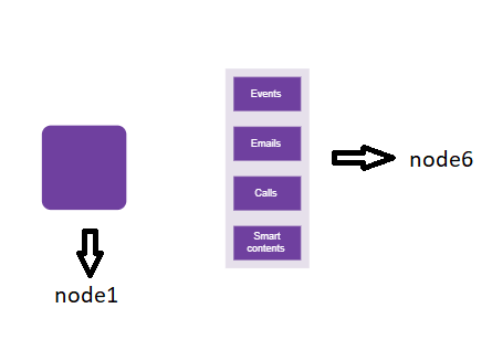
How to Update Common Node Styles
The diagram’s SetNodeTemplate method allows defining styles for nodes. The following example demonstrates how to apply different styles to different nodes through SetNodeTemplate method.
@using Syncfusion.Blazor.Diagram
@using System.Collections.ObjectModel

@* Initialize Diagram *@
<SfDiagramComponent Height="600px" Nodes="@_nodes" SetNodeTemplate="@SetNodeTemplate" />

@code
{
    // Initialize node collection with node
    private DiagramObjectCollection<Node> _nodes;

    protected override void OnInitialized()
    {
        _nodes = new DiagramObjectCollection<Node>();
        Node node1 = new Node()
        {
            ID = "node1",
            // Size of the node
            Height = 100,
            Width = 100,
            // Position of the node
            OffsetX = 100,
            OffsetY = 100,
        };
        Node node2 = new Node()
        {
            ID = "node6",
            // Size of the node
            Height = 510,
            Width = 202,
            // Position of the node
            OffsetX = 300,
            OffsetY = 100,
        };
        _nodes.Add(node1);
        _nodes.Add(node2);
    }

    //SetNode Template method
    private CommonElement SetNodeTemplate(IDiagramObject node)
    {
        if ((node as Node).ID == "node6")
        {
            StackPanel table = new StackPanel();
            table.Style = new ShapeStyle() { Fill = "#e6e0eb", StrokeColor = "#e6e0eb" };
            table.Orientation = Orientation.Horizontal;
            StackPanel column1 = new StackPanel();
            column1.Style = new ShapeStyle() { Fill = "#6F409F", StrokeColor = "#6F409F" };
            column1.Margin = new DiagramThickness() { Bottom = 10, Left = 10, Right = 10, Top = 10 };
            column1.Padding = new DiagramThickness() { Bottom = 10, Left = 10, Right = 10, Top = 10 };
            column1.Children = new ObservableCollection<CommonElement>();
            column1.Children.Add(GetTextElement("Events"));

            StackPanel column2 = new StackPanel();
            column2.Margin = new DiagramThickness() { Bottom = 10, Left = 10, Right = 10, Top = 10 };
            column2.Padding = new DiagramThickness() { Bottom = 10, Left = 10, Right = 10, Top = 10 };
            column2.Children = new ObservableCollection<CommonElement>();
            column2.Children.Add(GetTextElement("Emails"));
            column2.Style = new ShapeStyle() { Fill = "#6F409F", StrokeColor = "#6F409F" };

            StackPanel column3 = new StackPanel();
            column3.Margin = new DiagramThickness() { Bottom = 10, Left = 10, Right = 10, Top = 10 };
            column3.Padding = new DiagramThickness() { Bottom = 10, Left = 10, Right = 10, Top = 10 };
            column3.Children = new ObservableCollection<CommonElement>();
            column3.Children.Add(GetTextElement("Calls"));
            column3.Style = new ShapeStyle() { Fill = "#6F409F", StrokeColor = "#6F409F" };

            StackPanel column4 = new StackPanel();
            column4.Margin = new DiagramThickness() { Bottom = 10, Left = 10, Right = 10, Top = 10 };
            column4.Padding = new DiagramThickness() { Bottom = 10, Left = 10, Right = 10, Top = 10 };
            column4.Children = new ObservableCollection<CommonElement>();
            column4.Children.Add(GetTextElement("Smart contents"));
            column4.Style = new ShapeStyle() { Fill = "#6F409F", StrokeColor = "#6F409F" };

            table.Orientation = Orientation.Vertical;
            table.Children = new ObservableCollection<CommonElement>() { column1, column2, column3, column4 };
            return table;
        }
        else
        {
            (node as Node).Style = new ShapeStyle() { Fill = "#6F409F", StrokeColor = "#6F409F", StrokeWidth = 2 };
            (node as Node).Shape = new BasicShape() { Type = NodeShapes.Basic, Shape = NodeBasicShapes.Rectangle, CornerRadius = 10 };
        }
        return null;
    }

    private TextElement GetTextElement(string text)
    {
        TextElement textElement = new TextElement();
        textElement.Width = 60;
        textElement.Height = 20;
        textElement.Content = text;
        textElement.Style = new TextStyle() { Color = "white" };
        return textElement;
    }
}
A complete working sample can be downloaded from GitHub
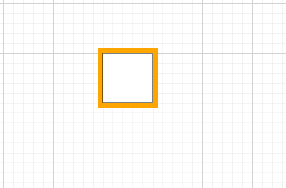
How to change the border color of a node
The diagram provides the ability to customize the border color of a node using the BorderColor property. By default, the border is black.
@using Syncfusion.Blazor.Diagram

<SfDiagramComponent Height="600px" Nodes="@_nodes" />

@code
{
    // Define diagram's nodes collection
    private DiagramObjectCollection<Node> _nodes;

    protected override void OnInitialized()
    {
        _nodes = new DiagramObjectCollection<Node>();

        // A node is created and stored in nodes array.
        Node node = new Node()
        {
            ID = "node1",
            // Position of the node
            OffsetX = 100,
            OffsetY = 100,
            // Size of the node
            Width = 100,
            Height = 100,

            // Sets the border color of the node
            BorderColor = "Orange",

            // Sets the border width for better visibility
            BorderWidth = 20
        };
        _nodes.Add(node);
    }
}
A complete working sample can be downloaded from GitHub
How to change the border width of a node
The diagram allows customizing the border width of a node using the BorderWidth property. By default, the border width is 1 pixel. Adjust this value to increase or decrease the thickness of the node’s border as needed.
@using Syncfusion.Blazor.Diagram

<SfDiagramComponent Height="600px" Nodes="@_nodes" />

@code
{
    // Define diagram's nodes collection
    private DiagramObjectCollection<Node> _nodes;

    protected override void OnInitialized()
    {
        _nodes = new DiagramObjectCollection<Node>();

        // A node is created and stored in nodes array.
        Node node = new Node()
        {
            ID = "node1",
            // Position of the node
            OffsetX = 100,
            OffsetY = 100,
            // Size of the node
            Width = 100,
            Height = 100,
            // Sets the border color of the node
            BorderColor = "Orange",
            // Sets the border width for better visibility
            BorderWidth = 20
        };
        _nodes.Add(node);
    }
}A complete working sample can be downloaded from GitHub
How to Update Node Shadow
Diagram supports adding a Shadow effect to a node. Shadow is disabled by default and can be enabled by using the node’s constraints. The following example shows how to draw a shadow.
@using Syncfusion.Blazor.Diagram

<SfDiagramComponent Height="600px" Nodes="@_nodes" />

@code
{
    //Define diagram's nodes collection
    private DiagramObjectCollection<Node> _nodes;

    protected override void OnInitialized()
    {
        _nodes = new DiagramObjectCollection<Node>();
        // A node is created and stored in nodes array.
        Node node = new Node()
        {
            // Position of the node
            OffsetX = 250,
            OffsetY = 250,
            // Size of the node
            Width = 100,
            Height = 100,
            Style = new ShapeStyle()
            {
                Fill = "#6495ED",
                StrokeColor = "white"
            },
            Constraints = NodeConstraints.Default | NodeConstraints.Shadow
        };
        _nodes.Add(node);
    }
}
A complete working sample can be downloaded from GitHub

How to Customize Node Shadow
The Angle, Distance, and Opacity of the shadow can be customized using the node’s shadow settings. The following example illustrates how to customize shadow.
@using Syncfusion.Blazor.Diagram

<SfDiagramComponent Height="600px" Nodes="@_nodes" />

@code
{
    //Define diagram's nodes collection
    private DiagramObjectCollection<Node> _nodes;

    protected override void OnInitialized()
    {
        _nodes = new DiagramObjectCollection<Node>();
        // A node is created and stored in nodes array.
        Node node = new Node()
        {
            // Position of the node
            OffsetX = 250,
            OffsetY = 250,
            // Size of the node
            Width = 100,
            Height = 100,
            Style = new ShapeStyle()
            {
                Fill = "#6495ED",
                StrokeColor = "white"
            },
            Constraints = NodeConstraints.Default | NodeConstraints.Shadow,
            // Custom Shadow of the node
            Shadow = new Shadow()
            {
                Angle = 50,
                Color = "Blue",
                Opacity = 0.8,
                Distance = 20
            }
        };
        _nodes.Add(node);
    }
}
A complete working sample can be downloaded from GitHub

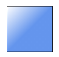
How to Apply Gradient Style
The Gradient property allows applying gradient effects to a node. GradientStop class property defines the Color and a Offset, where the previous color transition ends and a new color transition starts. The gradient stop’s Opacity property defines the transparency level of the region.
There are two types of gradients:
-
LinearGradientBrush
-
RadialGradientBrush
How to Apply Linear Gradient Brush
LinearGradientBrush defines a smooth transition between a set of colors (stops) along a line. The X1, Y1, X2, and Y2 properties define the position (relative to the node) of the rectangular region to be painted.
@using Syncfusion.Blazor.Diagram

<SfDiagramComponent Height="600px" Nodes="@_nodes" />

@code
{
    //Define diagram's nodes collection
    private DiagramObjectCollection<Node> _nodes;

    protected override void OnInitialized()
    {
        _nodes = new DiagramObjectCollection<Node>();
        // A node is created and stored in nodes array.
        Node node = new Node()
        {
            // Position of the node
            OffsetX = 250,
            OffsetY = 250,
            // Size of the node
            Width = 100,
            Height = 100,
            Style = new ShapeStyle()
            {
                Gradient = new LinearGradientBrush()
                {
                    //Start point of linear gradient
                    X1 = 0,
                    Y1 = 0,
                    ////End point of linear gradient
                    X2 = 50,
                    Y2 = 50,
                    //Sets an array of stop objects
                    GradientStops = new DiagramObjectCollection<GradientStop>()
                    {
                        new GradientStop(){ Color = "white", Offset = 0},
                        new GradientStop(){ Color = "#6495ED", Offset = 100}
                    },
                }
            },
        };
        _nodes.Add(node);
    }
}
A complete working sample can be downloaded from GitHub
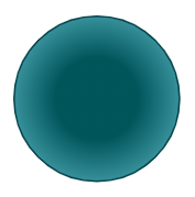
How to Apply Radial Gradient Brush
RadialGradientBrush defines a smooth transition between stops within a circle. Its properties define the positions (relative to the node) of the outermost or the innermost circle of the radial gradient.
@using Syncfusion.Blazor.Diagram

<SfDiagramComponent Height="600px" Nodes="@_nodes" />

@code
{
    //Define diagram's nodes collection
    private DiagramObjectCollection<Node> _nodes;

    protected override void OnInitialized()
    {
        _nodes = new DiagramObjectCollection<Node>();
        Node node = new Node()
        {
            // Position of the node
            OffsetX = 250,
            OffsetY = 250,
            // Size of the node
            Width = 100,
            Height = 100,
            Shape = new BasicShape()
            {
                Type = NodeShapes.Basic,
                Shape = NodeBasicShapes.Ellipse
            },
            Style = new ShapeStyle()
            {
                Fill = "37909A#",
                StrokeColor = "#024249",
                Gradient = new RadialGradientBrush()
                {
                    //Center point of outer circle
                    CX = 50,
                    CY = 50,
                    //Center point of inner circle
                    FX = 50,
                    FY = 50,
                    GradientStops = new DiagramObjectCollection<GradientStop>()
                    {
                        new GradientStop() { Color = "#00555b", Offset = 45 },
                        new GradientStop() { Color= "#37909A", Offset= 90 }
                    },
                }
            },
        };
        // Add node
        _nodes.Add(node);
    }
}
A complete working sample can be downloaded from GitHub
How to Add Additional Information for a Node
The AdditionalInfo property allows attaching additional, custom data to a node.
The following code shows how to set the AdditionalInfo value.
@using Syncfusion.Blazor.Diagram

<SfDiagramComponent Height="600px" Nodes="@_nodes" />

@code
{
    //Define diagram's nodes collection
    private DiagramObjectCollection<Node> _nodes;

    protected override void OnInitialized()
    {
        _nodes = new DiagramObjectCollection<Node>();
        Dictionary<string, object> nodeInfo = new Dictionary<string, object>();
        nodeInfo.Add("nodeInfo", "Central Node");
        // A node is created and stored in nodes collection.
        Node node = new Node()
        {
            // Position of the node
            OffsetX = 250,
            OffsetY = 250,
            // Size of the node
            Width = 100,
            Height = 100,
            Style = new ShapeStyle()
            {
                Fill = "#6BA5D7",
                StrokeColor = "white"
            },
            AdditionalInfo = nodeInfo
        };
        // Add node
        _nodes.Add(node);
    }
}A complete working sample can be downloaded from GitHub
Note: You can set any type of value for the AdditionalInfo property.
How to Set ZIndex Property for a Node
- The node’s ZIndex property specifies the stack order of the node. A node with a greater stack order is always in front of a node with a lower stack order. By default, the value is -1.
The following code illustrates how to render nodes based on the stack order.
@using Syncfusion.Blazor.Diagram
@using System.Collections.ObjectModel

<SfDiagramComponent Height="600px" @ref="@_diagram" Nodes="@_nodes" />

@code
{
    private SfDiagramComponent _diagram;
    private DiagramObjectCollection<Node> _nodes;

    protected override void OnInitialized()
    {
        _nodes = new DiagramObjectCollection<Node>();
        // nodes are created and stored in nodes array.
        Node node1 = new Node()
        {
            ID = "node1",
            // Position of the node.
            OffsetX = 250,
            OffsetY = 250,
            // Size of the node.
            Width = 100,
            Height = 100,
            ZIndex = 2,
            Style = new ShapeStyle()
            {
                Fill = "#6495ED",
                StrokeColor = "white"
            },
        };
        _nodes.Add(node1);

        Node node2 = new Node()
        {
            ID = "node2",
            // Position of the node.
            OffsetX = 300,
            OffsetY = 300,
            // Size of the node.
            Width = 100,
            Height = 100,
            ZIndex = 1,
            Style = new ShapeStyle()
            {
                Fill = "#6495ED",
                StrokeColor = "white"
            },
        };
        _nodes.Add(node2);
    }
}A complete working sample can be downloaded from GitHub
How to Set Pivot Property for a Node
- Node rotation is based on Pivot values which range from 0 to 1 similar to offset values. By default,
Pivotis X = 0.5 and Y = 0.5.
The following code illustrates how to set the Pivot value.
@using Syncfusion.Blazor.Diagram
@using System.Collections.ObjectModel

<SfDiagramComponent Height="600px" @ref="@_diagram" Nodes="@_nodes" />

@code
{
    private SfDiagramComponent _diagram;
    private DiagramObjectCollection<Node> _nodes;

    protected override void OnInitialized()
    {
        _nodes = new DiagramObjectCollection<Node>();
        // A node is created and stored in nodes array.
        Node node = new Node()
        {
            ID = "node",
            // Position of the node.
            OffsetX = 250,
            OffsetY = 250,
            // Size of the node.
            Width = 100,
            Height = 100,
            ZIndex = 2,
            Style = new ShapeStyle()
            {
                Fill = "#6495ED",
                StrokeColor = "white"
            },
            // Pivot of the node.
            Pivot = new DiagramPoint() { X = 0, Y = 0 },
        };
        _nodes.Add(node);
    }
}A complete working sample can be downloaded from GitHub
How to Set Background Color for a Node
- The node’s BackgroundColor property sets the node’s background color. By default, it is transparent.
The following code illustrates how to set the background color for the node.
@using Syncfusion.Blazor.Diagram
@using System.Collections.ObjectModel

<SfDiagramComponent Height="600px" @ref="@_diagram" Nodes="@_nodes" />

@code
{
    private SfDiagramComponent _diagram;
    private DiagramObjectCollection<Node> _nodes;

    protected override void OnInitialized()
    {
        _nodes = new DiagramObjectCollection<Node>();
        // A node is created and stored in nodes array.
        Node node = new Node()
        {
            ID = "node",
            // Position of the node.
            OffsetX = 250,
            OffsetY = 250,
            // Size of the node.
            Width = 100,
            Height = 100,
            BackgroundColor = "red",
            Shape = new BasicShape()
            {
                Shape = NodeBasicShapes.Star
            }
        };
        _nodes.Add(node);
    }
}A complete working sample can be downloaded from GitHub
How to Check if a Node Is Automatically Positioned
- The node’s CanAutoLayout property indicates whether the node should be automatically positioned or not. This is applicable when a layout is enabled..
The following code illustrates how to set the auto layout property for nodes.
@using Syncfusion.Blazor.Diagram

<SfDiagramComponent Height="600px" Nodes="@_nodes" Connectors="@_connectors" NodeCreating="@OnNodeCreating" ConnectorCreating="@OnConnectorCreating">
    <Layout Type="LayoutType.HierarchicalTree" @bind-HorizontalSpacing="@_horizontalSpacing" @bind-VerticalSpacing="@_verticalSpacing">
    </Layout>
    <SnapSettings>
        <HorizontalGridLines LineColor="white" LineDashArray="2,2">
        </HorizontalGridLines>
        <VerticalGridLines LineColor="white" LineDashArray="2,2">
        </VerticalGridLines>
    </SnapSettings>
</SfDiagramComponent>

@code
{
    private DiagramObjectCollection<Node> _nodes = new DiagramObjectCollection<Node>();
    private DiagramObjectCollection<Connector> _connectors = new DiagramObjectCollection<Connector>();
    private int _horizontalSpacing = 40;
    private int _verticalSpacing = 40;

    private void OnNodeCreating(IDiagramObject obj)
    {
        Node node = obj as Node;
        node.Height = 40;
        node.Width = 100;
        //Initialize the default node's shape style.
        node.Style = new ShapeStyle() { Fill = "darkcyan", StrokeWidth = 3, StrokeColor = "Black" };
        node.Annotations = new DiagramObjectCollection<ShapeAnnotation>()
        {
            new ShapeAnnotation
            {
                Content = node.Annotations[0].Content,
                Style = new TextStyle() { Color = "white", Bold = true },
            }
        };
    }

    private void OnConnectorCreating(IDiagramObject connector)
    {
        (connector as Connector).Type = ConnectorSegmentType.Orthogonal;
    }

    protected override void OnInitialized()
    {
        //Initialize the node and connectors.
        _nodes = new DiagramObjectCollection<Node>()
        {
            new Node() { ID="node1", CanAutoLayout = true, Annotations = new DiagramObjectCollection<ShapeAnnotation>() { new ShapeAnnotation{Content="Steve-Ceo"} } },
            new Node() { ID="node2", CanAutoLayout = true, Annotations = new DiagramObjectCollection<ShapeAnnotation>() { new ShapeAnnotation{Content="Kevin-Manager"} } },
            new Node() { ID="node3", CanAutoLayout = true, Annotations = new DiagramObjectCollection<ShapeAnnotation>() { new ShapeAnnotation{Content="Peter-Manager"} } },
            new Node() { ID="node4", CanAutoLayout = true, Annotations = new DiagramObjectCollection<ShapeAnnotation>() { new ShapeAnnotation{Content="Jim-CSE"} } },
            new Node() { ID="node5", CanAutoLayout = true, Annotations = new DiagramObjectCollection<ShapeAnnotation>() { new ShapeAnnotation{Content="Martin-CSE"} } },
            new Node() { ID="node6", CanAutoLayout = true, Annotations = new DiagramObjectCollection<ShapeAnnotation>() { new ShapeAnnotation{Content="John-Manager"} } },
            new Node() { ID="node7", CanAutoLayout = false, Annotations = new DiagramObjectCollection<ShapeAnnotation>() { new ShapeAnnotation{Content="Mary-CSE"} } },
        };
        _connectors = new DiagramObjectCollection<Connector>()
        {
            new Connector() { ID="connector1", SourceID="node1", TargetID="node2" },
            new Connector() { ID="connector2", SourceID="node1", TargetID="node3" },
            new Connector() { ID="connector3", SourceID="node2", TargetID="node4" },
            new Connector() { ID="connector4", SourceID="node2", TargetID="node5" },
            new Connector() { ID="connector5", SourceID="node3", TargetID="node6" },
            new Connector() { ID="connector6", SourceID="node3", TargetID="node7" },
        };
    }
}A complete working sample can be downloaded from GitHub
How to Get InEdges and OutEdges of a Node
InEdges returns the incoming connectors of the node. OutEdges returns the outgoing connectors of the node.
@using Syncfusion.Blazor.Diagram
@using Syncfusion.Blazor.Buttons

<SfButton Content="GetInEdges" OnClick="@GetInEdges" />
<SfDiagramComponent @ref="_diagram" Height="600px" Nodes="@_nodes" Connectors="@_connectors" />

@code
{
    private SfDiagramComponent _diagram;
    private DiagramObjectCollection<Node> _nodes = new DiagramObjectCollection<Node>();
    private DiagramObjectCollection<Connector> _connectors = new DiagramObjectCollection<Connector>();

    protected override void OnInitialized()
    {
        Node node1 = new Node()
        {
            ID = "node1",
            Width = 100,
            Height = 100,
            OffsetX = 300,
            OffsetY = 300,
        };
        _nodes.Add(node1);
        Node node2 = new Node()
        {
            ID = "node2",
            Width = 100,
            Height = 100,
            OffsetX = 300,
            OffsetY = 500,
        };
        _nodes.Add(node2);
        Connector connector1 = new Connector()
        {
            ID = "connector1",
            SourceID = "node1",
            TargetID = "node2",
        };
        _connectors.Add(connector1);
    }

    private void GetInEdges()
    {
        List<string> Inedges = new List<string>();
        foreach (string inedge in _diagram.Nodes[1].InEdges)
        {
            Inedges.Add(inedge);
        }
    }
}A complete working sample can be downloaded from GitHub
How to Get Data Source Settings Details
- The node’s Data property returns the record from the data source. Each record in the data source represents a node in an automatic layout.
The following code illustrates how to get data source settings details.
@using Syncfusion.Blazor.Diagram

<SfDiagramComponent Height="600px" Width="1200px" NodeCreating="@OnNodeCreating" ConnectorCreating="@OnConnectorCreating">
    <DataSourceSettings ID="Id" ParentID="Manager" DataSource="_dataSource"> </DataSourceSettings>
    <Layout Type="LayoutType.HierarchicalTree" HorizontalSpacing="@_horizontalSpacing" VerticalSpacing="@_verticalSpacing">
    </Layout>
    <SnapSettings>
        <HorizontalGridLines LineColor="white" LineDashArray="2,2">
        </HorizontalGridLines>
        <VerticalGridLines LineColor="white" LineDashArray="2,2">
        </VerticalGridLines>
    </SnapSettings>
</SfDiagramComponent>

@code
{
    private int _horizontalSpacing = 40;
    private int _verticalSpacing = 40;

    private void OnNodeCreating(IDiagramObject obj)
    {
        Node node = obj as Node;
        node.Height = 40;
        node.Width = 100;
        HierarchicalDetails Data = node.Data as HierarchicalDetails;
        node.Annotations = new DiagramObjectCollection<ShapeAnnotation>()
        {
            new ShapeAnnotation()
            {
                Content = Data.Role
            }
        };
        //Initializing the default node's shape style.
        node.Style = new ShapeStyle()
        {
            Fill = "darkcyan",
            StrokeWidth = 3,
            StrokeColor = "Black"
        };
    }

    private void OnConnectorCreating(IDiagramObject connector)
    {
        (connector as Connector).Type = ConnectorSegmentType.Orthogonal;
    }

    public class HierarchicalDetails
    {
        public string Id { get; set; }
        public string Role { get; set; }
        public string Manager { get; set; }
        public string ChartType { get; set; }
        public string Color { get; set; }
    }

    public List<HierarchicalDetails> _dataSource = new List<HierarchicalDetails>()
    {
        new HierarchicalDetails()   { Id= "parent", Role= "Board", Color= "#71AF17" },
        new HierarchicalDetails()   { Id= "1", Role= "General Manager", Manager= "parent", ChartType= "right", Color= "#71AF17" },
        new HierarchicalDetails()   { Id= "11", Role= "Assistant Manager", Manager= "1", Color= "#71AF17" },
        new HierarchicalDetails()   { Id= "2", Role= "Human Resource Manager", Manager= "1", ChartType= "right", Color= "#1859B7" },
        new HierarchicalDetails()   { Id= "3", Role= "Trainers", Manager= "2", Color= "#2E95D8" },
        new HierarchicalDetails()   { Id= "4", Role= "Recruiting Team", Manager= "2", Color= "#2E95D8" },
        new HierarchicalDetails()   { Id= "5", Role= "Finance Asst. Manager", Manager= "2", Color= "#2E95D8" },
        new HierarchicalDetails()   { Id= "6", Role= "Design Manager", Manager= "1",ChartType= "right", Color= "#1859B7" },
        new HierarchicalDetails()   { Id= "7", Role= "Design Supervisor", Manager= "6", Color= "#2E95D8" },
        new HierarchicalDetails()   { Id= "8", Role= "Development Supervisor", Manager= "6", Color= "#2E95D8" },
        new HierarchicalDetails()   { Id= "9", Role= "Drafting Supervisor", Manager= "6", Color= "#2E95D8" },
        new HierarchicalDetails()   { Id= "10", Role= "Operation Manager", Manager= "1", ChartType= "right", Color= "#1859B7" },
        new HierarchicalDetails()   { Id= "11", Role= "Statistic Department", Manager= "10", Color= "#2E95D8" },
        new HierarchicalDetails()   { Id= "12", Role= "Logistic Department", Manager= "10", Color= "#2E95D8" },
        new HierarchicalDetails()   { Id= "16", Role= "Marketing Manager", Manager= "1", ChartType= "right", Color= "#1859B7" },
        new HierarchicalDetails()   { Id= "17", Role= "Oversea sales Manager", Manager= "16", Color= "#2E95D8" },
        new HierarchicalDetails()   { Id= "18", Role= "Petroleum Manager", Manager= "16", Color= "#2E95D8" },
        new HierarchicalDetails()   { Id= "20", Role= "Service Dept. Manager", Manager= "16", Color= "#2E95D8" },
        new HierarchicalDetails()   { Id= "21", Role= "Quality Department", Manager= "16", Color= "#2E95D8" }
    };
}A complete working sample can be downloaded from GitHub