Node Shapes in Blazor Diagram Component
9 Jul 202624 minutes to read
Diagram supports creating several kinds of nodes. The available shape types include:
- Text shape
- Image shape
- Path shape
- Basic shape
- Flow shape
- SVG shape
- HTML template
- BPMN shape
How to Create and Customize a Text Node
The diagram allows to add texts as TextShape. The Content property defines the text that is to be added. The Style of the node is used as TextStyle to customize the appearance of the text.
The following code illustrates how to create a text node.
@using Syncfusion.Blazor.Diagram

@* Initialize Diagram *@
<SfDiagramComponent Height="600px" Nodes="@_nodes" />

@code
{
    private SfDiagramComponent _diagram;
    private DiagramObjectCollection<Node> _nodes = new DiagramObjectCollection<Node>();

    protected override void OnInitialized()
    {
        Node node = new Node()
        {
            ID = "node1",
            //Size of the node.
            Height = 100,
            Width = 100,
            //Position of the node.
            OffsetX = 100,
            OffsetY = 100,
            Shape = new TextShape()
            {
                //Set the Content of the text shape.
                Content = "Text Node"
            },

        };
        _nodes.Add(node);
    }
}
A complete working sample can be downloaded from GitHub

How to Create a Image Node
The diagram allows to add images as ImageShape. The Shape property of node allows to set the type of node and for image nodes, it should be set as Image. In addition, the Source property of shape enables to set the image.
The following code illustrates how an image node is created.
@using Syncfusion.Blazor.Diagram

@* Initialize Diagram *@
<SfDiagramComponent Height="600px" Nodes="@_nodes" />

@code
{
    private SfDiagramComponent _diagram;
    private DiagramObjectCollection<Node> _nodes = new DiagramObjectCollection<Node>();

    protected override void OnInitialized()
    {
        Node node = new Node()
        {
            ID = "node1",
            //Size of the node
            Height = 100,
            Width = 100,
            //Position of the node
            OffsetX = 100,
            OffsetY = 100,
            Shape = new ImageShape()
            {
                Type = NodeShapes.Image,
                //Sets the source to the image shape
                Source = "https://cdn.syncfusion.com/content/images/company-logos/Syncfusion_Logo_Image.png"
            }
        };
        _nodes.Add(node);
    }
}
A complete working sample can be downloaded from GitHub

How to Add a Base64 Encoded Image to an Image Node
The following code illustrates how to add a Base64 image to the image node.
@using Syncfusion.Blazor.Diagram

@* Initialize Diagram *@
<SfDiagramComponent Height="600px" Nodes="@_nodes"></SfDiagramComponent>

@code
{
    //Initialize node collection with node
    private DiagramObjectCollection<Node> _nodes = new DiagramObjectCollection<Node>();

    protected override void OnInitialized()
    {
        Node node = new Node()
        {
            ID = "node1",
            //Size of the node
            Height = 100,
            Width = 100,
            //Position of the node
            OffsetX = 100,
            OffsetY = 100,
            //Sets type of the shape as image
            Shape = new ImageShape()
            {
                Type = NodeShapes.Image,
                Source = "data:image/gif;base64,R0lGODlhPQBEAPeoAJosM//AwO/AwHVYZ/z595kzAP/s7P+goOXMv8+fhw/v739/f+8PD98fH/8mJl+fn/9ZWb8/PzWlwv///6wWGbImAPgTEMImIN9gUFCEm/gDALULDN8PAD6atYdCTX9gUNKlj8wZAKUsAOzZz+UMAOsJAP/Z2ccMDA8PD/95eX5NWvsJCOVNQPtfX/8zM8+QePLl38MGBr8JCP+zs9myn/8GBqwpAP/GxgwJCPny78lzYLgjAJ8vAP9fX/+MjMUcAN8zM/9wcM8ZGcATEL+QePdZWf/29uc/P9cmJu9MTDImIN+/r7+/vz8/P8VNQGNugV8AAF9fX8swMNgTAFlDOICAgPNSUnNWSMQ5MBAQEJE3QPIGAM9AQMqGcG9vb6MhJsEdGM8vLx8fH98AANIWAMuQeL8fABkTEPPQ0OM5OSYdGFl5jo+Pj/+pqcsTE78wMFNGQLYmID4dGPvd3UBAQJmTkP+8vH9QUK+vr8ZWSHpzcJMmILdwcLOGcHRQUHxwcK9PT9DQ0O/v70w5MLypoG8wKOuwsP/g4P/Q0IcwKEswKMl8aJ9fX2xjdOtGRs/Pz+Dg4GImIP8gIH0sKEAwKKmTiKZ8aB/f39Wsl+LFt8dgUE9PT5x5aHBwcP+AgP+WltdgYMyZfyywz78AAAAAAAD///8AAP9mZv///wAAAAAAAAAAAAAAAAAAAAAAAAAAAAAAAAAAAAAAAAAAAAAAAAAAAAAAAAAAAAAAAAAAAAAAAAAAAAAAAAAAAAAAAAAAAAAAAAAAAAAAAAAAAAAAAAAAAAAAAAAAAAAAAAAAAAAAAAAAAAAAAAAAAAAAAAAAAAAAAAAAAAAAAAAAAAAAAAAAAAAAAAAAAAAAAAAAAAAAAAAAAAAAAAAAAAAAAAAAAAAAAAAAAAAAAAAAAAAAAAAAAAAAAAAAAAAAAAAAAAAAAAAAAAAAAAAAAAAAAAAAAAAAAAAAAAAAAAAAAAAAAAAAAAAAAAAAAAAAAAAAAAAAAAAAAAAAAAAAAAAAAAAAACH5BAEAAKgALAAAAAA9AEQAAAj/AFEJHEiwoMGDCBMqXMiwocAbBww4nEhxoYkUpzJGrMixogkfGUNqlNixJEIDB0SqHGmyJSojM1bKZOmyop0gM3Oe2liTISKMOoPy7GnwY9CjIYcSRYm0aVKSLmE6nfq05QycVLPuhDrxBlCtYJUqNAq2bNWEBj6ZXRuyxZyDRtqwnXvkhACDV+euTeJm1Ki7A73qNWtFiF+/gA95Gly2CJLDhwEHMOUAAuOpLYDEgBxZ4GRTlC1fDnpkM+fOqD6DDj1aZpITp0dtGCDhr+fVuCu3zlg49ijaokTZTo27uG7Gjn2P+hI8+PDPERoUB318bWbfAJ5sUNFcuGRTYUqV/3ogfXp1rWlMc6awJjiAAd2fm4ogXjz56aypOoIde4OE5u/F9x199dlXnnGiHZWEYbGpsAEA3QXYnHwEFliKAgswgJ8LPeiUXGwedCAKABACCN+EA1pYIIYaFlcDhytd51sGAJbo3onOpajiihlO92KHGaUXGwWjUBChjSPiWJuOO/LYIm4v1tXfE6J4gCSJEZ7YgRYUNrkji9P55sF/ogxw5ZkSqIDaZBV6aSGYq/lGZplndkckZ98xoICbTcIJGQAZcNmdmUc210hs35nCyJ58fgmIKX5RQGOZowxaZwYA+JaoKQwswGijBV4C6SiTUmpphMspJx9unX4KaimjDv9aaXOEBteBqmuuxgEHoLX6Kqx+yXqqBANsgCtit4FWQAEkrNbpq7HSOmtwag5w57GrmlJBASEU18ADjUYb3ADTinIttsgSB1oJFfA63bduimuqKB1keqwUhoCSK374wbujvOSu4QG6UvxBRydcpKsav++Ca6G8A6Pr1x2kVMyHwsVxUALDq/krnrhPSOzXG1lUTIoffqGR7Goi2MAxbv6O2kEG56I7CSlRsEFKFVyovDJoIRTg7sugNRDGqCJzJgcKE0ywc0ELm6KBCCJo8DIPFeCWNGcyqNFE06ToAfV0HBRgxsvLThHn1oddQMrXj5DyAQgjEHSAJMWZwS3HPxT/QMbabI/iBCliMLEJKX2EEkomBAUCxRi42VDADxyTYDVogV+wSChqmKxEKCDAYFDFj4OmwbY7bDGdBhtrnTQYOigeChUmc1K3QTnAUfEgGFgAWt88hKA6aCRIXhxnQ1yg3BCayK44EWdkUQcBByEQChFXfCB776aQsG0BIlQgQgE8qO26X1h8cEUep8ngRBnOy74E9QgRgEAC8SvOfQkh7FDBDmS43PmGoIiKUUEGkMEC/PJHgxw0xH74yx/3XnaYRJgMB8obxQW6kL9QYEJ0FIFgByfIL7/IQAlvQwEpnAC7DtLNJCKUoO/w45c44GwCXiAFB/OXAATQryUxdN4LfFiwgjCNYg+kYMIEFkCKDs6PKAIJouyGWMS1FSKJOMRB/BoIxYJIUXFUxNwoIkEKPAgCBZSQHQ1A2EWDfDEUVLyADj5AChSIQW6gu10bE/JG2VnCZGfo4R4d0sdQoBAHhPjhIB94v/wRoRKQWGRHgrhGSQJxCS+0pCZbEhAAOw=="
            },
            Style = new ShapeStyle() { StrokeColor = "White" }
        };
        _nodes.Add(node);
    }
}
A complete working sample can be downloaded from GitHub

NOTE
Deploy your HTML file in the web application and export the diagram (image node) or else the image node will not be exported in the Chrome and Firefox due to security issues.
How to Stretch and Align Image Content
Stretch and align the image content anywhere but within the node boundary. The Scale property of the node allows to stretch the image as you desire. (either to maintain proportion or to stretch). By default, the Scale property of the node is set as Meet. The following code illustrates how to scale or stretch the content of the image node.
@using Syncfusion.Blazor.Diagram

@* Initialize Diagram *@
<SfDiagramComponent Height="600px" Nodes="@_nodes" />

@code
{
    private SfDiagramComponent _diagram;
    private DiagramObjectCollection<Node> _nodes = new DiagramObjectCollection<Node>();

    protected override void OnInitialized()
    {
        Node node = new Node()
        {
            ID = "node1",
            //Size of the node.
            Height = 100,
            Width = 100,
            //Position of the node.
            OffsetX = 100,
            OffsetY = 100,
            Shape = new ImageShape()
            {
                Type = NodeShapes.Image,
                Source = "/diagram/images/productmanager.png",
                //To stretch the image.
                Scale = DiagramScale.Meet,
                //To align the image.
                ImageAlign = ImageAlignment.XMinYMax
            }
        };
        _nodes.Add(node);
    }
}A complete working sample can be downloaded from GitHub
- ImageAlign property of the shape helps to align the image based on the x and y values in the node boundary. The following table illustrates the various image alignments in the node boundary.
| Scale | ImageAlign | Result |
|---|---|---|
| Meet | XMinYMax | 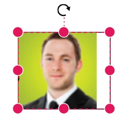 |
| Meet | XMinYMin | 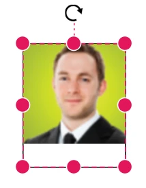 |
| Meet | XMaxYMax | 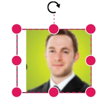 |
| None | XMinYMax | 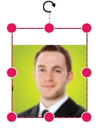 |
| None | XMinYMin | 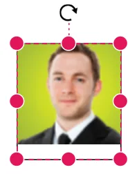 |
| Slice | XMinYMax | 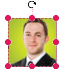 |
| Slice | XMinYMin | 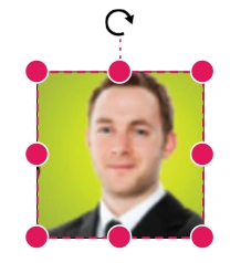 |
How to Create HTML Template Shapes
HTML elements can be embedded in the diagram by setting the node Shape type to HTML. The Shape property of Node determines the node type. The following code illustrates how an HTML node is created.
@using Syncfusion.Blazor.Diagram

@* Add a Namespace for a Blazor control used in Diagrm HTML node *@
@using Syncfusion.Blazor.CircularGauge

@* Initialize Diagram with node template *@
<SfDiagramComponent Height="600px" Nodes="@_nodes">
    <DiagramTemplates>
        <NodeTemplate>
            @{
                <SfCircularGauge Width="300px" Height="300px">
                    <CircularGaugeAxes>
                        <CircularGaugeAxis StartAngle="210" EndAngle="150" Minimum="0" Maximum="120" Radius="80%">
                            <CircularGaugeAxisLineStyle Width="10" Color="transparent">
                            </CircularGaugeAxisLineStyle>
                            <CircularGaugeAxisLabelStyle UseRangeColor="false">
                                <CircularGaugeAxisLabelFont Size="12px" FontFamily="Roboto" FontStyle="Regular">
                                </CircularGaugeAxisLabelFont>
                            </CircularGaugeAxisLabelStyle>
                            <CircularGaugeAxisMajorTicks Height="10" Offset="5" UseRangeColor="false">
                            </CircularGaugeAxisMajorTicks>
                            <CircularGaugeAxisMinorTicks Height="0" Width="0" UseRangeColor="false">
                            </CircularGaugeAxisMinorTicks>
                            <CircularGaugeAnnotations>
                                <CircularGaugeAnnotation Radius="30%" Angle="0" ZIndex="1" Content="Speedometer">
                                    <ContentTemplate>
                                        <div><span style="font-size:14px; color:#9E9E9E; font-family:Regular; margin-left: -33px">Speedometer</span></div>
                                    </ContentTemplate>
                                </CircularGaugeAnnotation>
                                <CircularGaugeAnnotation Radius="40%" Angle="180" ZIndex="1" Content="65 MPH">
                                    <ContentTemplate>
                                        <div><span style="font-size:20px; color:#424242; font-family:Regular; margin-left: -33px">65 MPH</span></div>
                                    </ContentTemplate>
                                </CircularGaugeAnnotation>
                            </CircularGaugeAnnotations>
                            <CircularGaugeRanges>
                                <CircularGaugeRange Start="0" End="40" Color="#30B32D" StartWidth="10" EndWidth="10" RoundedCornerRadius="0">
                                </CircularGaugeRange>
                                <CircularGaugeRange Start="40" End="80" Color="#FFDD00" StartWidth="10" EndWidth="10" RoundedCornerRadius="0">
                                </CircularGaugeRange>
                                <CircularGaugeRange Start="80" End="120" Color="#F03E3E" StartWidth="10" EndWidth="10" RoundedCornerRadius="0">
                                </CircularGaugeRange>
                            </CircularGaugeRanges>
                            <CircularGaugePointers>
                                <CircularGaugePointer Value="65" Radius="60%" PointerWidth="8">
                                    <CircularGaugePointerAnimation Enable="true"></CircularGaugePointerAnimation>
                                    <CircularGaugeCap Radius="7">
                                    </CircularGaugeCap>
                                    <CircularGaugeNeedleTail Length="18%">
                                    </CircularGaugeNeedleTail>
                                </CircularGaugePointer>
                            </CircularGaugePointers>
                        </CircularGaugeAxis>
                    </CircularGaugeAxes>
                </SfCircularGauge>
            }
        </NodeTemplate>
    </DiagramTemplates>
</SfDiagramComponent>

@code
{
    //Initialize node collection with node
    private DiagramObjectCollection<Node> _nodes = new DiagramObjectCollection<Node>();

    protected override void OnInitialized()
    {
        Node node = new Node()
        {
            ID = "node1",
            //Size of the node
            Width = 300,
            Height = 300,
            //Position of the node
            OffsetX = 400,
            OffsetY = 300,
            //sets the type of the shape as HTML
            Shape = new Shape()
            {
                Type = NodeShapes.HTML,
            }
        };
        _nodes.Add(node);
    }
}
A complete working sample can be downloaded from GitHub

NOTE
HTML nodes cannot be exported to image format, like JPEG and PNG. It is by design, while exporting the diagram is drawn in a canvas. Further, this canvas is exported into image formats. Currently, drawing in a canvas equivalent from all possible HTML is not feasible. Hence, this limitation. Also , HTML node always appears as topmost layer ( whose index is the higher index, even though it is defined at the last).
How to Create a Basic Shape Node
The BasicShapes are common shapes that are used to represent the geometrical information visually. To create basic shapes, the Type of the shape should be set as Basic. Its Shape property can be set with any one of the built-in shapes. To render a rounded rectangle, set the type as Basic and shape as Rectangle. Set the CornerRadius property to specify the radius of rounded rectangle.
The following code example illustrates how to create a basic shape.
@using Syncfusion.Blazor.Diagram

@* Initialize Diagram *@
<SfDiagramComponent Height="600px" Nodes="@_nodes" />

@code
{
    //Initialize node collection with node.
    private DiagramObjectCollection<Node> _nodes = new DiagramObjectCollection<Node>();

    protected override void OnInitialized()
    {
        Node node = new Node()
        {
            ID = "node1",
            //Size of the node.
            Height = 100,
            Width = 100,
            //Position of the node.
            OffsetX = 100,
            OffsetY = 100,
            //Sets the type of the shape as basic.
            Shape = new BasicShape()
            {
                Type = NodeShapes.Basic,
                Shape = NodeBasicShapes.Rectangle,
                //Sets the corner radius to the node shape.
                CornerRadius = 10
            },
            Style = new ShapeStyle() { Fill = "#6495ED" }
        };
        _nodes.Add(node);
    }
}
A complete working sample can be downloaded from GitHub
NOTE
By default, the Shape property of the node is set as Basic. Default property for
Shapeis Rectangle.
WhenShapeis not set for a basic shape, it is considered as a Rectangle.
TheCornerRadiusproperty applies only to basic shapes.
The list of basic shapes are as follows.

How to Create a Path Shape Node
The PathShape is a commonly used basic shape that allows visually to represent the geometrical information. As node path data, any geometrical data can be provided. Create own Geometry and assign it to data if you want anything different from the standard figures. A geometry does not require any dimension specifications, such as width or height, because it specifies its own size. If the node’s size is set, the geometry is extended to fit the node’s dimensions.
To create a path node, set the shape as Path. The geometry of the path is defined using the Data property. The following code illustrates how a path node is created.
@using Syncfusion.Blazor.Diagram

@* Initialize Diagram *@
<SfDiagramComponent Height="600px" Nodes="@_nodeCollection">
    <SnapSettings Constraints="SnapConstraints.None"></SnapSettings>
</SfDiagramComponent>
@code
{
    //Initialize node collection with node
    private DiagramObjectCollection<Node> _nodeCollection = new DiagramObjectCollection<Node>()
    {
        // Creates a path node
        new Node()
        {
            ID="node1",
            //Size of the node
            Height=100,
            Width=100,
            //Position of the node
            OffsetX=100,
            OffsetY=100,
            //Sets the type of the shape as path
            Shape=new PathShape()
            {
                Type=NodeShapes.Path,
                Data="M 355.31 12.07 C 352.11 5.95 345.35 -1.14 331.41 0.15 C 290.33 3.93 209.61 81.48 190.42 111.69 C 189.66 107.76 187.9 101.49 184.12 98.05 C 189.5 87.75 198.01 69.64 201.57 52.48 C 202.4 52.26 203.12 51.68 203.34 50.44 C 203.72 48.34 204 46.22 204.39 44.13 C 205.01 40.62 199.99 39.43 199.42 42.91 C 199.06 45.06 198.69 47.15 198.35 49.31 C 198.16 50.6 198.69 51.62 199.54 52.14 C 196.08 68.87 187.75 86.63 182.43 96.81 C 181.52 96.29 180.53 95.87 179.41 95.7 C 179.09 95.65 178.8 95.72 178.5 95.71 C 178.19 95.72 177.91 95.65 177.59 95.7 C 176.46 95.87 175.48 96.29 174.56 96.81 C 169.24 86.63 160.92 68.87 157.46 52.14 C 158.3 51.62 158.83 50.6 158.65 49.31 C 158.3 47.15 157.93 45.06 157.58 42.91 C 157.01 39.43 151.99 40.62 152.61 44.13 C 152.99 46.22 153.28 48.34 153.66 50.44 C 153.87 51.68 154.6 52.27 155.42 52.48 C 158.98 69.63 167.49 87.75 172.87 98.05 C 169.09 101.49 167.33 107.76 166.57 111.69 C 147.39 81.48 66.67 3.93 25.59 0.15 C 11.65 -1.14 4.89 5.95 1.69 12.07 C -2.05 19.07 0.84 33.48 6.24 58.46 C 8.66 69.55 11.16 80.96 12.94 92.2 C 13.89 98.36 14.79 104.49 15.64 110.36 C 19.39 136.89 22.52 158.97 32.64 166.04 C 35.41 167.98 38.65 168.78 42.61 168.24 C 52.26 165.95 63.79 164.03 75.99 162.67 C 64.03 171.47 49.08 185.81 44.17 204.84 C 40.38 219.72 43.37 234.86 53.01 250.05 C 64.37 267.81 76.02 279.48 86.91 287.09 C 108.68 302.31 127.52 301.24 135.48 300.78 C 136.3 300.77 136.94 300.71 137.56 300.69 C 143.62 300.61 147.76 291.39 156.6 270.51 C 160.94 260.34 167.39 245.19 172.83 237.47 C 173.97 240.31 177.22 242.31 178.92 242.87 C 178.78 242.94 178.62 243.07 178.49 243.12 C 178.65 243.08 178.83 242.97 179 242.91 C 179.1 242.94 179.25 243.02 179.34 243.04 C 179.26 243.01 179.13 242.93 179.04 242.89 C 180.83 242.24 183.05 240.25 184.16 237.48 C 189.6 245.19 196.05 260.34 200.39 270.52 C 209.23 291.4 213.38 300.61 219.43 300.7 C 220.05 300.72 220.69 300.77 221.51 300.78 C 229.47 301.25 248.31 302.31 270.08 287.1 C 280.97 279.49 292.62 267.81 303.98 250.05 C 313.62 234.86 316.6 219.72 312.82 204.84 C 307.91 185.82 292.96 171.48 281 162.67 C 293.2 164.03 304.73 165.95 314.38 168.24 C 318.34 168.78 321.58 167.98 324.35 166.04 C 334.47 158.97 337.6 136.89 341.35 110.37 C 342.19 104.49 343.1 98.37 344.05 92.2 C 345.83 80.96 348.33 69.55 350.75 58.46 C 356.16 33.48 359.05 19.07 355.31 12.07 z M 183.92 237.56 C 182.35 240.3 180.35 242.13 178.97 242.86 C 177.49 242.19 174.7 240.38 173.08 237.56 C 173.08 237.56 166.19 138.22 166.91 113.58 C 166.91 113.58 169.24 97.92 178.5 97.81 C 187.76 97.92 190.09 113.58 190.09 113.58 C 190.81 138.22 183.92 237.56 183.92 237.56 z"
            },
            Style=new ShapeStyle()
            {
                Fill="Orange"
            }
        }
    };
}
A complete working sample can be downloaded from GitHub

How to Create a Flow Shape Node
The FlowShape represent process flow. It is used for analyzing, designing and managing the documentation process. To create a flow shape, specify the shape type as Flow. By default, it is considered as a Process. The following code example illustrates how to create a flow shape.
@using Syncfusion.Blazor.Diagram

@* Initialize Diagram *@
<SfDiagramComponent Height="600px" Nodes="@_nodes" />

@code
{
    //Initialize node collection with node.
    private DiagramObjectCollection<Node> _nodes = new DiagramObjectCollection<Node>();

    protected override void OnInitialized()
    {
        Node node = new Node()
        {
            ID = "node1",
            //Size of the node.
            Height = 100,
            Width = 100,
            //Position of the node.
            OffsetX = 100,
            OffsetY = 100,
            //Sets the type of the shape as flow.
            Shape = new FlowShape()
            {
                Type = NodeShapes.Flow,
                Shape = NodeFlowShapes.DirectData
            }
        };
        _nodes.Add(node);
    }
}
A complete working sample can be downloaded from GitHub
The list of flow shapes are as follows.

How to Create a SVG Template Shape
The diagram provides support to embed SVG element into a node. The Shape property of the node allows to set the type of node. To create a SVG node, it should be set as SVG. The following code illustrates how a SVG node is created.
@using Syncfusion.Blazor.Diagram

@* Initialize Diagram *@
<SfDiagramComponent Height="600px" Nodes="@_nodes">
    <SnapSettings Constraints="SnapConstraints.None"></SnapSettings>
    <DiagramTemplates>
        <NodeTemplate>
            @{
                if ((context as Node).Shape.Type == NodeShapes.SVG)
                {
                    <svg viewBox="0 0 100 100" xmlns="http://www.w3.org/2000/svg">
                        <!-- Using g to inherit presentation attributes -->
                        <g fill="white" stroke="green" stroke-width="5">
                            <circle cx="40" cy="40" r="25" />
                            <circle cx="60" cy="60" r="25" />
                        </g>
                    </svg>
                }
            }
        </NodeTemplate>
    </DiagramTemplates>
</SfDiagramComponent>

@code
{
    //Initialize node collection with node.
    private DiagramObjectCollection<Node> _nodes = new DiagramObjectCollection<Node>();

    protected override void OnInitialized()
    {
        Node node = new Node()
        {
            ID = "node1",
            // Size of the node.
            Height = 100,
            Width = 100,
            // Position of the node.
            OffsetX = 100,
            OffsetY = 100,
            //Sets type of the shape as SVG.
            Shape = new Shape() { Type = NodeShapes.SVG },
        };
        _nodes.Add(node);
    }
}
A complete working sample can be downloaded from GitHub

NOTE
Similar to HTML node, SVG nodes cannot be exported to image format. The fill color of an SVG node can be overridden by inline style or fill of the SVG element specified in the template.
Node with BPMN shapes
The BPMN shapes visually represent Business Process Model and Notation elements such as events, tasks, gateways, and more. To create BPMN shapes, set the Type property of the shape to Bpmn.
Its Shape property can then be configured with any one of the available built-in BPMN subtypes, such as events, activities, or gateways. Customize each BPMN shape by specifying its category and characteristics (like Event, Trigger, Loop, etc.).
The following code example illustrates how to create a BPMN shape.
@using Syncfusion.Blazor.Diagram
@* Initialize Diagram *@
<SfDiagramComponent Height="600px" Nodes="@_nodes" />
@code
{
    // Initialize node collection with Node.
    private DiagramObjectCollection<Node> _nodes;

    protected override void OnInitialized()
    {
        _nodes = new DiagramObjectCollection<Node>();
        Node node = new Node()
        {
            // Position of the node.
            OffsetX = 100,
            OffsetY = 100,
            // Size of the node.
            Width = 100,
            Height = 100,
            // Unique Id of the node.
            ID = "node1",
            // Sets the shape to activity.
            Shape = new BpmnActivity()
            {
                ActivityType = BpmnActivityType.Task
            },
        };
        _nodes.Add(node);
    }
}
A complete working sample can be downloaded from GitHub

See also
- How to Create Polygon and Circle Shapes in Blazor Diagram
- How to Export HTML Shapes Into Image and PDF Format in Blazor Diagram
- How to Serialize the HTML Template Value of the NodeTemplate Property in Blazor Diagram
- How to Add Custom HTML Nodes in Symbol Palette for Blazor Diagram
- How to Make HTML Node Resizable but Not Draggable in Blazor Diagram
- How to Update HTML Node Size on HTML Template in Blazor Diagram
- How to Print or Export the HTML and Native Node into Image Format in Blazor Diagram