How can I help you?
Container in Blazor Diagram Component
22 Jun 202614 minutes to read
Containers provide a structured way to organize and manage collections of diagram elements. They act as logical groupings of shapes enclosed by a customizable border, allowing for intuitive drag-and-drop operations during runtime. Changes to the container, such as position, size, or style, do not affect its children. This enhances diagram clarity by maintaining organization while allowing individual elements to be edited separately.
How to Create a Container
A container can be created and added to the diagram either programmatically or interactively.
How to Add a Container
To create a container, define a Container object and add it to the Nodes collection of the diagram. The following code illustrates how to create a container node.
@using Syncfusion.Blazor.Diagram

<SfDiagramComponent @ref="@_diagram" Height="600px" Nodes="@_nodes">
</SfDiagramComponent>

@code
{
    private SfDiagramComponent _diagram;
    //Initialize the node collection
    private DiagramObjectCollection<Node> _nodes = new DiagramObjectCollection<Node>();

    protected override void OnInitialized()
    {
        // Create container
        Container container = new Container()
        {
            ID = "container",
            Height = 300, Width = 500, OffsetX = 500, OffsetY = 300,
        };
        _nodes.Add(container);
    }
}A complete working sample can be downloaded from GitHub.
Note: The container ID should be unique, begin with a letter, and not contain spaces or special characters (such as underscores or symbols).
How to Add Elements to a Container
To add child elements to a container, define the child nodes and assign their IDs to the container’s Children property. When child nodes are added to a container, they become part of its structure while remaining individually editable. The following code illustrates how to create a container with children.
@using Syncfusion.Blazor.Diagram

<SfDiagramComponent @ref="@_diagram" Height="600px" Nodes="@_nodes">
</SfDiagramComponent>

@code
{
    private SfDiagramComponent _diagram;
    //Initialize the node collection
    private DiagramObjectCollection<Node> _nodes = new DiagramObjectCollection<Node>();

    protected override void OnInitialized()
    {
        Node node1 = new Node()
        {
            ID = "node1",
            Height = 60,
            Width = 100,
            OffsetX = 400,
            OffsetY = 300,
            Annotations = new DiagramObjectCollection<ShapeAnnotation>()
            {
                new ShapeAnnotation(){ Content = "Process"}
            }
        };
        Node node2 = new Node()
        {
            ID = "node2",
            Height = 60,
            Width = 100,
            OffsetX = 600,
            OffsetY = 300,
            Annotations = new DiagramObjectCollection<ShapeAnnotation>()
            {
                new ShapeAnnotation(){ Content = "Process"}
            }
        };
        Container container = new Container()
        {
            ID = "container",
            Height = 300, Width = 500, OffsetX = 500, OffsetY = 300,
            Children = new string[] { "node1", "node2" }
        };
        _nodes.Add(node1);
        _nodes.Add(node2);
        _nodes.Add(container);
    }
}A complete working sample can be downloaded from GitHub.
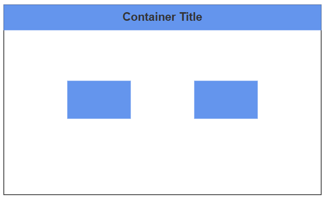
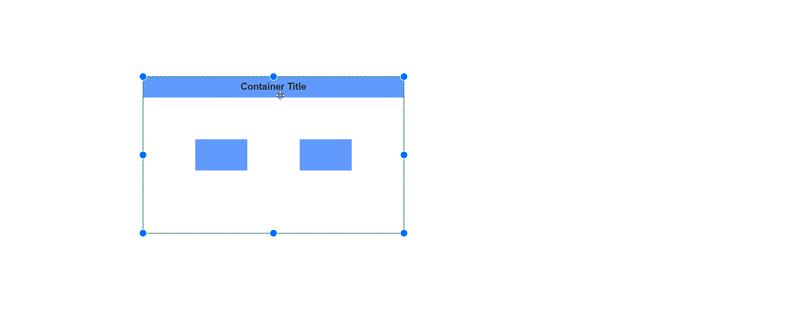
How to Customize Container Header
Containers can include descriptive text to identify their purpose or contents through the Header property. This enhances readability by providing clear labels for grouped elements. The header’s visual presentation is fully customizable using the Style property.
The following example shows how to define a container header and customize its appearance.
@using Syncfusion.Blazor.Diagram

<SfDiagramComponent @ref="@_diagram" Height="600px" Nodes="@_nodes">
</SfDiagramComponent>

@code
{
    private SfDiagramComponent _diagram;
    //Initialize the node collection
    private DiagramObjectCollection<Node> _nodes = new DiagramObjectCollection<Node>();

    protected override void OnInitialized()
    {
        Node node1 = new Node()
        {
            ID = "node1",
            Height = 60,
            Width = 100,
            OffsetX = 400,
            OffsetY = 300,
            Style = new ShapeStyle()
            {
                Fill = "CornflowerBlue",
            }
        };
        Node node2 = new Node()
        {
            ID = "node2",
            Height = 60,
            Width = 100,
            OffsetX = 600,
            OffsetY = 300,
            Style = new ShapeStyle()
            {
                Fill = "CornflowerBlue",
            }
        };
        Container container = new Container()
        {
            ID = "container",
            Header = new ContainerHeader()
            {
                ID = "containerHeader",
                Height = 40,
                Annotation = new ShapeAnnotation()
                {
                    Content = "Container Title",
                    Style = new TextStyle() { FontSize = 18, Bold = true, Color = "#343434" }
                },
                Style = new TextStyle()
                {
                    Fill = "CornflowerBlue"
                }
            },
            Height = 300,
            Width = 500,
            OffsetX = 500,
            OffsetY = 300,
            Children = new string[] { "node1", "node2" }
        };
        _nodes.Add(node1);
        _nodes.Add(node2);
        _nodes.Add(container);
    }
}A complete working sample can be downloaded from GitHub.
Note: Edit the header by double-clicking the header region, or by pressing F2.
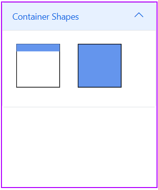
How to Add Containers to the Symbol Palette
Container nodes can be predefined and added to the symbol palette for quick and consistent reuse throughout diagrams. Drag the predefined containers from the palette and drop them into the diagram to instantiate them.
The following code example shows how to define containers and add them to the symbol palette.
@using Syncfusion.Blazor.Diagram
@using Syncfusion.Blazor.Diagram.SymbolPalette

<div class="control-section">
    <div style="width:254px;">
        <div id="palette-space" class="sb-mobile-palette" style="border: 2px solid #b200ff">
            <SfSymbolPaletteComponent @ref="@_symbolPalette" Height="300px" Width="250px"
                                      Palettes="@_palettes" SymbolHeight="100" SymbolWidth="100" SymbolMargin="@_symbolMargin">
            </SfSymbolPaletteComponent>
        </div>
    </div>
</div>

@code
{
    private SfSymbolPaletteComponent _symbolPalette;
    //Define symbol margin.
    private SymbolMargin _symbolMargin = new SymbolMargin { Left = 15, Right = 15, Top = 15, Bottom = 15 };
    //Define palattes collection.
    private DiagramObjectCollection<Palette> _palettes = new DiagramObjectCollection<Palette>();
    // Defines palette's container-shape collection.
    private DiagramObjectCollection<NodeBase> _containerNodes = new DiagramObjectCollection<NodeBase>();

    protected override void OnInitialized()
    {
        InitPaletteModel();
    }

    private void InitPaletteModel()
    {
        _palettes = new DiagramObjectCollection<Palette>();

        _containerNodes = new DiagramObjectCollection<NodeBase>();

        // Create container with header
        Container container = new Container()
        {
            ID = "containerWithHeader",
            Header = new ContainerHeader()
            {
                ID = "containerHeader",
                Height = 50,
                Annotation = new ShapeAnnotation()
                {
                    Content = "Container Title"
                },
                Style = new TextStyle()
                {
                    Fill = "CornflowerBlue"
                }
            },
            Height = 300,
            Width = 300,
            OffsetX = 100,
            OffsetY = 100,
        };

        // Create container without header.
        Container containerWithoutHeader = new Container()
        {
            ID = "containerWithoutHeader",
            Height = 300,
            Width = 300,
            OffsetX = 100,
            OffsetY = 100,
            Style = new ShapeStyle() { Fill = "CornflowerBlue" }
        };

        _containerNodes = new DiagramObjectCollection<NodeBase>()
        {
            container,
            containerWithoutHeader,
        };

        _palettes = new DiagramObjectCollection<Palette>()
        {
            new Palette(){Symbols = _containerNodes, Title="Container Shapes", ID="ContainerShapes" },
        };
      }
}A complete working sample can be downloaded from GitHub.
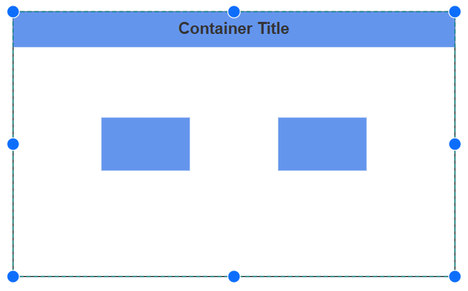
How to Interactively Add or Remove Diagram Elements into Container
Diagram elements can be added to or removed from a container at runtime. When an element is dropped onto the container’s edges, the container automatically adjusts its size to accommodate the new element.
Interaction
Diagram supports selecting, dragging, and resizing containers interactively..
How to Select a Container
A container can be selected by clicking (or tapping) it. It can also be selected at runtime by using the Select method, and selection can be cleared by using ClearSelection
How to Drag a Container
-
A container can be moved by clicking and dragging it within the diagram.
-
When you drag the elements in the diagram, the PositionChanging and PositionChanged events get triggered and we can do customization on those events.
How to Resize a Container
- A selected container is surrounded by eight resize thumbs. Dragging these thumbs adjusts the container’s size.
- When one corner is dragged, the opposite corner remains fixed.
- To maintain the container’s aspect ratio during resizing, enable the AspectRatio constraint in NodeConstraints.
- A container can be resized by using the selector or by moving child nodes toward the container edge. If a child node reaches the container edge, the container is resized automatically.
