Expand and Collapse Support for Nodes in Blazor Diagram Component
3 Jul 202624 minutes to read
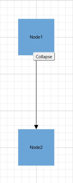
The Diagram component supports to describe the state of the node. i.e., whether the node is in an expanded or collapsed state. Use the IsExpanded property on a node to expand or collapse its children nodes. Expand and Collapse support is used to compress the hierarchy view so that only the roots of each elements are visible.
The following Node properties represent the state of the node and allows user to Expand and Collapse the desired Node :
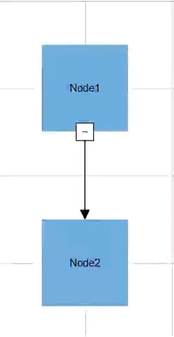
The following code example illustrates how to create icons of various shapes on a simple node connection.
@using Syncfusion.Blazor.Diagram

<SfDiagramComponent Height="600px" Nodes="@_nodes" Connectors="@_connectors" />

@code
{
    private DiagramObjectCollection<Node> _nodes = new DiagramObjectCollection<Node>();
    private DiagramObjectCollection<Connector> _connectors = new DiagramObjectCollection<Connector>();

    protected override void OnInitialized()
    {
        Node node1 = new Node()
        {
            ID = "node1",
            Width = 100,
            Height = 100,
            OffsetX = 300,
            OffsetY = 300,
            Style = new ShapeStyle()
            {
                Fill = "#6BA5D7",
                StrokeColor = "white"
            },
            Annotations = new DiagramObjectCollection<ShapeAnnotation>()
            {
                new ShapeAnnotation()
                {
                    Content = "Node1"
                }
            },
            ExpandIcon = new DiagramExpandIcon()
            {
                Shape = DiagramExpandIcons.Minus,
                Height = 20,
                Width = 20,
            },
            CollapseIcon = new DiagramCollapseIcon()
            {
                Shape = DiagramCollapseIcons.Plus,
                Height = 20,
                Width = 20,
            },
        };
        _nodes.Add(node1);
        Node node2 = new Node()
        {
            ID = "node2",
            Width = 100,
            Height = 100,
            OffsetX = 300,
            OffsetY = 500,
            Style = new ShapeStyle()
            {
                Fill = "#6BA5D7",
                StrokeColor = "white"
            },
             Annotations = new DiagramObjectCollection<ShapeAnnotation>()
            {
                new ShapeAnnotation()
                {
                    Content = "Node2"
                }
            },
            ExpandIcon = new DiagramExpandIcon()
            {
                Shape = DiagramExpandIcons.Minus,
                Height = 20,
                Width = 20,
            },
            CollapseIcon = new DiagramCollapseIcon()
            {
                Shape = DiagramCollapseIcons.Plus,
                Height = 20,
                Width = 20,
            },
        };
        _nodes.Add(node2);
        Connector connector1 = new Connector()
        {
            ID = "connector1",
            SourceID = "node1",
            TargetID = "node2",
        };
        _connectors.Add(connector1);
    }
}
A complete working sample can be downloaded from GitHub
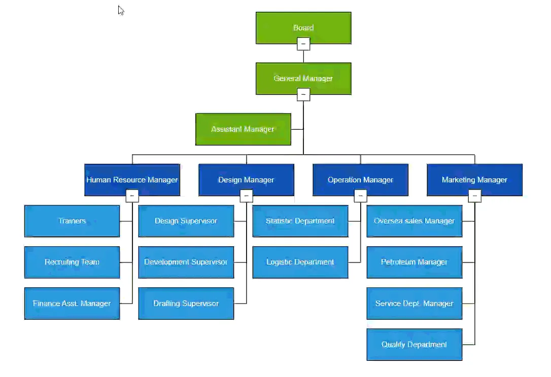
The following code example illustrates how to create an icon of various shapes in a layout.
@using Syncfusion.Blazor.Diagram
@using Syncfusion.Blazor.Diagram.Internal
@using System.Collections.ObjectModel

<SfDiagramComponent @ref="diagram" Width="1500px" Height="800px" NodeCreating="NodeCreating" ConnectorCreating="ConnectorCreating">
    <DataSourceSettings DataSource="DataSource" ID="Id" ParentID="Manager"></DataSourceSettings>
    <Layout @bind-Type="type" @bind-HorizontalSpacing="@HorizontalSpacing" @bind-FixedNode="@FixedNode" @bind-Orientation="@oreintation" @bind-VerticalSpacing="@VerticalSpacing" @bind-HorizontalAlignment="@horizontalAlignment" @bind-VerticalAlignment="@verticalAlignment" GetLayoutInfo="GetLayoutInfo">
        <LayoutMargin @bind-Top="@top" @bind-Bottom="@bottom" @bind-Right="@right" @bind-Left="@left"></LayoutMargin>
    </Layout>
    <SnapSettings Constraints="SnapConstraints.None"></SnapSettings>
</SfDiagramComponent>

@code {
    private SfDiagramComponent _diagram;
    private double top = 50;
    private double bottom = 50;
    private double right = 50;
    private double left = 50;
    private LayoutType type = LayoutType.OrganizationalChart;
    private LayoutOrientation oreintation = LayoutOrientation.TopToBottom;
    private HorizontalAlignment horizontalAlignment = HorizontalAlignment.Auto;
    private VerticalAlignment verticalAlignment = VerticalAlignment.Auto;
    private int HorizontalSpacing = 30;
    private int VerticalSpacing = 30;
    private Orientation subTreeOrientation = Orientation.Vertical;
    private SubTreeAlignmentType subTreeAlignment = SubTreeAlignmentType.Left;
    private string FixedNode = null;

    public class HierarchicalDetails
    {
        public string Id { get; set; }
        public string Role { get; set; }
        public string Manager { get; set; }
        public string ChartType { get; set; }
        public string Color { get; set; }
    }

    private List<HierarchicalDetails> DataSource = new List<HierarchicalDetails>()
    {
        new HierarchicalDetails()   { Id= "parent", Role= "Board", Color= "#71AF17" },
        new HierarchicalDetails()   { Id= "1", Role= "General Manager", Manager= "parent", ChartType= "right", Color= "#71AF17" },
        new HierarchicalDetails()   { Id= "11", Role= "Assistant Manager", Manager= "1", Color= "#71AF17" },
        new HierarchicalDetails()   { Id= "2", Role= "Human Resource Manager", Manager= "1", ChartType= "right", Color= "#1859B7" },
        new HierarchicalDetails()   { Id= "3", Role= "Trainers", Manager= "2", Color= "#2E95D8" },
        new HierarchicalDetails()   { Id= "4", Role= "Recruiting Team", Manager= "2", Color= "#2E95D8" },
        new HierarchicalDetails()   { Id= "5", Role= "Finance Asst. Manager", Manager= "2", Color= "#2E95D8" },
        new HierarchicalDetails()   { Id= "6", Role= "Design Manager", Manager= "1",ChartType= "right", Color= "#1859B7" },
        new HierarchicalDetails()   { Id= "7", Role= "Design Supervisor", Manager= "6", Color= "#2E95D8" },
        new HierarchicalDetails()   { Id= "8", Role= "Development Supervisor", Manager= "6", Color= "#2E95D8" },
        new HierarchicalDetails()   { Id= "9", Role= "Drafting Supervisor", Manager= "6", Color= "#2E95D8" },
        new HierarchicalDetails()   { Id= "10", Role= "Operation Manager", Manager= "1", ChartType= "right", Color= "#1859B7" },
        new HierarchicalDetails()   { Id= "11", Role= "Statistic Department", Manager= "10", Color= "#2E95D8" },
        new HierarchicalDetails()   { Id= "12", Role= "Logistic Department", Manager= "10", Color= "#2E95D8" },
        new HierarchicalDetails()   { Id= "16", Role= "Marketing Manager", Manager= "1", ChartType= "right", Color= "#1859B7" },
        new HierarchicalDetails()   { Id= "17", Role= "Oversea sales Manager", Manager= "16", Color= "#2E95D8" },
        new HierarchicalDetails()   { Id= "18", Role= "Petroleum Manager", Manager= "16", Color= "#2E95D8" },
        new HierarchicalDetails()   { Id= "20", Role= "Service Dept. Manager", Manager= "16", Color= "#2E95D8" },
        new HierarchicalDetails()   { Id= "21", Role= "Quality Department", Manager= "16", Color= "#2E95D8" }
    };

    private TreeInfo GetLayoutInfo(IDiagramObject obj, TreeInfo options)
    {
        if (rows == 0)
        {
            if (rows == 0 && options.Rows != null)
                options.Rows = null;
            Node node = obj as Node;
            if ((node.Data as HierarchicalDetails).Role == "General Manager")
            {
                if (options.Children.Count > 0)
                {
                    options.Assistants.Add(options.Children[0]);
                    options.Children.RemoveAt(0);
                }
            }
            if (!options.HasSubTree)
            {
                options.Orientation = subTreeOrientation;
                options.AlignmentType = subTreeAlignment;
            }
        }
        else
        {
            if (!options.HasSubTree)
            {
                options.AlignmentType = SubTreeAlignmentType.Balanced;
                options.Orientation = Orientation.Horizontal;
                options.Rows = rows;
            }
        }
        return options;
    }

    private int rows = 0;
    private void NodeCreating(IDiagramObject obj)
    {
        Node node = obj as Node;
        if (node.Data is System.Text.Json.JsonElement)
        {
            node.Data = System.Text.Json.JsonSerializer.Deserialize<HierarchicalDetails>(node.Data.ToString());
        }
        HierarchicalDetails hierarchicalData = node.Data as HierarchicalDetails;
        node.Width = 150;
        node.Height = 50;
        node.Style.Fill = hierarchicalData.Color;
        node.Annotations = new DiagramObjectCollection<ShapeAnnotation>()
        {
            new ShapeAnnotation()
            {
                Content = hierarchicalData.Role,
                Style = new TextStyle() { Color = "white" }
            }
        };
        node.ExpandIcon = new DiagramExpandIcon()
        {
            Shape = DiagramExpandIcons.Minus,
            Height = 20,
            Width = 20,
        };
        node.CollapseIcon = new DiagramCollapseIcon()
        {
            Shape = DiagramCollapseIcons.Plus,
            Height = 20,
            Width = 20,
        };
    }

    private void ConnectorCreating(IDiagramObject connector)
    {
        (connector as Connector).Type = ConnectorSegmentType.Orthogonal;
        (connector as Connector).TargetDecorator.Shape = DecoratorShape.None;
    }
}
A complete working sample can be downloaded from GitHub
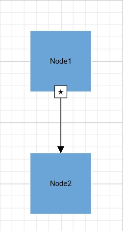
How to Customize Expand and Collapse Icon
Diagram allows customization of the node’s expand and collapse icons. For available properties, refer to DiagramExpandIcon and DiagramCollapseIcon.
How to Update Expand and Collapse Icon Size
Change the icon size using the Height and Width properties.
How to Customize Expand and Collapse Icon Shape
The shape of an ExpandIcon and CollapseIcon can be changed using the Shape property of DiagramExpandIcon and DiagramCollapseIcon respectively.
To explore the available expand icon shapes, refer to DiagramExpandIcons.
To explore the available collapse icon shapes, refer to DiagramCollapseIcons.
If you need to render a custom shape, Set shape to Path and define the path using the PathData property.
The following code explains how to initialize the icon with a path shape.
@using Syncfusion.Blazor.Diagram

<SfDiagramComponent Height="600px" Nodes="@_nodes" Connectors="@_connectors" />

@code
{
    //Initialize the diagram's nodes collection
    private DiagramObjectCollection<Node> _nodes = new DiagramObjectCollection<Node>();
    //Initialize the diagram's connectors collection
    private DiagramObjectCollection<Connector> _connectors = new DiagramObjectCollection<Connector>();

    protected override void OnInitialized()
    {
        Node node1 = new Node()
        {
            ID = "node1",
            Width = 100,
            Height = 100,
            OffsetX = 300,
            OffsetY = 300,
            Style = new ShapeStyle()
            {
                Fill = "#6BA5D7",
                StrokeColor = "white"
            },
            Annotations = new DiagramObjectCollection<ShapeAnnotation>()
            {
                new ShapeAnnotation()
                {
                    Content = "Node1"
                }
            },
            ExpandIcon = new DiagramExpandIcon()
            {
                Shape = DiagramExpandIcons.Path,
                Height = 20,
                Width = 20,
                PathData = "M540.3643,137.9336L546.7973,159.7016L570.3633,159.7296L550.7723,171.9366L558.9053,194.9966L540.3643,179.4996L521.8223,194.9966L529.9553,171.9366L510.3633,159.7296L533.9313,159.7016L540.3643,137.9336z"
            },
            CollapseIcon = new DiagramCollapseIcon()
            {
                Shape = DiagramCollapseIcons.Path,
                Height = 20,
                Width = 20,
                PathData = "M 355.31 12.07 C 352.11 5.95 345.35 -1.14 331.41 0.15 C 290.33 3.93 209.61 81.48 190.42 111.69 C 189.66 107.76 187.9 101.49 184.12 98.05 C 189.5 87.75 198.01 69.64 201.57 52.48 C 202.4 52.26 203.12 51.68 203.34 50.44 C 203.72 48.34 204 46.22 204.39 44.13 C 205.01 40.62 199.99 39.43 199.42 42.91 C 199.06 45.06 198.69 47.15 198.35 49.31 C 198.16 50.6 198.69 51.62 199.54 52.14 C 196.08 68.87 187.75 86.63 182.43 96.81 C 181.52 96.29 180.53 95.87 179.41 95.7 C 179.09 95.65 178.8 95.72 178.5 95.71 C 178.19 95.72 177.91 95.65 177.59 95.7 C 176.46 95.87 175.48 96.29 174.56 96.81 C 169.24 86.63 160.92 68.87 157.46 52.14 C 158.3 51.62 158.83 50.6 158.65 49.31 C 158.3 47.15 157.93 45.06 157.58 42.91 C 157.01 39.43 151.99 40.62 152.61 44.13 C 152.99 46.22 153.28 48.34 153.66 50.44 C 153.87 51.68 154.6 52.27 155.42 52.48 C 158.98 69.63 167.49 87.75 172.87 98.05 C 169.09 101.49 167.33 107.76 166.57 111.69 C 147.39 81.48 66.67 3.93 25.59 0.15 C 11.65 -1.14 4.89 5.95 1.69 12.07 C -2.05 19.07 0.84 33.48 6.24 58.46 C 8.66 69.55 11.16 80.96 12.94 92.2 C 13.89 98.36 14.79 104.49 15.64 110.36 C 19.39 136.89 22.52 158.97 32.64 166.04 C 35.41 167.98 38.65 168.78 42.61 168.24 C 52.26 165.95 63.79 164.03 75.99 162.67 C 64.03 171.47 49.08 185.81 44.17 204.84 C 40.38 219.72 43.37 234.86 53.01 250.05 C 64.37 267.81 76.02 279.48 86.91 287.09 C 108.68 302.31 127.52 301.24 135.48 300.78 C 136.3 300.77 136.94 300.71 137.56 300.69 C 143.62 300.61 147.76 291.39 156.6 270.51 C 160.94 260.34 167.39 245.19 172.83 237.47 C 173.97 240.31 177.22 242.31 178.92 242.87 C 178.78 242.94 178.62 243.07 178.49 243.12 C 178.65 243.08 178.83 242.97 179 242.91 C 179.1 242.94 179.25 243.02 179.34 243.04 C 179.26 243.01 179.13 242.93 179.04 242.89 C 180.83 242.24 183.05 240.25 184.16 237.48 C 189.6 245.19 196.05 260.34 200.39 270.52 C 209.23 291.4 213.38 300.61 219.43 300.7 C 220.05 300.72 220.69 300.77 221.51 300.78 C 229.47 301.25 248.31 302.31 270.08 287.1 C 280.97 279.49 292.62 267.81 303.98 250.05 C 313.62 234.86 316.6 219.72 312.82 204.84 C 307.91 185.82 292.96 171.48 281 162.67 C 293.2 164.03 304.73 165.95 314.38 168.24 C 318.34 168.78 321.58 167.98 324.35 166.04 C 334.47 158.97 337.6 136.89 341.35 110.37 C 342.19 104.49 343.1 98.37 344.05 92.2 C 345.83 80.96 348.33 69.55 350.75 58.46 C 356.16 33.48 359.05 19.07 355.31 12.07 z M 183.92 237.56 C 182.35 240.3 180.35 242.13 178.97 242.86 C 177.49 242.19 174.7 240.38 173.08 237.56 C 173.08 237.56 166.19 138.22 166.91 113.58 C 166.91 113.58 169.24 97.92 178.5 97.81 C 187.76 97.92 190.09 113.58 190.09 113.58 C 190.81 138.22 183.92 237.56 183.92 237.56 z"
            },
        };
        nodes.Add(node1);
        Node node2 = new Node()
        {
            ID = "node2",
            Width = 100,
            Height = 100,
            OffsetX = 300,
            OffsetY = 500,
            Style = new ShapeStyle()
            {
                Fill = "#6BA5D7",
                StrokeColor = "white"
            },
            Annotations = new DiagramObjectCollection<ShapeAnnotation>()
            {
                new ShapeAnnotation()
                {
                    Content = "Node2"
                }
            },
        };
        _nodes.Add(node2);
        Connector connector1 = new Connector()
        {
            ID = "connector1",
            SourceID = "node1",
            TargetID = "node2",
        };
        _connectors.Add(connector1);
    }
}
A complete working sample can be downloaded from GitHub
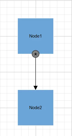
How to Customize Expand and Collapse Icon Appearance
Customize the icon appearance using Fill, BorderColor, BorderWidth, and CornerRadius properties.
The following code explains how to change the appearance of the Icon using Fill, BorderColor, BorderWidth properties.
@using Syncfusion.Blazor.Diagram

<SfDiagramComponent Height="600px" Nodes="@_nodes" Connectors="@_connectors" />

@code
{
    //Initialize the diagram's nodes collection
    private DiagramObjectCollection<Node> _nodes = new DiagramObjectCollection<Node>();
    //Initialize the diagram's connectors collection
    private DiagramObjectCollection<Connector> _connectors = new DiagramObjectCollection<Connector>();

    protected override void OnInitialized()
    {
        Node node1 = new Node()
        {
            ID = "node1",
            Width = 100,
            Height = 100,
            OffsetX = 300,
            OffsetY = 300,
            Style = new ShapeStyle()
            {
                Fill = "#6BA5D7",
                StrokeColor = "white"
            },
            Annotations = new DiagramObjectCollection<ShapeAnnotation>()
            {
                new ShapeAnnotation()
                {
                    Content = "Node1"
                }
            },
            ExpandIcon = new DiagramExpandIcon()
            {
                Shape = DiagramExpandIcons.Path,
                Height = 20,
                Width = 20,
                PathData = "M540.3643,137.9336L546.7973,159.7016L570.3633,159.7296L550.7723,171.9366L558.9053,194.9966L540.3643,179.4996L521.8223,194.9966L529.9553,171.9366L510.3633,159.7296L533.9313,159.7016L540.3643,137.9336z",
                CornerRadius = 10,
                Fill = "Gray",
            },
            CollapseIcon = new DiagramCollapseIcon()
            {
                Shape = DiagramCollapseIcons.Plus,
                Height = 20,
                Width = 20,
                Fill = "Gray",
                BorderColor = "Blue",
            },
        };
        _nodes.Add(node1);
        Node node2 = new Node()
        {
            ID = "node2",
            Width = 100,
            Height = 100,
            OffsetX = 300,
            OffsetY = 500,
            Style = new ShapeStyle()
            {
                Fill = "#6BA5D7",
                StrokeColor = "white"
            },
            Annotations = new DiagramObjectCollection<ShapeAnnotation>()
            {
                new ShapeAnnotation()
                {
                    Content = "Node2"
                }
            },
            ExpandIcon = new DiagramExpandIcon()
            {
                Shape = DiagramExpandIcons.Minus,
                Height = 20,
                Width = 20,
            },
            CollapseIcon = new DiagramCollapseIcon()
            {
                Shape = DiagramCollapseIcons.Plus,
                Height = 20,
                Width = 20,
            },
        };
        _nodes.Add(node2);
        Connector connector1 = new Connector()
        {
            ID = "connector1",
            SourceID = "node1",
            TargetID = "node2",
        };
        _connectors.Add(connector1);
    }
}
A complete working sample can be downloaded from GitHub
The following code explains how to change the icon appearance using the CornerRadius property.
@using Syncfusion.Blazor.Diagram

<SfDiagramComponent Height="600px" Nodes="@nodes" Connectors="@connectors" />

@code
{
    private DiagramObjectCollection<Node> _nodes = new DiagramObjectCollection<Node>();
    private DiagramObjectCollection<Connector> _connectors = new DiagramObjectCollection<Connector>();

    protected override void OnInitialized()
    {
        Node node1 = new Node()
        {
            ID = "node1",
            Width = 100,
            Height = 100,
            OffsetX = 300,
            OffsetY = 300,
            Style = new ShapeStyle()
            {
                Fill = "#6BA5D7",
                StrokeColor = "white"
            },
            Annotations = new DiagramObjectCollection<ShapeAnnotation>()
            {
                new ShapeAnnotation()
                {
                    Content="Node1"
                }
            },
            ExpandIcon = new DiagramExpandIcon()
            {
                Shape = DiagramExpandIcons.Path,
                Height = 20,
                Width = 20,
                PathData = "M540.3643,137.9336L546.7973,159.7016L570.3633,159.7296L550.7723,171.9366L558.9053,194.9966L540.3643,179.4996L521.8223,194.9966L529.9553,171.9366L510.3633,159.7296L533.9313,159.7016L540.3643,137.9336z",
                CornerRadius = 10
            },
            CollapseIcon = new DiagramCollapseIcon()
            {
                Shape = DiagramCollapseIcons.Plus,
                Height = 20,
                Width = 20,
                CornerRadius = 10
            },
        };
        _nodes.Add(node1);
        Node node2 = new Node()
        {
            ID = "node2",
            Width = 100,
            Height = 100,
            OffsetX = 300,
            OffsetY = 500,
            Style = new ShapeStyle()
            {
                Fill = "#6BA5D7",
                StrokeColor = "white"
            },
            Annotations = new DiagramObjectCollection<ShapeAnnotation>()
            {
                new ShapeAnnotation()
                {
                    Content = "Node2"
                }
            },
            ExpandIcon = new DiagramExpandIcon()
            {
                Shape = DiagramExpandIcons.Minus,
                Height = 20,
                Width = 20,
            },
            CollapseIcon = new DiagramCollapseIcon()
            {
                Shape = DiagramCollapseIcons.Plus,
                Height = 20,
                Width = 20,
            },
        };
        _nodes.Add(node2);
        Connector connector1 = new Connector()
        {
            ID = "connector1",
            SourceID = "node1",
            TargetID = "node2",
        };
        _connectors.Add(connector1);
    }
}
A complete working sample can be downloaded from GitHub
How to Position and Align Expand and Collapse Icon
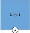
Diagram allows you to customize the position and alignment of the Icon efficiently. An Icon can be aligned in respect to the node boundaries. The following properties are used to position the Icon.
The following table shows the relationship between the Icon position and Icon OffsetX and OffsetY values (fraction values).
| OffsetX,OffsetY values | Output |
|---|---|
| (0,0) | 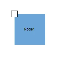 |
| (0,0.5) | 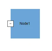 |
| (0,1) | 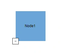 |
| (0.5,0) | 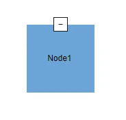 |
| (0.5,0.5) | 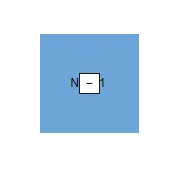 |
| (0.5,1) | 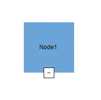 |
| (1,0) | 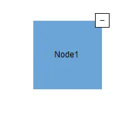 |
| (1,0.5) | 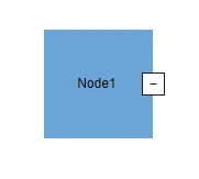 |
| (1,1) | 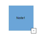 |
How to find node is in expanded or not
IsExpanded is used to defines whether the node is expanded or not. The following example demonstrate node’s isexpanded property. The default value of IsExpanded property is true.
@using Syncfusion.Blazor.Diagram

<SfDiagramComponent Height="600px" Nodes="@_nodes" Connectors="@_connectors" />

@code
{
    //Initialize the diagram's nodes collection
    private DiagramObjectCollection<Node> _nodes = new DiagramObjectCollection<Node>();
    //Initialize the diagram's connectors collection
    private DiagramObjectCollection<Connector> _connectors = new DiagramObjectCollection<Connector>();

    protected override void OnInitialized()
    {
        Node node1 = new Node()
        {
            ID = "node1",
            Width = 100,
            Height = 100,
            OffsetX = 300,
            OffsetY = 300,
            IsExpanded = false,
            Style = new ShapeStyle()
            {
                Fill = "#6BA5D7",
                StrokeColor = "white"
            },
            Annotations = new DiagramObjectCollection<ShapeAnnotation>()
            {
                new ShapeAnnotation()
                {
                    Content = "Node1"
                }
            },
            ExpandIcon = new DiagramExpandIcon()
            {
                Shape = DiagramExpandIcons.Minus,
                Height = 20,
                Width = 20,
                Fill = "Gray",
                BorderColor = "Blue",
                BorderWidth = 3,
            },
            CollapseIcon = new DiagramCollapseIcon()
            {
                Shape = DiagramCollapseIcons.Plus,
                Height = 20,
                Width = 20,
                Fill = "Gray",
                BorderColor = "Blue",
                BorderWidth = 3,
            },
        };
        _nodes.Add(node1);
        Node node2 = new Node()
        {
            ID = "node2",
            Width = 100,
            Height = 100,
            OffsetX = 300,
            OffsetY = 500,
            Style = new ShapeStyle()
            {
                Fill = "#6BA5D7",
                StrokeColor = "white"
            },
            Annotations = new DiagramObjectCollection<ShapeAnnotation>()
            {
                new ShapeAnnotation()
                {
                    Content = "Node2"
                }
            },
            ExpandIcon = new DiagramExpandIcon()
            {
                Shape = DiagramExpandIcons.Minus,
                Height = 20,
                Width = 20,
            },
            CollapseIcon = new DiagramCollapseIcon()
            {
                Shape = DiagramCollapseIcons.Plus,
                Height = 20,
                Width = 20,
            },
        };
        _nodes.Add(node2);
        Connector connector1 = new Connector()
        {
            ID = "connector1",
            SourceID = "node1",
            TargetID = "node2",
        };
        _connectors.Add(connector1);
    }
}A complete working sample can be downloaded from GitHub
How to Use Template Support for Expand and Collapse Icon
The Blazor Diagram component provides template support for customizing the expand and collapse icons of nodes. This feature allows you to create personalized visual representations for these interactive elements, enhancing the user experience and matching your application’s design language.
To implement a custom template for expand and collapse icons, please refer to the following code example.
@using Syncfusion.Blazor.Diagram

<SfDiagramComponent Height="600px" Nodes="@_nodes" Connectors="@_connectors">
    <DiagramTemplates>
        <DiagramExpandIconTemplate>
            @{
                <div style="height: 100%; width: 100%">
                    <input type="button" value="Collapse" />
                </div>
            }
        </DiagramExpandIconTemplate>
        <DiagramCollapseIconTemplate>
            @{
                <div style="height: 100%; width: 100%">
                    <input type="button" value="Expand" />
                </div>
            }
        </DiagramCollapseIconTemplate>
    </DiagramTemplates>
</SfDiagramComponent>

@code {
    private DiagramObjectCollection<Node> _nodes = new DiagramObjectCollection<Node>();
    private DiagramObjectCollection<Connector> _connectors = new DiagramObjectCollection<Connector>();

    protected override void OnInitialized()
    {
        _nodes = new DiagramObjectCollection<Node>() { };
        Node node1 = new Node()
        {
            ID = "node1",
            Width = 100,
            Height = 100,
            OffsetX = 300,
            OffsetY = 100,
            Style = new ShapeStyle()
            {
                Fill = "#6BA5D7",
                StrokeColor = "white"
            },
            Annotations = new DiagramObjectCollection<ShapeAnnotation>()
            {
                new ShapeAnnotation()
                {
                    Content = "Node1"
                }
            },
            ExpandIcon = new DiagramExpandIcon()
            {
                Shape = DiagramExpandIcons.Template,
                Height = 20,
                Width = 20,
            },
            CollapseIcon = new DiagramCollapseIcon()
            {
                Shape = DiagramCollapseIcons.Template,
                Height = 20,
                Width = 20,
            },
        };
        _nodes.Add(node1);
        Node node2 = new Node()
        {
            ID = "node2",
            Width = 100,
            Height = 100,
            OffsetX = 300,
            OffsetY = 400,
            Style = new ShapeStyle()
            {
                Fill = "#6BA5D7",
                StrokeColor = "white"
            },
            Annotations = new DiagramObjectCollection<ShapeAnnotation>()
            {
                new ShapeAnnotation()
                {
                    Content = "Node2"
                }
            },
            ExpandIcon = new DiagramExpandIcon()
            {
                Shape = DiagramExpandIcons.Template,
                Height = 20,
                Width = 20,
            },
            CollapseIcon = new DiagramCollapseIcon()
            {
                Shape = DiagramCollapseIcons.Template,
                Height = 20,
                Width = 20,
            },
        };
        _nodes.Add(node2);
        Connector connector1 = new Connector()
        {
            ID = "connector1",
            SourceID = "node1",
            TargetID = "node2",
        };
        _connectors.Add(connector1);
    }
}
A complete working sample can be downloaded from GitHub
How to Set Padding for the Expand/Collapse Icon
The Blazor Diagram component features a Padding property specifically designed for the expand and collapse icons of the nodes. This property allows you to customize the spacing around these icons, providing greater control over their positioning. By adjusting the Padding, you can define the space that the icon should maintain from its border.
The following code shows how to set the Padding property of expand or collapse icon.
@using Syncfusion.Blazor.Diagram

<SfDiagramComponent Height="600px" Nodes="@_nodes" Connectors="@_connectors" />

@code
{
    //Initialize the diagram's nodes collection
    private DiagramObjectCollection<Node> _nodes = new DiagramObjectCollection<Node>();
    //Initialize the diagram's connectors collection
    private DiagramObjectCollection<Connector> _connectors = new DiagramObjectCollection<Connector>();

    protected override void OnInitialized()
    {
        Node node1 = new Node()
        {
            ID = "node1",
            Width = 100,
            Height = 100,
            OffsetX = 300,
            OffsetY = 300,
            IsExpanded = false,
            Style = new ShapeStyle()
            {
                Fill = "#6BA5D7",
                StrokeColor = "white"
            },
            Annotations = new DiagramObjectCollection<ShapeAnnotation>()
            {
                new ShapeAnnotation()
                {
                    Content = "Node1"
                }
            },
            ExpandIcon = new DiagramExpandIcon()
            {
                Shape = DiagramExpandIcons.Minus,
                Height = 20,
                Width = 20,
                Fill = "Gray",
                Padding = new DiagramThickness()
                {
                    Top = 1,
                    Bottom = 1,
                    Left = 1,
                    Right = 1,
                },
                BorderColor = "Blue",
                BorderWidth = 3,
            },
            CollapseIcon = new DiagramCollapseIcon()
            {
                Shape = DiagramCollapseIcons.Plus,
                Height = 20,
                Width = 20,
                Fill = "Gray",
                BorderColor = "Blue",
                Padding = new DiagramThickness()
                {
                    Top = 1,
                    Bottom = 1,
                    Left = 1,
                    Right = 1,
                },
                BorderWidth = 3,
            },
        };
        _nodes.Add(node1);
        Node node2 = new Node()
        {
            ID = "node2",
            Width = 100,
            Height = 100,
            OffsetX = 300,
            OffsetY = 500,
            Style = new ShapeStyle()
            {
                Fill = "#6BA5D7",
                StrokeColor = "white"
            },
            Annotations = new DiagramObjectCollection<ShapeAnnotation>()
            {
                new ShapeAnnotation()
                {
                    Content = "Node2"
                }
            },
            ExpandIcon = new DiagramExpandIcon()
            {
                Shape = DiagramExpandIcons.Minus,
                Height = 20,
                Width = 20,
            },
            CollapseIcon = new DiagramCollapseIcon()
            {
                Shape = DiagramCollapseIcons.Plus,
                Height = 20,
                Width = 20,
            },
        };
        _nodes.Add(node2);
        Connector connector1 = new Connector()
        {
            ID = "connector1",
            SourceID = "node1",
            TargetID = "node2",
        };
        _connectors.Add(connector1);
    }
}A complete working sample can be downloaded from GitHub
How to Set Margin for the Expand/Collapse Icon
The Blazor Diagram component includes a Margin property for the expand and collapse icons of the nodes. This property defines the space from the actual offset values of the icon, allowing you to precisely adjust how the icons are positioned relative to their surrounding elements.
@using Syncfusion.Blazor.Diagram

<SfDiagramComponent Height="600px" Nodes="@_nodes" Connectors="@_connectors" />

@code
{
    //Initialize the diagram's nodes collection
    private DiagramObjectCollection<Node> _nodes = new DiagramObjectCollection<Node>();
    //Initialize the diagram's connectors collection
    private DiagramObjectCollection<Connector> _connectors = new DiagramObjectCollection<Connector>();

    protected override void OnInitialized()
    {
        Node node1 = new Node()
        {
            ID = "node1",
            Width = 100,
            Height = 100,
            OffsetX = 300,
            OffsetY = 300,
            IsExpanded = false,
            Style = new ShapeStyle()
            {
                Fill = "#6BA5D7",
                StrokeColor = "white"
            },
            Annotations = new DiagramObjectCollection<ShapeAnnotation>()
            {
                new ShapeAnnotation()
                {
                    Content = "Node1"
                }
            },
            ExpandIcon = new DiagramExpandIcon()
            {
                Shape = DiagramExpandIcons.Minus,
                Height = 20,
                Width = 20,
                Fill = "Gray",
                Margin = new DiagramThickness()
                {
                    Top = 5,
                    Bottom = 5,
                    Left = 5,
                    Right = 5,
                },
                BorderColor = "Blue",
                BorderWidth = 3,
            },
            CollapseIcon = new DiagramCollapseIcon()
            {
                Shape = DiagramCollapseIcons.Plus,
                Height = 20,
                Width = 20,
                Fill = "Gray",
                BorderColor = "Blue",
                Margin = new DiagramThickness()
                {
                    Top = 5,
                    Bottom = 5,
                    Left = 5,
                    Right = 5,
                },
                BorderWidth = 3,
            },
        };
        _nodes.Add(node1);
        Node node2 = new Node()
        {
            ID = "node2",
            Width = 100,
            Height = 100,
            OffsetX = 300,
            OffsetY = 500,
            Style = new ShapeStyle()
            {
                Fill = "#6BA5D7",
                StrokeColor = "white"
            },
            Annotations = new DiagramObjectCollection<ShapeAnnotation>()
            {
                new ShapeAnnotation()
                {
                    Content = "Node2"
                }
            },
            ExpandIcon = new DiagramExpandIcon()
            {
                Shape = DiagramExpandIcons.Minus,
                Height = 20,
                Width = 20,
            },
            CollapseIcon = new DiagramCollapseIcon()
            {
                Shape = DiagramCollapseIcons.Plus,
                Height = 20,
                Width = 20,
            },
        };
        _nodes.Add(node2);
        Connector connector1 = new Connector()
        {
            ID = "connector1",
            SourceID = "node1",
            TargetID = "node2",
        };
        _connectors.Add(connector1);
    }
}A complete working sample can be downloaded from GitHub