How can I help you?
Diagram Component Overview
22 Jun 20265 minutes to read
The Blazor Diagram component is a high-performance and versatile library designed for visualizing, creating, and editing interactive diagrams. With comprehensive support for flowcharts, organizational charts, mind maps, and other diagram types, this component empowers users to create sophisticated visual representations of data and processes with ease.
Key features of Diagram Component are as follows:
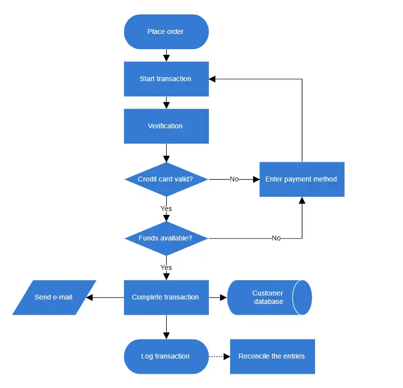
- Flowchart: Provides all the standard flowchart shapes as ready-made objects, making it easy to add them to a diagram surface in a single call.
- Ports: Connect connectors to specific locations on a node using various types of ports or connecting points for precise connectivity.
- Nodes: Visualize and arrange any graphical object using nodes, which can be manipulated freely on the Blazor diagram surface.
- Built-in Shapes: Provided built-in shapes such as basic and flow shapes.
- Swimlane: Visualize groups and categorizes activities or tasks based on the role or department responsible for their execution, aiding in illustrating complex processes involving multiple participants or departments within an organization.
- Connectors: Represent connections between nodes, defining relationships and workflows within the diagram.
- Annotations: Add textual representations to nodes or connectors using annotations. These editable text blocks can be displayed over diagram elements to provide additional information or labels. Multiple annotations can be attached to a single node or connector, allowing for flexible and detailed labeling of diagram components. Annotations support real-time editing, enabling dynamic updates to the diagram’s textual content during runtime.
-
Routing: Enhanced the dynamic updating of connector routes based on the placement or movement of nearby shapes. This feature is activated by setting the Routing enum value to the Constraints property for both the diagram and connectors, and setting the
RoutingTypeto Classic or Advanced. - Interaction: Diagram elements can be selected, rotated, resized, and moved.
- Z-Order: Diagram elements overlapping can be controlled by changing their Z-Order value.
- Pan and Zoom: Navigate the diagram with pan and zoom options for detailed and broad views.
- Snapping: Precisely align nodes, connectors, and annotations while dragging them just by snapping to the nearest gridlines or objects.
- Undo/Redo: Allows you to keep track of the recent changes made in a diagram component to correct your mistakes.
- Commands: Frequently used commands like delete, connect, and duplicate can be shown as buttons near a selector. This makes it easy for users to quickly perform those operations instead of searching for the correct buttons in a toolbox.
- Keyboard Shortcuts: Perform diagramming actions using customizable keyboard shortcuts.
- Clipboard Operations: Ability to cut, copy, and paste or duplicate selected Diagram elements within and across diagrams.
- Automatic Layouts: Comprehensive built-in support for automatic node arrangement, including organization chart, mind map, flowchart, radial tree, hierarchical tree, and complex hierarchical layouts. These intelligent layout algorithms optimize the visual structure of your diagrams for enhanced readability and aesthetics.
- Serialization: Save the Blazor diagram state in JSON format and load it back later for further editing using the serializer.
- Symbol palette: Includes a gallery of stencils, reusable symbols, and nodes that can be dragged onto the surface of a Blazor diagram.
- Overview control: Displays a small preview of the entire diagram page for easier navigation.
- Localization: Localizes every static text in the control to any supported language.
- DrawingTool: Draw all kinds of built-in nodes and connect them with connectors interactively by just clicking and dragging on the drawing area.
- Printing: Print diagrams from the browser. Users can also customize the page size, orientation, and page margin, and fit a diagram to a single page.
- Exporting: You can export a diagram to different image files such as PNG, JPEG, and SVG.
- Tooltip: Enhance user experience by implementing tooltips to display supplementary information for various diagram elements, including nodes, connectors, ports, user handles, and fixed user handles. Tooltips provide context-sensitive details when users hover over or interact with these elements.
- Context menu: Customize the context menu with frequently used commands for easier access.
- Gridlines: Gridlines provide guidance when trying to align objects.
- Data binding: Create and position nodes and connectors in Blazor diagrams based on data from data sources. Furthermore, data in any format can be easily converted, mapped, and consumed in the Blazor diagram by simply changing a few properties without writing any code. Loading data from a list or an IEnumerable collection is also supported by the Blazor Diagram library.
- Spacing Commands: Spacing commands allow you to place selected objects on the diagram at equal intervals.
- Sizing Commands: Use sizing commands to proportionally size selected nodes in relation to the first selected object.
- Alignment Commands: All nodes or connectors in the selection list can be aligned horizontally to the left, right, or centre, or vertically to the top, bottom, or middle.
- UserHandle: The user handles are customizable handles that can be used to perform custom and default clipboard actions.
- Group: The NodeGroup element is used to group together multiple nodes and connectors into a single element. It serves as a container for its children (nodes, nodegroups, and connectors). Every modification to the node group has an impact on the children. Individual child elements can be edited.
- Ruler: Added horizontal and vertical guides for precise measuring in the Diagram control. The ruler ensures accuracy when placing, sizing, and aligning shapes and objects within a diagram.
- Mermaid: Support for creating, importing, and exporting diagrams using the Mermaid syntax, allowing users to define flowcharts and mind maps through a simple text-based format. This feature enables easy visualization of complex ideas and processes without manual drawing.
- CRUD: The Diagram component supports real-time CRUD actions, enabling dynamic manipulation of the DataSource. This allows seamless addition, modification, and removal of nodes, connectors, and other diagram elements during runtime, enhancing interactivity and data management capabilities.
-
Chunk Message: The Blazor Diagram component introduces the
EnableChunkMessagesproperty to address potential connection issues when processing large data sets. This feature is particularly useful when calculating the bounds of paths, text, images, and SVG data from the server to the JavaScript side using JsInterop calls.