Page Settings in Diagram Component
3 Jul 202617 minutes to read
By default, the diagram page size is decided based on the position of its diagram elements. The size and appearance of diagram pages can be customized using the PageSettings property of the diagram.
-
The Width and Height properties of
PageSettingsdefine the size of the page. The defaultWidthis 1123 pixels, andHeightis 794 pixels. -
The Orientation property of
PageSettingsis used to change the page orientation to portrait or landscape. The default orientation is landscape. -
Page breaks are visual guide to show how the pages are split into multiple pages. The ShowPageBreaks property decides the visibility of page breaks. By default, this property is set to false. If it is true, then the page break lines will be visible.
-
To explore those properties, refer to PageSettings.
To learn more about customization of diagram page, refer to the below video link,
@using Syncfusion.Blazor.Diagram

<SfDiagramComponent Height="600px" Nodes="@_nodes">
    @*Initialize the page settings with page orientation and break lines*@
    <PageSettings Height="300"
                  Width="300"
                  Orientation="@_orientation"
                  MultiplePage="true"
                  ShowPageBreaks="true">
        @*Set the page background color*@
        <BackgroundStyle Background="LightGreen" />
        <PageMargin Left="10" Top="10" Bottom="10" />
    </PageSettings>
</SfDiagramComponent>

@code
{
    private DiagramObjectCollection<Node> _nodes = new DiagramObjectCollection<Node>();
    protected override void OnInitialized()
    {
        Node node = new Node()
            {
                ID = "node6",
                Width = 50,
                Height = 50,
                OffsetX = 150,
                OffsetY = 100,
                Style = new ShapeStyle()
                {
                    Fill = "#6495ED",
                    StrokeColor = "white"
                }
            };
        _nodes.Add(node);
    }
    //Set the page orientation as landscape.
    private PageOrientation _orientation = PageOrientation.Landscape;
}A complete working sample can be downloaded from GitHub
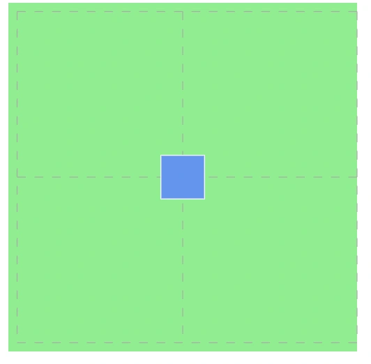
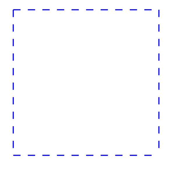
| Orientation | Output |
|---|---|
| Landscape |  |
| Portrait |  |
How to Enable Multiple Pages
Based on the diagramming element position, the size of the page dynamically increases or decreases in multiples of page width and height using the MultiplePage property of PageSettings.
@using Syncfusion.Blazor.Diagram

<SfDiagramComponent Height="600px" Nodes="@_nodes">
    <SnapSettings Constraints="SnapConstraints.None"></SnapSettings>
    @*Initialize the page settings with multiple page, page orientation and break lines*@
    <PageSettings Height="200"
                  Width="200"
                  MultiplePage="true"
                  Orientation="@_orientation"
                  ShowPageBreaks="true">
    </PageSettings>
</SfDiagramComponent>

@code
{
    //Sets the page orientation as landscape.
    private PageOrientation _orientation = PageOrientation.Landscape;
    private DiagramObjectCollection<Node> _nodes = new DiagramObjectCollection<Node>();
    protected override void OnInitialized()
    {
        Node node = new Node()
        {
            ID = "node6",
            Width = 50,
            Height = 50,
            OffsetX = 200,
            OffsetY = 200,
            Style = new ShapeStyle()
            {
                Fill = "#6495ED",
                StrokeColor = "white"
            }
        };
        _nodes.Add(node);
    }
}
A complete working sample can be downloaded from GitHub

How to Customize Page Appearance
Customize page appearance using the PageSettings properties:
-
The
Backgroundproperty of BackgroundStyle sets the page background color. -
The ImageSource property of the
BackgroundStylesets the background image path (URL/base64). -
The ImageScale and ImageAlign control background image scaling and alignment.
@using Syncfusion.Blazor.Diagram

<SfDiagramComponent Height="600px" Nodes="@_nodes">
    <SnapSettings Constraints="SnapConstraints.None"></SnapSettings>
    @*Initialize the page settings with page orientation and break lines*@
    <PageSettings Height="200"
                  Width="200"
                  Orientation="@_orientation"
                  MultiplePage="true"
                  ShowPageBreaks="true">
        @*Set the page background color*@
        <BackgroundStyle Background="LightGreen" />
        <PageMargin Left="10" Top="10" Bottom="10" />
    </PageSettings>
</SfDiagramComponent>

@code
{
    private DiagramObjectCollection<Node> _nodes = new DiagramObjectCollection<Node>();
    protected override void OnInitialized()
    {
        Node node = new Node()
        {
            ID = "node6",
            Width = 50,
            Height = 50,
            OffsetX = 200,
            OffsetY = 200,
            Style = new ShapeStyle()
            {
                Fill = "#6495ED",
                StrokeColor = "white"
            }
        };
        _nodes.Add(node);
    }
    //Set the page orientation as landscape.
    private PageOrientation _orientation = PageOrientation.Landscape;
}
A complete working sample can be downloaded from GitHub
How to Customize Page Break Appearance
The appearance of the PageBreak can be customized using the style properties such as stroke, stroke-width and stroke-dasharray of the diagram pagebreak class.
Refer to the following code example on how to change the stroke, stroke-dasharray of the pagebreak.
@using Syncfusion.Blazor.Diagram

<style>
    .e-diagram-page-break
    {
        stroke: blue;
        stroke-width: 3;
        stroke-dasharray: 20,20;
    }
</style>

<SfDiagramComponent Height="600px">
    <SnapSettings Constraints="SnapConstraints.None"></SnapSettings>
    @*Initialize the page settings with page orientation and break lines*@
    <PageSettings Height="500"
                  Width="500"
                  MultiplePage="true"
                  ShowPageBreaks="true">
                  <PageMargin Left="50" Right="50" Top="50" Bottom="50"></PageMargin>
    </PageSettings>
</SfDiagramComponent>
A complete working sample can be downloaded from GitHub
How to Change Page Margins
The area between the maintain content of a page and the page edges can be changed by using the PageMargin property. The default margins are 25 pixels on all sides.
@using Syncfusion.Blazor.Diagram

<SfDiagramComponent Height="600px">
    @*Initialize the page settings with page margin*@
    <PageSettings Height="300"
                  Width="300"
                  MultiplePage="true"
                  ShowPageBreaks="true">
        <BackgroundStyle Background="lightblue"/>
        <PageMargin Left="50" Right="50" Top="50" Bottom="50"/>
    </PageSettings>
</SfDiagramComponent>A complete working sample can be downloaded from GitHub
How to Restrict Node Interaction Using Boundary Constraints
Restrict or customize the interactive region, out of which the elements cannot be dragged, resized, or rotated. The BoundaryConstraints property of page settings allows to customize the interactive region. To explore the boundary constraints, refer to Boundary Constraints.
The following code example illustrates how to define boundary constraints with respect to the page.
@using Syncfusion.Blazor.Diagram

<SfDiagramComponent Nodes="@_nodeCollection" Height="600px">
    <SnapSettings>
        <HorizontalGridLines LineColor="gray"/>
        <VerticalGridLines LineColor="gray"/>
    </SnapSettings>
    @*Initialize the page settings with page orientation and break lines*@
    <PageSettings Height="300"
                  Width="300"
                  MultiplePage="true"
                  Orientation="@_orientation"
                  BoundaryConstraints="@_boundaryConstraints"
                  ShowPageBreaks="true">
        <BackgroundStyle Background="lightblue"/>
        <PageMargin Left="10" Top="10" Bottom="10"/>
    </PageSettings>
</SfDiagramComponent>

@code
{
    //Reference to diagram.
    private SfDiagramComponent _diagram;
    private PageOrientation _orientation = PageOrientation.Landscape;
    private BoundaryConstraints _boundaryConstraints = BoundaryConstraints.Page;
    //Define diagram's nodes collection.
    private DiagramObjectCollection<Node>
    _nodeCollection = new DiagramObjectCollection<Node>();

    protected override void OnInitialized()
    {
        Node node = new Node()
        {
            ID = "group",
            OffsetX = 200,
            OffsetY = 200,
            Width = 100,
            Height = 100,
            Annotations = new DiagramObjectCollection<ShapeAnnotation>()
            {
                new ShapeAnnotation()
                {
                    Content = "Node1",
                    Style = new TextStyle()
                    {
                        Color = "white",
                    }
                }
            },
            Style = new ShapeStyle()
            {
                Fill = "cornflowerblue",
                StrokeColor = "white"
            }
        };
        _nodeCollection.Add(node);
    }
}A complete working sample can be downloaded from GitHub
How to Make Responsive with Parent Container
By setting the value in percentage, the diagram gets its dimention with respect to its parent container.Specify the Width and Height as 100% to make the diagram element fill its parent container.
Setting the Height to 100% requires the diagram parent element to have explicit height or you can use calc function to set explicit height based on the browser layout.
The following code example illustrates how to set width and height in percentage
@using Syncfusion.Blazor.Diagram
@using System.Collections.ObjectModel
<div style="width:700px; height:700px;">
    <SfDiagramComponent @ref="@_diagram" Width="100%" Height="100%" Nodes="@_nodes"></SfDiagramComponent>
</div>
@code
{
    private DiagramObjectCollection<Node> _nodes = new DiagramObjectCollection<Node>();
    private SfDiagramComponent _diagram;
    protected override void OnInitialized()
    {
        _nodes.Add(new Node()
        {
            ID = "node1",
            OffsetX = 100,
            OffsetY = 100,
            Width = 100,
            Height = 100,
            Style = new ShapeStyle() { Fill = "#6495ED", StrokeColor = "white" }
        });
    }
}A complete working sample can be downloaded from GitHub
How to Handle Page Settings Property Changes Using Callback Methods
- BackgroundChanged : Specifies the callback to trigger when the Background value changes.
- BoundaryConstraintsChanged : Specifies the callback to trigger when the BoundaryConstraints value changes.
- HeightChanged : Specifies the callback to trigger when the height value changes.
- MarginChanged : Specifies the callback to trigger when the Margin value changes.
- MultiplePageChanged :Specifies the callback to trigger when the MultiplePage value changes.
- OrientationChanged : Specifies the callback to trigger when the Orientation value changes.
- ShowPageBreaksChanged : Specifies the callback to trigger when the ShowPageBreaks value changes.
- WidthChanged : Specifies the callback to trigger when the width value changes.
@using Syncfusion.Blazor.Diagram

<SfDiagramComponent Height="600px">
    @* Sets the ScrollLimit of scroll settings *@
     <PageSettings BackgroundChanged="OnBackgroundChanged"></PageSettings>
</SfDiagramComponent>

@code
{
    private void OnBackgroundChanged()
    {
       // Enter your code.
    }
}