Ruler Settings in Blazor Diagram Component
3 Jul 20262 minutes to read
The Ruler provides horizontal and vertical guides for measuring in the Diagram control. It can be used to measure diagram objects, indicate positions, and align diagram elements, making it especially useful in creating scale models.
How to Add Rulers to the Diagram Component
The RulerSettings property of SfDiagramComponent is used to control the visibility and appearance of the ruler in the diagram. The HorizontalRuler and VerticalRuler properties of RulerSettings are used to define and customize the horizontal ruler and vertical ruler in the diagram canvas.
The following code demonstrates how to add a ruler to the diagram.
@using Syncfusion.Blazor.Diagram

<SfDiagramComponent Height="600px" >
	<RulerSettings>
        <HorizontalRuler>
          </HorizontalRuler>
        <VerticalRuler >
          </VerticalRuler>
    </RulerSettings>
</SfDiagramComponent>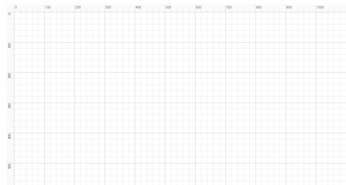
How to Customize the Ruler
The HorizontalRuler and VerticalRuler properties RulerSettings class are used to customize the appearance of the rulers in the diagram. The following properties are used to customize the appearance of both the horizontal and vertical rulers.
- Interval - This property allows to define the number of intervals to be present on each segment of both horizontal and vertical rulers.
- IsVisible - This property determines whether the horizontal and vertical rulers are displayed in the diagram. This can be useful for toggling rulers on and off depending on your needs.
- TickAlignment - This property controls the placement of the tick marks (also called hash marks) on the ruler. Typically choose to have them positioned on the left or right for the vertical ruler and on the top or bottom for the horizontal ruler.
- MarkerColor - This property defines the color of the marker line, also known as the cursor guide. This line appears in the diagram and aligns with the ruler, visually indicating the current position of your cursor.
The code below demonstrates how the diagram ruler can be customized.
@using Syncfusion.Blazor.Diagram

<SfDiagramComponent @ref="@_diagram" Height="600px" >
	<RulerSettings>
        <HorizontalRuler  IsVisible="true" Interval="@_rulerInterval"
                            TickAlignment="@_rulerTickAlignment" MarkerColor="@_rulerMarkerColor">
        </HorizontalRuler>
        <VerticalRuler IsVisible="false"  Interval="@_rulerInterval"
                        TickAlignment="@_rulerTickAlignment" MarkerColor="@_rulerMarkerColor">
        </VerticalRuler>
    </RulerSettings>
</SfDiagramComponent>

@code
{
    //Reference to diagram.
    private SfDiagramComponent _diagram;
    //Defining Ruler Interval of Rulers
    private int _rulerInterval = 20;
    //Defining Tick Alignment of Rulers
    private TickAlignment _rulerTickAlignment = TickAlignment.RightAndBottom;
    //Defining Marker color of Rulers
    private string _rulerMarkerColor = "green";

}A complete working sample can be downloaded from GitHub